Hey, as discussed in our scriptorium, we want to remove the title Unchecked (image) in hewikisource site.
Description
Description
Related Objects
Related Objects
Event Timeline
Comment Actions
I don’t think this is currently supported, and considering T277883: Drop all low-use and unused features of FlaggedRevs to make it more maintainable, I doubt it will be added in the near future. However, just as you use Common.css to move the box around (search for .flaggedrevs_short), you could use Common.css to completely hide it.
Comment Actions
Ok, thank you. I thought that one of these settings is relevant: (from mw:Extension:FlaggedRevs#User interface)
- $wgSimpleFlaggedRevsUI – When enabled, a simpler, icon based UI is used. Does not affect the tags shown in edit mode.
- $wgFlaggedRevsLowProfile – This setting hides the review status box/bar for pages that are reviewed in their latest version. Explanatory text is also removed from some places.
Comment Actions
Both of these settings are set to true on hewikisource (hewikisource configuration), so you already have the smallest possible amount of noise achievable through configuration.
Thinking it over, the fact that it cannot be configured further is probably for a reason: by removing the button, users had no way to tell reviewed and unreviewed pages apart. The design clash you mentioned in the scriptorium could be resolved by simply removing all styles from Common.css, and maybe by turning the censor button into an indicator:
| Current | .flaggedrevs_short overrides removed | + censor button moved to indicators |
|---|---|---|
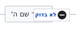 | 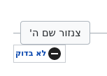 | 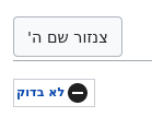 |
Comment Actions
Thank you, I got it. Probably it's our (old) community fault.
@neriah, what do you think about the option of indicator?
@Tacsipacsi can you extend, or give any source, about this option? Is that an extension?
Maybe it's for another issue, but in our main page this big sign is also exists. I think that it should be removed from the main page, of course it checked, only sysops can edit it...
Comment Actions
The title "Unchecked" has been removed. @Shalomori123 Was there anything else we wanted in this matter?