Page MenuHomePhabricator

Propose a control for collections
Open, LowPublic

Description

As an admin, I want to be able to manage elements from a collection of configurations in the editor.

Background:

CommunityConfiguration 1.0 renders collections in a poor way, see screenshot:

Screenshot 2024-03-19 at 19.03.45.png (1×1 px, 377 KB)

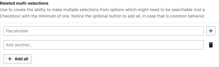
This a poor UI/UX in the sense that it does not allow to add or remove elements. Also the doubled number list 1) 1) is quite strange. A more powerful solution would be to add some add/remove controls so this collection can be fully managed

Design:

TBD

Design alternatives:

Screenshot 2024-03-19 at 19.02.50.png (1×2 px, 119 KB)

A control that displays all existing elements of the collection, showing inline fields that belong to the same element, and has "add" and "remove" controls.

Acceptance Criteria:

  • Design is proposed, components clarified
  • Vue components are implemented in CommunityConfiguration and/or Codex

Event Timeline

Sgs renamed this task from Vue design for page titles selector control to Propose a control for collections.Mar 21 2024, 5:33 PM
Sgs updated the task description. (Show Details)
Sgs triaged this task as Low priority.Mar 22 2024, 1:50 PM

hi @Sgs, commenting on my understanding here about this just to make sure it is not completely inaccurate :) is the need here to build a way for admins to add/remove 'elements' of the respective collection, in this case, links?

a few days ago I aimed to improve the doubled numbered list you talked about in the description by using a multi-column field. is this something that you think could alleviate the issue?

help panel links example.png (824×950 px, 39 KB)

hi @Sgs, commenting on my understanding here about this just to make sure it is not completely inaccurate :) is the need here to build a way for admins to add/remove 'elements' of the respective collection, in this case, links?

Yes, for the GrowthExperiments Help panel links we would not show the controls because we want exactly five items but that is a Growth special case rather than the general case where "management" is desired.

a few days ago I aimed to improve the doubled numbered list you talked about in the description by using a multi-column field. is this something that you think could alleviate the issue?

help panel links example.png (824×950 px, 39 KB)

This is indeed an improvement that we can apply to the Help panel config form but it does not remove the need for the "management" feature.

thank you! same as https://phabricator.wikimedia.org/T357710 I think this may also take advantage of the multi selections approach in form guidelines?

multi-selections (1).png (230×752 px, 18 KB)

feel free to disagree, maybe I am not getting these use cases right!

thank you! same as https://phabricator.wikimedia.org/T357710 I think this may also take advantage of the multi selections approach in form guidelines?

multi-selections (1).png (230×752 px, 18 KB)

feel free to disagree, maybe I am not getting these use cases right!

I think the ChipInput plus Menu metaphor works well one there's only one value to select, in the case of the help panel links there are two values to select per row. Could we update design to reflect so?

@Sgs just to make sure I am following,

I think the ChipInput plus Menu metaphor works well one there's only one value to select, in the case of the help panel links there are two values to select per row. Could we update design to reflect so?

Is the need here for a design that has the multi selections workaround I commented, but using the multi column field (two values per row)?

I think that is a design question, but I tempted to say yes. In our case, the help panel links would display much better if we inlined the "Destination page" filed and the "Label" one.

Thanks for the patience here @Sgs, I also agree with mixing the multi selections with the multi-columns. Here's an attempt at that:

Form for Help panel.png (2×1 px, 139 KB)

I added the 'plus' button to the 'Fifth link' field in the Help panel links sections, but I am wondering if there is a better placement for this for our use case 🤔 Do you have any thoughts?

Form for Help panel.png (2×1 px, 139 KB)

This improves the current status quo we have but I think it does not complete the management requirement as it lacks a delete button (trash button in "design alternative") and also the "single" labels approach in the "design alternative" seems it would save some vertical space in the form which would improve the UX. What do you think?

I added the 'plus' button to the 'Fifth link' field in the Help panel links sections, but I am wondering if there is a better placement for this for our use case 🤔 Do you have any thoughts?

I think we should split this task in two, this task can hold the management functionality requirements which per comments above need some refinement and one for the in-lined display of fields. For the latter I have filed T364557 (and asked some design clarifications there).

This improves the current status quo we have but I think it does not complete the management requirement as it lacks a delete button (trash button in "design alternative") and also the "single" labels approach in the "design alternative" seems it would save some vertical space in the form which would improve the UX. What do you think?

Gotcha! I think that makes sense. We can do the following, see screenshot:

Collections proposal.png (1×752 px, 26 KB)

[not directly related to the task] Let's maybe encapsulate each link/option inside of a module to create visual separation (see https://doc.wikimedia.org/codex/latest/style-guide/constructing-forms.html#modules). We can have the delete action next to the 'X link' label, and then have the action to add another link (or whichever element) at the bottom of the section.

@Sgs how does this sound?

I think we should split this task in two, this task can hold the management functionality requirements which per comments above need some refinement and one for the in-lined display of fields. For the latter I have filed T364557 (and asked some design clarifications there).

Thank you, I'll comment on that task for that :-)

(very rough) Notes from demo:

  • We should have one explanatory field at the top ("Help panel links" or something...)
  • "Destination page" and "Label" could possibly be headers for the full column rather than needed for each new row.
  • i18n issues with having "First link", "Second link", etc. because what happens when a new row is added? (Could we remove these labels, or just have them numbered?)
  • We still need to have the "recommended help page" text in the design for this particular example.