Page MenuHomePhabricator

The link in the "privacy considerations" flyout on PDF file description pages is still difficult to click
Closed, ResolvedPublic

Description

T157544: The link in the "privacy considerations" flyout on PDF file description pages is difficult to click is happening again – the “Learn more about this issue.” link on file pages is very difficult to click:

It looks like this is because the 2017 fix added some additional space below the button, and at the time the flyout / popup was shown below the button (as seen in T157544#3379587), but now it shows above it.
Event Timeline

I tried fixing this by just copying the padding-bottom + margin-bottom rules into -top versions, but testing it locally, I’m not sure it’s really helping – the flyout just gets further away from the button then :/

at the time the flyout / popup was shown below the button (as seen in T157544#3379587), but now it shows above it

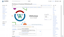
It shows above or below depending on whether there is space for it (probably since https://gerrit.wikimedia.org/r/c/oojs/ui/+/385309). Try it on a landscape PDF; for example, on https://commons.wikimedia.org/wiki/File:Msz2001_Prezentacja_Wikifunkcje.pdf, I see the popup below the button:

image.png (2×3 px, 1004 KB)

However, in this case, the link is also difficult to click! The flyout is further away from the button than it should be (you can kind of see it in my screenshot), just like it happened when you tried to add padding/margin at the top. I don't know what change in OOUI caused this, but we can fix this problem by telling the popup where exactly it should be positioned.

Change #1023563 had a related patch set uploaded (by Bartosz Dziewoński; author: Bartosz Dziewoński):

[mediawiki/core@master] mw.filewarning: Adjust the area of the warning button again

https://gerrit.wikimedia.org/r/1023563

Change #1023563 merged by jenkins-bot:

[mediawiki/core@master] mw.filewarning: Adjust the area of the warning button again

https://gerrit.wikimedia.org/r/1023563