Some special pages now have a icon with a help link in the right top corner. In modern skin the contrast is bad and the link is not visible.
Description
Description
Event Timeline
Comment Actions

Perhaps this should be declined as we don't actively support Modern or encourage its use.
Comment Actions
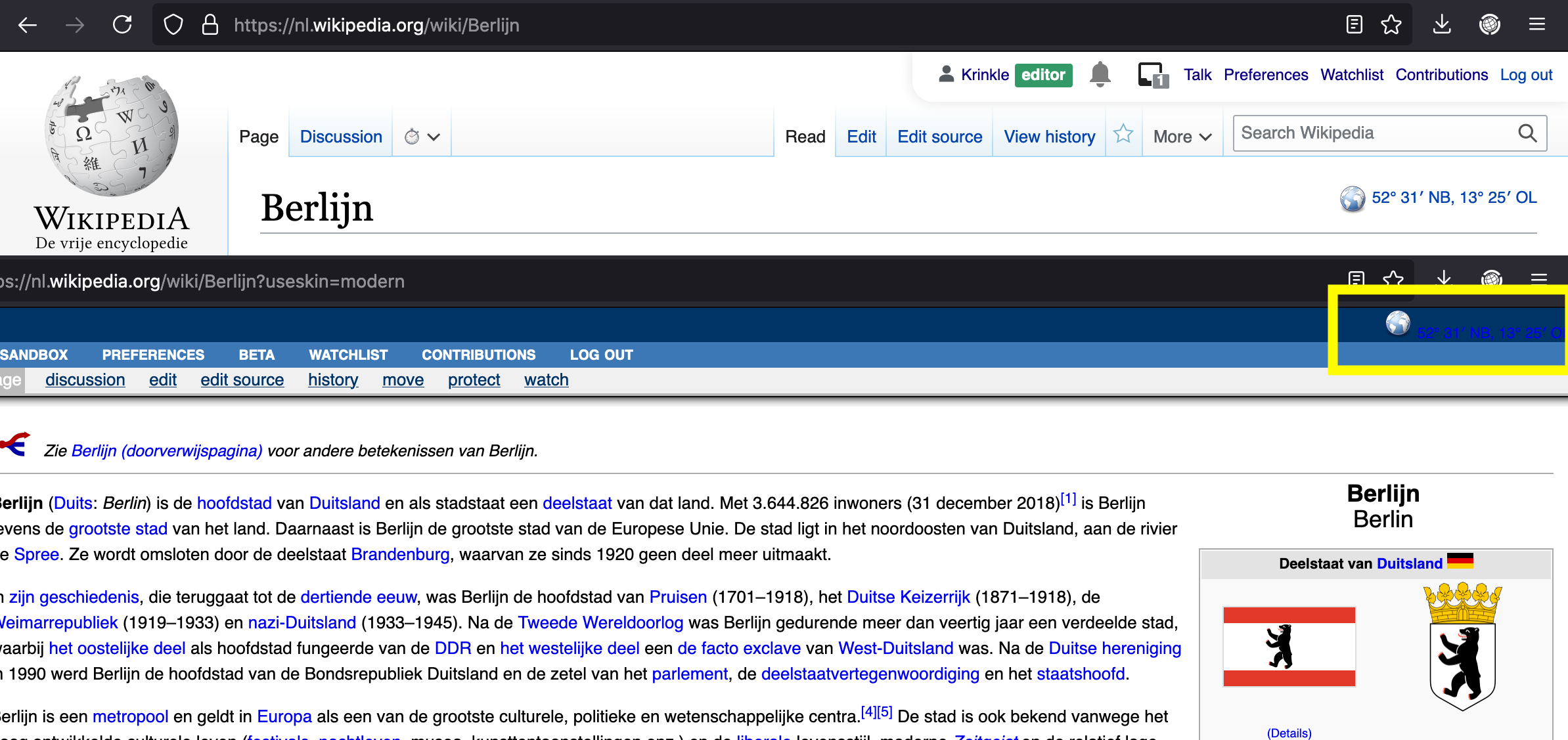
This seems to be a general problem with page indicators in the Modern skin. It rendered them in its skin layout outside the content area. I suspect this may have unintentionally happened as part of refactoring, and not result of an intentional decision to output indicators over there.
They are not an abstract piece of information that can be expected to adapt to a skin's layout and theme. They are user-generated and thus should render in a location suitable for such content which is generally the content area or something visually compatible with it.
For example:
https://nl.wikipedia.org/wiki/Berlijn?useskin=modern
Comment Actions
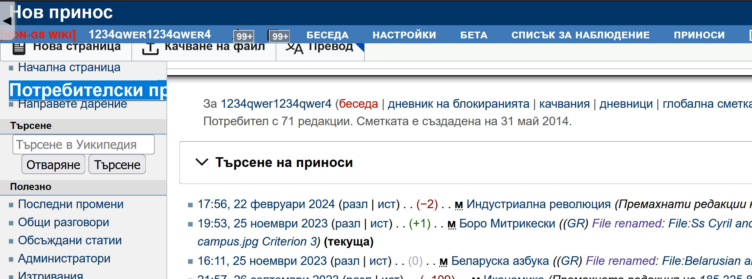
It seems that Modern is the only skin that separates the page header outside of the "content area". For the same reason, ContentTranslation's buttons on contribution pages appear on top of other toolbars: