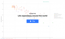
For the interactive graphs, I think we should follow the standard set by the videos - show the graph with a gray-out (transparent?) effect, with a big "play" button in the middle. Once clicked, the graph becomes non-grayed (thus indicating that it finished loading), or we could change it to non-grayed on mouse over, and show a loading bar when clicked. Also, instead of the "play" button, we could experiment with a "gears" button, possibly even spinning ones. Once we have many interactive graphs, we could do an a/b test on this.
Description
Description
Details
Details
Customize query in gerrit
Event Timeline
Comment Actions

Hey I made some quick mocks with Julien. They are attached here.
Interactive graphs is super cool and I'm really excited to get this up!


Comment Actions
Change 257386 had a related patch set uploaded (by JGirault):
Interactive graphs button cleanup
Comment Actions
Change 257777 had a related patch set uploaded (by Yurik):
Interactive graphs button cleanup
Comment Actions
Well done @JGirault & @MSyed! The new design is on the train being deployed.
Yet, I feel we are ignoring a big class of interactive graphs that will suffer from this design - graphs that are useful in both the static and in interactive mode. For example, tooltip, budget, and crossfilter graphs show useful information by themselves, but allow user to see a bit more interactively. Should we make them blink once on load and show non-grayed-out unless the user mouse-over?
Comment Actions
Here's is an example of how video tag is done - i think we should have exactly the same one: http://tools.wmflabs.org/hartman/mediawiki-dev/index.php?title=Player_demo
Comment Actions
Change 263079 had a related patch set uploaded (by JGirault):
Modifies Play button and layover because the previous layover was hiding the static graph
Comment Actions
Change 263079 merged by jenkins-bot:
Modifies Play button and layover because the previous layover was hiding the static graph