This was originally brought up on the Brickimedia Association's GitHub (https://github.com/Brickimedia/brickimedia/issues/432).
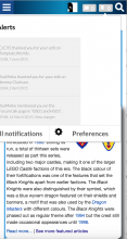
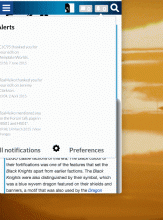
Echo does not display well on smaller screens. This isn't a problem on Wikimedia projects since they use MobileFrontend, but this does cause problems for other sites that do not. Here it is on Brickipedia, which uses the Refreshed skin (GitHub):
It breaks on resize too (gif):
Issues can be split into two parts: the buttons and the dropdown.
The switch to two buttons with icons means Echo takes up a good deal more screen real estate than it did before. This isn't much of an issue on larger screens, but as you can see on small screens like phones or tablets that extra space is much more valuable and would find better use elsewhere. It would be nice if the buttons consolidated into one beneath some window width. Also, this might belong in a separate task, but there could be a LocalSettings or user preference to toggle between one and two buttons as well.
Next the dropdown itself. As shown above, the notification text gets partially cut off on small screens, and it can disappear entirely when the window is resized. It would be nice if the notification items took up with the full width of the window once it gets small enough.

