Page MenuHomePhabricator

[App review] As a reader, I'm missing visible infoboxes
Closed, ResolvedPublic

Description

Swedish review 1 on the App Store: "Missing the infoboxes on the right side as on the dektop. On mobile web I get that directly under the main image, which is neat. Currently I do not have much less use of the app, since mobile web is superior."

On mobile view, shows the infobox:

IMG_2400.PNG (1×750 px, 510 KB)

In app, it's hidden in a collapsed box, a section down:
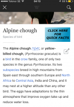
IMG_2401.PNG (1×750 px, 313 KB)

Event Timeline

Josve05a raised the priority of this task from to Needs Triage.
Josve05a updated the task description. (Show Details)
Josve05a subscribed.

This is an interesting issue and it's actually really tricky :)

If we treat infoboxes in the manner you see in screenshot one, it makes it much more difficult to do nice native lead image presentation you see in screenshot two*.
You would very often see the same image twice, so basically the entire screen would be taken up by the same image.
And you can't hide the image in the infobox to address that problem because sometimes the image is critical to the infobox's presentation. It's tricky!

(* It's a native gallery you can swipe side-to-side and it is good about not centering faces instead or cropping them awkwardly.)

We could move the collapsed infobox to appear before lead content, but after the WIkidata description (and the line break). That way, the infobox would be at the top, but still hide the image. At least it is a first step...

(* It's a native gallery you can swipe side-to-side and it is good about not centering faces instead of cropping them awkwardly.)

It still cropped this bird awkwardly ;)

If I recall correctly both iOS and Android experimented with just that approach and we got UX feedback that having the text above was nicer. But we can always take another look!

hmm...what about changing the look of the infobox-"collpased-box", somehow, to look...more interesting? Not sure, but hidden at the bottom of the lead, with a pretty "big" clumpsly" box, that doens't look interesting to me...

IMG_2401.png (1×746 px, 299 KB)

(a joke, but more...appealing than current option)

@Josve05a lol on the bird cropping, maybe we can do a "bird face" detection ;)

As I said in IRC, there's no reason the first infobox button has to be edge-to-edge - I like @Josve05a's idea of trying a smaller button on the side. It solves the ticket's UX problem nicely.

Mhurd renamed this task from [App review] As a reader, I'm missing visable infoboes to [App review] As a reader, I'm missing visable infoboxes.Feb 12 2016, 3:57 AM
Mhurd set Security to None.
TheDJ renamed this task from [App review] As a reader, I'm missing visable infoboxes to [App review] As a reader, I'm missing visible infoboxes.Feb 12 2016, 7:32 AM

Yes, I think we can do a lot to improve the infobox presentation on the app. Won't get to it this version, but tagging for 5.1 consideration.

JMinor claimed this task.

Long ago added an option to open infoboxes by default.