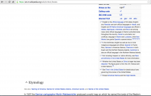
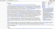
There is so much whitespace next to the infobox that I wonder if we should display sections next to it as opposed to after it. That would be similar to how other skins display it.
Currently it looks like this in Minerva:
And this is how it looks in Monobook:

