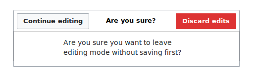
When cancelling an edit with VE, a dialog pops up asking 'Are you sure?', with different style of buttons (frameless?) from the rest of the dialogs.
For a more consistent experience, it should use the normal dialog that all the tools, the save, etc use, with normal buttons.
Cancel dialog:
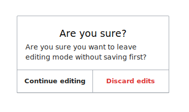
Normal dialog:
Mockup of cancel dialog using normal dialog layout: