Page MenuHomePhabricator

Decide on graveyards
Closed, ResolvedPublic

Assigned To
Authored By
Pnorman
Jan 26 2017, 1:18 AM
Referenced Files
F8759433: image.png
Jul 14 2017, 4:28 PM
F8732972: image.png
Jul 13 2017, 5:24 PM
F8732774: image.png
Jul 13 2017, 5:24 PM
F8731539: cemetery_sample.png
Jul 13 2017, 3:52 PM
F5363404: Screen Shot 2017-01-26 at 9.57.38 AM.png
Jan 26 2017, 4:59 PM
F5358714: pasted_file
Jan 26 2017, 1:18 AM

Description

pasted_file (257×713 px, 116 KB)

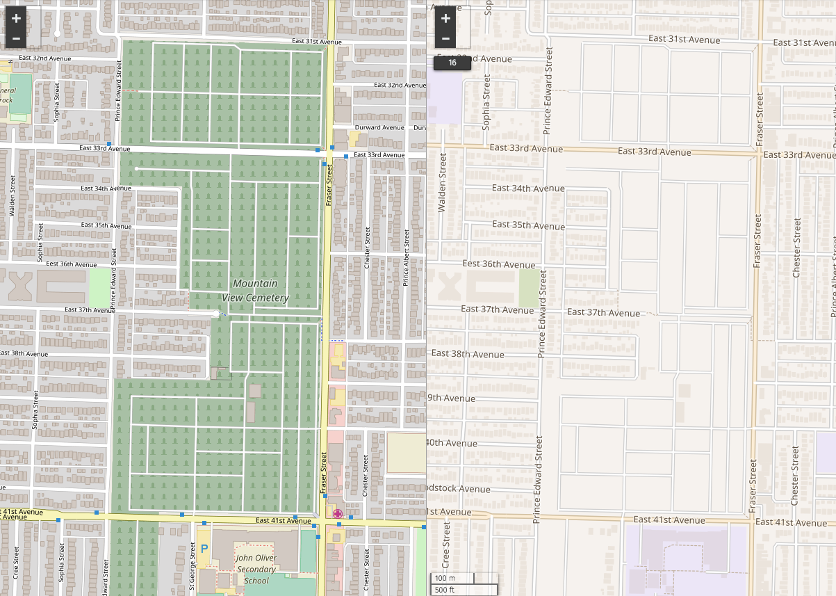
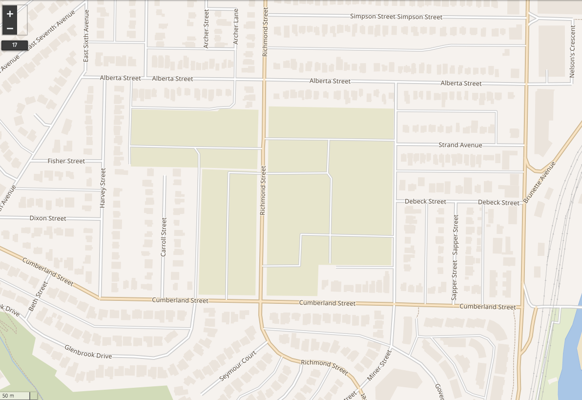
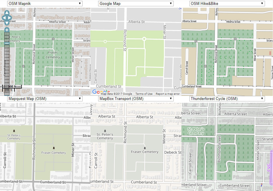
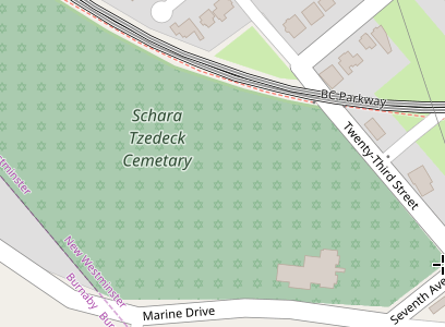
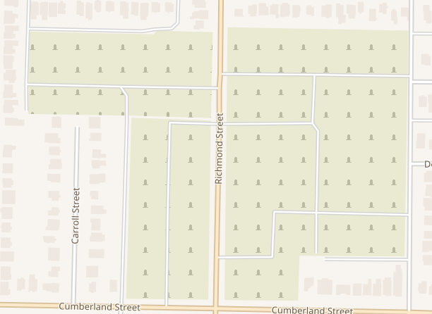
Current graveyard styling in OSM bright is a problem because

  • it's extremely strong given its importance and typical sizes of graveyards;
  • the colour is close to some other combinations of greens;
  • Nothing about the cartography makes it obvious that it's a graveyard, either on first inspection, or after knowing the style

I have three options

  1. Leave them out
  2. Copy the existing osm-bright styling
  3. Come up with something new

All three are technically very easy to implement, but I can't think of good cartography for the third.

This might need a PM call

Event Timeline

Current dark fill doesn't feel obvious, however for example the OSM-carto way of rendering cemeteries isn't nice either.

I think if we use a lighter green as the background and a lighter green for the symbols would be fine. Something to show it's a cemetery, but not so dark/bright that it immediately draws your eyes to it.

Screen Shot 2017-01-26 at 9.57.38 AM.png (857×1 px, 690 KB)

per discussions, going to use brown-green for graveyard (greener than buildings in parks).

Perhaps something like #e9ead1 //lch(92,13,110)

Color looks fine, but is there a texture that can be added on top to note that it's a cemetery (since there don't appear to be labels)?

cemetery_sample.png (819×1 px, 436 KB)

I looked at what other maps are doing with graveyards

image.png (665×951 px, 372 KB)

The symbology choices are a headstone pattern or a single headstone icon. I'll be adding in labels too, but not all graveyards will have them.

Something OpenStreetMap Carto and other maps derived from the old osm.xml Mapnik style do is change the symbols when there's a religion associated with the graveyard

image.png (300×408 px, 65 KB)

I'm not sure that's worth it for us.

A less-dense pattern for the cemeteries would be great.

image.png (446×612 px, 74 KB)

Thoughts on this look?

The pattern spacing is at 32px and consists of lch(75,13,110) on lch(92,13,110)

Spacing looks fine, the icons can be a bit less prominent - less opaque or a lighter color.

adjusted as per above and discussion on irc. the pattern now starts on z15 too.

debt claimed this task.