Description
Details
| Subject | Repo | Branch | Lines +/- | |
|---|---|---|---|---|
| WikimediaUI theme: Ensure icon aligns in dropdown menu | oojs/ui | master | +4 -3 |
Related Objects
- Mentioned Here
- rGOJU4d23c4b482f3: MenuOptionWidget: Remove theme-independent 'check' icon
T87835: OptionWidget has icon: 'check' in default settings for all themes, but only Apex needs this
T101560: OO.ui.MenuOptionWidget's icons are hidden in the mediawiki theme in the selected state and can't be used
Event Timeline
Change 355619 had a related patch set uploaded (by VolkerE; owner: VolkerE):
[oojs/ui@master] WikimediaUI theme: Ensure icon aligns in dropdown menu
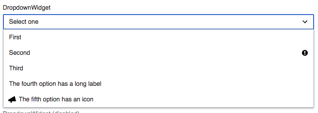
This patch correctly aligns the icon with the text. The task is also about the text of the option with the widget with the icon not being aligned with the rest of the option's text. This isn't just a CSS problem, but a design decision too. One that I am unsure of. What is better?
| A: Text aligns | B: Left-most edge aligns |
|---|---|
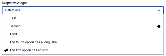 | |
I am not yet convinced by either.
@Prtksxna Thanks for the clarification. First off, having icons in DropdownWidgets (not Toolbar menus!) is the exception.
Even if we assume all options would feature icons, the icon would be at the current starting position. But DropdownWidget doesn't feature any parent class to align all children options the way proposed in A.
I see this as something we can help more at the styleguide level than trying the component to correct user decisions. As a guideline I'd propose either not to use icons or use them for all elements (even if some use a generic icon).
In the case that users want to add an icon only to one specific item, option B seems the one bringing less unexpected behaviour. While option A can cause confusion when the item causing the extra space is not on the current viewport.
I agree with Pau. Given Volker's patch is now (being) merged, can we declare this Resolved?
Change 355619 merged by jenkins-bot:
[oojs/ui@master] WikimediaUI theme: Ensure icon aligns in dropdown menu