Page MenuHomePhabricator

Constraints gadget: change help button to normal link
Closed, ResolvedPublic

Description

@Jan_Dittrich pointed out that the behavior of the help button is unexpected: instead of a small popover, it opens a new tab. It should be a regular link.

We’re not yet sure if the link should be right after the constraint type name or if it should have float: right.

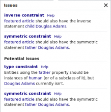
Float left:

Screen Shot 2017-09-06 at 15.35.26.png (405×402 px, 31 KB)

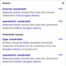
Float right:

Screen Shot 2017-09-06 at 15.35.49.png (405×402 px, 31 KB)

Event Timeline

Change 376256 had a related patch set uploaded (by Lucas Werkmeister (WMDE); owner: Lucas Werkmeister (WMDE)):
[mediawiki/extensions/WikibaseQualityConstraints@master] Change help button in gadget to regular link

https://gerrit.wikimedia.org/r/376256

Change 376256 merged by jenkins-bot:
[mediawiki/extensions/WikibaseQualityConstraints@master] Change help button in gadget to regular link

https://gerrit.wikimedia.org/r/376256

Lucas_Werkmeister_WMDE added a subscriber: thiemowmde.

Change merged, but @thiemowmde disagrees with the change… do you want to discuss this here?

@Lucas_Werkmeister_WMDE : Thanks for bringing the discussion back to phabricator.
@thiemowmde mentioned on gerrit: "I think the label of the link should not be the text "help", but a question mark icon. Really, I mean that. What is the problem with a question mark icon linking to a help page?"
I would agree with Thiemo and prefer an icon as well. I'm also happy to see discussions about that topic. Here is why an icon is not ideal in this special case:

  • The "help" link is already part of a pop up box
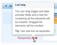
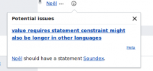
  • usually a question mark icon opens a pop up as seen in the screenshots below
  • a question mark icon would suggest to open another pop up on top of the pop up, which is not ideal from a user's and probably also dev perspective
  • choosing a text link on the right side keeps the expectations to the following action open, which is why it was decided to handle it like seen above

Screen Shot 2017-09-07 at 14.58.23.png (212×366 px, 21 KB)

Screen Shot 2017-09-07 at 15.04.57.png (251×312 px, 34 KB)

I hope that makes sense and I'm happy to hear your opinion on that. Thanks!

Thanks a lot for the detailed explanation! Makes sense, and helped me very much to understand the motivation better.

The main reason why I brought this up is: a text link needs localization, and the length of these localized texts might be very different in different languages. The text might be so long that it always wraps to the next line. Is this taken into account? Is this acceptable? An icon would not have this problem.

Currently there is at least a padding-left missing:

image.png (180×459 px, 13 KB)

Thanks for the very valid advice.
I have two other options now:

  1. to help avoid text overlay, include another break if necessary. e.g. as follows

170907_text-link.png (214×459 px, 27 KB)

  1. establish a new icon which combines help with the hint to be opened in another tab/window. This is a delicate way to go as we cannot be sure if people understand what we mean. See some exapmles here:

170907_new-help-tab.png (56×183 px, 1 KB)

I think @Lydia_Pintscher 's opinion is asked whether we are going to take the safe option and implement a possible break for a text link (1.) or if we can afford to test the icons to make sure it is understandable (2.).

A break very close to the one shown in the image already happens. The CSS just needs an additional padding-left: 1em or something close to this. @Lucas_Werkmeister_WMDE, can you make this a patch? Otherwise please let me know if I should do it.

Change 376538 had a related patch set uploaded (by Lucas Werkmeister (WMDE); owner: Lucas Werkmeister (WMDE)):
[mediawiki/extensions/WikibaseQualityConstraints@master] Add margin-left to gadget help link

https://gerrit.wikimedia.org/r/376538

I’ve uploaded a second change to add a margin. Here’s what it looks like just before a line break:

Screen Shot 2017-09-07 at 17.51.19.png (51×373 px, 4 KB)

And after the line break:
Screen Shot 2017-09-07 at 17.51.32.png (70×373 px, 4 KB)

Change 376538 merged by jenkins-bot:
[mediawiki/extensions/WikibaseQualityConstraints@master] Add margin-left to gadget help link

https://gerrit.wikimedia.org/r/376538

Change 378678 had a related patch set uploaded (by Lucas Werkmeister (WMDE); owner: Lucas Werkmeister (WMDE)):
[mediawiki/extensions/WikibaseQualityConstraints@master] Increase margin-left on gadget help link

https://gerrit.wikimedia.org/r/378678

Change 378678 merged by jenkins-bot:
[mediawiki/extensions/WikibaseQualityConstraints@master] Increase margin-left on gadget help link

https://gerrit.wikimedia.org/r/378678

Lucas_Werkmeister_WMDE moved this task from Review to Done on the Wikidata-Former-Sprint-Board board.

We’re not yet sure if the link should be right after the constraint type name or if it should have float: right.

I don’t think we ever decided on that, but I guess float: right is now the way to go?

Change 382457 had a related patch set uploaded (by Lucas Werkmeister (WMDE); owner: Lucas Werkmeister (WMDE)):
[mediawiki/extensions/WikibaseQualityConstraints@master] Drop oojs-ui.styles.icons-interactions dependency

https://gerrit.wikimedia.org/r/382457

Change 382457 merged by jenkins-bot:
[mediawiki/extensions/WikibaseQualityConstraints@master] Drop oojs-ui.styles.icons-interactions dependency

https://gerrit.wikimedia.org/r/382457