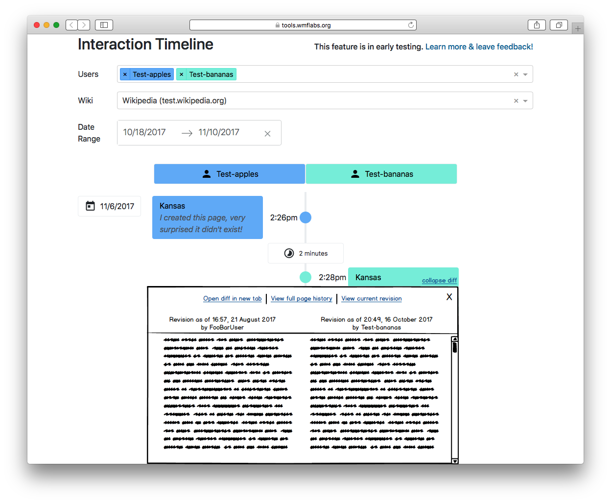
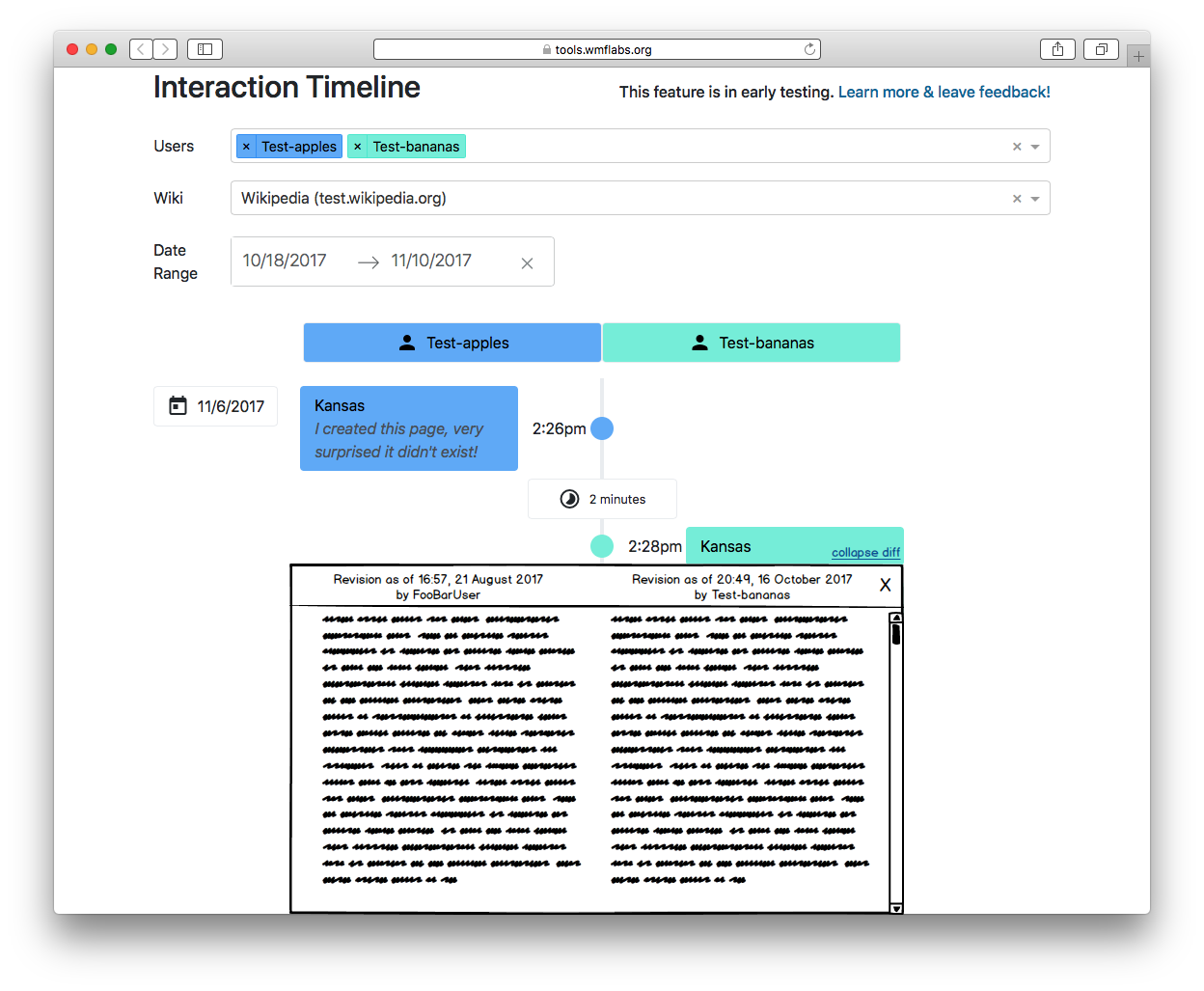
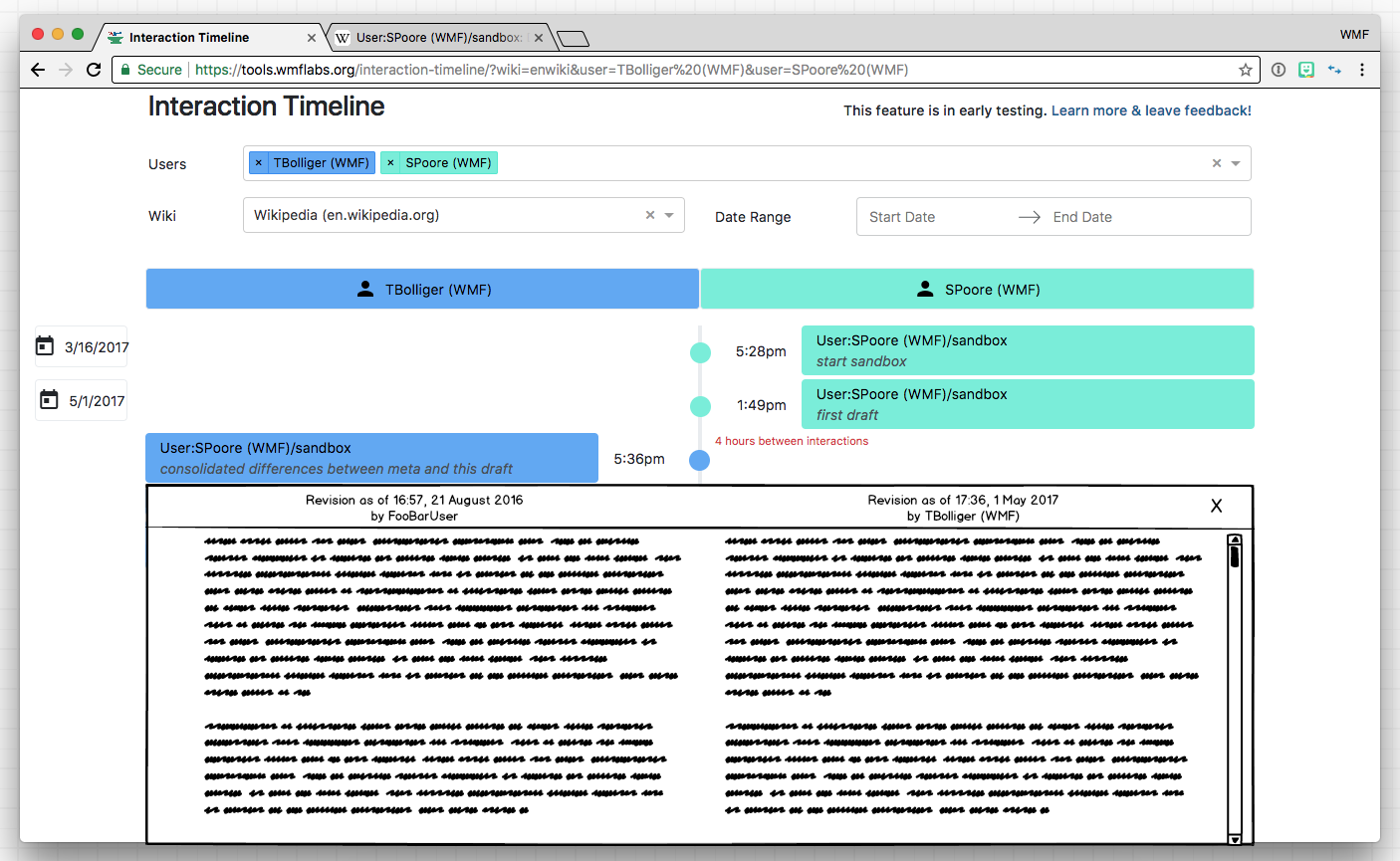
Page MenuHomePhabricator

Interaction Timeline V1: Inline diffs
Closed, ResolvedPublic3 Estimated Story Points

Description

Problem to solve

In the current Timeline, to scrutinize the contents of every edit, users must open the diffs in a new tab. This makes using the Timeline a multiple-tab tool, which may decrease productivity.


Acceptance criteria

  • When a user clicks on an edit box the diff container should open, which includes:
    • A fixed header
      • "Revision as of TIMESTAMP" linked to the revision, above each revision column
      • "by USERNAME" linked to the userpage, above each revision column
      • A close button in the top right corner. When clicked, the diff container should close.
    • A two-column wikitext diff with the same styling as it does on standard desktop Wikimedia diff pages (example)
      • Line numbers
      • Color coding and highlighting
      • + and - symbols
      • The diff should have a maximum height of 500 pixels and should scroll within if needed
  • Multiple diffs should be able to be opened on the same page.

Wireframe

Screen Shot 2017-12-04 at 10.27.58 AM.png (865×1 px, 200 KB)

Notes

There should probably be an onClick() handler on the revision card. When clicked, it will dispatch an action to go get the diff (if it doesn't already exist). The diff should probably be stored within the revision object. If this needs a loading indicator, you would probably have to add some sort of loading flag on each revision. It might not need a full-blown loading indicator, it could be something subtle... like the hover color sticks around or something like that.

API
Edit: https://test.wikipedia.org/w/api.php?action=compare&fromrev=338496&torelative=prev&formatversion=2
New Page: https://test.wikipedia.org/w/api.php?action=compare&fromrev=338495&torelative=prev&formatversion=2

Event Timeline

I made a (very rudimentary) wireframe to make sure I covered everything:

In-line diff v1.png (1×1 px, 107 KB)

I like it! i think this a great one. But the collapse diff could be a X and in the diff box itself.

Maybe — but we probably wouldn't want it to scroll away. So maybe something like this:

In-line diff v2.png (1×1 px, 107 KB)

I'm not 100% happy with those links at the top — they should only be there when necessary. Maybe we could tuck them at the end or hide them under a dropdown?

Well if someone is scrolling to read everything, then can scroll pass the links. We could also ask editors/admins what they prefer? Some ppl may want to see the information at the top even as they are reading....

Re-reading the previous feedback, no one has explicitly asked for those links yet. Let's start small and add on when requested:

In-line diff v3.png (1×1 px, 105 KB)

I'm happy to dummy up another wireframe based on the latest Timeline design

TBolliger renamed this task from Interaction Timeline V1: In-line diffs to Interaction Timeline V1: Inline diffs.Dec 1 2017, 7:12 PM

I made a newer wireframe:

Screen Shot 2017-12-04 at 10.27.58 AM.png (865×1 px, 200 KB)

I think the boarder of the diff box should be the same color (blue or green) to reinforce who made the edit. Thoughts?

@TBolliger FYI I'm going to take a few artistic liberties, if you don't like it we can change it. :)

@TBolliger FYI I'm going to take a few artistic liberties, if you don't like it we can change it. :)

:) Looking forward to seeing what you create!

@TBolliger Should suppressed revisions be clickable at all? or should you able able to click them but it shows some sort of error?

I like the idea of not having them clickable at all, but there ought to be some sort of indicator that tells you the revision was suppressed. Should it just strike through the timestamp like it does on the history page?

Or maybe it's a combination of both?

I guess we could always go with what's on the diff page:

You cannot view this diff because one or both of the revisions has been suppressed.

I guess we could always go with what's on the diff page:

You cannot view this diff because one or both of the revisions has been suppressed.

Yes, this please.

If it doesn't open, then it might feel broken, even if there is some visual indication.

The same-colored border as the card it relates to looks really good! From this static screenshot everything looks good, but I'm going to have to test some real world cases to know.

My big concern — and maybe this is unavailable, given we're mixing two two-column UIs into a single UI — is that the left/right columns will be confusing. Hopefully the interactivity helps this make sense.