Page MenuHomePhabricator

UX/UI-state: lack of invalid state for the "custom amount" input field
Closed, ResolvedPublic2 Estimated Story Points

Description

Need: As a user I want to be sure that my actions have the intended consequences

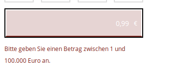
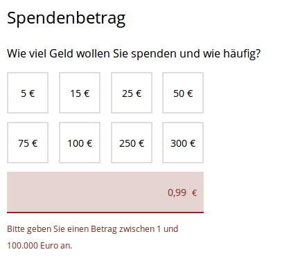
Problem: The donation and membership processes show a "custom amount" input field that is validated on the server side. When entering amounts that are considered invalid (e.g. "0,99" €), the application is aware of this state and does not allow the form to be submitted (button greyed out), but does not reveal (e.g. red color) the invalid field to the user. View handlers are already in place to set the appropriate classes in the DOM, but these are not used inside CSS.

Acceptance criteria:

  • the field's style is switched to what indicates an error in other fields:
    • border color #812923
    • background color #e6d4d3 (which is the border color with an opacity value of 0.2 on white background)
  • an error message stating the minimum and maximum value is displayed below the field (AC already fulfilled)
  • When deep-linking from a banner the field's (in)validity is being displayed properly

There already is an error message in the donation form. The membership application form needs to consider the amount, the payment interval and the address type.

Related Objects

Event Timeline

kai.nissen set the point value for this task to 2.
kai.nissen moved this task from Backlog to Sprint ready on the WMDE-Fundraising-Tech board.

Sorry, my bad. I wasn't clear enough on what I meant by red. Will update the task description accordingly.

@kai.nissen The field looks really bad with the 'rose' color IMO.

looks_bad.png (155×352 px, 4 KB)

looks_ok.png (96×315 px, 1 KB)

Possible changes that would make this better:

  • Keep the color, remove all borders but the bottom one.
  • Change the font color because white on rose looks bad. But then grayish/black does not look great on the blue we use when the field is valid => make it light blue.

If we want to keep the borders to indicate this field is really important I think we shouldn't change the color of the bottom border.

What do you think?

@Tonina_Zhelyazkova_WMDE and I made a suggestion/change to the button, making the invalid state look very much like the invalid state of the other fields (No black border, dark red border at the bottom, font inside field dark red, too)

@Tonina_Zhelyazkova_WMDE: Could you add a screenshot so @kai.nissen is up-to-date?