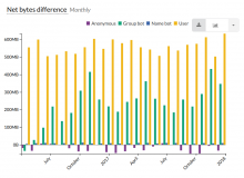
A long time ago we agreed with Erik Zachte and among the team that we'd use line charts for timeseries breakdowns.
Even if the un-broken-down chart is of column type. Otherwise the column chart can become more difficult to read:
Description
Description
Event Timeline
Comment Actions
@mforns & I were discussing this in out weekly review meeting that showing a popup just over the Change Chart selector dropdown saying switch to 'Line Chart' for ease of read/visibility.
This can be slightly tricky as we would need to work out a logic to show a popup only for difficult to read (very dense) bar charts.
