Why are we doing this?
We are updating the editing UI, but have not updated the visual treatment of the abuse filter. It would be great to take the time to make sure that the abuse filter and associated alerts match the style of the rest of the editing interface and are easy for users to understand.
User story
As a user who triggers an abuse filter, I would like to be able to understand what I did wrong and for the interface to look trustworthy.
Mocks
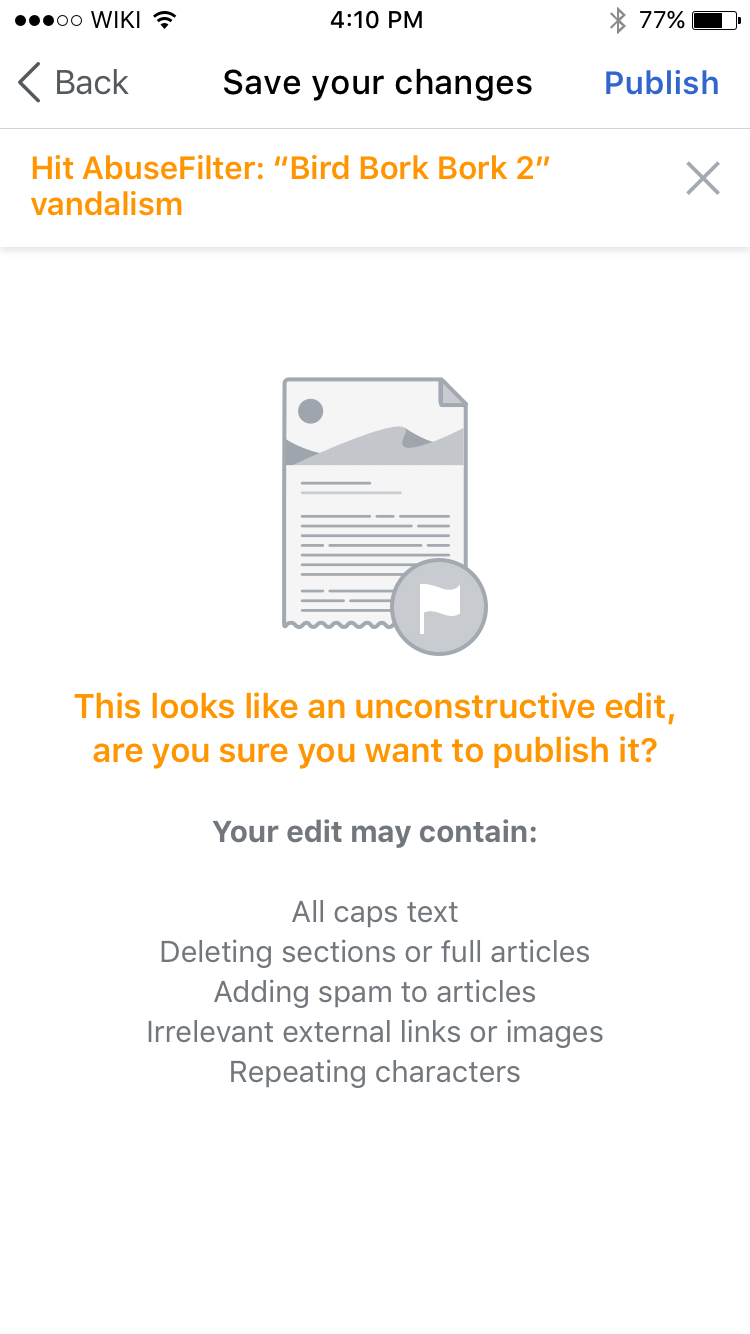
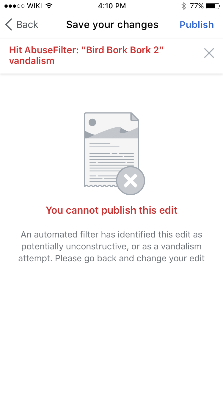
| Warning | Alert |
|---|---|
| Zeplin: https://zpl.io/aBy3n0A | Zeplin: https://zpl.io/aXwRpvp |
Testing criteria
- Under Settings > My languages > Add another language select Test wiki
- Tap Search Wikipedia and select Test Wiki and search for and select the Bird article (it really doesn't matter what article you search for, it DOES matter that it's on Test Wiki though!!!)
- tap an edit pencil
- add the word soup anywhere
- tap Next
- tap Publish
- you should see the abuse filter screen from the first mock above (with yellow text). on test wiki this is triggered when saving an edit containing the word soup
- tap back twice and change the word soup to poop (seriously)
- tap Next
- tap Publish
- you should see the abuse filter screen from the second mock above (with red text). on test wiki this is triggered when saving an edit containing the word poop
- note that each of these screens only shows the alert at the top (seen in the screenshots above) for a couple seconds


