Page MenuHomePhabricator

🎬 desktop-de-08 | Prepare Banner B19_WMDE_08_laika – ⏰ 04.11.
Closed, ResolvedPublic

Description

Preview: B19_WMDE_08_ctrl

For testing the new compact Laika layout we will use identical CTRL and VAR banners that should be based on B19_WMDE_04_laika with error messages implemented since B19_WMDE_05_ctrl
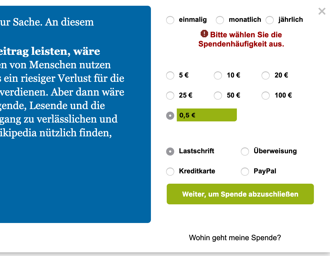
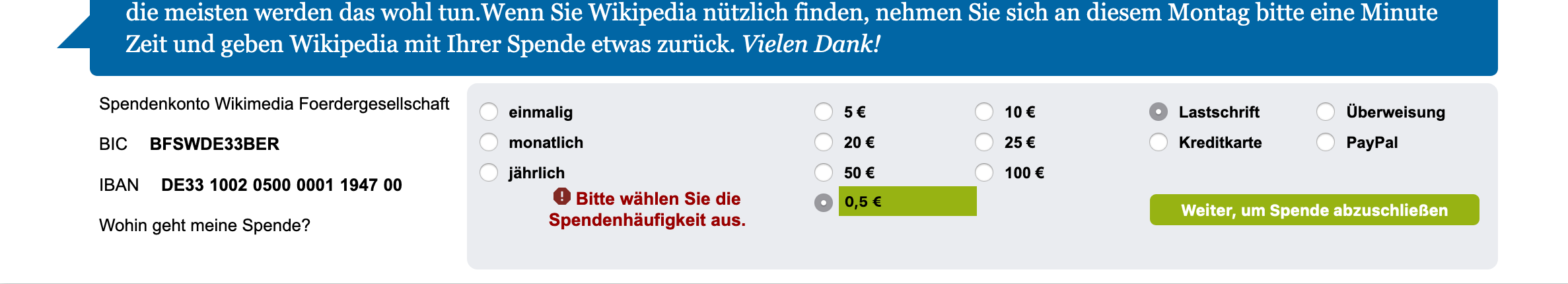
Screenshot 2019-10-28 at 22.08.44.png (892×1 px, 149 KB)

Screenshot 2019-10-28 at 22.08.56.png (430×2 px, 161 KB)

Acceptance criteria

  • The base banner should be B19_WMDE_04_laika
  • It is acceptable that the banner gets bigger if the error messages is being displayed
  • Error messages should be displayed like in B19_WMDE_05_ctrl, i.e. styling, icons and actual messaging
  • Error messages should be left aligned inside its respective section (unlike B19_WMDE_05_ctrl where they are centered)

Event Timeline

@tmletzko The devs asked me to make this a separate ticket. The banner is basically a new banner although it is based on existing code. Please check the acceptance criteria, this is a suggestion from my side. Garbriel needed us to be more specific, especially regarding the what to copy from B19_WMDE_05_ctrl. Do we just want the style or also the changed errors messages. Should the icons in front of the errors message also be shown? Please change.

@gabriel-wmde This is the separate ticket.

@Jan_Dittrich FYI, there is a separate banner. Maybe Gabriel needs support with the style as the height of B19_WMDE_04_laika does not have enough room for the bigger error messages from B19_WMDE_05_ctrl but I guess to fix that you could approach him directly.

B19_WMDE_08_laika is what I think this banner should be named, please update if that does not fit the naming convention.

three remarks

  • it is ok that the banner gets bigger if the error messages is being displayed
  • the error messages seem to be centered underneath the respective section. I rather have them left aligned.
  • I have no opinion about the banner name but for the campaign the banner should be name according to the current banner syntax.

I've added your remarks into the acceptance criteria. Anything else from your side? Otherwise this ticket is ready for development.

@gabriel-wmde Is there anything potentially missing that you'd need?

@tmletzko The screenshots in the ticket do not match the design of the banner you have linked (B19_WMDE_04_laika). Which one is the design you want?

@tmletzko Okay, nevermind, I get it now: You just showed error message screenshots from banner 05 but you want that in the design from 04 which is not on the screenshots.

chrp updated the task description. (Show Details)
JanJaquemot subscribed.

Banner and error messages are looking good now. left aligned and everything.
Errors just slightly change the banner size in vertical mode which is fine.
However I saw that the "Weiter, um Spende abzuschliesen" button doesn't actually link through to the LP (well it doesn't work at all).
Please fix.

chrp renamed this task from B19_WMDE_08_laika to 🎬 desktop-de-08 | Prepare Banner B19_WMDE_08_laika – ⏰ 10.11. .Nov 4 2019, 1:07 PM
chrp renamed this task from 🎬 desktop-de-08 | Prepare Banner B19_WMDE_08_laika – ⏰ 10.11. to 🎬 desktop-de-08 | Prepare Banner B19_WMDE_08_laika – ⏰ 5.11. .
chrp renamed this task from 🎬 desktop-de-08 | Prepare Banner B19_WMDE_08_laika – ⏰ 5.11. to 🎬 desktop-de-08 | Prepare Banner B19_WMDE_08_laika – ⏰ 04.11. .

@JanJaquemot You can preview the compact design at http://test-spenden-2.wikimedia.de/?skin=0&compact=1&zahlweise=BEZ&betrag=20
If you want to compare side-by-side in 2 windows, here is the URL for the "classic" version: You can preview the compact design at http://test-spenden-2.wikimedia.de/?skin=0&compact=0&zahlweise=BEZ&betrag=20

If the design is ok, I'll put in on the production server.