Page MenuHomePhabricator

Minerva: Logged-in page actions spread out
Open, MediumPublic

Description

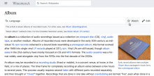
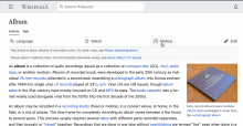
Default reader view (logged-out)Logged-in view
Screenshot 2020-03-20 at 19.58.14.png (1×2 px, 551 KB)
Screenshot 2020-03-20 at 19.57.30.png (1×2 px, 557 KB)

It seems that the flex-end style rule is not working as intended when logged-in. This causes the buttons to be spread out over the screen and appear quite far apart. This feels rather disorienting.

Another example from https://en.m.wikipedia.org/wiki/File:Example.svg:

Screenshot 2020-04-29 at 20.27.00.png (762×2 px, 99 KB)

Also an issue at smaller screen size

currentdesired
en.m.wikipedia.org_wiki_Kevin_Daley_(politician)(iPhone 6_7_8) (1).png (1×750 px, 149 KB)
en.m.wikipedia.org_wiki_Kevin_Daley_(politician)(iPhone 6_7_8).png (1×750 px, 149 KB)

Event Timeline

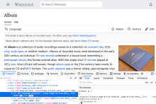
From a quick glance at the dev tools I see this could be due to flex-grow override. If disabled, it creates the expected result (preview below). This might not be the right patch though, I'm sure the rule is there there for a reason and might have other side-effects :)

Screenshot 2020-03-20 at 20.00.35.png (1×1 px, 574 KB)

Is this by design @Jdrewniak and @alexhollender ? I remember we had a lot of different combinations for this menu (AMC, AMC+download icon, normal, normal+download icon).

Is this by design @Jdrewniak and @alexhollender ? I remember we had a lot of different combinations for this menu (AMC, AMC+download icon, normal, normal+download icon).

That is not by design unfortunately. They should be aligned as follows:

image.png (1×10 px, 582 KB)

ovasileva triaged this task as Medium priority.Mar 24 2020, 7:40 PM
ovasileva moved this task from Incoming to Triaged but Future on the Web-Team-Backlog board.