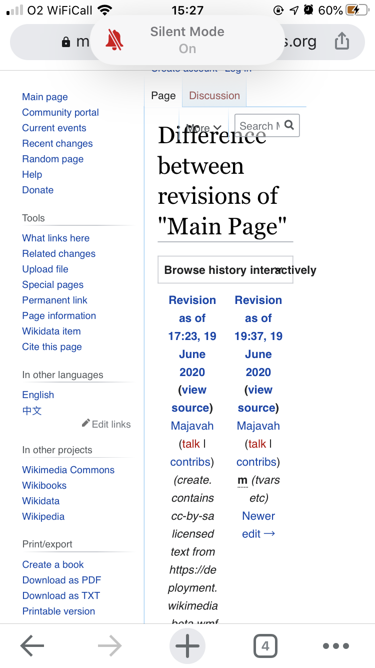
I have everything set in desktop views because I prefer them but the search function is unusable on https://test.wikimedia.beta.wmflabs.org/wiki/Main_Page
That's on a iPhone 8 running iOS 13.5.1 and Chrome for iOS 83.0.4103.88
| RhinosF1 | |
| Jun 22 2020, 9:58 AM |
| F31874946: 222F2CFC-EF1C-4638-AC31-57B3F3BC34F1.png | |
| Jun 22 2020, 2:27 PM |
| F31874385: 453A5559-9D80-422D-8265-7EE48376468E.png | |
| Jun 22 2020, 9:58 AM |
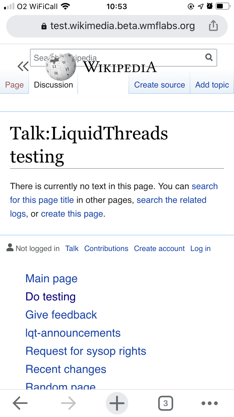
I have everything set in desktop views because I prefer them but the search function is unusable on https://test.wikimedia.beta.wmflabs.org/wiki/Main_Page
That's on a iPhone 8 running iOS 13.5.1 and Chrome for iOS 83.0.4103.88
Responsive behavior was not the focus at the early stage of Desktop Improvements (Vector 2022)
This will be fixed by T249363: Move the existing search to the header in preparation for Vue.js search development if it ever gets merged.
Please see the May 6 DEMO there (soon to be updated).
If you mean the VectorTabs wrapping in 2 lines and with the More menu having not enough space to "dance" back to one line and therefore overlapping the title, then:
No. It's how the tabs behave at unsupported narrow width. This presumably will be better when the sidebar is collapsed (in progress: T246420).
There were hints that the layout of the VectorTabs might be revamped as well at some later stage, but nothing specific yet.
How many pixels wide is that screenshot? <450px? The image at 778px seems to be stretched / zoomed?
How many pixels wide is that screenshot? <450px? The image at 778px seems to be stretched / zoomed?
The iPhone 8 has a 4.7-inch display with a 1334-by-750-pixel resolution at 326 ppi (https://www.apple.com/mt/iphone-8/specs/)