Open questions
- Does the user menu have a min width? See @bwang question on T276564#7086220
Background
The user links menu T266536: [EPIC] Consolidate user links into a single menu will require a separate treatment at smaller resolutions to ensure that all required links are displayed correctly.
Acceptance criteria
- For logged-out users, below tablet threshold, the menu will collapse the create account link into the user menu
- For logged-in users, below tablet threshold, the menu will collapse the user name/link to user page into the user menu
- The "you have new messages" bar should be hidden at lower resolutions (temporary solution until T284243)
- At lower resolutions the search input is hidden search and only the submit button is shown. It should behave like a form submit link (e.g. submit the form with no input value). We'll wire this up in a later task T284242
Design
Prototype: https://di-community-round-2.web.app/Gucci_Mane
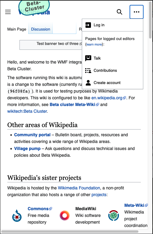
Logged-out
| default | menu open | notes | |
|---|---|---|---|
| full size |  | 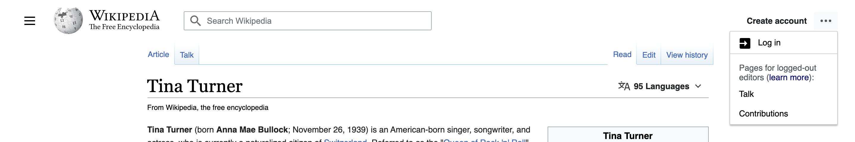 | - |
| medium |  |  | (1) Create account collapses into menu, (2) icon (globe) drops from logo |
| small | 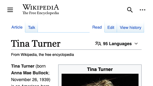 | 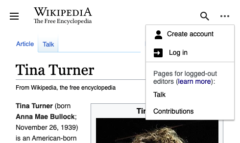 | Search collapses into a icon button |
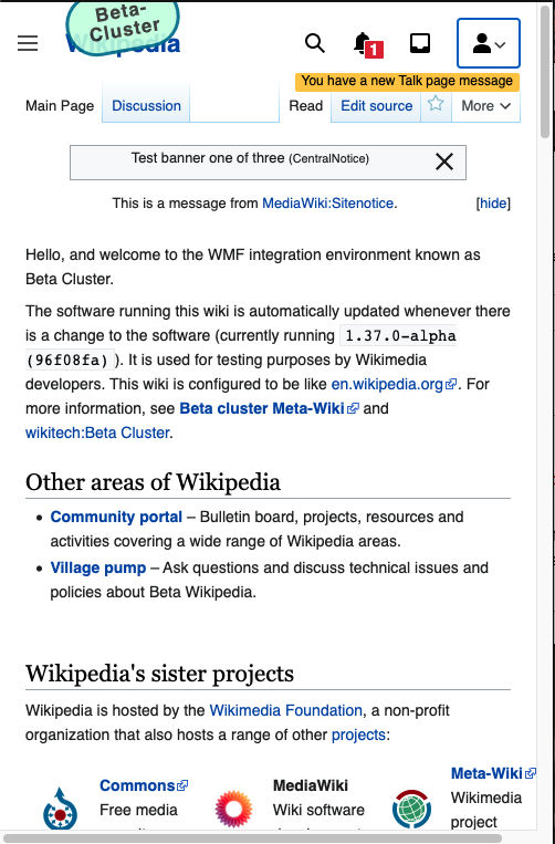
Logged-in
| default | menu open | notes | |
|---|---|---|---|
| full size | 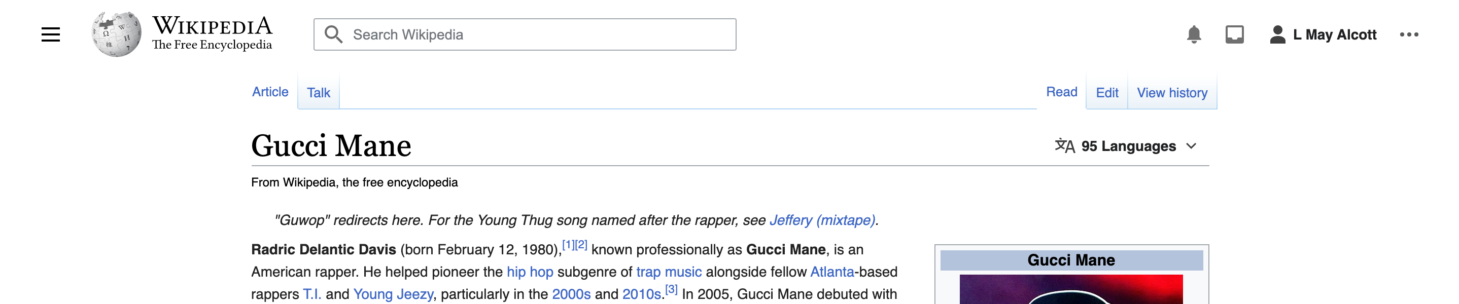 | 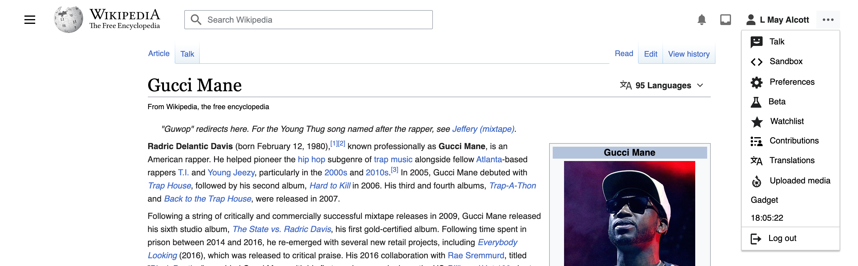 | - |
| medium | 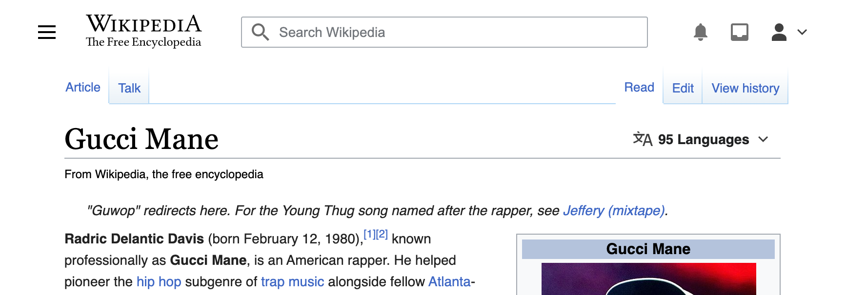 | 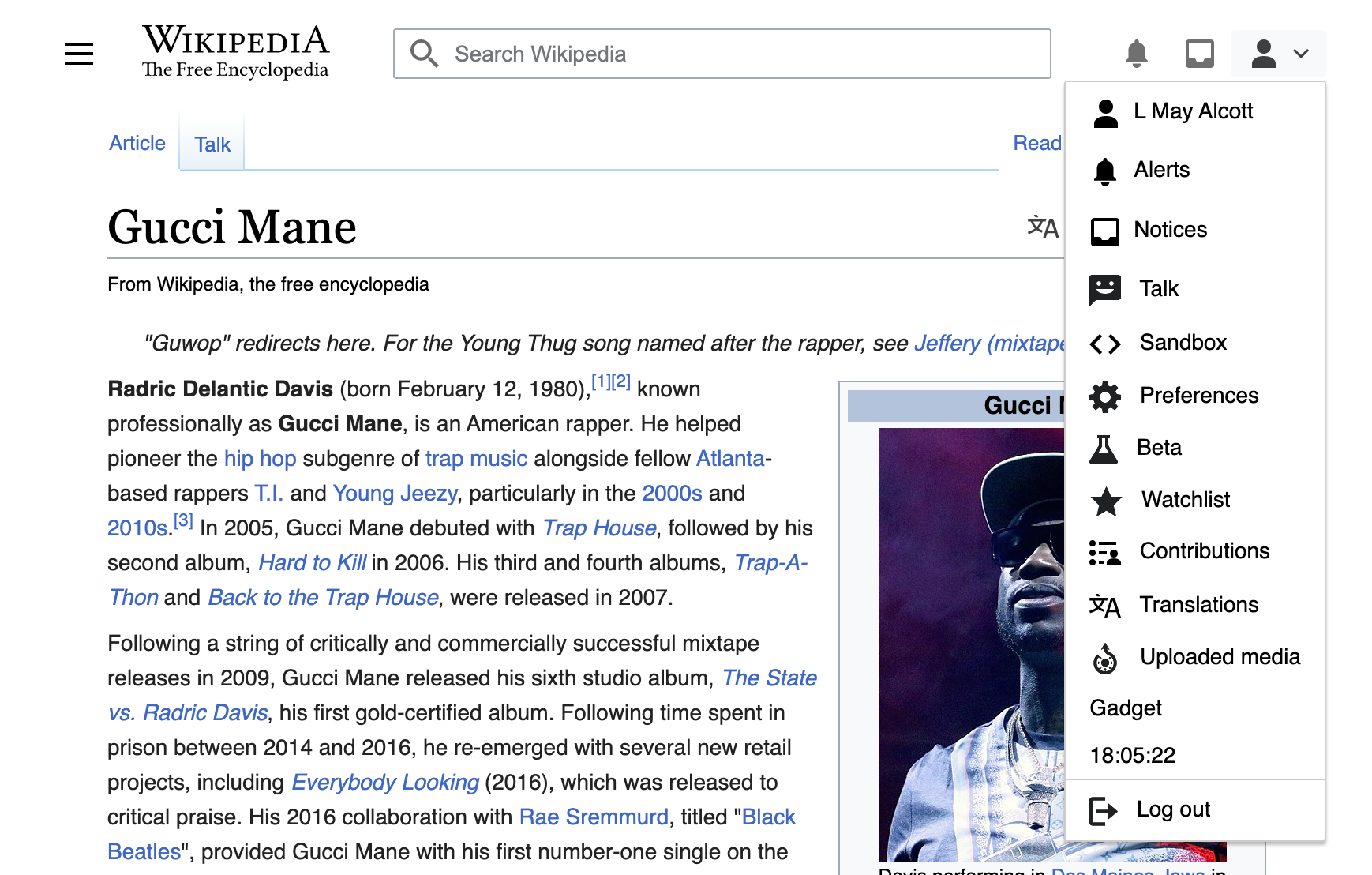 | (1) menu icon switches from ... to 👤, (2) [Username] collapses into menu, (3) icon (globe) drops from logo |
| small |  | 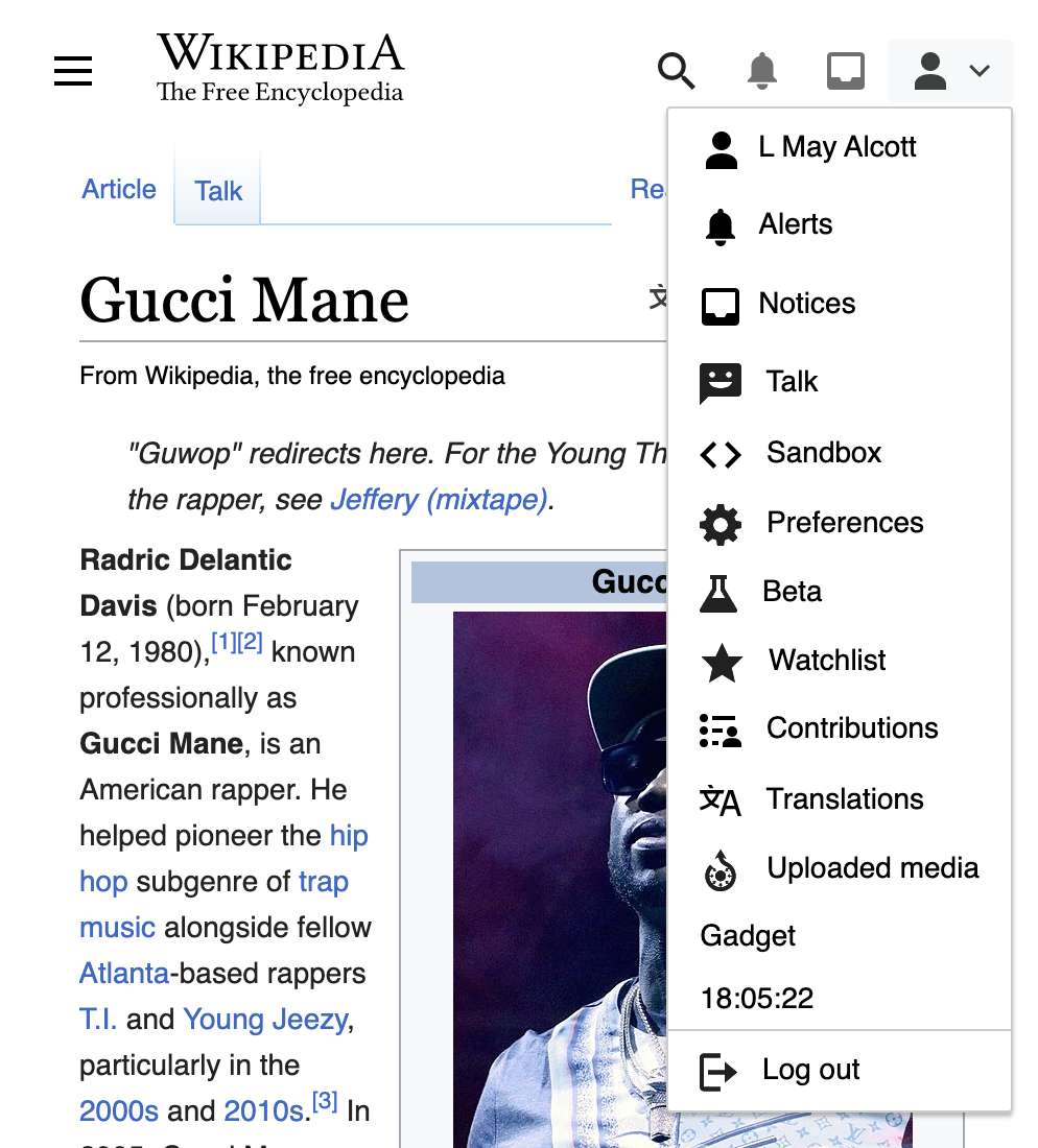 | Search collapses into a icon button |
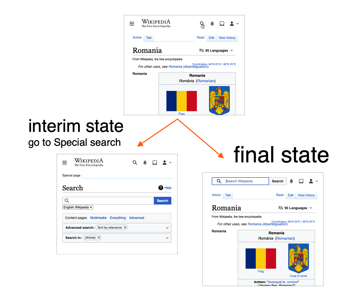
Interim stage for search button
QA
Use beta cluster. Resize browser to 500px and verify the header fits into one line.
QA (in prod)
- visit https://test.wikipedia.org/wiki/Main_Page on a mobile device and switch to desktop site.
- it's expected that the site fits into the mobile viewport
QA Results - Beta
| AC | Status | Details |
|---|---|---|
| 1 | ✅ | T276566#7240372 |
| 2 | ✅ | T276566#7240372 |
| 3 | ❓ | T276566#7240372 |
| 4 | ❓ | T276566#7240372 |