Description
After the proposed changes in T276566, the search icon at lower resolutions when clicked will take the user to the search page.
With some changes it should be possible to wire this up in such a way that it operates as it does at higher resolutions.
After talking to @alexhollender we will likely make this behave similar to mobile - e.g. open an overlay. This will likely require a slight change to our wire up and a new component.
Design
Basic demo: https://di-community-round-2.web.app
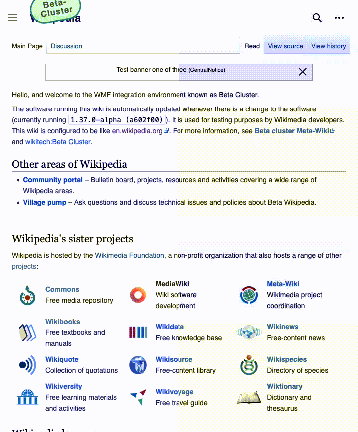
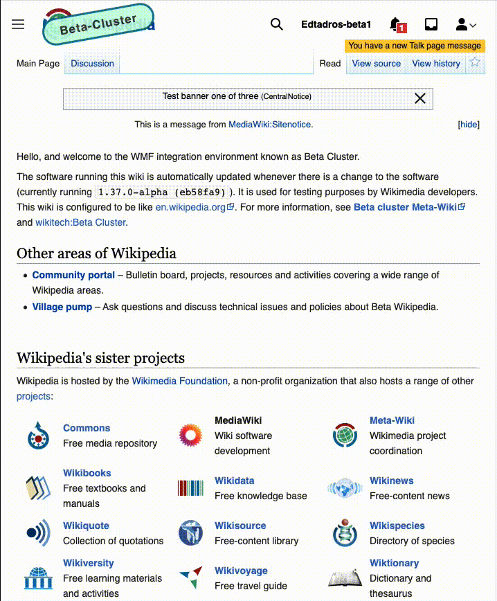
| logged out | logged in |
 | 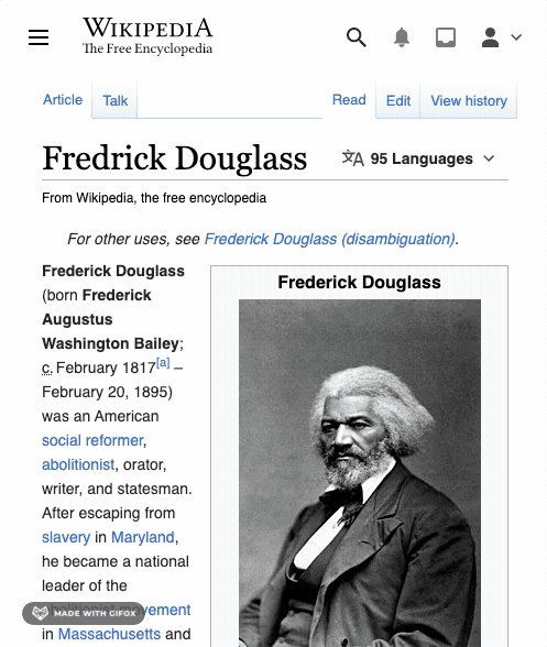 |
TODO
- @alexhollender to provide mocks
- Engineer to analyse and provide a suitable approach and fill in developer notes
Developer notes
See commit message of https://gerrit.wikimedia.org/r/699462 for the challenges on this one.
Acceptance criteria
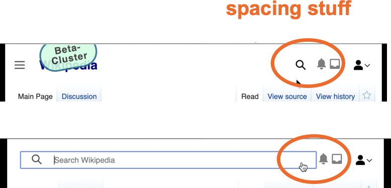
- Add a dedicated toggle button
- Wire up toggle button to load and show/hide the search interface
- When search is open the hamburger and logo is obscured underneath
- When search is open the user links are visible (tricky bit)
QA steps
Browser compatibility could potentially be an issue with this ticket so please test the following steps with Chrome, Firefox, Safari, and Edge:
- Go to https://en.wikipedia.beta.wmflabs.org/wiki/Main_Page
- Resize browser to <= 719px width
- Ensure that search magnifying glass icon appears in header
- Click search magnifying icon
- Ensure that hamburger menu icon and logo disappear. Ensure that search input appears and is focused.
- Type into input and ensure search suggestions appear
- Click the body of the page
- Ensure that hamburger menu icon, logo, and magnifying glass icon appears. Ensure that search input disappears.
QA Results - Beta
| AC | Status | Details |
|---|---|---|
| 1 | ✅ | T284242#7247665 |
| 2 | ✅ | T284242#7247665 |
| 3 | ✅ | T284242#7247665 |