Background
As a part of our sidebar work, we would like to restrict the content width of the content in order to create a better reading experience by improving readability. This change requires several additional pieces of work: creating a width-container for the entire page, positioning the various containers appropriately, styling the sidebar background, adding a sidebar animation, styling of the footer, and handling certain special pages (which won't be getting the fixed-width).
More details on motivation and rationale are available in this section of our project documentation.
Design details
Latest prototype: https://di-collapsible-sidebar-5.firebaseapp.com/Hathor
Proposed patch: 589774 | demo (login: "Guest" pass: "guestguest") | history
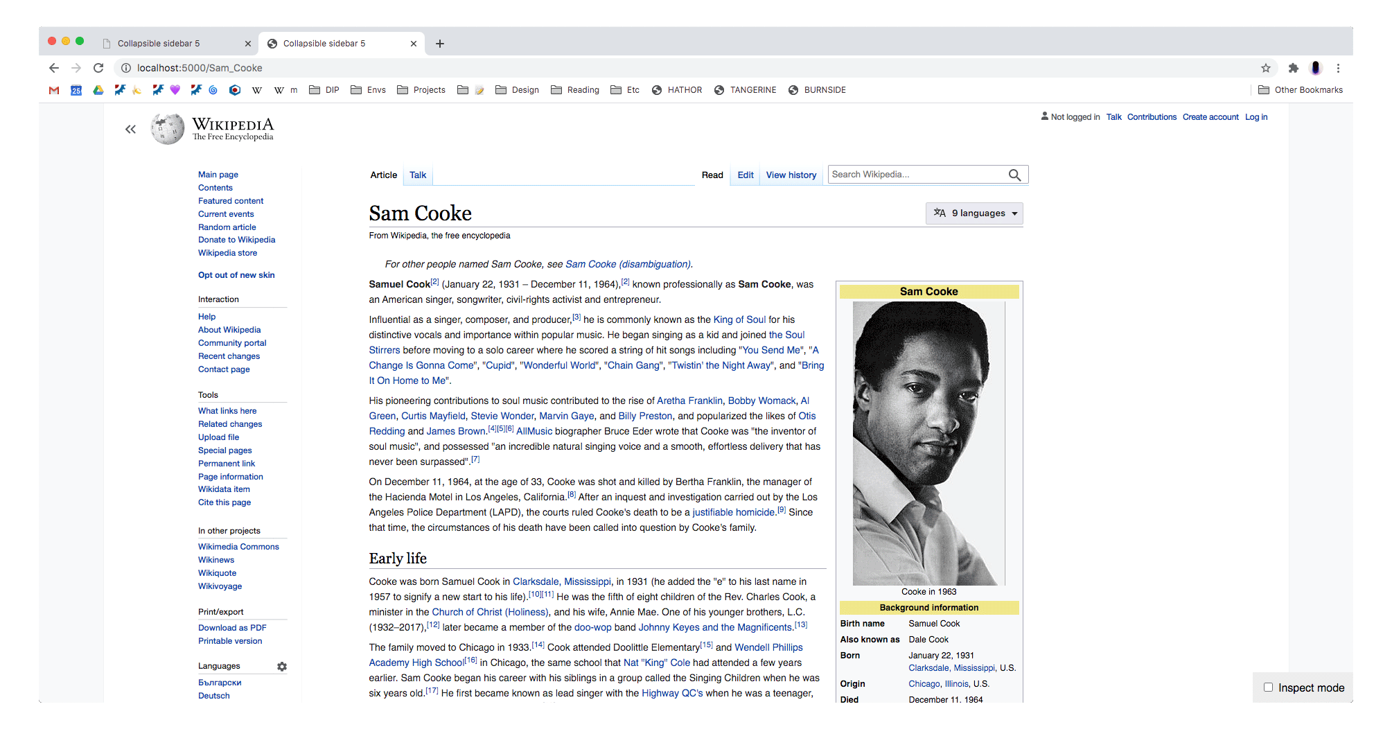
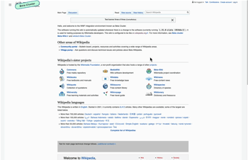
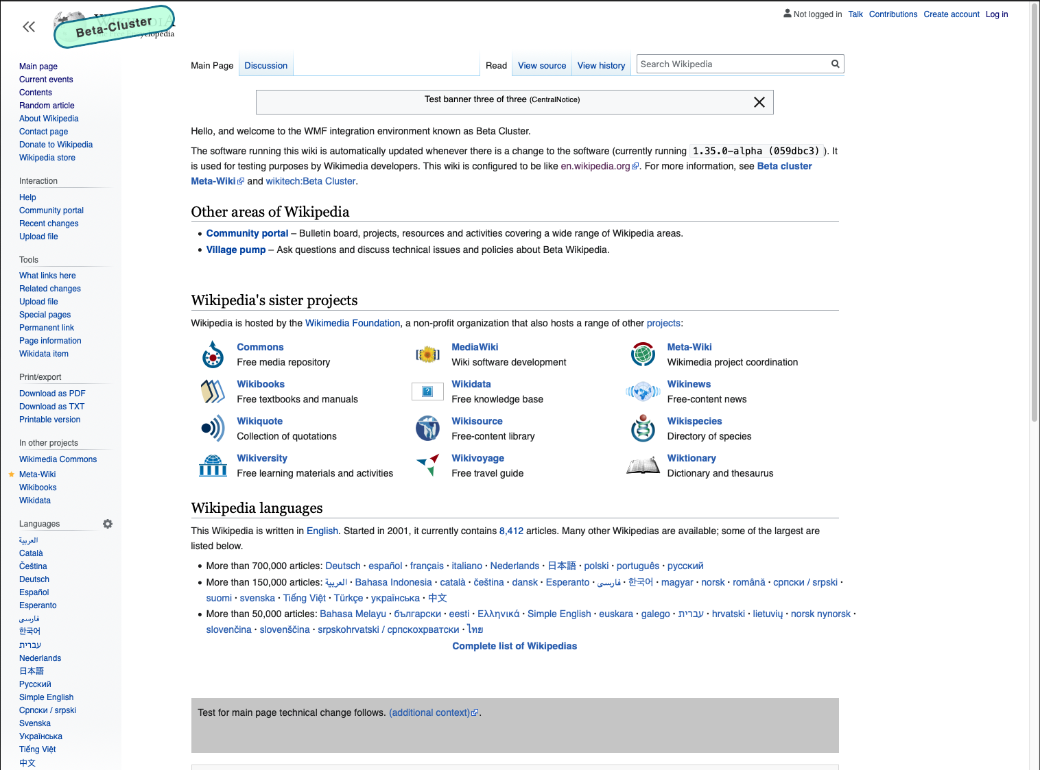
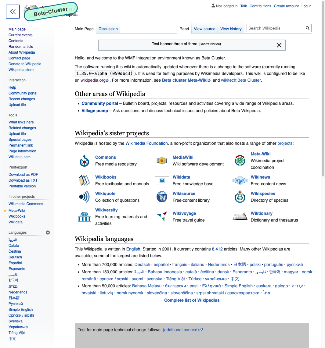
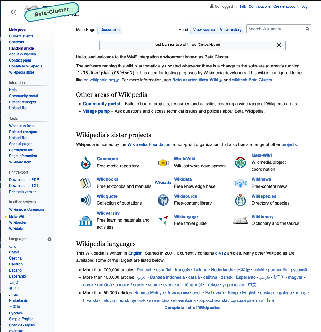
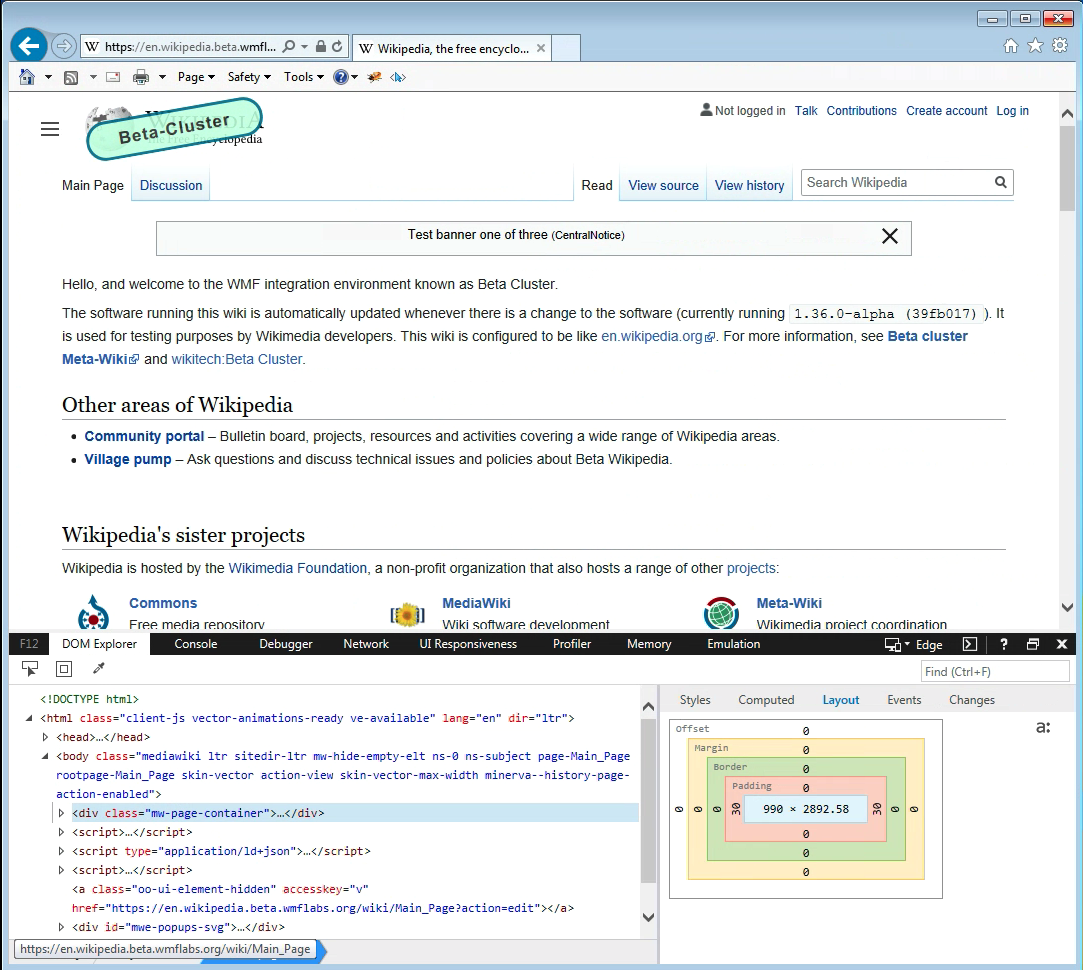
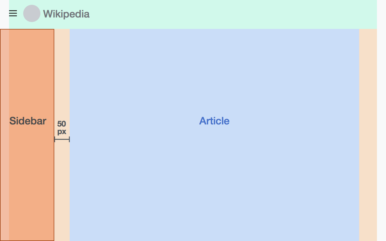
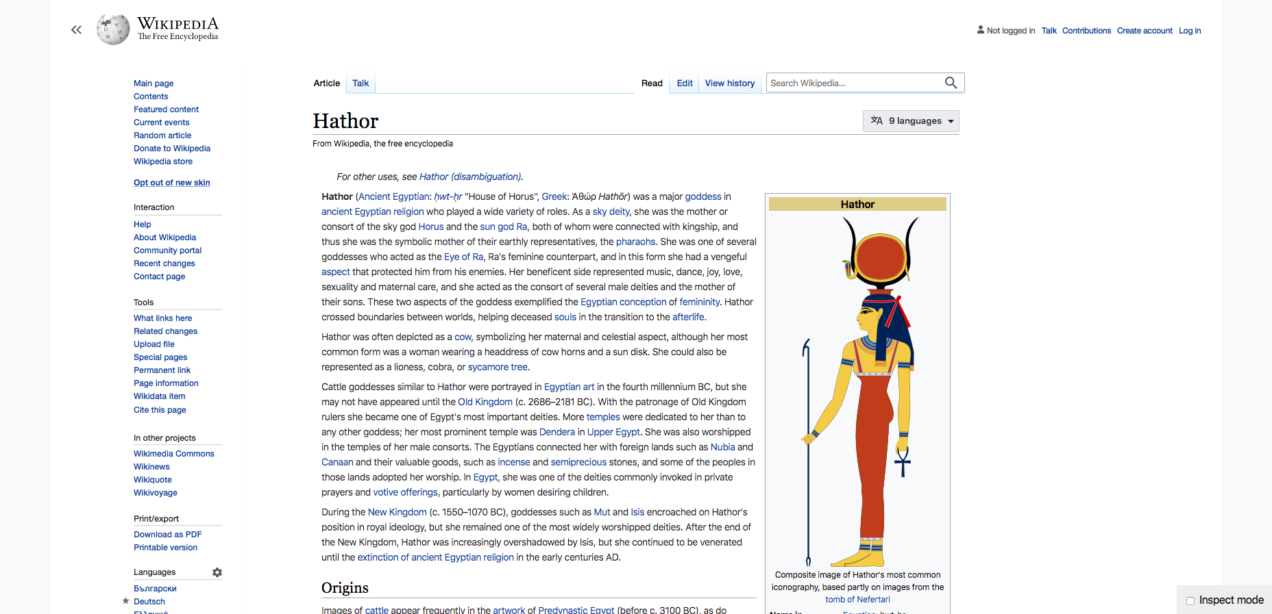
Wide screen (1780px)
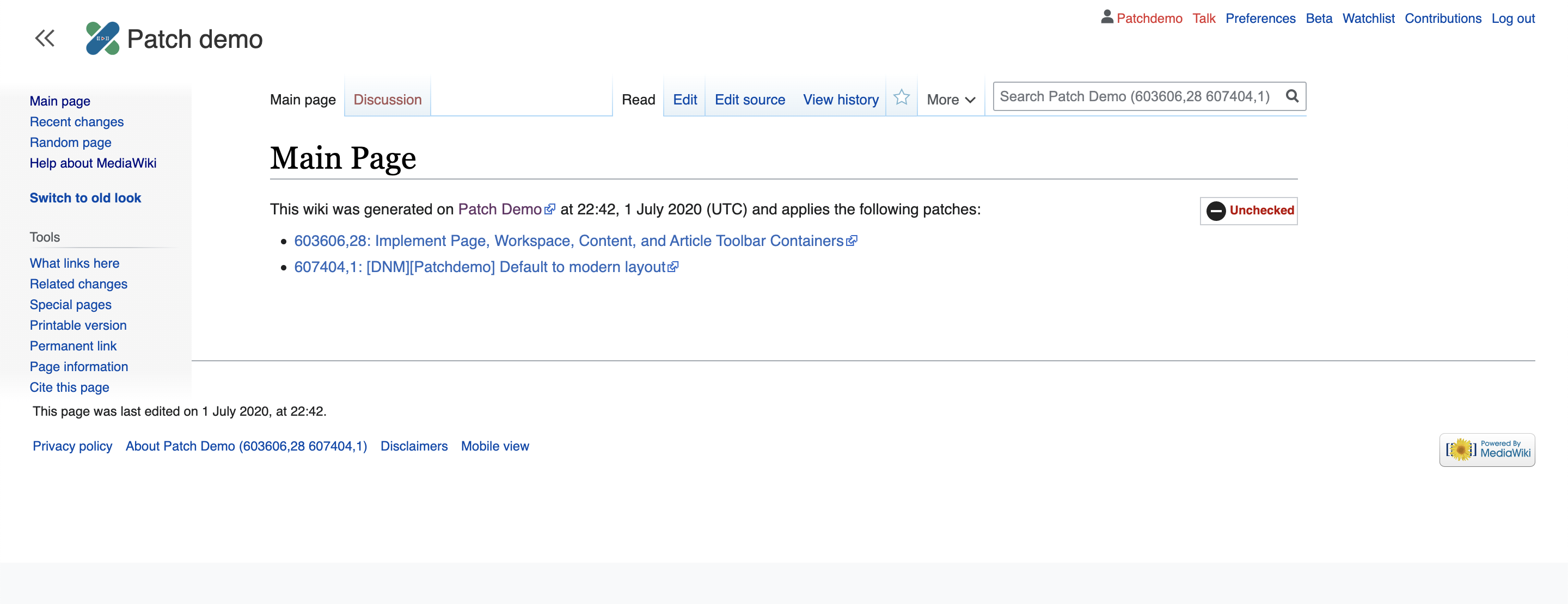
| sidebar closed | sidebar open | sidebar open on special page |
|---|---|---|
 |  |  |
Narrow screen (1280px)
| sidebar closed | sidebar open | sidebar open on special page |
|---|---|---|
 |  |  |
Sidebar animation
In order to avoid weird content reflow issues:
If there is enough room for the sidebar to open without the article content having to move, the sidebar will have an animation. This should be at or above 1420px (the magic number at which the sidebar can open without the content having to move).
If there is not enough room, the sidebar will not have an animation.
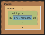
Sidebar background
The sidebar background changes based on the width of the page.
Below 1500px: background: linear-gradient(to bottom, #fff 0%, #f8f9fa 3%, #f8f9fa 97%, #fff 100%);
At or above 1500px: white background w/ left border that mimics the gradient above
(I wasn't able to figure out how to get the gradient border to work the way I wanted so for the prototype I ended up putting a gradient background on the parent element, and then making the parent element 1px wider than the sidebar container.)
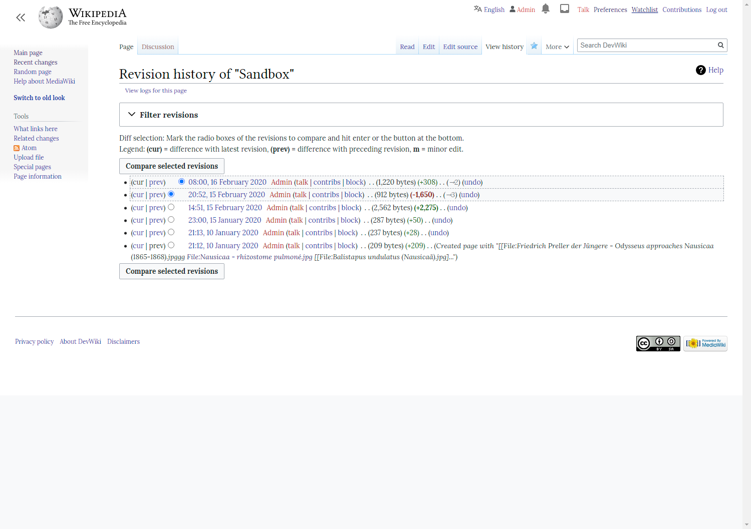
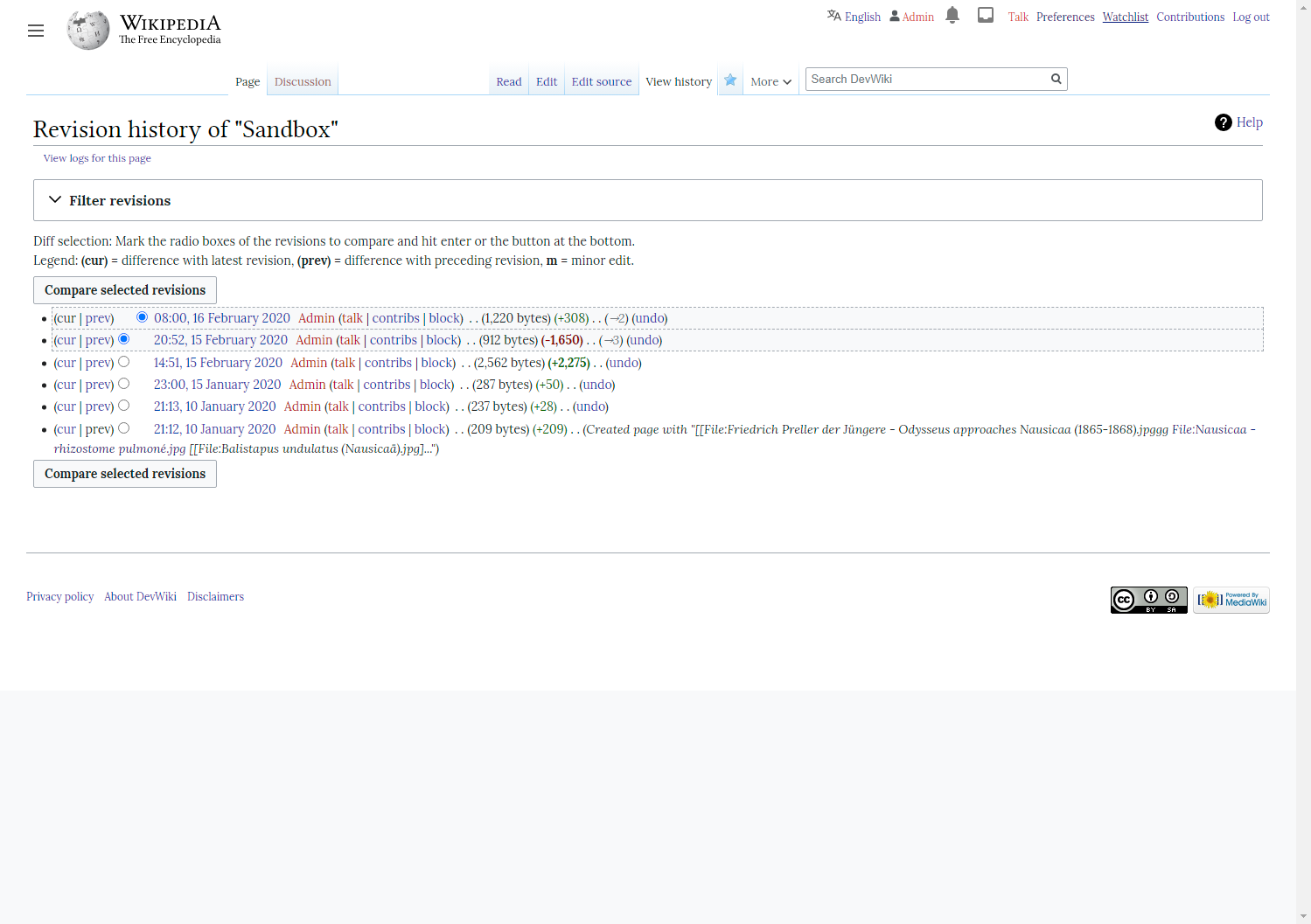
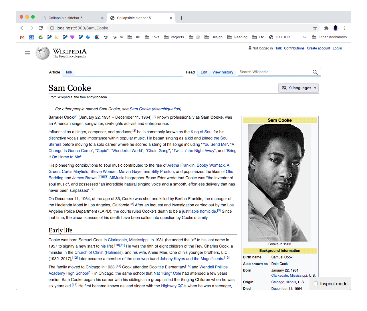
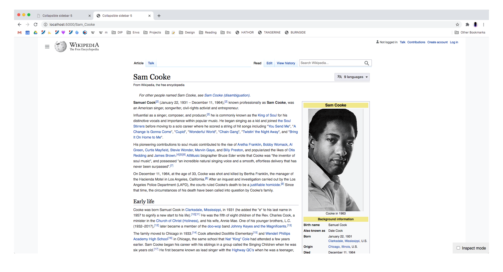
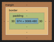
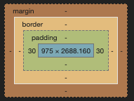
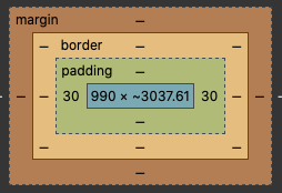
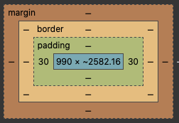
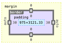
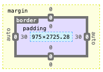
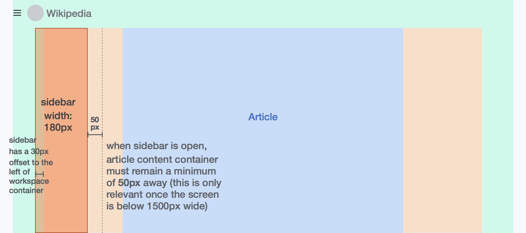
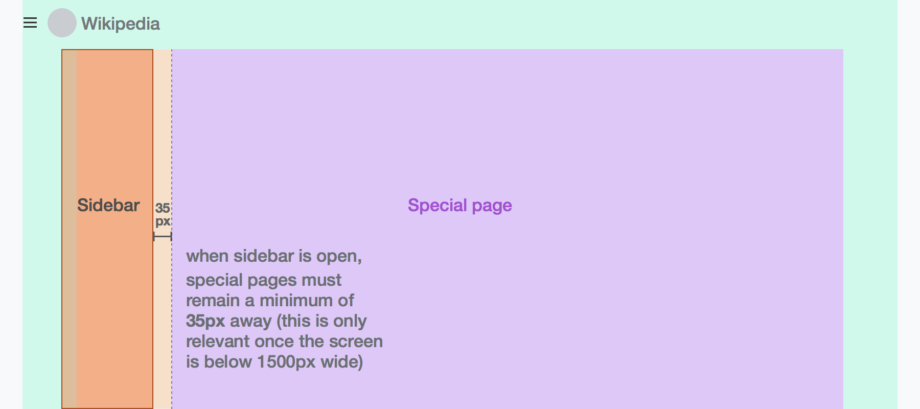
Container width & breakpoints
There are three containers. All three containers usually remain horizontally centered within the browser window. The case where they don't is when the browser is less than 1500px wide and the sidebar is open, in which case the content container gets offset to the right.
- Page container
- this is the outer-most container, ensuring that on extra wide screens the header contents don't drift too far from the content. The only thing that lives at this level is the site header.
- max-width: 1650px, padding: 0 30px
- Workspace container
- this is in place to ensure that the sidebar doesn't drift too far from the content on wide screens. It also acts as a container for Special page contents that are not limited to the content container
- max-width: 1440px, padding: 0
- Content container
- this is the inner-most container, which contains the article toolbar and article contents
- max-width: 960px, padding 0
We've discussed whether or not below a certain screen width the sidebar should slide over the content (like how the mobile menu does). At this point I think we can hold off on that functionality. The website will be usable, with the sidebar open, until the screen width gets below ~700px, at which point a horizontal scrollbar will appear.
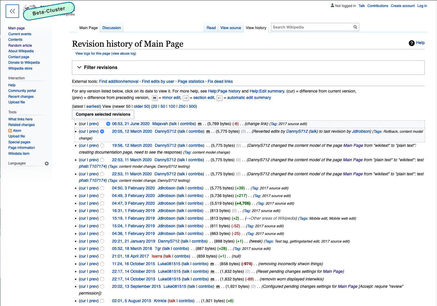
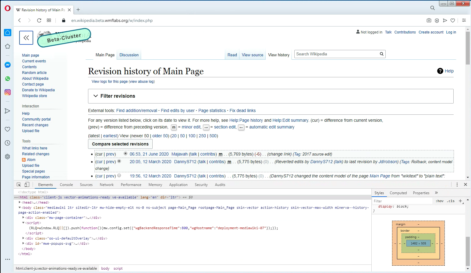
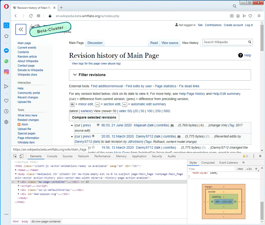
Page footer
Page footer should be within the workspace container (red dotted line in screenshot below)
Some pages will not get a max-width
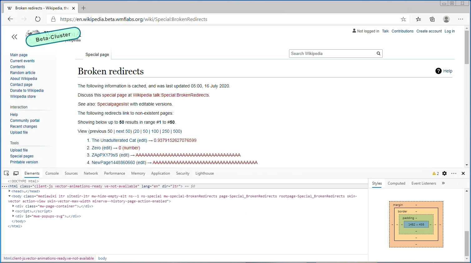
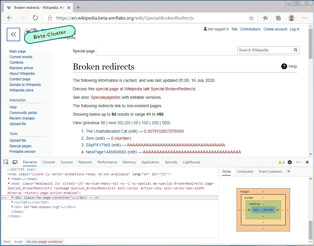
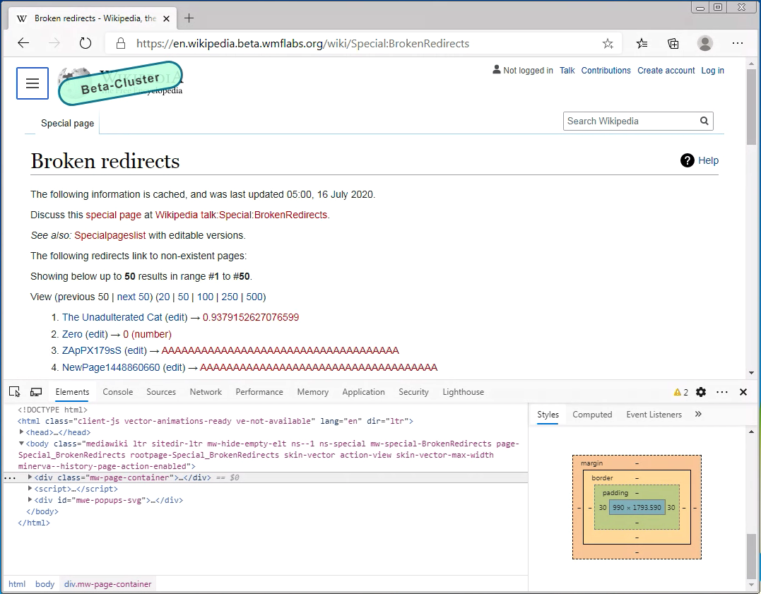
The contents container of certain pages will not have a max-width. Context: the purpose of the max-width is to make articles easier to read. Some of the non-article page types benefit from this constraint, e.g. Talk pages and User pages. While others, functioning more as dashboards/logs/tables, do not benefit from this constraint. In particular we've identified that pages using the "ChangeList" component are negatively affected by this constraint. Therefore to begin with the following pages will not have a max-width:
- All special pages
- History pages
The resulting variability in the contents container size is both an inconsistency, and a capability of sorts. In the future we should think more about whether we want to try and converge on one page size that works for all page types, or further formalize the different options.
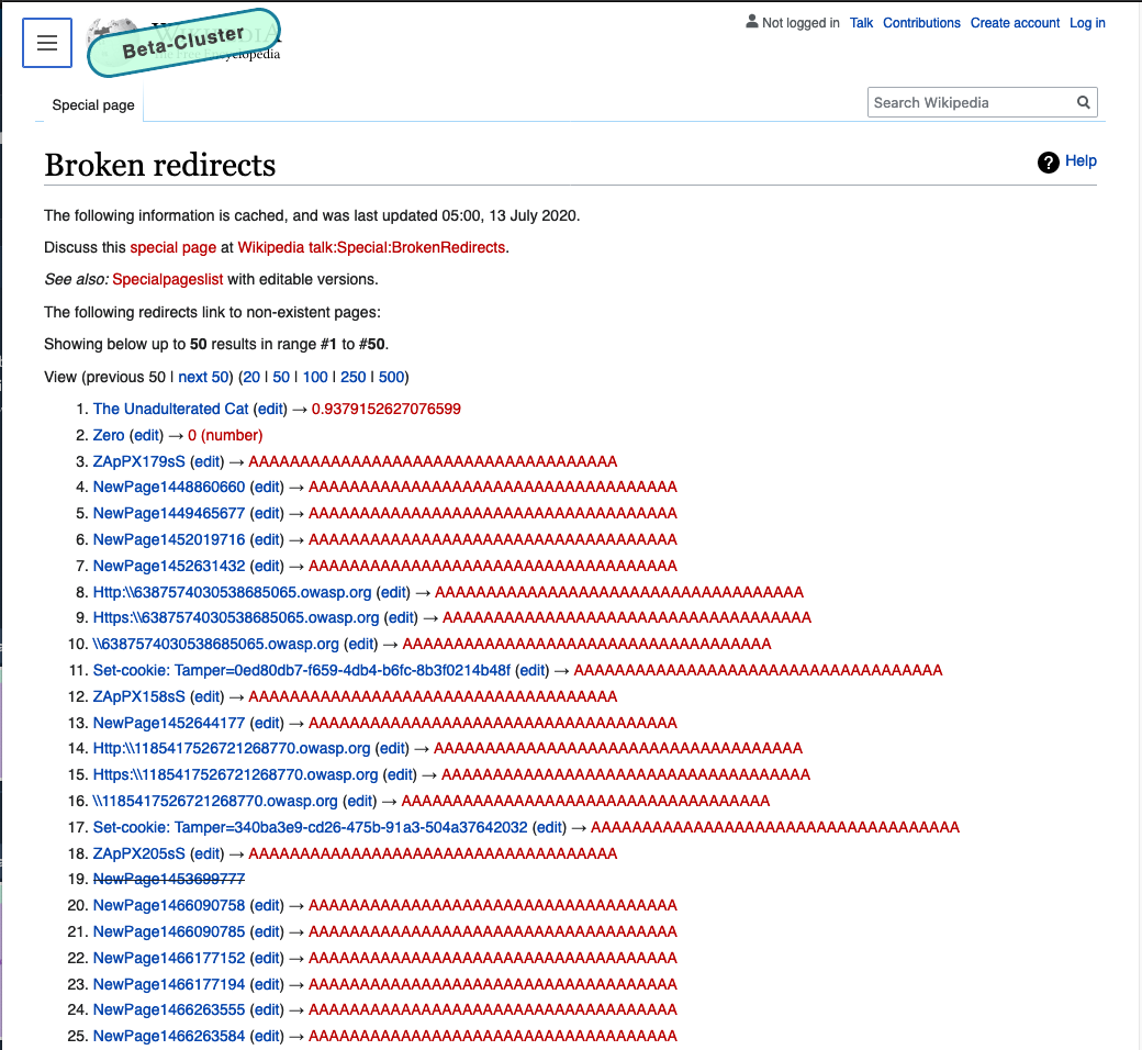
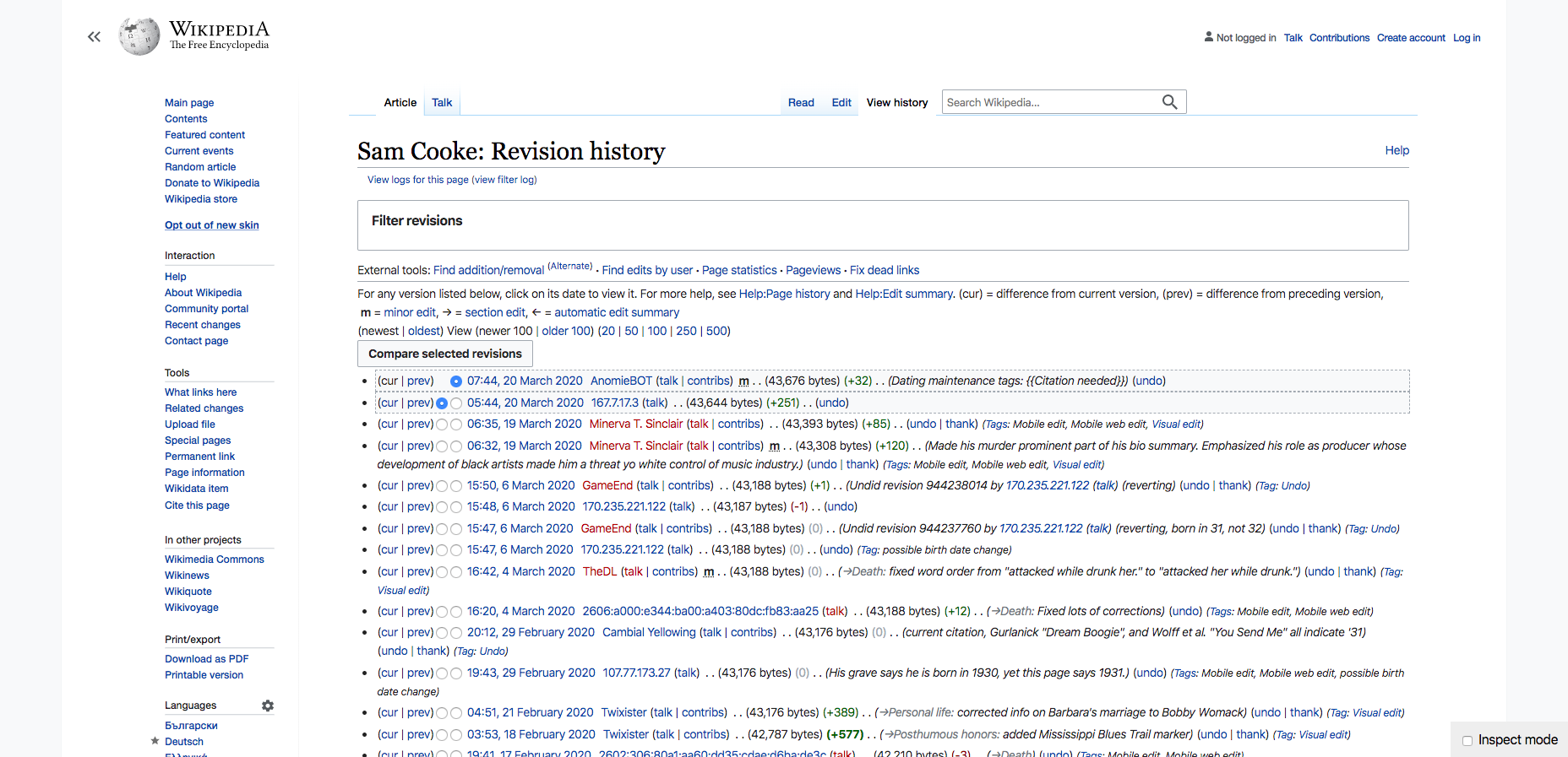
Here is an extreme example of how this will look:
Sidebar closed
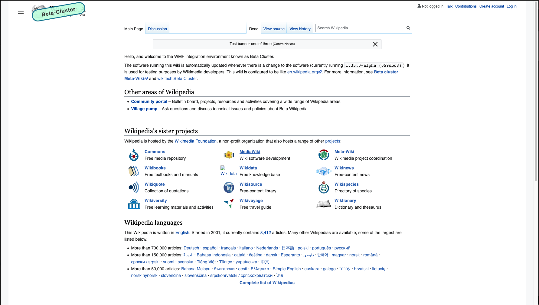
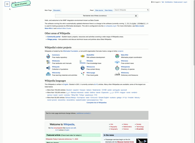
| normal page | special page | gif |
|---|---|---|
 |  |  |
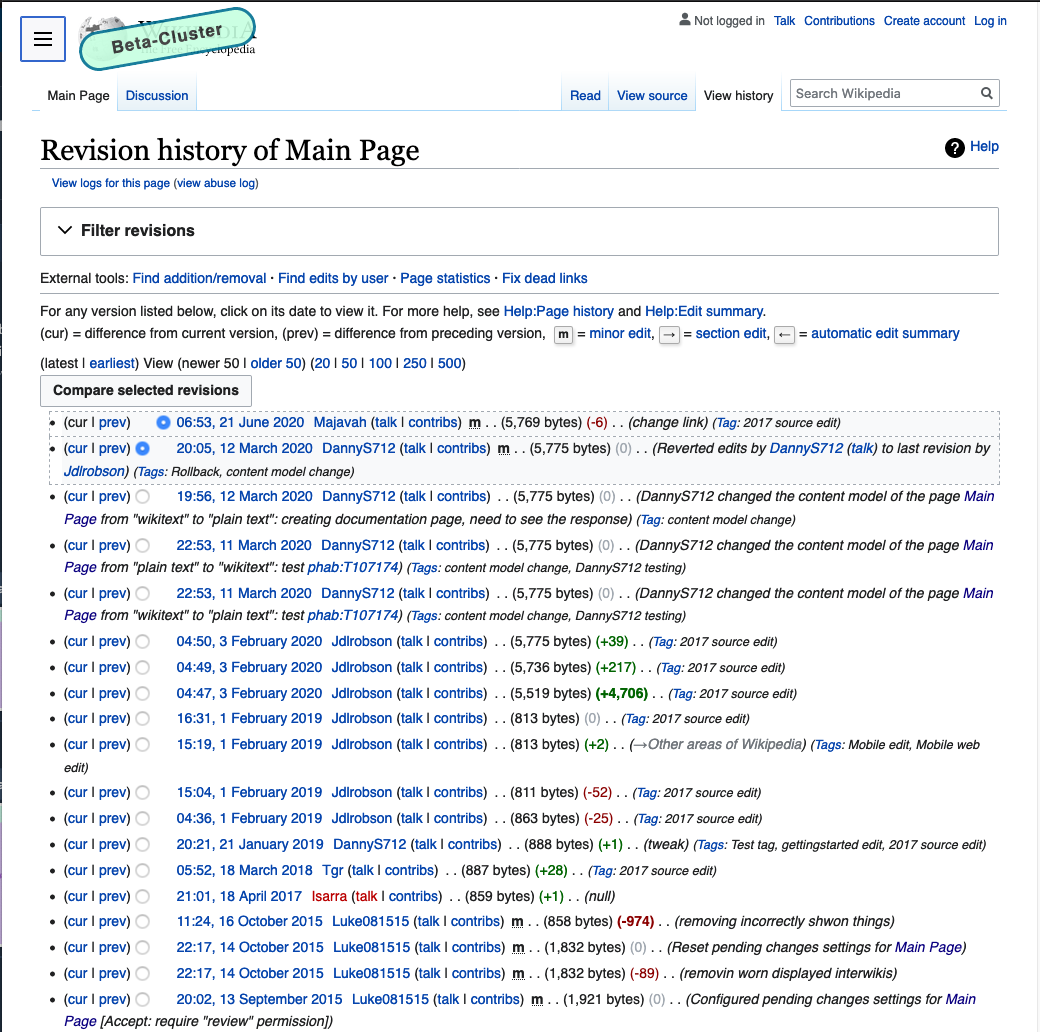
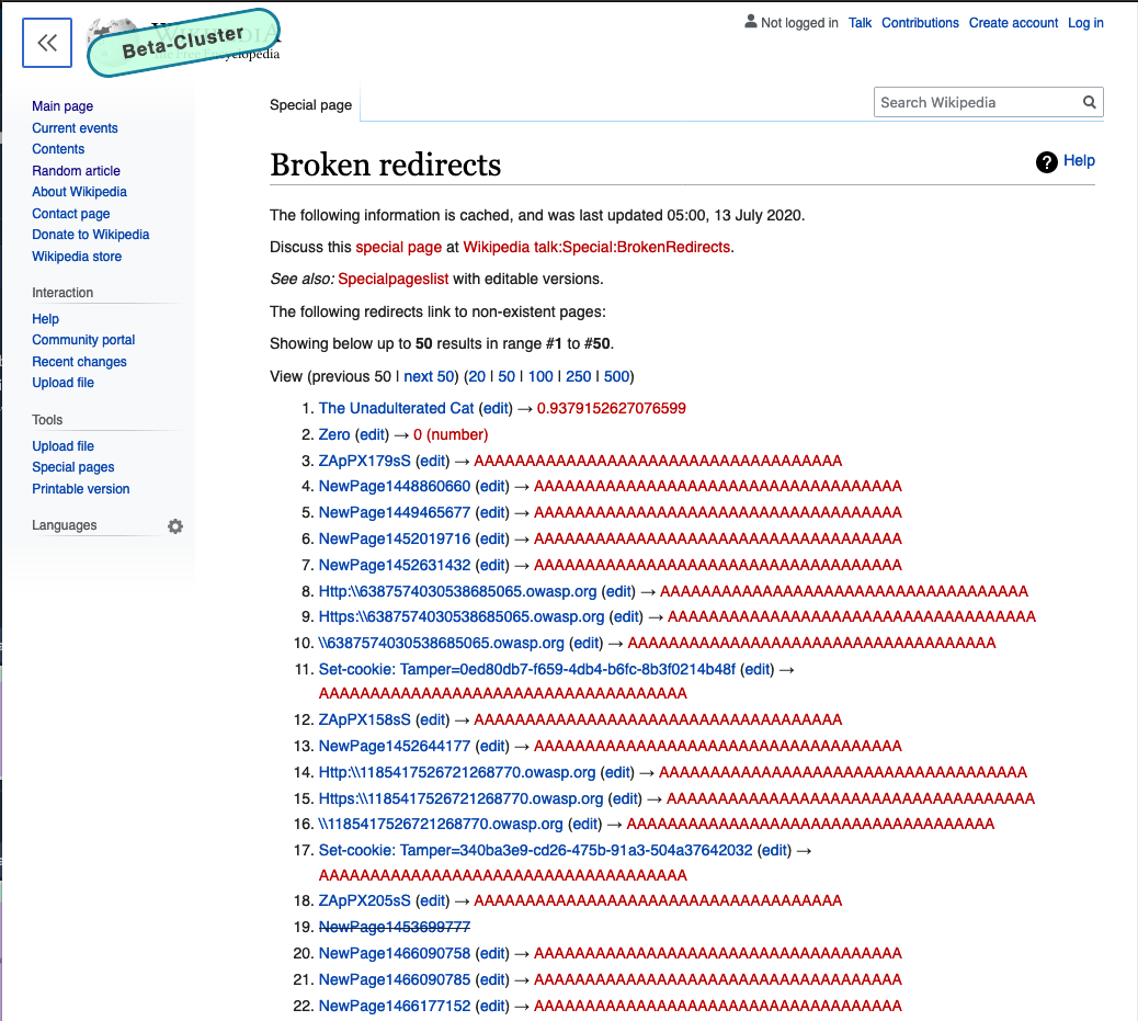
Sidebar open
| normal page | special page | gif |
|---|---|---|
 |  |  |
Acceptance criteria
- Limit width as per spec above
- Special pages will NOT have fixed width
- This should be feature flagged if possible
- We will not be responsible for any issues with templates or content as a part of this task - we will collect a list of issues (if any) and work with communities to get them fixed on wiki
Open questions
- How do we approach this? How do we set widths and breaking points
- Do we want to have separate behavior for tablets/small screens?
QA Steps
Browser list: Chrome 83, 81, Firefox 77, 76, Safari 13, IE 11, Opera 68, Edge 83
For article pages:
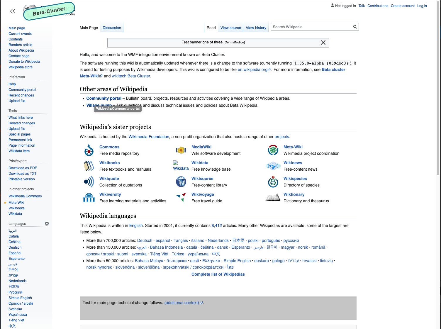
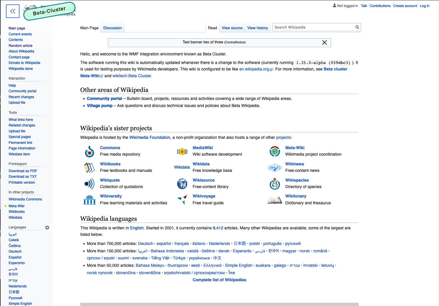
- Visit https://en.wikipedia.beta.wmflabs.org/wiki/Main_Page when anon.
- Make sure your screen is > 1750px and ensure there is grey surrounding the white part of the page. Click the sidebar button to make it appear.
- Click the sidebar button and ensure the sidebar disappears and the content does not move. Click the sidebar button again to make it reappear. Again, ensure the content does not move.
- Resize your browser's window width to 1499px and ensure the sidebar turns grey
- Resize your browser's window to 1050px and click the sidebar button to make it disappear. Ensure the content's width expands to fill most of the screen (there should still be 30px of padding on each side of the content though). Click the sidebar button again to make it reappear.
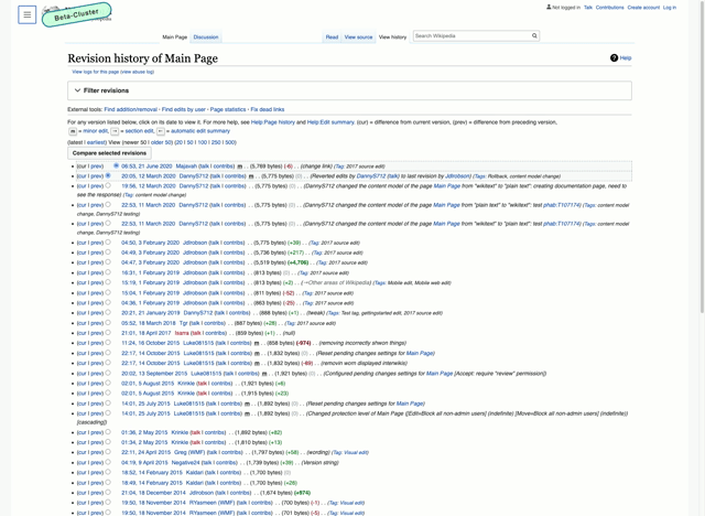
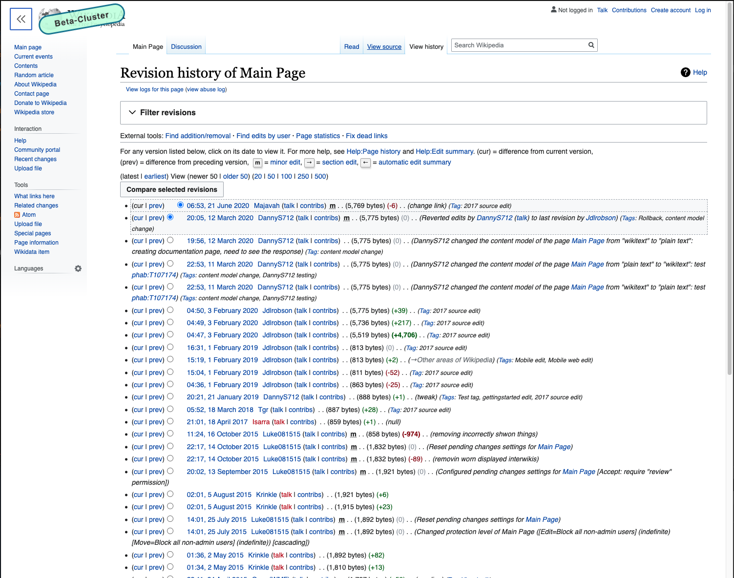
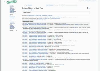
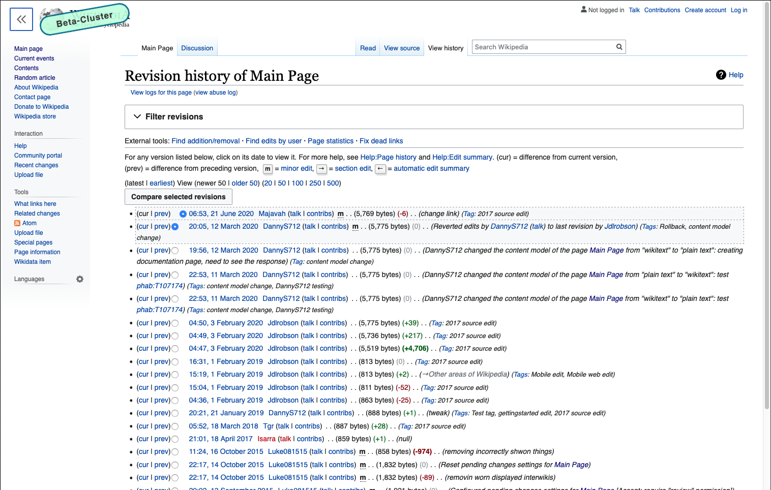
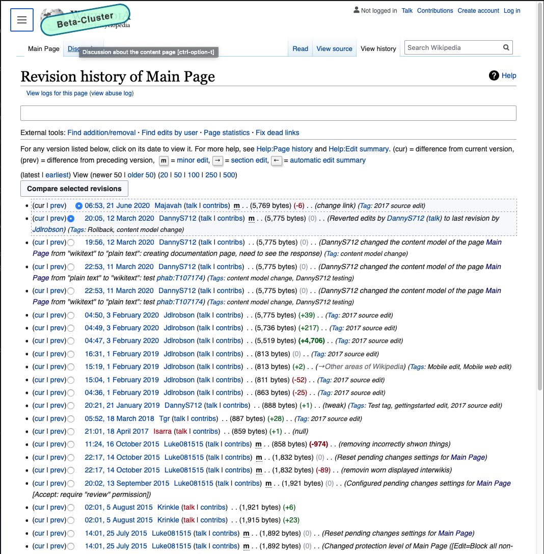
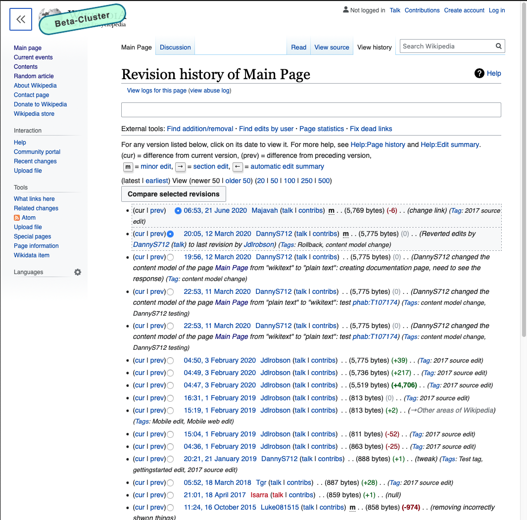
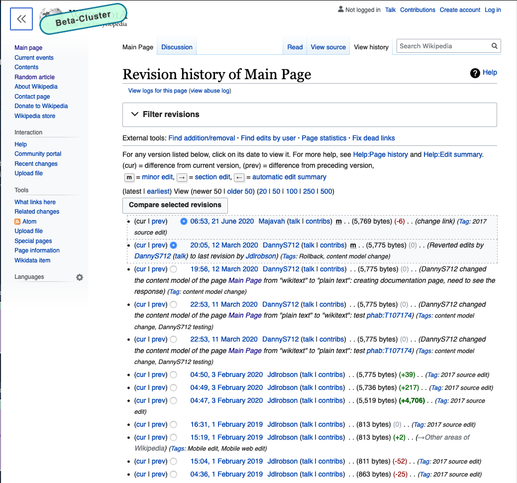
For history pages:
- Visit https://en.wikipedia.beta.wmflabs.org/w/index.php?title=Main_Page&action=history when anon.
- Make sure your screen is > 1750px and ensure there is grey surrounding the white part of the page. Also ensure that the content of the page is wider than it was for the article page. Click the sidebar button to make it appear.
- Click the sidebar button and ensure the sidebar disappears. The content should expand to fill more of the page, but the tabs shouldn't move at all. Click the sidebar button again to make it reappear. Ensure the content shrinks to make room for the sidebar.
- Resize your browser's window width to 1499px and ensure the sidebar turns grey
- Resize your browser's window to 1050px and click the sidebar button to make it disappear. Ensure the content's width expands to fill most of the screen (there should still be 30px of padding on each side of the content though). Click the sidebar button again to make it reappear.
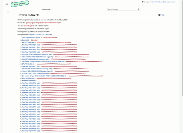
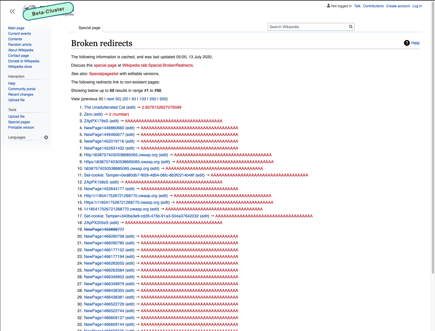
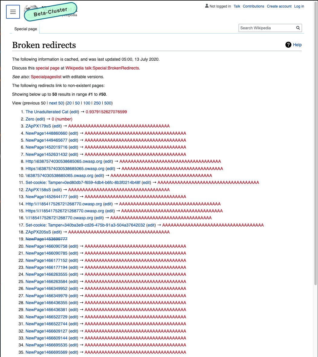
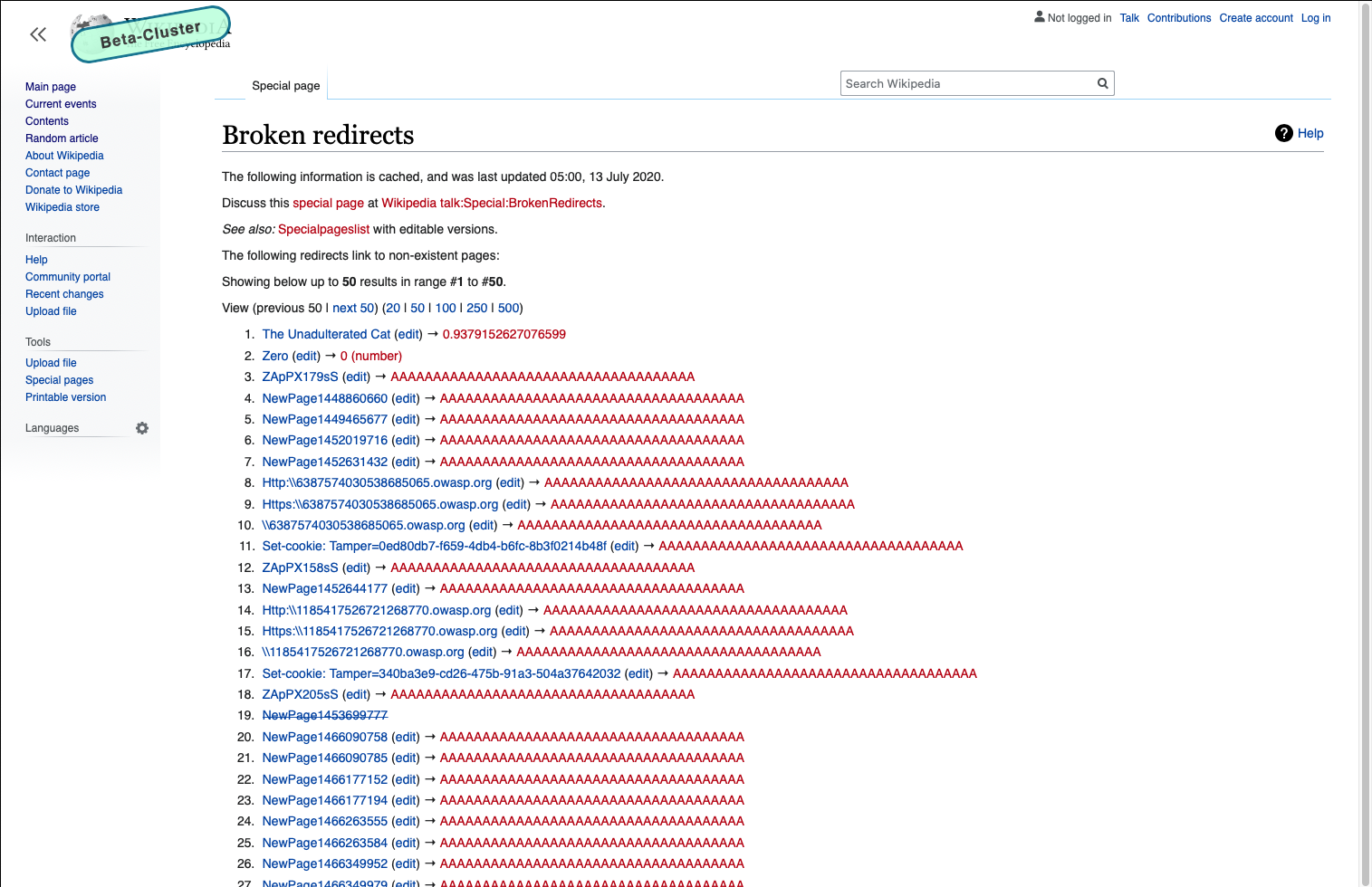
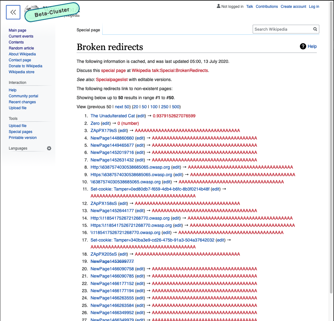
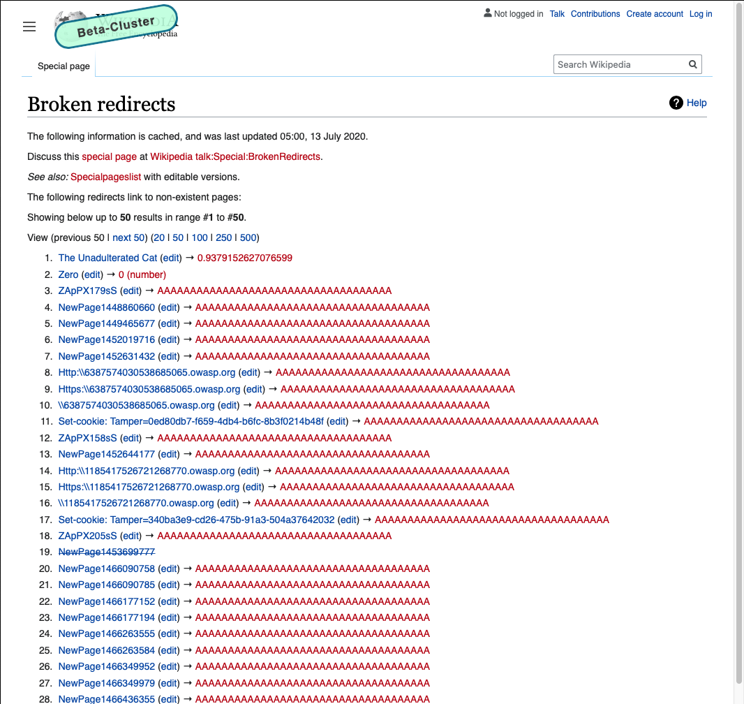
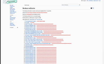
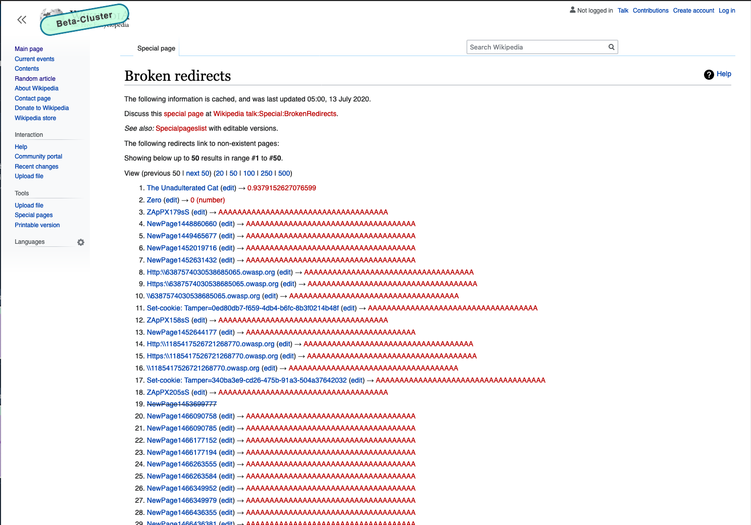
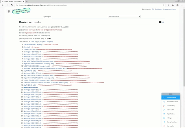
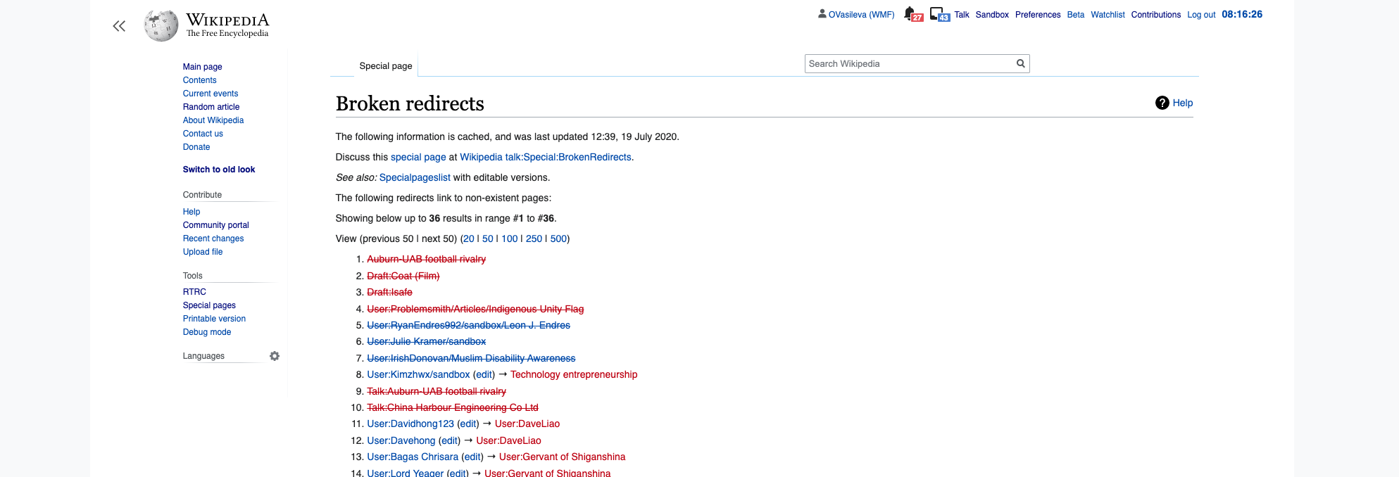
For special pages: (should behave very similarly to history page)
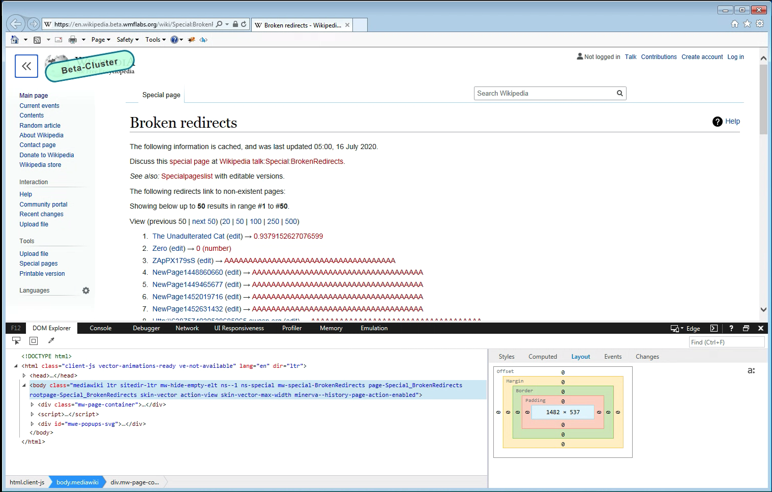
- Visit https://en.wikipedia.beta.wmflabs.org/wiki/Special:BrokenRedirects when anon.
- Make sure your screen is > 1750px and ensure there is grey surrounding the white part of the page. Also ensure that the content of the page is wider than it was for the article page. Click the sidebar button to make it appear.
- Click the sidebar button and ensure the sidebar disappears. The content should expand to fill more of the page, but the tabs shouldn't move at all. Click the sidebar button again to make it reappear. Ensure the content shrinks to make room for the sidebar.
- Resize your browser's window width to 1499px and ensure the sidebar turns grey
- Resize your browser's window to 1050px and click the sidebar button to make it disappear. Ensure the content's width expands to fill most of the screen (there should still be 30px of padding on each side of the content though). Click the sidebar button again to make it reappear.
QA Results - Beta (Chrome 83.0.4103.116 (Official Build) (64-bit))
| AC | Status | Details |
|---|---|---|
| 1 | ✅ | T246420#6307087 |
| 2 | ✅ | T246420#6307087 |
| 3 | ✅ | T246420#6307087 |
| 4 | ✅ | T246420#6307087 |
| 5 | ✅ | T246420#6307087 |
| 6 | ✅ | T246420#6307087 |
| 7 | ✅ | T246420#6307087 |
| 8 | ✅ | T246420#6307087 |
| 9 | ✅ | T246420#6307087 |
| 10 | ✅ | T246420#6307087 |
| 11 | ✅ | T246420#6307087 |
| 12 | ✅ | T246420#6307087 |
QA Results - Beta (Safari Version 13.1.1 (15609.2.9.1.2))
| AC | Status | Details |
|---|---|---|
| 1 | ✅ | T246420#6307110 |
| 2 | ✅ | T246420#6307110 |
| 3 | ✅ | T246420#6307110 |
| 4 | ✅ | T246420#6307110 |
| 5 | ✅ | T246420#6307110 |
| 6 | ✅ | T246420#6307110 |
| 7 | ✅ | T246420#6307110 |
| 8 | ✅ | T246420#6307110 |
| 9 | ✅ | T246420#6307110 |
| 10 | ✅ | T246420#6307110 |
| 11 | ✅ | T246420#6307110 |
| 12 | ✅ | T246420#6307110 |
QA Results - Beta (Firefox Version 78.0.2 (64-bit))
| AC | Status | Details |
|---|---|---|
| 1 | ✅ | T246420#6307198 |
| 2 | ✅ | T246420#6307198 |
| 3 | ✅ | T246420#6307198 |
| 4 | ✅ | T246420#6307198 |
| 5 | ✅ | T246420#6307198 |
| 6 | ✅ | T246420#6307198 |
| 7 | ✅ | T246420#6307198 |
| 8 | ✅ | T246420#6307198 |
| 9 | ✅ | T246420#6307198 |
| 10 | ✅ | T246420#6307198 |
| 11 | ✅ | T246420#6307198 |
| 12 | ✅ | T246420#6307198 |
QA Results - Beta (IE11)
| AC | Status | Details |
|---|---|---|
| 1 | ✅ | T246420#6311097 |
| 2 | ✅ | T246420#6311097 |
| 3 | ✅ | T246420#6311097 |
| 4 | ✅ | T246420#6311097 |
QA Results - Beta (Opera 68)
| AC | Status | Details |
|---|---|---|
| 5 | ✅ | T246420#6311097 |
| 6 | ✅ | T246420#6311097 |
| 7 | ✅ | T246420#6311097 |
| 8 | ✅ | T246420#6311097 |
QA Results - Beta (Edge 83)
| AC | Status | Details |
|---|---|---|
| 9 | ✅ | T246420#6311097 |
| 10 | ✅ | T246420#6311097 |
| 11 | ✅ | T246420#6311097 |
| 12 | ✅ | T246420#6311097 |