Page MenuHomePhabricator

[Epic] Determine the optimum Vector DOM structure for a11y and performance
Closed, ResolvedPublicSpike

Description

Problem statement

In order to accommodate all users (GUI+pointer users, keyboard users, assistive technology users, non-JS users and related search robots) the Vector theme should provide a performant, interaction-mode independent and accessible DOM structure.

Current DOM structure (Vector)

  1. MW Head Base & Page Base (not sure what possible contents are there in our projects) div#mw-page-base & div#mw-head-base
  2. div#content.mw-body[role=main] Content
    1. a#top – any other way around this?
    2. div#siteNotice > div#centralNotice, SiteNotice & CentralNotice
    3. div.mw-indicators, MW indicators – problematic that high up in DOM, should be underneath title aka firstHeading
  3. h1#firstHeading, first heading
  4. div#bodyContent.mw-body-content, Body content
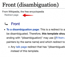
    1. div#siteSub, “From Wikipedia, the free encyclopedia”
    2. div#contentSub, example “Redirect page”
    3. div#jump-to-nav empty currently
    4. a.mw-jump-link -> #mw-head
    5. a.mw-jump-link -> #p-search
    6. div#mw-content-text, Content & parser output
    7. div.printfooter

Order of elements on page should accommodate users of assistive technology as well as visual users. The importance of DOM elements would be represented in following sequence:

  1. site logo/branding for identification
  2. content
  3. navigation

and provide skip-links to content, navigation and possibly search.

Collection

.mw-indicators#contentSub
image.png (90×318 px, 4 KB)
image.png (134×376 px, 4 KB)
image.png (604×688 px, 75 KB)

Related Objects

StatusSubtypeAssignedTask
ResolvedGoalovasileva
ResolvedJdlrobson
Resolvedovasileva
ResolvedSpikeovasileva
ResolvedSpikephuedx
Resolvedovasileva
ResolvedSpikeVolker_E
ResolvedSpikeovasileva
ResolvedBUG REPORTNone
ResolvedVolker_E
Resolvedovasileva
Resolvedsgrabarczuk
ResolvedBUG REPORTovasileva
ResolvedJdrewniak
DeclinedSpikeNone
Resolved nray
Resolvedovasileva
ResolvedSpikeovasileva
Resolvedovasileva
ResolvedBUG REPORTmatmarex
Resolvedovasileva
ResolvedJdlrobson
Resolvedphuedx
Resolved nray
ResolvedMayakp.wiki
ResolvedMayakp.wiki
Stalledovasileva
DeclinedNone
ResolvedEdtadros
InvalidNone
DeclinedNone

Event Timeline

There are a very large number of changes, so older changes are hidden. Show Older Changes

(Was a bit weird having a spike in needs analysis - I think this can either be in todo or doing depending on whether @Volker_E is actually looking at it.

ovasileva renamed this task from [SPIKE] Determine the optimum Vector DOM structure for a11y and performance to [SPIKE 8hrs] Determine the optimum Vector DOM structure for a11y and performance.Mar 18 2020, 5:25 PM
Volker_E added a subscriber: alexhollender_WMF.

@alexhollender Are there any foreseeable design plans on indicators, like barnstars?

It seems reasonable and sensible to move indicators underneath headings, I think that would also be a logical step for screenreader users. I'd be interested to hear, after navigating to a featured article's heading, that it's actually a featured article. For other users there shouldn't be a visible change.

@alexhollender Are there any foreseeable design plans on indicators, like barnstars?

Yes:

In T248761#6021044, @alexhollender wrote:

...as part of Desktop Improvements (Vector 2022) we've identified that in order to put the language switcher in the desired location we'd have to move these article indicators below the border:

image.png (188×1 px, 45 KB)

Per kickoff discussion earlier today, I promised that I would link T246419 to this task.

T246419 briefly explored adding a skip link or accesskey to the sidebar given the new mechanic of the collapse / hide button and the DOM distance from the sidebar's contents. @nray @Volker_E @Jdlrobson, and I decided against it (with a lot of help from @Volker_E especially--thank you!). Here's the minutes as I understand them:

  • Keyboard and accessibility concerns are related but not necessarily overlapping.
  • macOS has a pretty good accessibility wheel for jumping to different parts of the page without skip links. That means the main use case is for keyboard users only.
  • Sidebar is important but its purpose is ambiguous, currently unique to MediaWiki, and may be changing in the scope of Desktop Improvements Project.
  • Adding accesskeys requires broader coordination.

Consensus: abandon now. Change by request or as needed later. /cc @Jdrewniak

With regards to the sidebar, I think that in order to best accommodate the collapsible sidebar, we might have to place the sidebar (and by sidebar I mean all of #mw-panel) inside the header, right next to the hamburger icon, as per mocks in T246419. This is what the Minerva skin does, and it facilitates a css-only collapsible menu that's keyboard accessible.

With regards to the sidebar, I think that in order to best accommodate the collapsible sidebar, we might have to place the sidebar (and by sidebar I mean all of #mw-panel) inside the header, right next to the hamburger icon, as per mocks in T246419. This is what the Minerva skin does, and it facilitates a css-only collapsible menu that's keyboard accessible.

That's not necessary. The Sidebar can be anywhere in the DOM after the header, only the icon has to be right after the checkbox in the focus order to behave as expected.

Sidebar after SearchBox: DEMO of patch 592328 (see index.mustache) based on @Niedzielski's sidebar implementation in T246419.
Also note: the state of the sidebar is saved between page loads.

Although placing the sidebar right after the toggle icon would put the sidebar links right after the sidebar icon in the tab order...

we might have to place the sidebar (and by sidebar I mean all of #mw-panel) inside the header, right next to the hamburger icon

Sidebar right after menu icon: DEMO of patch 592395.
Very good navigation compared to previous demo: after opening the sidebar 1 TAB key already steps into the sidebar (the logo in this case, which will be gone).

Quick update here, with T246420 on the horizon to be merged, we have a tab order behaviour in modern Vector of “menu button > sidebar links (when open) > logo”. I'm not convinced this is the right order. It should probably be menu button > logo > sidebar links.

The logo as a link is redundant with the "Main Page" sidebar link. Navigates to the main page when clicked is ok, but IMO it should not be part of the TAB sequence at all. Pressing TAB twice will bring you to: -> sidebar button -> "Main Page". That's sufficient.

Now that the max-width ticket has been resolved (T246420, T257518), I think we should make this ticket a very high priority and do a thorough cost-benefit analysis of Vector's "content-first" DOM order status quo as there were many challenges I encountered during this work (e.g. T257518) that made me question its value, and I think the pitfalls associated with this DOM order will continue to pop up as we progress with the Desktop Improvements Project. Additionally, the further we progress through Desktop Improvements and the more hoops we have to jump through to make this DOM order work, the more costly it will be to change later.

My concerns with this approach:

  • It pretty much forces us to use absolute positioning for the header, sidebar, and article toolbar and take these elements out of the normal document flow which has ironically lead to other accessibility issues/bugs such as the sidebar overlapping the footer (mitigated in T257518 by making the footer width match the content width giving the sidebar its own "lane" of space ) or the sidebar popping out of the page container (still an issue but mitigated by applying a min-height to the page container). Future tasks such as T249363 where the personal menu links wrap at small viewport widths and are supposed to push the content down may face similar challenges with the absolute positioning/DOM order.
  • Closely related, making these elements absolutely positioned offloads a significant burden of work that the browser could be responsible for and places it on the developer/code instead which increases complexity/maintainability costs. For example, we need to calculate the height of the header to determine how to position the sidebar and article toolbar and need to calculate the height of the header plus the height of the article toolbar in order to position the top of the content.

I'm sure there are benefits associated with the DOM order we have as well, but the more I try to research what these benefits are, the more discouraged I become:

  • Accessibility: This is probably the most influential reason given for our DOM order. However, as @Jdrewniak mentioned previously, WebAIM (an organization that is arguably one the worldwide leaders in accessibility) gives a very mixed review of this approach stating:

The concept can be useful, but users can becomes disoriented with an atypical reading and navigation order [1]

It is also worth noting that WebAIM itself does not place their content first in the DOM. Instead, they follow the more conventional approach of header, content, sidebar, footer. Are there any other major websites that order their DOM like we currently do?

  • SEO: This is another reason I've heard for the purported benefits of our DOM order, but I have not been able to find any evidence supporting this claim. A quick google search for "dom order and seo" did not lead me to any satisfactory evidence. On the contrary, it lead me to this thread posted in 2011 with the opinion: I don't think code order matters that much anymore (in relation to SEO) [2]. FWIW, Moz an arguable leader in this space and a site that ranks #1 in Google for the term "SEO", does not place their content first in the DOM. Instead, similar to WebAIM they have: header, content, footer.
  • Performance: It is true that by ordering the content before the header and sidebar users will see the content first and this is the most important element on the page. However, it also has drawbacks because the header and sidebar are "above-the-fold" and their rendering will be last which can also be unexpected for the user/increase the perceived loading time of the page. Furthermore, since the size of the content's HTML is significantly larger than the size of the header/sidebar HTML in the majority of pages, the delay caused by ordering the content before the header/sidebar is most likely much more significant than the delay that would occur by ordering the header/sidebar before the content. It seems that the performance team also shares this hypothesis [3][4].

In summary, I strongly believe we should reevaluate the pros/cons of our current DOM order and its purported value as the costs are concretely high and the benefits are increasingly nebulous to me.

[1] https://webaim.org/techniques/skipnav/#altorders
[2] https://moz.com/community/q/does-code-order-matter
[3] https://phabricator.wikimedia.org/T237636#5699004
[4] https://phabricator.wikimedia.org/T231168

@ovasileva I think this ticket is pretty important for future DIP work (it certainly played a large role in T246420) and IMO should be prioritized. I'm moving to the upcoming column as I did some analysis of it today.

@nray Thanks for this inputs. A few quick thoughts:

  • Accessibility Tagged here to make sure assistive technology users can work with the page (HTML structure) in a logical, way. It's the least important of all three, as we can and have to assure that it works no matter which DOM structure we choose. An advantage of the current structure is, that it is learnt territory, it has been the same way for a long time and has been undisputed by AT users for most parts. Any change for this is a risk where we need to aim to come up with a similar or better experience for our users. That would translate to intensive testing with a group of AT users before/after and possible even A/B between different paths.
  • SEO That's a bit black magic. Content first is and has always been a great way to make sites shine in most search engines ranking algorithms. Does other factors like our popularity might help us with changes – probably!? Do we have the capacity to fully conduct such a change and address issues with it, like ranking results changes?
  • Performance From my POV the biggest impact area: Perceived speed is, as you mention, very important for user satisfaction and retention. Hypothesis: As user I don't care if all sidebar links are ready as I want to start (passively) interacting with the content. As soon as the content is available I'm able to start reading and scrolling. My comment in T237636#5697840 stands true. Also, having header underneath content loading late is the case in legacy Vector and users seem satisfied with it. In an alternative hypothesis users would wait for the logo and the (invisible) sidebar to kick in before reading. I don't buy into that in our case, but we should consider test it. A third alternative hypothesis were that personal tools and search are gaining importance, are crucial for achieving the success critieria for this project and therefore all of the header should be come first. All possible risks above are true for this, and it would mean to reconsider many of the current structure givens in legacy Vector, that we only prolonged in order to speed up development.

Additionally on layout:

  • Your point about wrapping of the personal tools menu is valid! We will run into multiple wrapped lines with absolute positioning on smaller screens. It's an edge case though that we are planning to tackle differently (personal dropdown menu) further down the project roadmap as well and in the mean time fix temporarily.
  • Flexbox could also help us achieving a different order without the absolute positioning dependency (or just as fallback).

Whichever solution we decide on, it has to fulfill all needs above and be approachable in code and usability terms. It will certainly be complex one way or the other, just the risk (cost) seems different to me.

SEO

Regarding general data order, there is some related discourse in T254631.

Thanks @Volker_E and @Niedzielski . I dug into the performance aspects of a content-first vs header-first (plus sidebar, article toolbar, personal tools) DOM order more since that was identified by @Volker_E as potentially having the biggest impact:

Comparing content-first vs. header-first DOM order and its impact on the 14KB target budget

Why is this important?

Because Vector's DOM order currently positions the content before the header, sidebar, article toolbar and personal menu, the browser renders the content first. If we move Vector's header, sidebar, article toolbar, and personal menu above the content there might be a concern that the user would see these navigational items first instead of the content at first paint and users would need to wait longer to see the content. Since the content is the most important item on the page, it is a valid concern, but also one I am skeptical of.

In T231168, the performance team stated a desire for fitting our "above-the-fold" layout and content in the first 14KB of the response of the page in order to optimize the constraints of TCP slow start algorithms in which a maximum of 10 TCP packets (~14KB) can be sent before the client must send acknowledgment of its receipt. Although this number is not an exact science [1], it is a recommended practice to include above-the-fold content within this budget so that if the browser performs a first paint with this payload, it is meaningful to the user.

Therefore, I took the same steps @Krinkle did in T231168#5436324 to see what effect moving the header, sidebar, personal toolbar, and article toolbar above the content would have on this 14KB budget. Note that my test differed from @Krinkle's in the fact that I measured the end of the first paragraph on the Stockholm page because I wanted to see if we could fit this (including the infobox) within that budget so users would have content to read:

Steps performed
Size of HTTP headers:

  • curl -i https://en.wikipedia.org/wiki/Stockholm > http-head
  • trim until line above <!DOCTYPE html>.
  • measure with wc -c.

Size of HTML until end of first paragraph (includes infobox as well):

  • curl -i https://en.wikipedia.org/wiki/Stockholm > html
  • keep only until before <a href="/wiki/Stockholm_County" title="Stockholm County"> …
  • measure with cat | gzip -7 -c | wc -c
Results
Size of HTTP headers (uncompressed)1,060 bytes
Size of HTML until end of first paragraph with content-first DOM order (gzipped)7,442 bytes
Size of HTML until end of first paragraph with header-first (and sidebar including language links) DOM order (gzipped)20,179 bytes
Size of HTML until end of first paragraph with header-first (and sidebar without language links) DOM order (gzipped)9,911 bytes
Total transfer size (gzipped) until end of first paragraph with content-first DOM order8.3 KB
Total transfer size (gzipped) of until end of first paragraph with header-first (and sidebar without language links) DOM order10.71 KB
First Conclusion

The sidebar's language links comprise the bulk of the above-the-fold HTML bytes (not including content) and moving the header, sidebar, personal toolbar, and article toolbar with the language links included in the sidebar exceeded the 14 KB budget. However, as part of the Desktop Improvements project, we plan to move these links out of the sidebar so we need to factor this into the calculation. With this factored in, the total cost comes out to be 10.71 KB and easily meets the 14KB budget recommended by the performance team. In all likelihood, the browser would probably be able to render much more than this on first paint because:

  1. We are well under the 14KB budget
  2. The browser is blocked from performing first paint until the two stylesheets in the <head> are loaded and parsed which allows the browser additional time to download more HTML.
Using WebPageTest to Determine Total Bytes Loaded At First Paint

As noted in my first conclusion above, my guess is that in the vast majority of cases and pages, the browser will be able to render all of the above-the-fold HTML and content at first-paint (and likely much more) if we switched to a header-first DOM order. However, I wanted to see more hints that this would be the case in the wild so I turned to WebPageTest. I performed 26 tests total all over the globe and with network connections ranging from 3G Slow to FIOS to Native and mostly using the Barack Obama page.

Steps performed
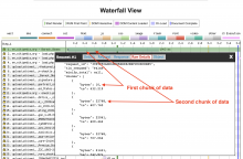
Using a combination of WebPageTest's "Waterfall" view and "Raw Details" view to identify where first paint occurred and the bytes download before first paint, I was able to approximately determine the percentage of the page's HTML rendered downloaded (downloaded is the most accurate term here as the browser also has to parse and perform rendering steps) before first paint.

chunks-of-data.png (486×1 px, 132 KB)

raw-details.png (1×1 px, 298 KB)

Results

24 tests showing bytes downloaded before start render (first paint) from the Barack Obama page (265,480 total bytes)

Test location - browser - connectionBytes downloaded Before First PaintApproximate Percentage of HTML downloaded Before First Paint
Ireland - EC2 Windows - Chrome - Native240,09290%
Amsterdam, NL - IISpeed - Chrome - Native174,55966%
Zurich, Switzerland - Chrome - Native174,56066%
South Africa - Chrome - Native265,480100%
Virginia USA - EC2 - Chrome - Native207,32478%
Nottingham, East Midlands, UK - Chrome - LTE265,480100%
Nottingham, East Midlands, UK - Chrome - Native162,64261%
Brussels, BE - Chrome - Native218,67782%
Sydney, Australia (Bulletproof Networks) Chrome FIOS265,480100%
Mumbai, India - EC2 - Chrome - Native162,64061%
Mumbai, India - EC2 - Chrome - Cable249,25394%
Istanbul, Turkey - Cloudeos - Opera - LTE265,480100%
South Africa - Chrome - 4G265,480100%
Stockholm, Sweden - Firefox - Native265,480100%
Stockholm, Sweden - Firefox - 3GSlow265,480100%
Prague, Czech Republic - Chrome - 3GFast265,480100%
Frankfurt, Germany - Dynatrace - Chrome - Cable265,480100%
Paris - EC2 - Chrome - 4G265,480100%
Dallas, TX - Chrome - 4G265,480100%
Dulles, VA - Firefox - 4G265,480100%
California - ScientiaMobile - Chrome - DSL265,480100%
Denver, Colorado USA - Chrome - Cable265,480100%
Virginia USA - EC2 - Chrome - DSL265,480100%
Virginia USA - EC2 - Chrome - 4G265,480100%

1 test showing bytes downloaded before start render (first paint) from B8_polytope page (95,375 total bytes)

Ireland - EC2 Windows - Chrome - Native48,43750%

1 test showing bytes downloaded before start render (first paint) from Tree page (122,687 total bytes)

Lincoln, Nebraska USA - Chrome Native122,687100%
Second Conclusion (and closing)

All of the WebPageTests I performed downloaded at least half of the page's response payload before first paint occurs (50% being the lowest percentage completed before first paint) which suggests that if we move the header, sidebar, article toolbar, and personal menu above the content, first paint would most likely include all of these above-the-fold elements, but also include a lot of the content below-the-fold. Furthermore, from my tests, there is no evidence to suggest that users seeing the header first and having to wait to see the content would be a likely scenario that would occur. If performance is the primary reason we are maintaining the status quo of Vector's content-first DOM order, I recommend we rethink this.

[1] https://www.tunetheweb.com/blog/critical-resources-and-the-first-14kb/

Thanks @nray for this in-depth researched comment. It seems helpful to have Performance-Team's inputs in response to verify. cc: @Krinkle

Thank you @nray for this very thorough performance analysis. I agree with your conclusions. Beyond the the theoretical initial 14kb window, we know that browsers use some heuristics to avoid having too many paints early on, and can intentionally delay first paint.

We are very lean in terms of critical path before the main content compared to other websites and our observation is that most of the time the majority of the above-the-fold content (minus "large" images) appears at once on first paint. I doubt that moving this UI chrome content back to its semantically correct position at the top of the HTML will have any measurable impact on our time to first paint, nor on the amount of content rendered during that first paint event.

If despite all these observations, you're worried about a potential impact on when the first paragraph is displayed to the user, you can now track this using Element Timing, which is available on Chrome since 77. I had a hacky patch for that which didn't go beyond code review. I abandoned it for the reasons I've just described, it's highly likely to be the same as first contentful paint 99% of the time.

Comparing content-first vs. header-first DOM order and its impact […]

Results
Size of HTTP headers (uncompressed)1,060 bytes
Size of HTML until end of first paragraph with content-first DOM order (gzipped)7,442 bytes
Size of HTML until end of first paragraph with header-first (and sidebar including language links) DOM order (gzipped)20,179 bytes
Size of HTML until end of first paragraph with header-first (and sidebar without language links) DOM order (gzipped)9,911 bytes
Total transfer size (gzipped) until end of first paragraph with content-first DOM order8.3 KB
Total transfer size (gzipped) of until end of first paragraph with header-first (and sidebar without language links) DOM order10.71 KB

First Conclusion: […] Second Conclusion […]

Awesome. This is some research here. Thanks @nray!

I agree with @Gilles that "time to first paint" and "time to above-the-fold article text" painting would likely not be negatively affected.

However, I do expect visual progression to improve significantly. That is, "the time until visually settled", or more specifically the time of the last last visual change above-the-fold. As the header, sidebar and logo instructions would no longer be transmitted after the below-the-fold HTML payload.

Right now, even on a moderately fast connection when navigating between articles you will (briefly) first see the article appear without skin header and then the header appears briefly later. This doesn't cause any layout churn as we do reserve that space. But it is a visual change nonetheless.

Browsers optimise for this by showing the old page until the next navigation has some content painted. In our case that currently means content without the skin header. This change would improve that and thus likely eliminate one of the rendering stages!

Browsers optimise for this by showing the old page until the next navigation has some content painted. In our case that currently means content without the skin header. This change would improve that and thus likely eliminate one of the rendering stages!

Do you have some further reading on this optimisation? Is it default in all major rendering engines now?

Just to recap the work done in this task: In accordance with the arguments presented above, the DOM order in modern Vector has been changed to reflect the visual flow of the page.
These changes will let us: shed a significant portion of the legacy CSS, improve the presentation on smaller screens, improve the loading experience, and bring Vector in line with more common accessibility patterns on the web.

The "jump to navigation" link has been replaced with a more common "jump to content" link.
The new DOM order is now:

  1. Jump to content link
  2. Header
    1. Sidebar button (with option to open sidebar menu)
    2. Search
    3. Personal menu
  3. Tabs
  4. Content
  5. Footer

There is still some followup work to do regarding the tab-order of the sidebar button and sidebar menu, but that has been captured in T262872. We also plan on conducting an accessibility audit of these changes. T263834.

In accordance with @ovasileva we'll move this to backlog and declare following tasks as sub-tasks

  • The indicators are still to be resolved one way or the other (already sub-task)
  • The tab order of sidebar buttons T262872
  • And the follow-ups from AFB testing would make good sub-tasks too
Volker_E renamed this task from [SPIKE 8hrs] Determine the optimum Vector DOM structure for a11y and performance to [Epic] Determine the optimum Vector DOM structure for a11y and performance.Oct 20 2020, 11:11 AM
Volker_E removed Volker_E as the assignee of this task.

@Volker_E @Jdrewniak given this is a team goal for the quarter and this is wrapping up, is there anything left here? Or can this be continued in subtasks without need of a goal tracking card?
In T240489#6563658 we said we'd move this to backlog so I'm a little confused with what happened here.

@Volker_E - resolving this for right now to make space on the board. Feel free to add any thoughts and re-open if necessary when you have time for a review.