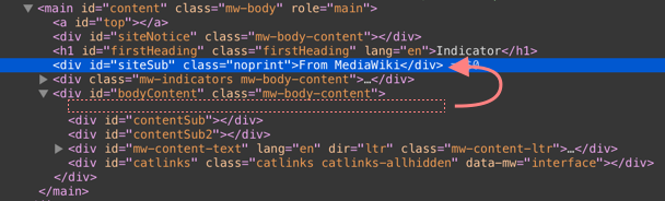
In preparation fro moving the languages, the first heading should come as far up as possible in DOM on new Vector. For now, Old Vector will remain the same and this will be the subject of a new task.
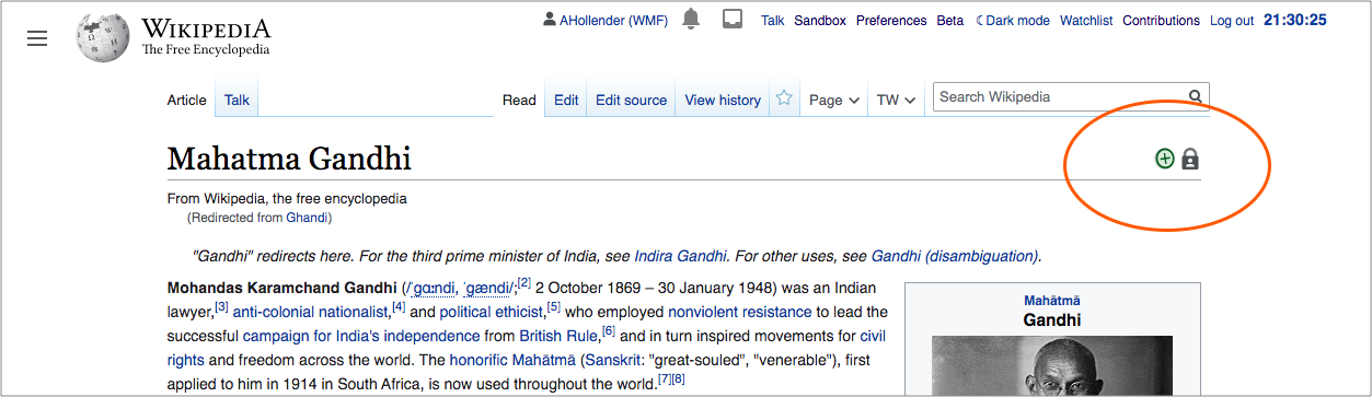
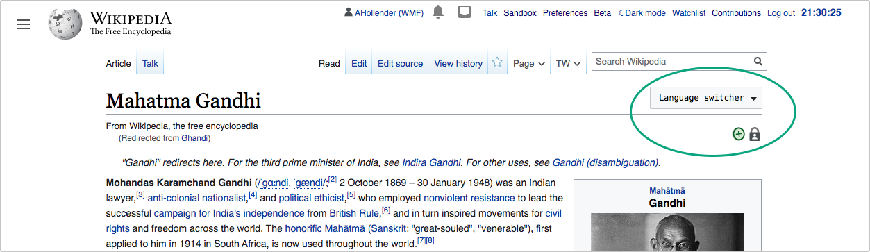
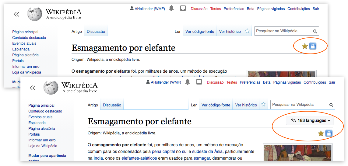
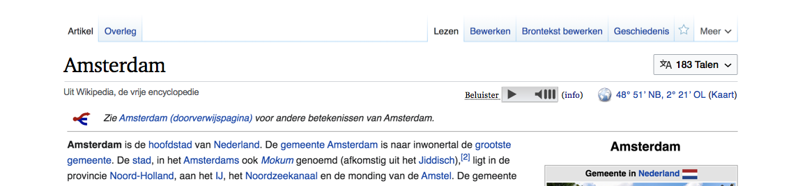
Indicators as shown here (barnstar), here (combination of badges on Commons) or here (helplink) should come after firstHeading as it's more descriptive and clearer to, users of screenreader software.
Imagine hearing the article title and then the information that it's a featured article.
Also consider subtask T254666: Indicators are unclickable on huwiki
Prototypes
DEMO 2 (flex layout)
DEMO 3 (float layout)
Q: Is there any benefit to using float instead of flex or the opposite?
Proposal
Move indicators directly under #firstHeading to
- improve screenreader experience
- also let indicators stay on same place close to heading underline, wiith multiline headings
Design
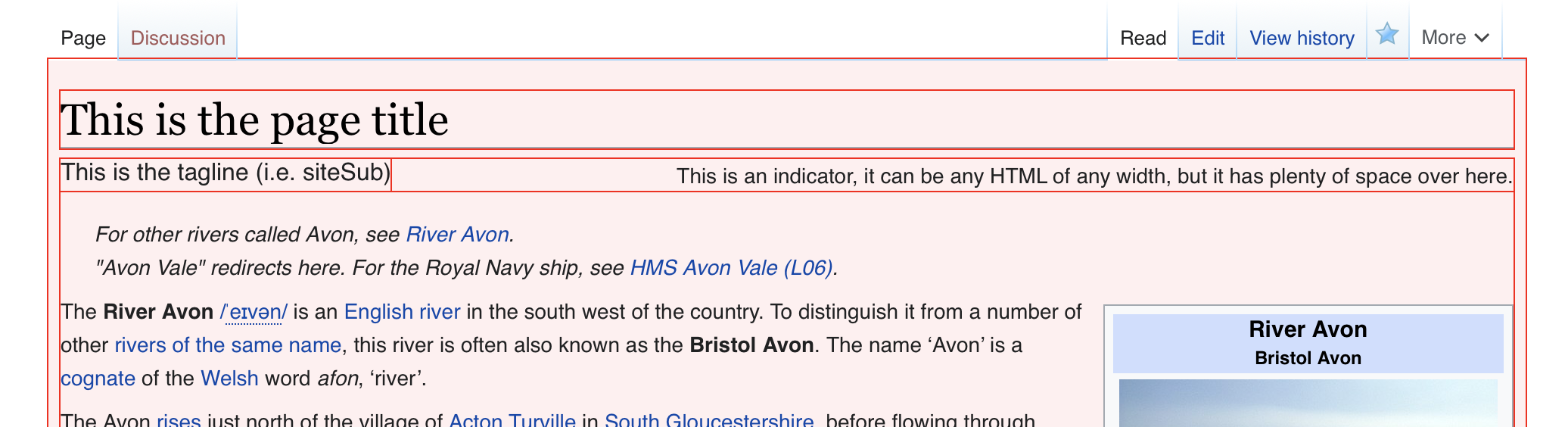
Before and after:
Coordinates & audio
Note
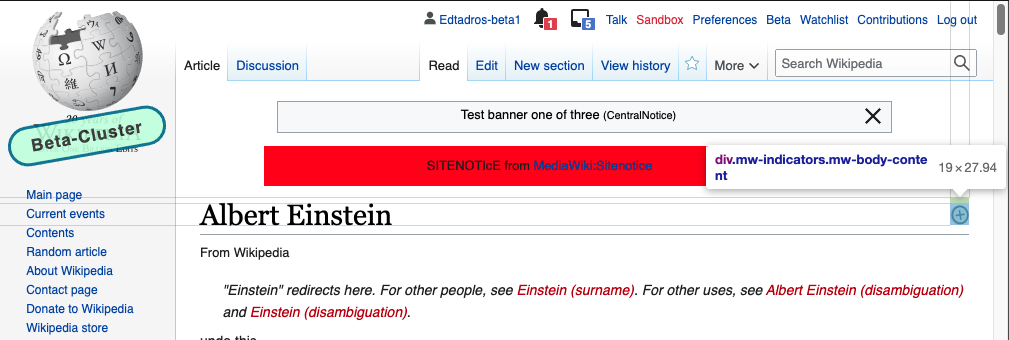
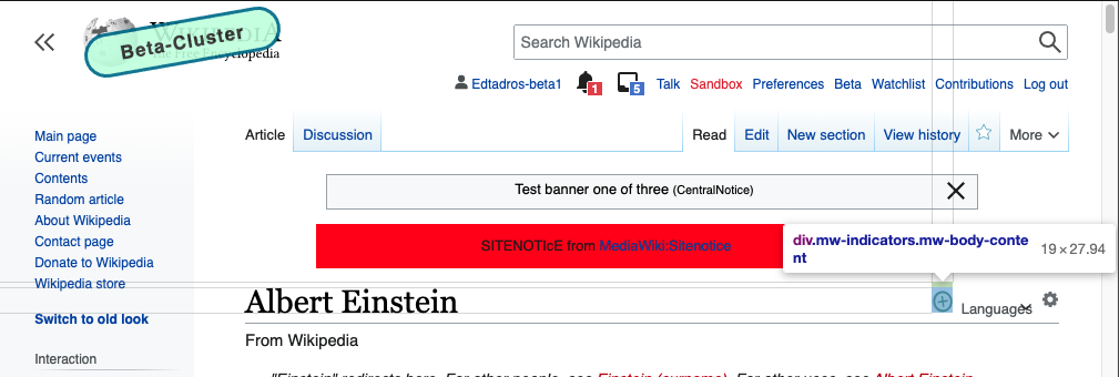
Currently, the right floated indicators in variable width are letting headings break before its div.
We need to apply a layout flexible solution, that takes the variable width of both elements into account.
One minor possible side-effect could be that excerpts of Wikipedia articles in search engine results would include the indicators in the excerpt in the sequence:
- first heading
- indicators “This is a featured article”
- prebodyhtml
- siteSub
instead of
- first heading
- prebodyhtml
- siteSub
Test matrix
Variations:
- Skin version: legacy / modern
- Media: screen (code) / print (code)
- Window width: narrow (?px) / medium (?px) / wide (?px) -- heading wrapping into 2 or more lines
- Uncommon cases: works well with flaggedrevs? (T254666, example page | with site-local repositioning: Vector.js)
- Caching: new HTML with old CSS (for 30 min?), old HTML with new CSS (for 4-7-14 days)
Local Testing
| Test IE 8 with changed DOM |
 |
Applied, manual testing
| jawiki | hewiki | commons (en) |
 |   |   |
QA
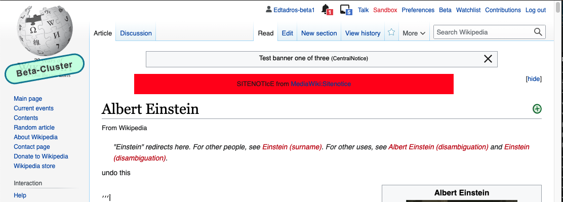
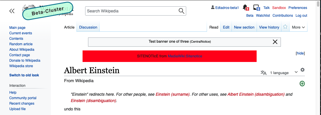
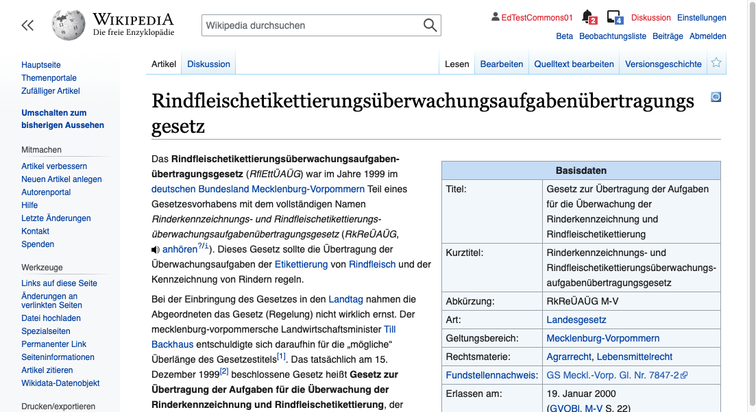
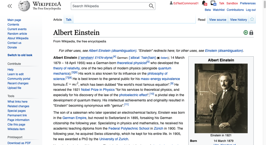
Test page: https://en.wikipedia.beta.wmflabs.org/wiki/Albert_Einstein or https://de.wikipedia.org/wiki/Rindfleischetikettierungs%C3%BCberwachungsaufgaben%C3%BCbertragungsgesetz (for overlong title)
- The indicators appear on the same position on legacy Vector
- The indicators appear on the same position on modern Vector
Note,
- it's acceptable if there's a 1px difference
- there's a local CSS override on enwiki adding a padding-top to position indicators, that's good to be removed with this change. Request captured on Vector.css talk page.
Sign off steps
- Discuss whether we want to do this for old Vector (and why) and create a new task if necessary
QA Results - Beta
| AC | Status | Details |
|---|---|---|
| 1 | ✅ | T248761#6804742 |
QA Results - Prod
| AC | Status | Details |
|---|---|---|
| 1 | ⬜ | T248761#6842520 |