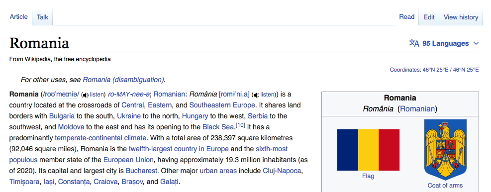
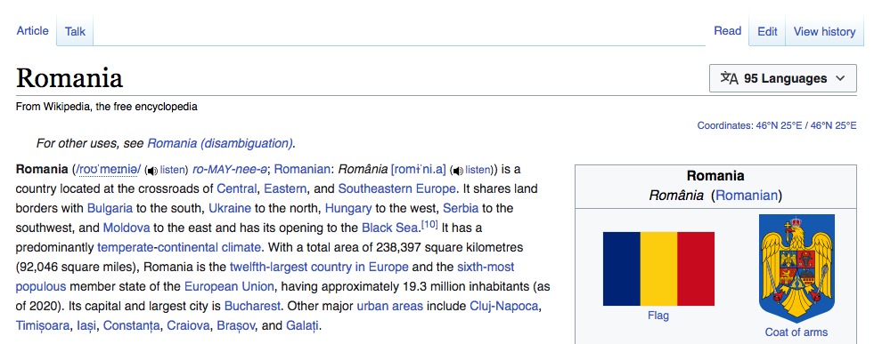
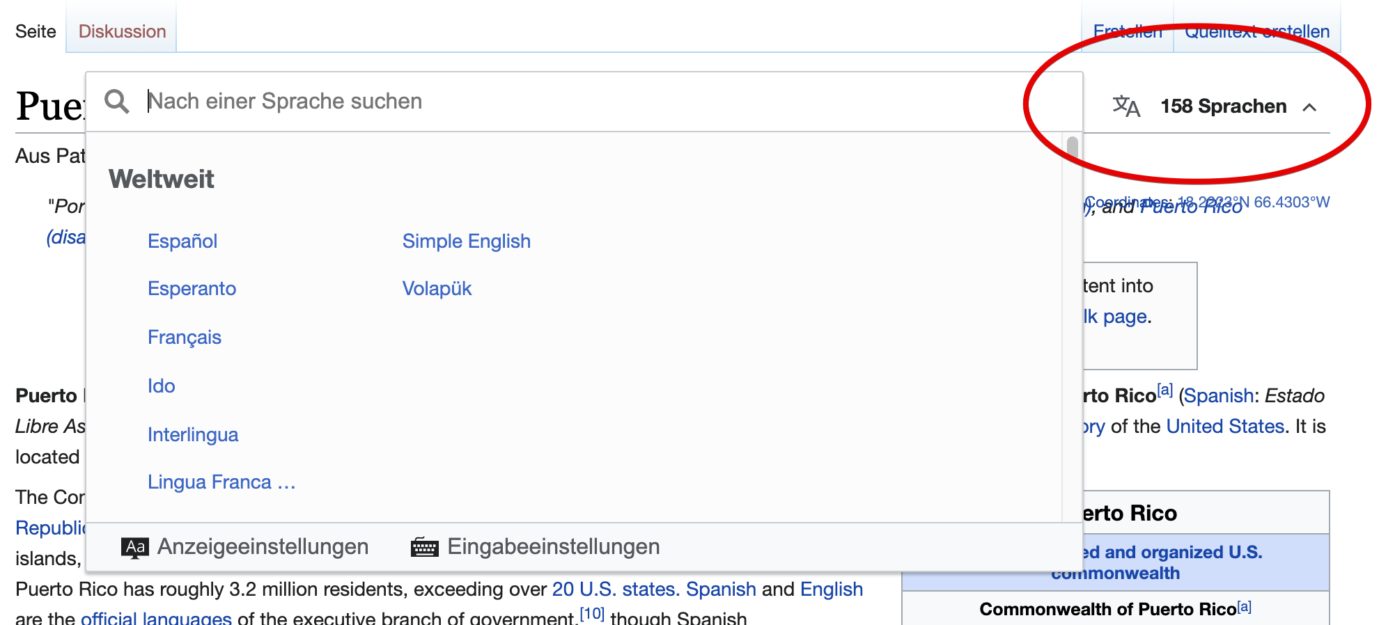
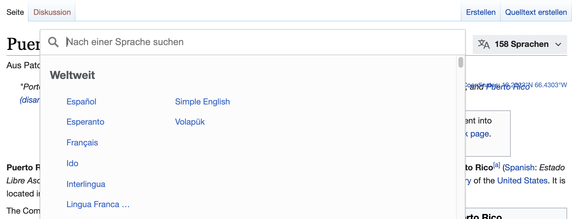
Background
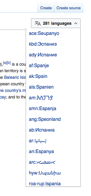
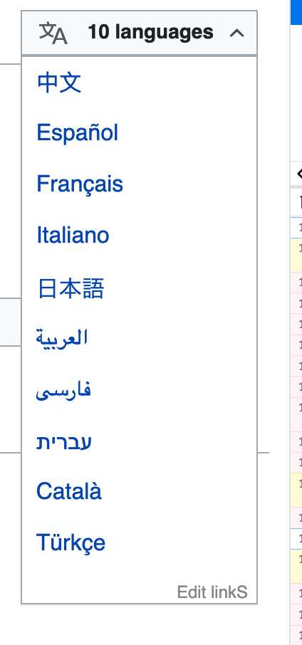
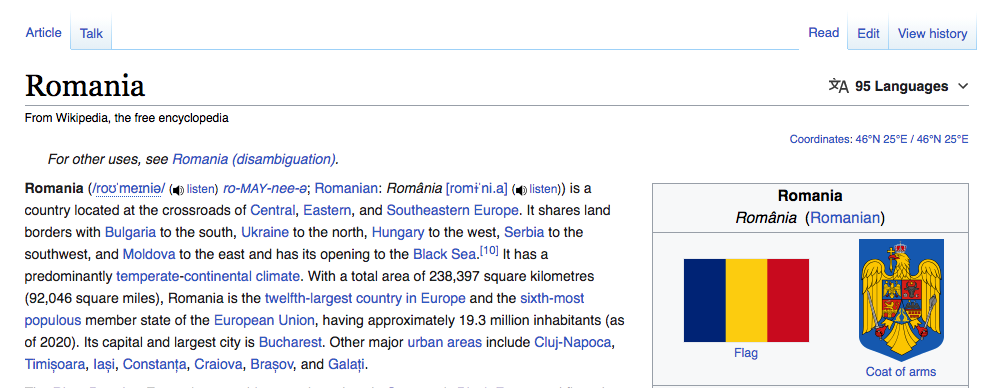
In T260738: Language button v1 - allow language button to appear at top of page (plus JS fallback) we will be creating the basis for the new language switcher with an initial language button displaying the list of languages via the ULS. This task will build upon that work and focus on styles and precise location of the new button
Acceptence Criteria
- Style and place new language button according to design requirements defined below
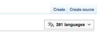
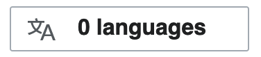
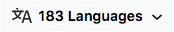
Current design
| default | hover | active | focus |
 |  | 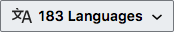 | 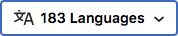 |
| - | bg: #F8F9FA | bg: #EAEDF0, border: #72777D | border: 2px #3366cc |
details
text color: #202122
entire height (including borders): 32px
entire width (including borders): ~174px
border-radius: 2px
font-size: 14px equivalent in ems
main icon canvas size: 20x20px
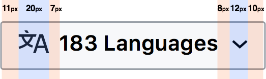
layout/spacing
Developer notes
https://gerrit.wikimedia.org/r/c/mediawiki/skins/Vector/+/635080 will be interesting reading prior to taking this on.
Ideas explored:
Using a different template for language button