Page MenuHomePhabricator

Design fixes for new Vue.js search experience
Closed, ResolvedPublic3 Estimated Story Points

Description

Background

Moved from T249299: [Epic] Build the new Vue.js search experience

For reference, see Alex's prototype: https://di-community-round-2.web.app/Romania

Acceptance criteria

Input box

Layout

image.png (182×663 px, 18 KB)

Current issues:

  • height of input box should be 32px
  • font-size for placeholder & input text should be 14px
  • search icon is slightly too large
  • search icon right & left padding doesn't match spec
  • placeholder text should say "Search Wikipedia"
  • remove invisible button at the end of the input box
    Screen Shot 2020-12-10 at 1.14.35 PM.png (134×760 px, 29 KB)
Interactivity

Hover state

correctcurrent
hover
image.png (73×500 px, 6 KB)
image.png (94×505 px, 13 KB)
hover (after having focused the input field)(same as above)
image.png (97×472 px, 12 KB)

Current issues:

  • the search button is not showing when hovering (before having focused the field)
  • the search box gets less wide after it has been focused
  • upon hover (after having focused) the search button appears "outside" of the box rather than inside
  • remove tooltip over magnifying glass icon
  • change cursor from pointer (hand) to arrow when hovering over magnifying glass icon before WVUI loads

Active & focus states

The initial transition into the active/hover state has some slight issues. I suspect this is due to with swapping the Vue component in. Going frame-by-frame here are the issues I'm seeing:

frame #screenshotissue(s)
1
image.png (57×509 px, 15 KB)
2
image.png (57×509 px, 16 KB)
input text shifts right by ~5px, end of input text gets clipped slightly, search button doesn't appear immediately
3
image.png (57×509 px, 15 KB)
blue border goes away
4
image.png (57×509 px, 16 KB)

Final state:

correct
image.png (54×524 px, 5 KB)
current
image.png (70×521 px, 8 KB)

Current issues:

  • too much spacing around the icon
  • icon opacity should switch to 1
  • there seems to be a slight delay in the border/outline thickening, please reference OOUI demo (link)

Search button

Current issues:

  • font-size should be 14px

Results list

Layout

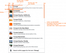
image.png (662×827 px, 129 KB)

Current issues:

  • image thumbnails are too large (41x41px), should be 36x36px
  • rows are too tall (57px), should be 54px -- I think this will resolve itself when we reduce the size of the image thumbnails
  • There is a bottom margin on each row that should be removed (it is a rogue style coming from Vector)
    image.png (236×1 px, 53 KB)
    https://gerrit.wikimedia.org/r/c/mediawiki/skins/Vector/+/650180
Interactivity

Current issues

"Search for pages containing"

Current issues

QA Instructions

Thumbnails Enabled: https://patchdemo.wmflabs.org/wikis/4e5d48023fbd967911848c5a059863f2/w/index.php/Main_Page
Thumbnails Disabled: https://patchdemo.wmflabs.org/wikis/9ed1c233860587aa138e8a652fbf5e63/w/index.php/Main_Page

Further instructions pending...

Details

SubjectRepoBranchLines +/-
mediawiki/skins/Vectormaster+39 -18
mediawiki/skins/Vectormaster+248 -12
mediawiki/skins/Vectormaster+10 -10
mediawiki/skins/Vectormaster+0 -17
wvuimaster+44 -26
mediawiki/skins/Vectormaster+6 -5
mediawiki/coremaster+1 -1
mediawiki/skins/Vectormaster+0 -1
mediawiki/skins/Vectormaster+5 -4
mediawiki/skins/Vectormaster+5 -0
mediawiki/skins/Vectormaster+16 -6
mediawiki/skins/Vectormaster+21 -6
wvuimaster+31 -25
wvuimaster+31 -26
wvuimaster+0 -1
wvuimaster+0 -4
mediawiki/skins/Vectormaster+12 -6
wvuimaster+1 -1
mediawiki/skins/Vectormaster+11 -0
wvuimaster+7 -1
Show related patches Customize query in gerrit

Event Timeline

There are a very large number of changes, so older changes are hidden. Show Older Changes

Change 651613 merged by jenkins-bot:
[mediawiki/skins/Vector@master] Sync Vector styling with latest changes in WVUI

https://gerrit.wikimedia.org/r/651613

@alexhollender I made a patchdemo yesterday that includes the latest WVUI work and latest Vector work except for 1 patch that will increase the search input width to 500px (as shown in the spec):

https://patchdemo.wmflabs.org/wikis/84b9a27e437ed8fa2343054ddf7321be/w/index.php/Main_Page

Please note the following:

the search button is not showing when hovering (before having focused the field)

This is due to us lazy loading the WVUI search component (and search button) only when the input first receives focus. Before the focus happens, it is merely the legacy search input styled to look like the WVUI input. In theory, we could add a button in Vector that is styled to look like the WVUI search button, but I think it's a slippery slope because

  1. Our current process of making the styles match is pretty tedious (we are basically copying the styles from WVUI into Vector)
  2. We have to be careful that the size of styles we are copying into Vector don't negate the reason we lazy load WVUI in the first place (because it has a large payload)

Given that, I think if this bullet point is important, it should be its own dedicated ticket.

remove invisible button at the end of the input box

That invisible button has been moved, but there is still a submit button with the magnifying glass on the left side of the input before WVUI lazy loads. Ideally, it would be a span to match how it is in WVUI, but we have to consider no-js users as well, and it is somewhat tricky to make this not be a button while also considering the points above.

Given that, I think if this bullet point is important, it should also be its own dedicated ticket.

the search box gets less wide after it has been focused

If this is referring to the first focus, this should be fixed now with the exception of wikis that choose not to display the thumbnails. I'll look into what can be done with that setting today.

there seems to be a slight delay in the border/outline thickening, please reference OOUI demo (link)

There is a style in Vector that intentionally disables the border transition because the animation was jarring when the WVUI was lazy loaded (and replaced the legacy search input).

Change 655721 had a related patch set uploaded (by Nray; owner: Nray):
[mediawiki/skins/Vector@master] Remove min-height style from #searchButton, #mw-searchButton

https://gerrit.wikimedia.org/r/655721

looking so good y'all !!!!!

Input box

Layout
  • height of input box should be 32px
  • font-size for placeholder & input text should be 14px
  • search icon is slightly too large
  • search icon right & left padding doesn't match spec
  • placeholder text should say "Search Wikipedia" -- *can't verify on PatchDemo
  • remove invisible button at the end of the input box
Interactivity
  • the search button is not showing when hovering (before having focused the field) -- *we decided to de-scope this
  • the search box gets less wide after it has been focused
  • upon hover (after having focused) the search button appears "outside" of the box rather than inside

Active & focus states

  • too much spacing around the icon
  • icon opacity should switch to 1
  • there seems to be a slight delay in the border/outline thickening, please reference OOUI demo (link)

Search button

  • font-size should be 14px

Results list

Layout
  • image thumbnails are too large (41x41px), should be 36x36px
  • rows are too tall (57px), should be 54px -- I think this will resolve itself when we reduce the size of the image thumbnails
Interactivity
  • remove text underlines when hovering a row
"Search for pages containing"
  • hover highlight color should be gray (same as other rows)
  • text should say "Search for pages containing [x]", currently it says "containing [x]" -- *where are we at with this?

Macro cat-strawberry: les roll

Change 655803 had a related patch set uploaded (by Nray; owner: Nray):
[mediawiki/skins/Vector@master] Add span with magnifying glass to simulate .wvui-input__start-icon (in WVUI)

https://gerrit.wikimedia.org/r/655803

Change 655985 had a related patch set uploaded (by Nray; owner: Nray):
[mediawiki/core@master] Change wording of searchsuggest-containing message

https://gerrit.wikimedia.org/r/655985

text should say "Search for pages containing [x]", currently it says "containing [x]" -- *where are we at with this?

That will be changed in https://gerrit.wikimedia.org/r/c/mediawiki/core/+/655985

placeholder text should say "Search Wikipedia" -- *can't verify on PatchDemo

I think this one is taken care of. It uses the name of the Wiki which is why it's showing as "Search Patch Demo (655529,3)" in patch demo, but it will change to "Search Wikipedia" when deployed to Wikipedia.

Change 656002 had a related patch set uploaded (by Nray; owner: Nray):
[mediawiki/skins/Vector@master] Change magnifying glass cursor from pointer to default (arrow)

https://gerrit.wikimedia.org/r/656002

Change 655803 abandoned by Nray:
[mediawiki/skins/Vector@master] Add span with magnifying glass to simulate .wvui-input__start-icon (in WVUI)

Reason:
This is probably the path we should eventually go down but it needs its own ticket to do it properly. As a stopgap, see https://gerrit.wikimedia.org/r/c/mediawiki/skins/Vector/ /656002

https://gerrit.wikimedia.org/r/655803

Change 650590 merged by jenkins-bot:
[mediawiki/skins/Vector@master] Set Vector search variables relative to @font-size-base factor and increase max-width

https://gerrit.wikimedia.org/r/650590

Change 656002 merged by jenkins-bot:
[mediawiki/skins/Vector@master] Change magnifying glass cursor from pointer to default (arrow)

https://gerrit.wikimedia.org/r/656002

nray updated the task description. (Show Details)
  • remove tooltip over magnifying glass icon

Clarified with Alex over slack that he is fine with just the cursor changing from a pointer (hand) to the default arrow when hovering over the magnifying glass. Removing the tooltip would require more than a CSS change and at that point we might as well make the magnifying glass button not be a button (but that should be done in its own ticket).

Change 656008 had a related patch set uploaded (by Nray; owner: Nray):
[mediawiki/skins/Vector@master] Use pointer-events: none on magnifying glass to prevent submit button behavior and tooltips

https://gerrit.wikimedia.org/r/656008

Removing the tooltip would require more than a CSS change and at that point we might as well make the magnifying glass button not be a button (but that should be done in its own ticket)

After saying this, I realized that pointer-events: none could be used to achieve this (see above patch), but it feels pretty hacky

Change 655721 merged by jenkins-bot:
[mediawiki/skins/Vector@master] Remove min-height style from #searchButton, #mw-searchButton

https://gerrit.wikimedia.org/r/655721

Change 655985 merged by jenkins-bot:
[mediawiki/core@master] Change wording of searchsuggest-containing message

https://gerrit.wikimedia.org/r/655985

@alexhollender your blockers should be addressed now in https://patchdemo.wmflabs.org/wikis/55796de21ed353df22c9ce80a17539af/w/index.php/Main_Page . Please double check to see if you have any remaining blockers

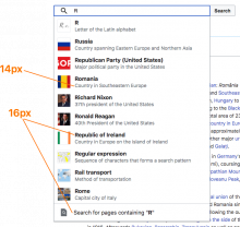
@nray looks great. Not sure if this is a new bug or I just didn't catch it before, but the font-size of the page titles in the results list is too small, should be 16px. I'm thinking maybe we create a separate task for that?

Also what do we want to do about QA here?

image.png (655×690 px, 121 KB)

Change 656504 had a related patch set uploaded (by Nray; owner: Nray):
[mediawiki/skins/Vector@master] Make expanding search input dependent on $wgVectorWvuiSearchOptions

https://gerrit.wikimedia.org/r/656504

Change 656008 merged by jenkins-bot:
[mediawiki/skins/Vector@master] Use pointer-events: none on magnifying glass to prevent submit button behavior and tooltips

https://gerrit.wikimedia.org/r/656008

In T270202#6742054, @alexhollender wrote:
  • text should say "Search for pages containing [x]", currently it says "containing [x]" -- *where are we at with this?

Thank you, I love this!!!

Patch for review is at https://gerrit.wikimedia.org/r/c/mediawiki/skins/Vector/+/656504 which makes the input NOT expand (and before WVUI loads) if the search configuration has thumbnails disabled

Change 657421 had a related patch set uploaded (by Nray; owner: Nray):
[mediawiki/skins/Vector@master] POC: Defer expanding input to WVUI

https://gerrit.wikimedia.org/r/657421

@alexhollender

Assuming thumbnails are enabled, how important is it to you to have the input expand immediately on first focus before WVUI loads vs. having the input expand after WVUI loads? As an example, please compare these two patchdemos:

A) https://patchdemo.wmflabs.org/wikis/ec95558701d147c8770c8aa37fc3791c/w/index.php/Main_Page

B) https://patchdemo.wmflabs.org/wikis/5c546dc5c54b306b22b78200f0874fde/w/index.php/Main_Page

They are exactly the same except in A the following events happen:

  1. User focuses input for first time
  2. Input expands
  3. WVUI loads with loading message (user waits or types characters)
  4. WVUI replaces expanded input with the WVUI expanded input

Whereas in B, the following events happen:

  1. User focuses input for first time
  2. WVUI loads with loading message (user waits or types characters)
  3. WVUI replaces contracted input with the WVUI expanded input

Note that A is what you've reviewed in the past (the status quo). I ask this question because I have a pending patch that adds additional logic to support A when thumbnails are disabled, but I want to make sure that A is the desired output. If it makes no difference to you or if you don't mind B, I'd love to remove the decent amount of code that is currently supporting A 😃

Please let me know if you have any questions!

Volker_E renamed this task from Design fixes for new vue.js search experience to Design fixes for new Vue.js search experience.Jan 21 2021, 6:50 PM

@nray re:T270202#6763805 I think unfortunately we should go with A. The expanding of the input field upon focusing it feels more expected/natural than the expanding of the input field upon WVUI loading (which I think would come across as arbitrary to the person using it?).

Also, and we can deal with this in a separate task, but I guess as a result of the slower internet connection here the search button took ~2.5 seconds to appear (search button.mov). If you watch the second video (truman.mov) you'll see the loading state, then the search button, then the results list, which feels perhaps like too many moving parts (i.e. not a smooth experience). Not sure if there's much we can do there (aside from going back down the road of the sham/fake button) but just wanted to call it out. cc @ovasileva


(not sure whether to put this back in needs more work or code review — not suggesting any new work aside from sorting out the A vs. B question you posed above)

Thank you @alexhollender and no problem 😃 I just wanted to make sure the code to support A was deliberate and preferred.

Regarding the sham button, I'm open to it. I made a note on T268241#6769951 as that task has the same pivotal question as this one might have if we go down that road - "how do we style the button?"

Change 657421 abandoned by Nray:
[mediawiki/skins/Vector@master] POC: Defer expanding input to WVUI

Reason:
Alex wants input to expand before WVUI loads per T270202#6767750

https://gerrit.wikimedia.org/r/657421

Change 657924 had a related patch set uploaded (by Nray; owner: Nray):
[mediawiki/skins/Vector@master] Rename wgVectorUseCoreSearch to wgVectorUseWvuiSearch

https://gerrit.wikimedia.org/r/657924

Change 657924 merged by jenkins-bot:
[mediawiki/skins/Vector@master] Rename wgVectorUseCoreSearch to wgVectorUseWvuiSearch

https://gerrit.wikimedia.org/r/657924

Change 658710 had a related patch set uploaded (by Nray; owner: Nray):
[mediawiki/skins/Vector@master] Move Wvui Search A/B Logic to FeatureManager

https://gerrit.wikimedia.org/r/658710

Change 658710 merged by jenkins-bot:
[mediawiki/skins/Vector@master] Move Wvui Search A/B Logic to FeatureManager

https://gerrit.wikimedia.org/r/658710

Change 656504 merged by jenkins-bot:
[mediawiki/skins/Vector@master] Make expanding search input dependent on $wgVectorWvuiSearchOptions

https://gerrit.wikimedia.org/r/656504

nray removed Edtadros as the assignee of this task.
nray moved this task from Code Review to QA on the Web-Team-Backlog (Kanbanana-FY-2020-21) board.
nray added a subscriber: Edtadros.

\o/

@alexhollender You might also be interested in looking at the search with thumbnails disabled as well: https://patchdemo.wmflabs.org/wikis/9ed1c233860587aa138e8a652fbf5e63/w/index.php/Main_Page

@ovasileva I'm not sure how we want to QA this given its mostly design fixes that Alex has already reviewed, but it might be good to do a broad sweep for any browser compatibility issues. If that sounds good, do you have a list of browsers/devices we would want to test against?

@alexhollender You might also be interested in looking at the search with thumbnails disabled as well: https://patchdemo.wmflabs.org/wikis/9ed1c233860587aa138e8a652fbf5e63/w/index.php/Main_Page

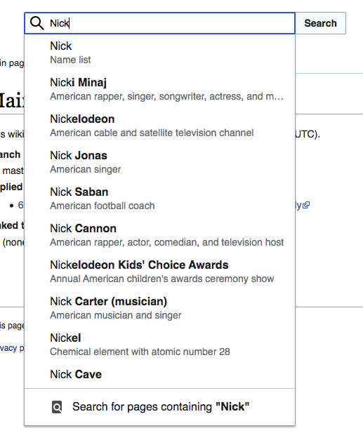
thanks for the heads up, looks good to me 💅

Screen Shot 2021-01-28 at 9.18.17 AM.png (637×517 px, 86 KB)

moving to signoff after talking to @ovasileva in standup today (qa will be done in T259798)

ovasileva claimed this task.

And resolving!