Description
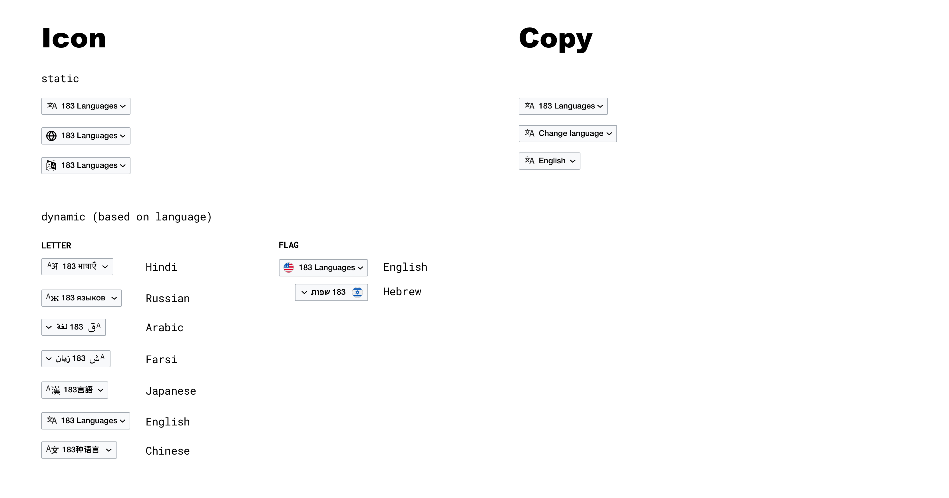
As part of the Desktop Improvements (Vector 2022) project we are moving the language links from the sidebar to a button/menu in the article header (details: T256023). We need to decide on the design of that button. There are two components:
- icon
- copy
In terms of similar buttons already in production:
| compact language links | 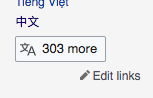 |
| ULS (wikidata, commons, etc) |  |
| mobile web | 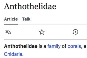 |
| Minerva | 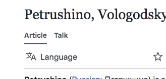 |
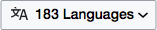
Using the existing icon, and following from the button in compact language links we get something like this:
Explorations
Additional context: in T210865 (and other places -- cc @Amire80 to add links if you have them) we've discussed improving the language icon.