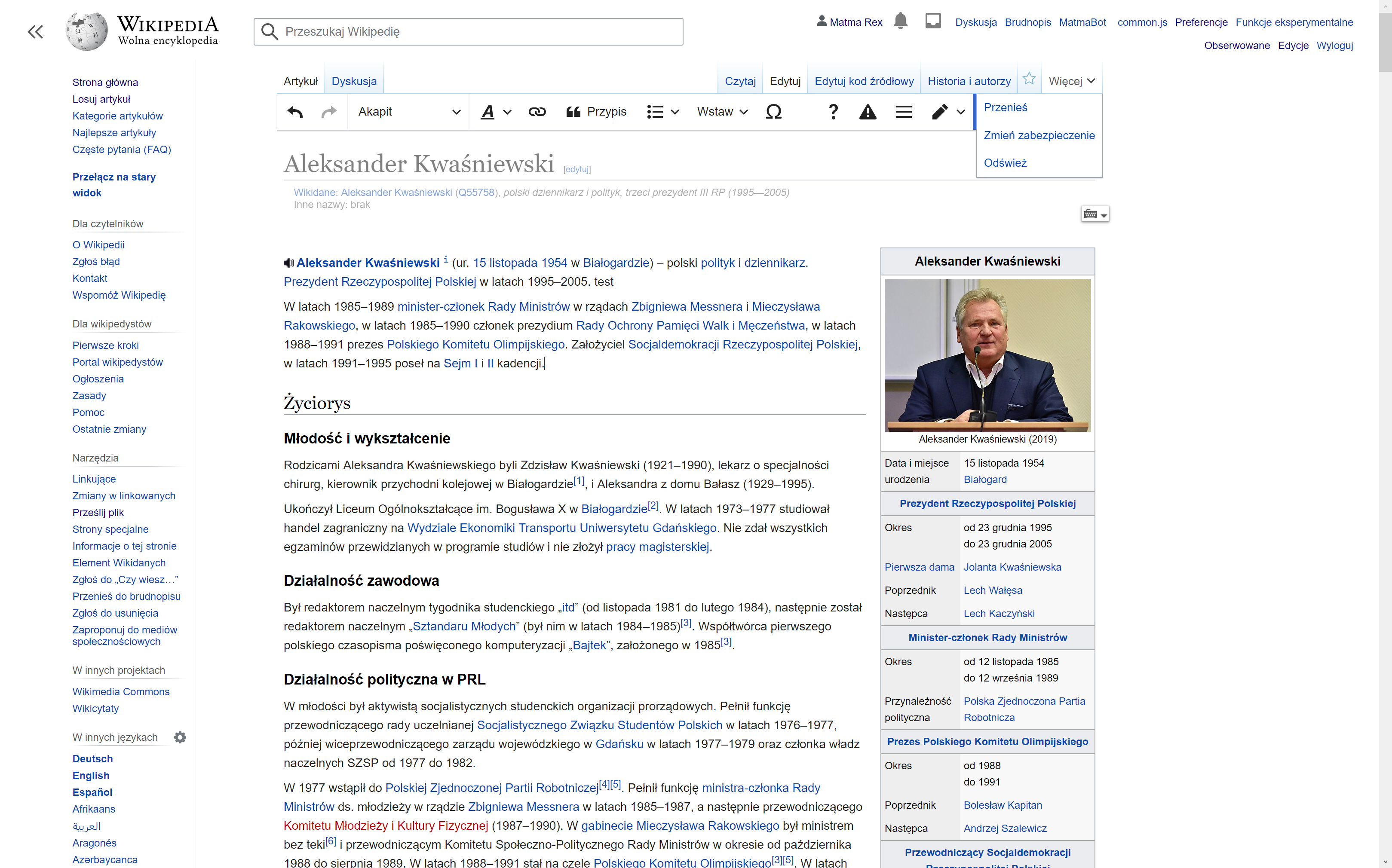
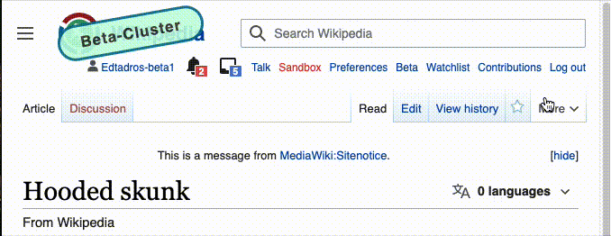
When selecting the more menu or language button in new Vector with JS disabled, the arrow flips.
We're never flipping arrows in menu triggering elements like for example dropdowns. See https://design.wikimedia.org/style-guide/components/dropdowns#states
Acceptance criteria
Following conversation between Jon, Volker and Alex:
- The arrow should never flip
- The dropdown menus should not reveal on hover. This is bad user experience. Only on click
- Clicking outside the menus should close them
- The above changes should apply to modern Vector only
QA
You will need to use an admin account, or shrink your screen resolution to test this.
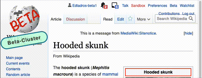
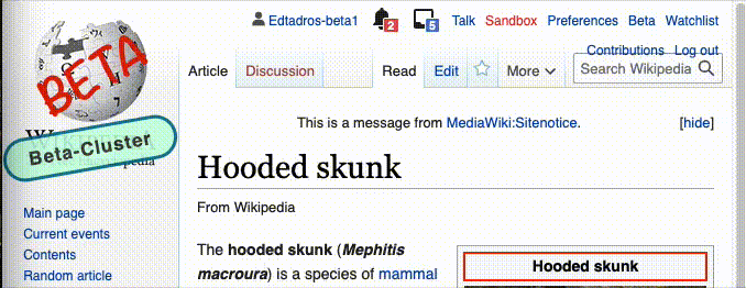
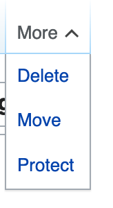
- When selecting the more menu on /classic Vector/ the arrow button should flip
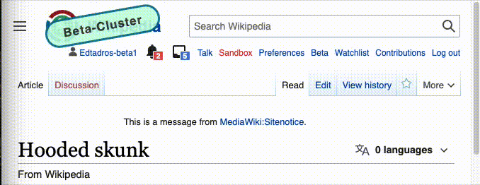
- When selecting the more menu on /modern Vector/ the arrow button shouldn't flip
- When selecting the language menu with JS disabled on /modern Vector/ the arrow button shouldn't flip
- When opening the more menu in /classic Vector/ clicking outside the menu should not close it
- When hovering the more menu in /classic Vector/ it should display
- When opening the more menu in /modern Vector/ clicking outside the menu should close it
Sign off steps
- Create a new task from removing from legacy Vector.
QA Results - Beta
| AC | Status | Details |
|---|---|---|
| 1 | ✅ | T275681#6904995 |
| 2 | ✅ | T275681#6904995 |
| 3 | ✅ | T275681#6904995 |
| 4 | ✅ | T275681#6904995 |
| 5 | ✅ | T275681#6904995 |
| 6 | ✅ | T275681#6904995 |