Page MenuHomePhabricator

[Design] Discussion: differentiation/separation of interface elements/regions in Vector 2022
Closed, ResolvedPublicSpike

Assigned To
Authored By
VulpesVulpes825
Jul 30 2020, 9:18 AM
Referenced Files
F36896704: irudia.png
Mar 7 2023, 4:07 PM
Restricted File
Mar 3 2023, 11:20 PM
F36890891: image.png
Mar 3 2023, 11:18 PM
Restricted File
Feb 21 2023, 3:16 PM
F36524686: image.png
Feb 20 2023, 8:01 PM
File Not Attached
F36862997: irudia.png
Feb 20 2023, 7:56 PM
F36862742: zebra9_wikiCSS.webm
Feb 20 2023, 5:02 PM
F36862743: bluewhale_wikiCSS.webm
Feb 20 2023, 5:02 PM

Description

Summary

To paraphrase one of the WCAG's cognitive accessibility design patterns: in order to help people understand and navigate the website, it is important to organize page content into logical sections, and to clearly differentiate regions of the interface (1). Much of the work we've been doing with Vector 2022 is in service of this goal. This discussion is about the second part of this goal (differentiation/separation of interface elements/regions), specifically: how the interface might benefit from additional differentiation/separation.

Currently we are using whitespace to separate the various regions of the interface:

screenshotscreenshot with interface regions highlighted in blue
image.png (1×2 px, 582 KB)
image.png (1×2 px, 572 KB)

Some people have experienced difficulty when reading, because they get distracted by the table of contents. For those who don't experience this issue, it might be easier to understand when looking at an article with longer section titles (because then there is less space between the table of contents and the article):

less white space between table of contents and article
Screenshot 2023-02-20 at 9.13.20 AM.png (756×1 px, 524 KB)

In response to this reported difficulty, we are exploring ways we might further differentiate the table of contents from the article. The two main options we've been discussing are:

1. Adding a gray background to the table of contents2. Adding a gray background to the page, and a white background to the article
logged out
di-content-separation.web.app_Blue_whale (1).png (1×3 px, 1 MB)
di-content-separation.web.app_Zebra.png (1×3 px, 1 MB)
logged-in (with tools pinned)
di-content-separation.web.app_Blue_whale.png (1×3 px, 1 MB)
di-content-separation.web.app_Zebra (1).png (1×3 px, 1 MB)
Link to prototype

The question/concern we have with option 2 is: will it lead to decreased usage of the table of contents? We think option 1 does a good job of further differentiating the table of contents from the article, without significantly de-emphasizing the table of contents (which we regard as a critical interface element).

Additional context

Desired outcome

Tasks capturing work to do based on the decisions made in this discussion.

Related Objects

Event Timeline

There are a very large number of changes, so older changes are hidden. Show Older Changes

circling back to @VulpesVulpes825's idea of adding a slight box-shadow to the main (white) container, to make it more clear/intentional that the gray area is out of bounds:

Screen Shot 2023-01-19 at 8.42.38 AM.png (1×3 px, 3 MB)

This really isn't the same thing as the feedback from the extensive Discord meeting, which spent some time on the Zebra prototypes. The accessibility concern expressed there was more towards bounding the article content from other site aspects, rather than simply bounding the overall box. During that meeting, #9 was preferred overwhelming by those expressing themselves to be in the accessibility corridor. Boxing the main container doesn't not help those of us with this issue.

This really isn't the same thing as the feedback from the extensive Discord meeting, which spent some time on the Zebra prototypes.

Agreed. That is a related but somewhat separate issue. My understanding is that this task is specifically about the gray "out of bounds" area.

This really isn't the same thing as the feedback from the extensive Discord meeting, which spent some time on the Zebra prototypes.

Agreed. That is a related but somewhat separate issue. My understanding is that this task is specifically about the gray "out of bounds" area.

What is needed to raise awareness of Zebra #9? This is the phab that updated and we were subscribed to following that meeting.

hey @Ferret & others, @ovasileva and I were discussing this some more today, and are curious what you think of https://di-article-tools-2.web.app/Blue_whale ? I think adding gray backgrounds to the TOC and page tools does a good job of making them distinct from the article content, and makes the page structure/areas much more clear (see https://www.w3.org/WAI/WCAG2/supplemental/patterns/o2p03-page-structure/ which recommends using background colors). I prefer it to Zebra #9, where the article content is framed in a white box, and everything else on the page is in a gray background. I still feel that Zebra #9 de-emphasizes the table of contents too much, and also adds unnecessary visual heaviness to the whole page (though I recognize that's quite subjective).

Blue_whale is certainly an improvement. Note that Zebra #9's primary purpose is to bound the reading area though. I can only speak for the goals I have in mind (General dyslexia and neurodivergent concerns), but for someone like me, the goal *is* to de-emphasize the TOC. Bounding the article creates a box for eyes that are scanning left to right to recognize and remain on the article content, rather than slipping back to the TOC or into whitespace. That said, blue_whale's clearly delineated TOC does partially provide a left side boundary. I'd still prefer Zebra #9, but Blue_Whale would help.

I don't really understand what "visual heaviness' is. But the linked w3 document says "clearly differentiating regions using dividing lines, whitespace, and background colors,", and it feels like there's a resistance to using dividing lines and background colors in general. The most important content on the page is the article itself, and Zebra #9 makes that clear.

Note that regardless of a change here, I personally invert with CSS to a darkmode to kill the brightness and white everywhere.

Now that we are discussing this seriously, I leave here an idea to make things better in the right side: T328077. I think that I should note this here, because shades of grey may be relevant to the discussion.

(volunteer hat on)

I think the gray backgrounds in https://di-article-tools-2.web.app/Blue_whale are definitely an improvement in delineating the different areas. Just sharing there was also an interesting idea suggested at https://www.mediawiki.org/wiki/Talk:Reading/Web/Desktop_Improvements#Suggestion_for_alternative_look_for_Vector_2022 by User:AsmodeanUnderscore (probably the header would need to be changed on this though)

Mockup_of_WMF_Vector_2022_style_with_Vector_2010_sidebar_colours.png (910×1 px, 160 KB)

I've actually been coming to like the idea behind Zebra 9. It tends more toward how Timeless does its sidebar and main column support in that like Zebra 9, we're shooting for bounding the reading area, not "almost" bounding the reading area as in Blue whale. Even if the right toolbar becomes sticky, it may still not be full height relative to the main content.

There's maybe something to be said about the particular gray used in either, but that's bikeshedding anyway.

I don’t see what’s a particularly big problem about de-emphasising ToC anyway. It’s not the thing of utmost importance on the page, the content is. It’s fine to emphasise the content in relation to the other elements on the page, that’s basically what the WMF Design Style Guide said anyway:

We follow our design principles of content first. Content precedes chrome.
Content goes on paper. Chrome stays on the base layer.
https://design.wikimedia.org/style-guide/visual-style.html

(would also note that the PNGs there are so similar to Zebra #9 that it's weird to find so much opposition to it here)

ToC is not content, it is related to content, but it is not what should take precedence for anyone. And the solution of adding a gray background to the whole page removes the weird grey background to the bounds of the interface, which is a nice plus.

@alexhollender_WMF @ovasileva this ticket doesn't look ready to be estimated so I'm putting it in sprint 4 for now. Please update before Thursday and re-tag if you want it to be considered for sprint 3. You may also want to see if this relates to T328111 in any way.

Thanks @Ferret, @Theklan, @Pcoombe, @Izno, and @stjn for the continued feedback.

In an attempt to add a bit more structure to this discussion, we’ve tried to distinguish two motivations of the designs above:

  1. Separating elements on the page from each other
  2. Emphasizing/de-emphasizing elements on the page

While these two things are interrelated, we think that articulating them as independent goals/impacts of the designs makes it easier to discuss the differences between Blue Whale and Zebra #9. Specifically:

  • We think that both options further separate elements on the page from each other (compared to what we have now)
  • We think that Zebra #9 goes noticeably further in terms of de-emphasizing all other aspects of the page outside of the article content

This brings us back to a question raised above: is the goal here to de-emphasize the table of contents? We don’t think that’s the main goal, and we also think that doing so could have negative consequences. We think the main goal is separating elements on the page from each other, so that it’s clear, for example, where the table of contents area ends and where the article area begins. And yes, in doing so we should take care to not overly emphasize non-critical elements. We agree that the article is more important than the table of contents, but we see the table of contents as a critical element for most people using the website, and one that is directly related to the content. One potentially helpful way to think about this: in Legacy Vector the main menu is de-emphasized the same way as the table of contents is in Zebra #9. However we see the table of contents as far more valuable to the day-to-day experience of most people using the website than the main menu, which makes us wonder if this level of de-emphasizing (Zebra #9) is too much, and could lead to a sort of blindness to the table of contents. Counterpoint to that: the table of contents in Vector 2022 is sticky, which makes it more available (and perhaps therefore more emphasized?) than the main menu in Legacy Vector.

Other notes:

  • We’ve updated the prototype to include both options (the old links still work as well): https://di-content-separation.web.app
  • The prototype allows you to adjust the top-offset of the menus, as well as their distance from the content area (which are two topics that came up in design review last week)
  • Looking around at other websites that have an approach similar to Zebra #9, we noticed that all of the examples we found (except for Gmail) add additional separation to the header, which we think makes it more grounded (versus kind of floating on the background of the page). So we’ve updated the prototype accordingly.

Thanks for the update, Alex. I commented that I really liked the Zebra #9, and with the separation for the header it is even better. BUT... I have doubts with the right menu when it collapses. In the current live version, when the right menu is collapsed and the width set at maximum, there's no space in the right (which I personally don't like, but I know lot of people will choose). In the Zebra #9, the right space seems very empty when the right menu is collapsed.

(I have to add, that even if I prefer the right menu there, I used English Wikipedia last week in a computer connected to a projector and the fixed 800px (?) width made the text too narrow, so I had to collapse the right menu)

This said, the Blue Whale doesn't have the right side menu problem, but everything seems like "floating". I even tried to drag and move the menus to another place! I think that the Zebra #9 is easier to read, even more for people with sight problems: the text area is well defined and you know that everything inside that is the article. The ToC in the left is still visible, and there could be other options (like making the title more evident or adding an icon before the "Contents" text) if we want to notice that the ToC is there.

And once we are here, please, consider this: T328077 and this: T293395. I honestly think that it will make everything way better.

This brings us back to a question raised above: is the goal here to de-emphasize the table of contents? We don’t think that’s the main goal, and we also think that doing so could have negative consequences. We think the main goal is separating elements on the page from each other, so that it’s clear, for example, where the table of contents area ends and where the article area begins.

I agree.

And yes, in doing so we should take care to not overly emphasize non-critical elements. We agree that the article is more important than the table of contents, but we see the table of contents as a critical element for most people using the website, and one that is directly related to the content.

I think that the three main columns are each critical, depending on audience.

Looking around at other websites that have an approach similar to Zebra #9, we noticed that all of the examples we found (except for Gmail) add additional separation to the header, which we think makes it more grounded (versus kind of floating on the background of the page). So we’ve updated the prototype accordingly.

#E7ECF1 (header bg) and rgba(234, 236, 240, 0.6) (full bg) are different greys. Oof.

I am in the midst of a major work project so don't have much time to wax on and on....

The new prototype's Zebra #9 is fantastic. I would immediately use this and attempt to acclimate to the rest of the changes.

In order of preference from best to worse:
Zebra #9
Blue Whale with Borders
Blue Whale
Current

In regards to the Top offset and Distance from content sliders, I'd personally put them both at 0px if it were an option, so that's my vote.

Sorry, I am swamped and can't give much more feedback than my direct preference right now. Zebra #9 + 0px offsets would be amazing. The new shading for the top bar and its separation from the rest is great. Contents and Tools don't need borders since they live in the grey margins.

I also like Zebra #9. It does achieve the aim of better separation and resolves the original problem stated in the task of inconsistent backgrounds at large widths. Subjectively it feels a bit less eye-straining. Not really concerned about it de-emphasizing the TOC, that still seems more than visible enough. There's the added bonus that the new TOC is self-demonstrating: as a reader scrolls through a page, the TOC updates which should make its purpose clear if it wasn't already.

One suggested change: keep the header and sticky header white (with a border when sticky) rather than the prototype's darker gray. It seems a good rule of thumb that items appearing "on top" of others should be brighter, not darker.

My main worry about Zebra #9 would be that introducing so much gray is a pretty big change to the overall "feel" of the site, and going significantly further from Legacy Vector. So I'm not sure how controversial this would be with the wider community, especially if Vector 2022 is supposed to be in the "tweaking" stage.


Blue Whale seems an improvement over the current design too, by improving delineation and fixing the inconsistency mentioned in T328111. I like how with borders the TOC actually looks quite similar to Legacy Vector, which might help people to identify it.

I personally like the dark header, for what it's worth. It becomes a bit like a reading guide for me as I scroll down. How much "user preference" is the team open to? Could the skin have a "dark/light" header selection?

Hi, please change the background color of table of content from pure white to other colors, it can be the same as background color of other menus. This way the margin of ToC and main article becomes clear,

Hi. As you probably know there are research materials that makes Zebra #9 a winner. Separation of main text and less of white on the screen makes things easier to read (not necessary dark mode, but less white).

McMullin et al. (2002) measured the effects of surrounding information and line length on text comprehension. They found that participants got distracted by the additional column or paragraph of information and performed slightly less well on comprehension questions than when information was surrounded by white space. They favored the use of white spaces over multiple columns, as white spaces helped prevent the influence of distracting and unimportant information and decreased the need to scan across the entire screen, which could be tiring for the viewer's eye span.
Glare had also been reported as a problem in a comparison of different CRT displays by Gould et al. (1987). As a follow up experiment of the same study Dyson and Kipping (1998) had hypothesized that by reducing the glare from the screen using a gray background, shorter lines were read at similar rates to longer lines.

People might think they want white, but they probably don't really ;). They use grey facebook and probably never notice there is a rather thin column (much thinner then V'22) with grey background all around.

In order of my personal preference from best to worse:

  1. Zebra #9 with only top border (below top bar)
  2. Zebra #9 with all borders
  3. Blue Whale with borders
  4. Blue Whale
  5. Current

I think borders around content are not necessary. Top border makes things look a bit better when the sticky bar is shown.

BTW. There is a bug with z-index and placement of tools when collapsed. I'm guessing it was reported somewhere already, but just in case:

miss-placed toolsz-index tools; too wide ToC
obraz.png (920×1 px, 396 KB)
obraz.png (920×1 px, 127 KB)

(Firefox, Win10, laptop with 125% zoom/dpi)

Chiming in as another fan of Zebra #9. I like the solid distinction between article content and navigation/tools.

I'm curious if there is a way to make a gadget or userscript so folks (ok, really I just want this) could test the change to Vector 2022 before making any broad changes to the skin? While I think the demo pages are great, one would be able to use this while editing to see how it shakes out.

I think that Zebra #9 without another colour in the header is still the best choice. To me, it doesn’t seem like there is much need in another colour there because there is still a clear separation by the fact that the content background starts lower than the rest of the page. I don’t think there’s enough justification in ‘other websites usually do it this way’ in this case, since usually those websites also have many focuses of attention. To me, what seems to be a good comparison would be news websites, for example, as opposed to (it seems) something like Github. (I would note that my opinion here is also based on the fact that the updated version just looks worse to me.)

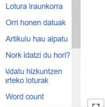
Will the Zebra #9 solve the obvious error of the sidebar's overflow scroll? This is pretty ugly now.

irudia.png (719×1 px, 484 KB)

Also, some of the items in the Tools menu are not tools at all, like the sister project links.

alexhollender_WMF renamed this task from Discussion: background color of new modern Vector skin to Discussion: differentiation of interface elements/regions in Vector 2022.Feb 20 2023, 2:14 PM
alexhollender_WMF updated the task description. (Show Details)

I'm curious if there is a way to make a gadget or userscript so folks (ok, really I just want this) could test the change to Vector 2022 before making any broad changes to the skin? While I think the demo pages are great, one would be able to use this while editing to see how it shakes out.

great idea. I've just written some CSS that I think does a decently good job of communicating each option. maybe someone else wants to take it a step further in terms of making it easier for people to switch one or the other on? I will be trying out each option for a few days and encourage others to do the same : )


Blue Whale

#vector-toc, #vector-page-tools-pinned-container {
    background-color: #f8f8f8;
    border-radius: 4px;
}

.client-js.vector-sticky-header-enabled .vector-toc-pinned #vector-toc-pinned-container {
	top: 4.125rem !important;
}

.vector-pinnable-header { padding-top: 5px !important; }

.vector-feature-page-tools-enabled.vector-feature-main-menu-pinned-disabled .vector-toc-pinned #vector-toc-pinned-container {
    margin-top: 2.8em;
}

.vector-column-end .vector-page-tools-landmark {
    margin-top: 2.3em;
}

.vector-feature-page-tools-enabled #vector-toc-pinned-container .vector-toc {
    padding-left: 30px;
}

.mw-page-container-inner, 
.vector-feature-page-tools-enabled .mw-header, 
.vector-feature-page-tools-pinned-enabled.vector-feature-page-tools-enabled .mw-body {
    column-gap: 46px;
}

#vector-page-tools-pinned-container .vector-page-tools {
    width: 160px;
}

#vector-toc::after, 
#vector-page-tools::after {
    background: none !important;
}

.vector-sticky-header {
    max-width: none;
}


Zebra #9

.mw-page-container { 
    background-color: #f8f9fa; 
    max-width: 108.75em;
}

.vector-sticky-header { max-width: none; }
.mw-header { padding-bottom: 0; }
.vector-toc { background-color: transparent; }
.vector-toc::after { background: initial !important; }

.vector-page-titlebar, 
.vector-page-toolbar, 
#bodyContent { 
    background: #fff;
    padding: 0 40px;
    width: 90%;
    border: 1px solid #ececec;
    border-bottom: none;
    border-top: none;
}

.vector-page-titlebar { 
    padding-top: 30px;
    border-radius: 4px;
    position: relative;
    box-shadow: none;
    border: 1px solid #ececec;
    border-bottom: none;
}
.vector-page-titlebar::after { 
    width: 93%;
    height: 1px;
    border-bottom: 1px solid #a2a9b1;
    content: '';
    display: block;
    position: absolute;
    bottom: 0;
    left: 40px;
}

.vector-feature-page-tools-enabled .mw-body { 
    display: grid;
    grid-template: min-content min-content min-content 1fr / minmax(0,67em) min-content;
    grid-template-areas:
        'titlebar-cx .'
        'titlebar columnEnd'
        'toolbar columnEnd'
        'content columnEnd';
}

.vector-feature-page-tools-pinned-enabled.vector-feature-page-tools-enabled .mw-body {
    column-gap: 16px;
}

.vector-feature-page-tools-enabled.vector-feature-main-menu-pinned-disabled .vector-toc-pinned #vector-toc-pinned-container {
    margin-top: 1.5em;
}

{F36864028}

Thanks @alexhollender_WMF, the result is good. I would go even darker, but I think that this is not a topic now.

Still, the right menu overflow bar is killing me.

irudia.png (696×1 px, 339 KB)

Steps to replicate the issue (include links if applicable):

What happens?:

  • Tools menu background color is white

image.png (1×2 px, 1 MB)

What should have happened instead?:

  • Tools menu background color should be gray, matching the left menu. I believe this to be more intuitive. Content/main area should be one color, and all menus another uniform color.
alexhollender_WMF renamed this task from Discussion: differentiation of interface elements/regions in Vector 2022 to Discussion: differentiation/separation of interface elements/regions in Vector 2022.Feb 21 2023, 3:21 PM

Added Zebra style to Stylus for easier installation:
https://userstyles.world/style/8689/wikipedia-v22-zebra-colors

I've added top background and fixed problems when width is less then 1000px. There are even more hacks then in Alex's version 😉, but I assume the structure will be different later. I mean currently right sidebar is part of body, and left side is not. Would be easier if body would be better separated from both.

I'd like to add my voice to the choir: zebra 9 is much calmer and easier to read than the white background, or having only the menus framed in grey. I personally prefer the version where the top is the same colour. I don't think the TOC will be used less.

great idea. I've just written some CSS that I think does a decently good job of communicating each option. maybe someone else wants to take it a step further in terms of making it easier for people to switch one or the other on? I will be trying out each option for a few days and encourage others to do the same : )

Tried this on for a bit. I do want to emphasise that any future option with background should not remove additional space from the page content area. The page margins are currently too big as it is.

@ovasileva according to Alex we're still discussing this so there is nothing actionable right now. Let's talk about this tomorrow and create tickets if there's anything we can do to make progress on this ticket.

Moving back into sprint board, but marking that it's a design-only task for now until we settle on a solution

ovasileva renamed this task from Discussion: differentiation/separation of interface elements/regions in Vector 2022 to [Design] Discussion: differentiation/separation of interface elements/regions in Vector 2022.Feb 24 2023, 5:02 PM

Coming back to offer a bit more feedback. The version of https://di-content-separation.web.app that is live right now, 3/3/2023 5:30pm EST, looks really good. The white background for the header is ok, though I kinda liked it being a darker shade. I would use this in Zebra #9 mode, with header background, with borders, and with framed menus.

I have one more bit of feedback then:

Vector 2022 puts a lot behind "The TOC and pinned Tools scroll with you, and this increases engagement of those."

I would like to suggest the header should also scroll/float with you. Not as an editor, but as a reader, when I finish an article, one of three things are going to happen: I close the tab entirely, I click to a wikilink (of which I may have already opened several in new tabs), or I use Search to go somewhere new. As the header is not sticky like the TOC, that means I have to scroll ALL THE WAY back up in order to perform a search.

I would like to suggest the header should also scroll/float with you. Not as an editor, but as a reader, when I finish an article, one of three things are going to happen: I close the tab entirely, I click to a wikilink (of which I may have already opened several in new tabs), or I use Search to go somewhere new. As the header is not sticky like the TOC, that means I have to scroll ALL THE WAY back up in order to perform a search.

The header does also float in current V22.

image.png (301×1 px, 198 KB)

I also agree about {F36890893}, if that's what you're seeing for the current mock. I personally prefer the white header here, but the rest is good for me.

I've since been informed since that the header floats for logged in users, but not for *logged out* users, and the prototype page is a logged out view. So I'm good there.

I've since been informed since that the header floats for logged in users, but not for *logged out* users, and the prototype page is a logged out view. So I'm good there.

@Ferret - if you want to check out what it looks like for logged-in users, select "log in" in the prototype and that should allow you to see the logged-in view

The problem with the prototype is that the right menu does not behave as we see here. It is narrower because the wide-option selector takes a full column in the right, instead of floating or taking a row in the bottom.

irudia.png (250×245 px, 16 KB)

Also notice, please, that Sitenotice and Centralnotice should be full-width, and this is not reflected in the proposal sections.

T312749

I, personally (not speaking for WMDE), would love to praise the direction the current Zebra #9 (Moss) prototype is heading. The thin borders make a huge difference for me.

Unfortunately the problem I have with the designs that don't have borders is hard to explain, and impossible to show on a screenshot. The problem is that the two background colors currently used in the skin have an virtually non-existing contrast ratio of 1.18:1. When I, for example, stick the main menu to the sidebar it's shown in a rectangle with this dim background shade. The rectangle is almost invisible, especially on cheaper monitors when the angle I look at the monitor is not perfectly 90°. Still something is there, shimmering in the background, almost as if it's out of focus. My eyes try to focus, but physically can't. I find it really hard to look at.

Additionally the dim rectangle with no border creates the impression that something wasn't successfully loaded. Like it's a placeholder, or parts of the CSS are missing, or I'm using an old browser that doesn't support certain CSS3 features. It feels weird.

A thin border or box-shadow always solves this. Phabricator here, for example, does this very well.

I hope this helps.

ovasileva claimed this task.

Resolving this task which covers the initial conversations. Discussion can continue in T331320: [SPIKE] Evaluate development of Zebra #9 prototype