Page MenuHomePhabricator

Style the page tools and main menu dropdown feature
Closed, ResolvedPublic5 Estimated Story Points

Authored By
Jdlrobson
Dec 10 2022, 12:01 AM
Referenced Files
F36825224: image.png
Feb 14 2023, 1:10 PM
F36823521: image.png
Feb 13 2023, 3:25 PM
F36823519: image.png
Feb 13 2023, 3:25 PM
F36823506: image.png
Feb 13 2023, 3:25 PM
F36823504: image.png
Feb 13 2023, 3:25 PM
F36822976: TOC-screen shot.png
Feb 13 2023, 3:57 AM
F36780601: image.png
Feb 6 2023, 7:52 PM
F36780598: image.png
Feb 6 2023, 7:52 PM

Description

Blockers: T317900

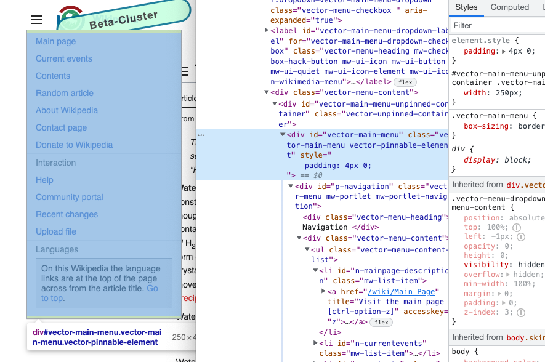
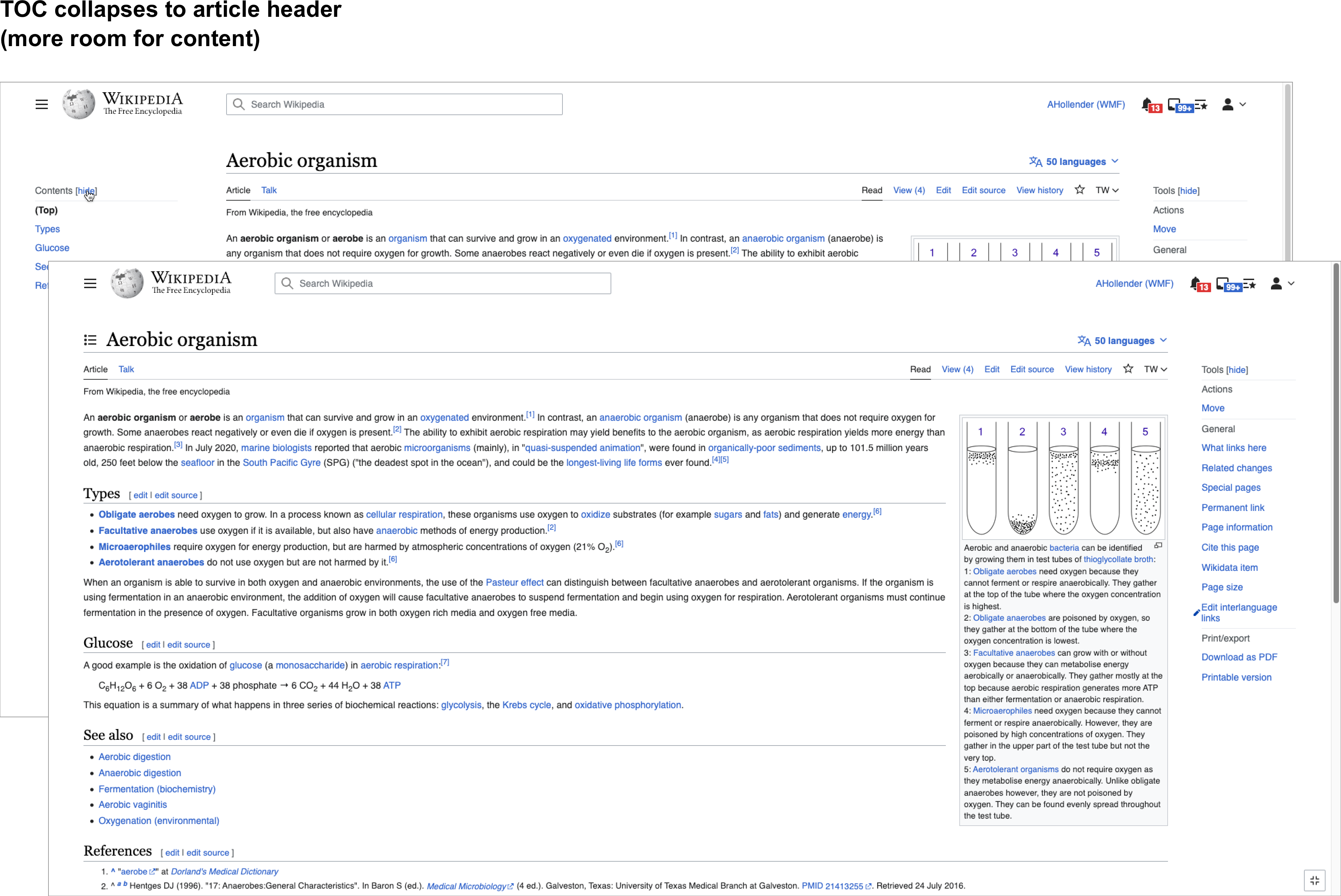
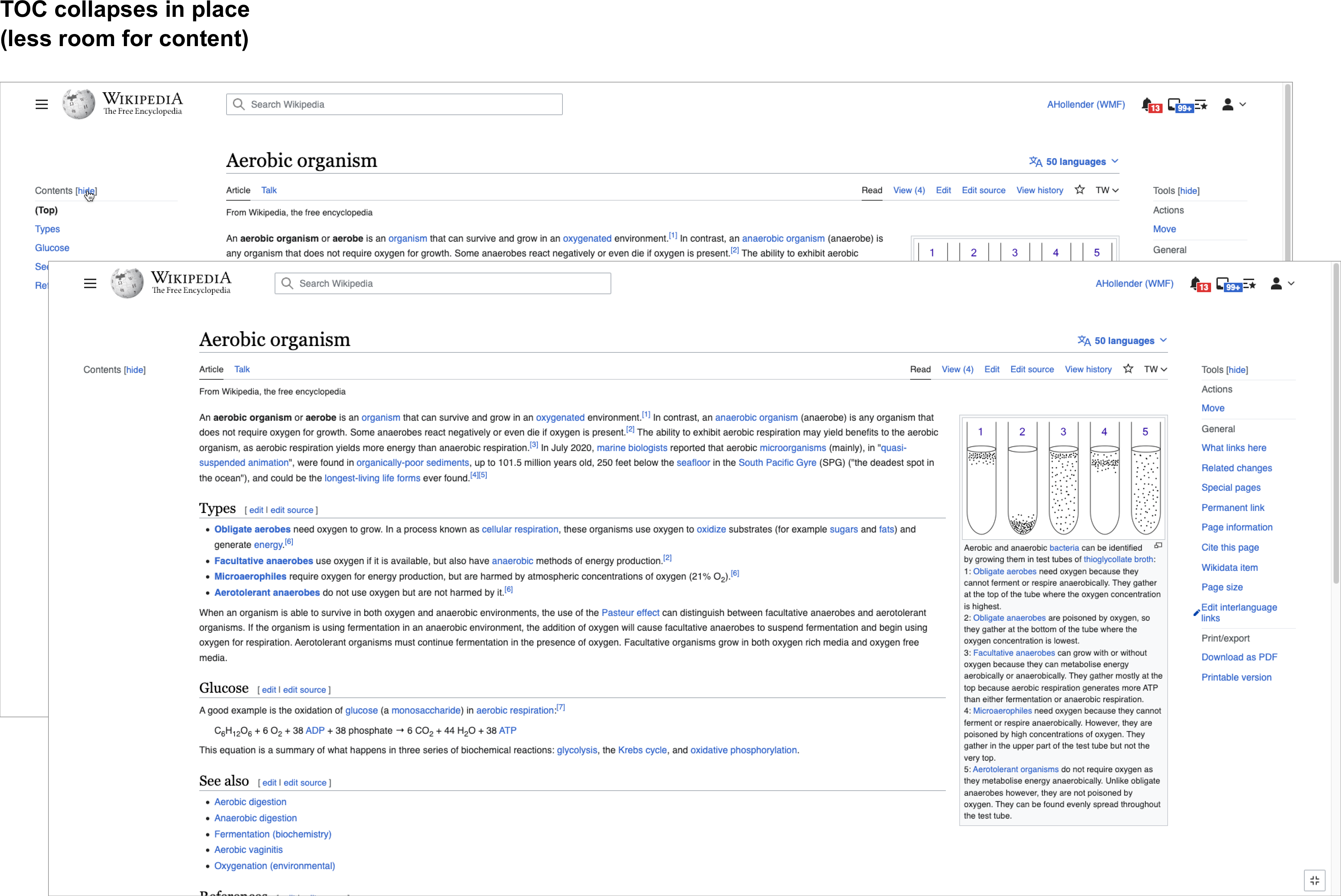
While working on making the main menu a dropdown in T317899, and generalizing the pinning functionality in T322051 many technical changes were made that impacted styles.

We decided to descope styling in those tasks to focus on the basis that any styles written at the time would likely be broken by future changes.

Once the main menu is made pinnable (in T317900) and much of the related componentization work in T320927 has been completed the HTML markup should be relatively stable meaning it's a good time to style the feature.

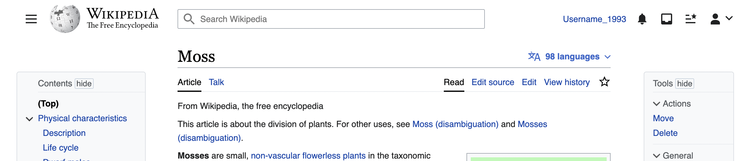
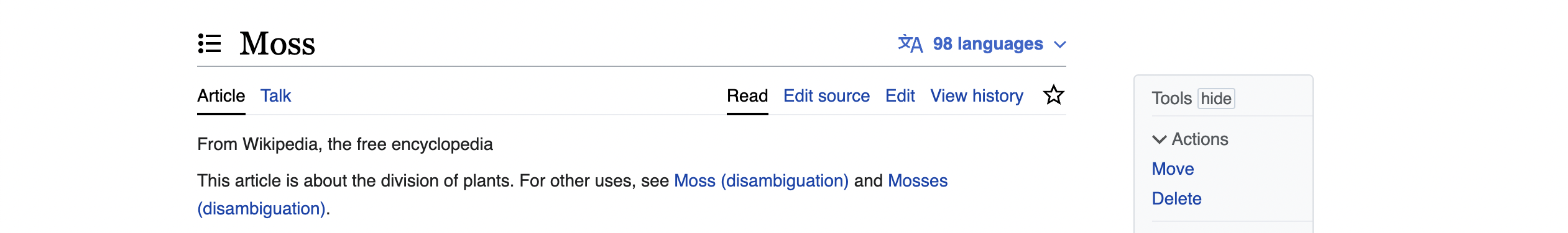
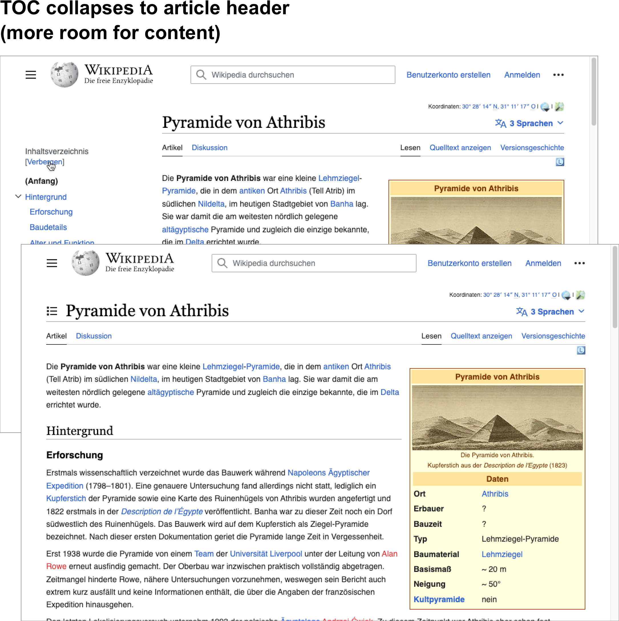
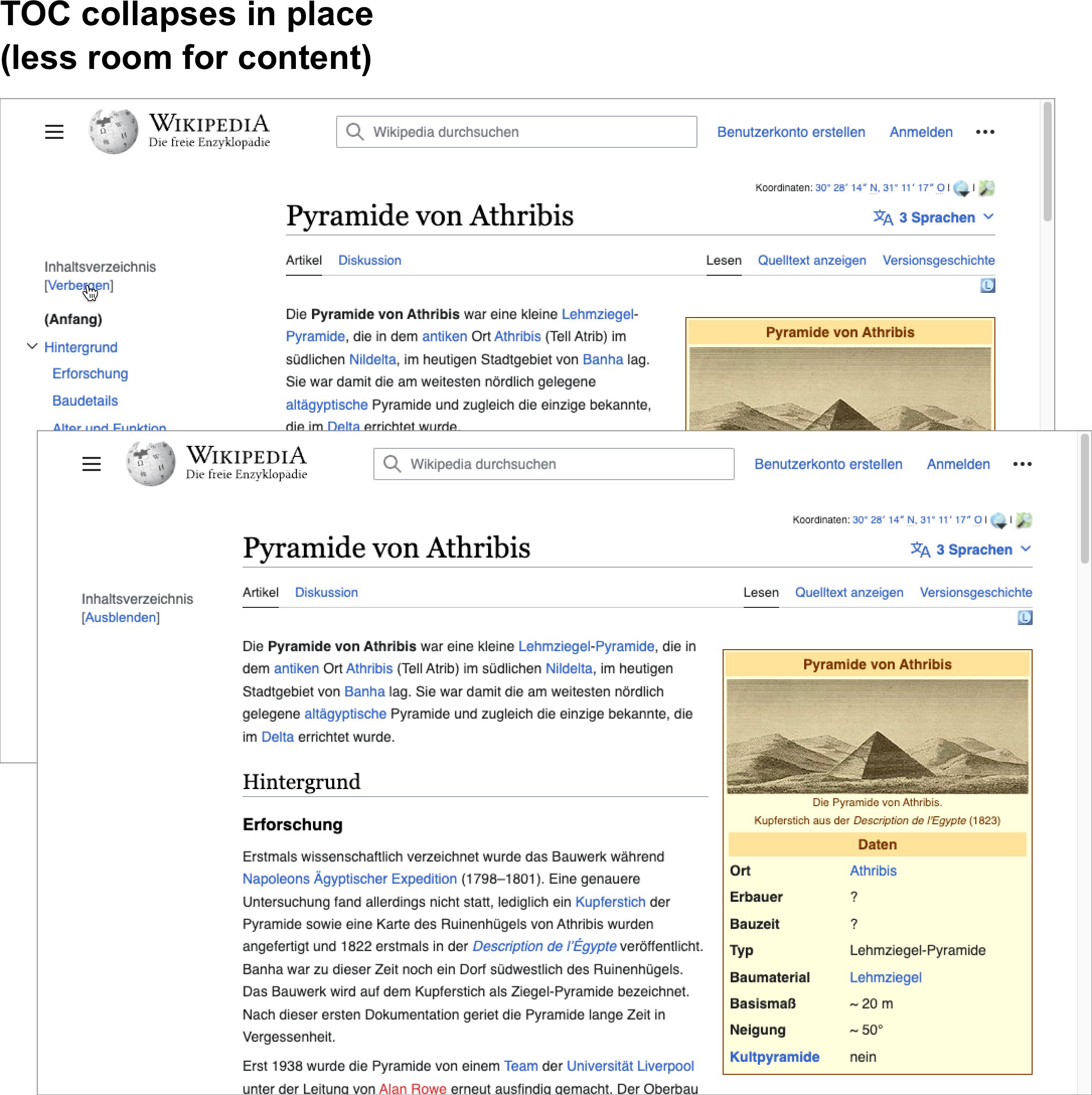
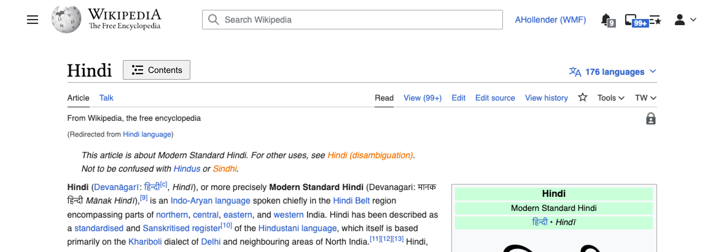
Mock:https://vector-2022.web.app/Moss

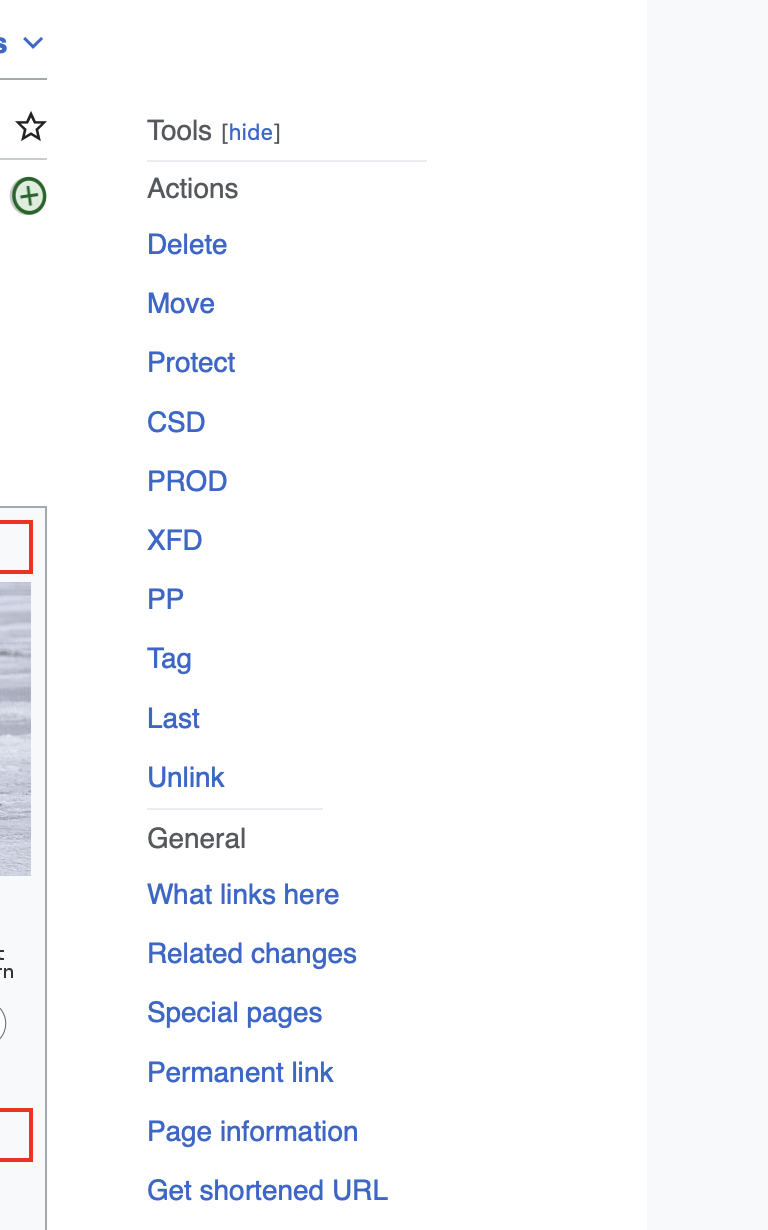
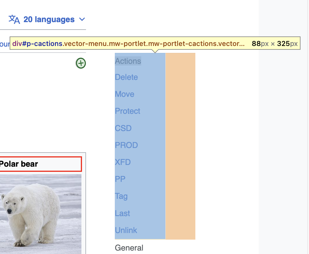
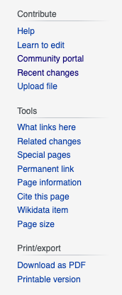
many of the styles relating to the main menu and page tools got broken as

TODO

  • Read the[[ https://wikimedia.slack.com/archives/G8QAPHCTT/p1669932811551019 | Alex thread ]]on Slack on 1st December 2.13pm for recent design guidance
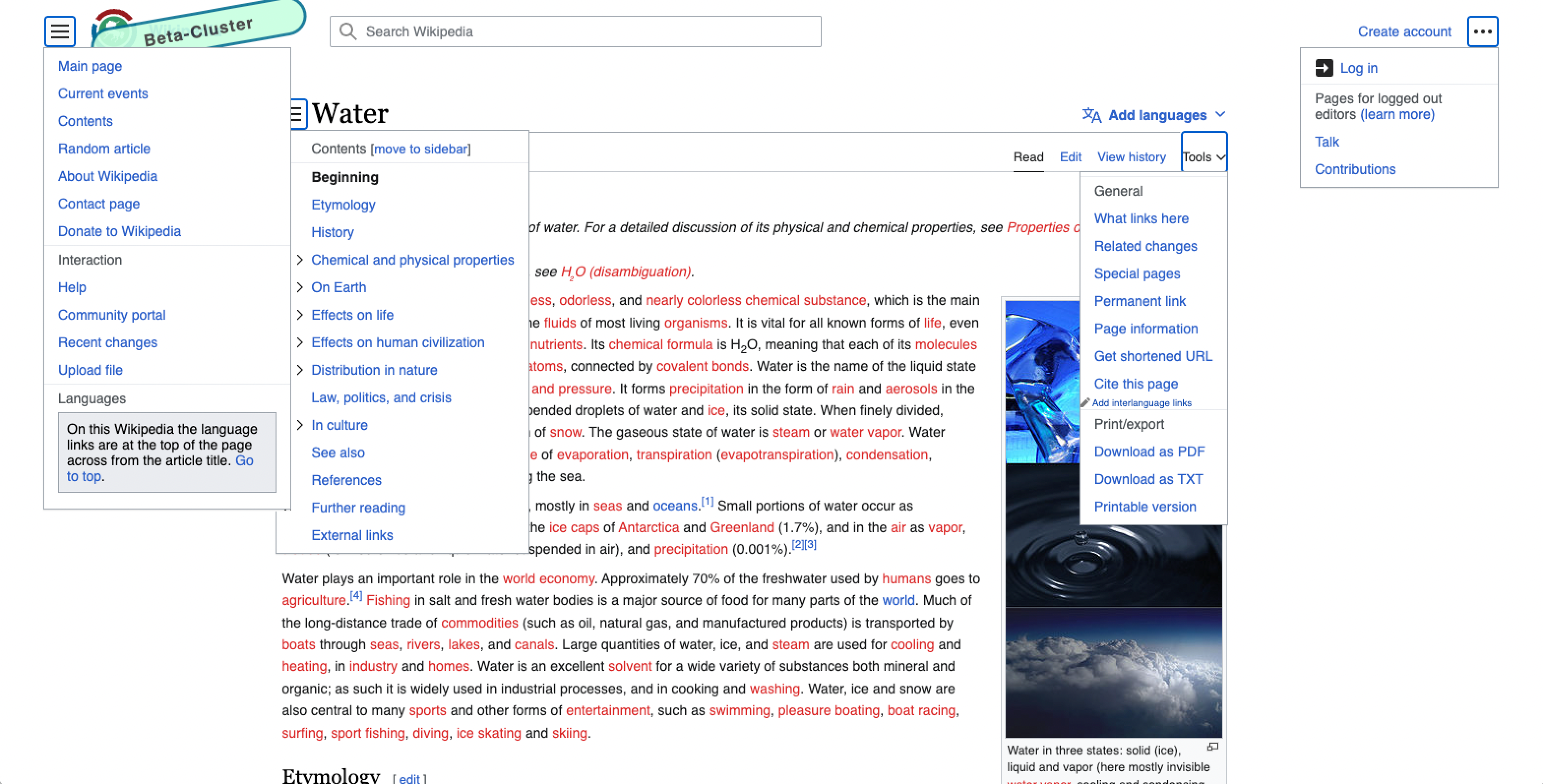
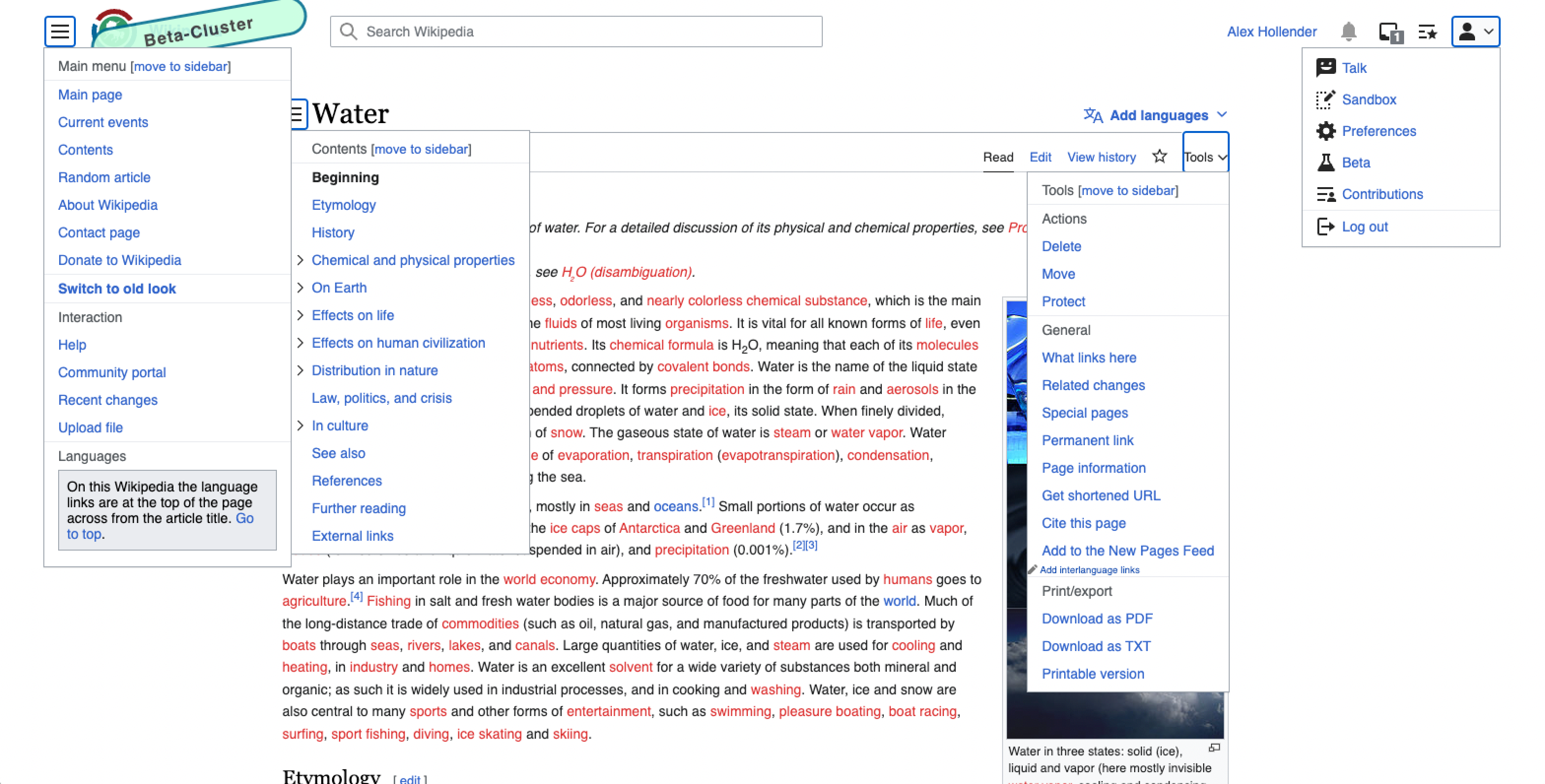
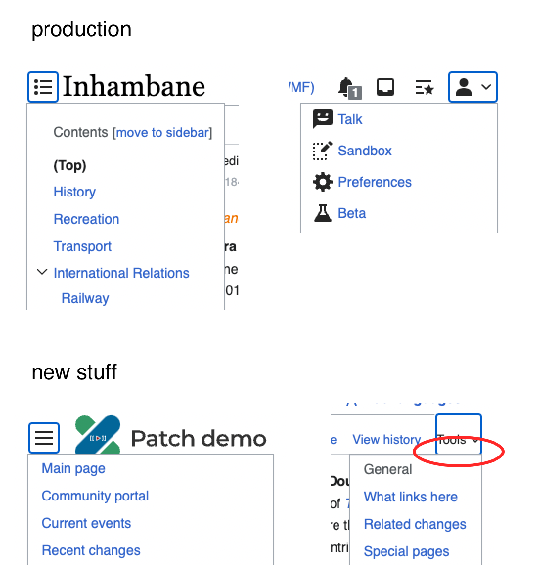
  • Implement the styles. Alex said it's okay to revise the design if it makes sense to add consistency between any of the menus (for example sidebar should change appearance with the changes here)
  • Do a design review with Alex and get sign off

QA

This can skip QA if Alex is happy with the feature.
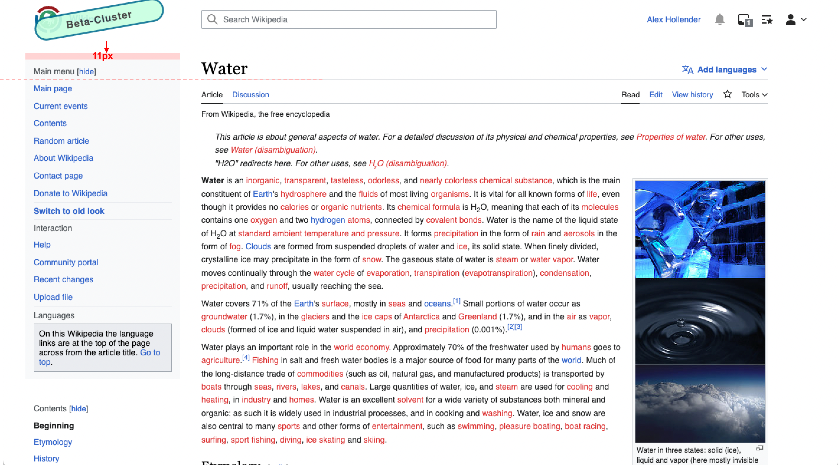
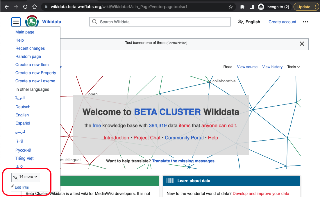
Related Objects

Event Timeline

There are a very large number of changes, so older changes are hidden. Show Older Changes

@bwang @nray super small thing: the page tools menu seems to be a pixel or two closer to it's button/trigger than other menus. notice how you can see the blue border/outline on the bottom of the other buttons, but not on the bottom of the Tools button:

image.png (1×1 px, 180 KB)

Main menu

  1. when pinned, main menu should automatically collapse at 1000px (currently it doesn't)
  2. below 1000px it should not have "move to sidebar" button
    Screen Shot 2023-01-04 at 3.58.44 PM.png (286×721 px, 119 KB)

Page tools

  1. when pinned, below 1000px it's in a weird position (should either be in the right column, or collapsed)
    image.png (1×1 px, 285 KB)
    1. if we're doing collapsed for now, the "move to sidebar" button should not be available below 1000px
      Screen Shot 2023-01-04 at 3.50.00 PM.png (443×750 px, 235 KB)

@alexhollender_WMF FYI i think these should be handled in T326364, ill update that task to make sure thats reflected

Change 877239 had a related patch set uploaded (by Bernard Wang; author: Bernard Wang):

[mediawiki/skins/Vector@master] Fix alignment/spacing of grid column items

https://gerrit.wikimedia.org/r/877239

note from standup, we should re-review this stuff once it's on beta cluster, specifically to make sure we check:

  • "In other projects" section
  • "Add interlanguage links" link

Change 877255 had a related patch set uploaded (by Bernard Wang; author: Bernard Wang):

[mediawiki/skins/Vector@master] Fix TOC scrollable indicator

https://gerrit.wikimedia.org/r/877255

An update from chatting with @alexhollender_WMF about text wrapping in the page tools and main menu dropdown menus. Currently Vector doesnt wrap text in dropdowns by default, and we need either a max width or a width for text to wrap. Alex said dropdown menus in general should have text wrap, and so rather than continue to override styles for each dropdown in a case by case basis, we decided it would be simpler to add a default max-width of 200px to all modern Vector dropdown menus (with the exception of the TOC dropdown menu T316056)

This change will be applied under the page tools flag, and will be revisited in T316055

Change 876252 merged by jenkins-bot:

[mediawiki/skins/Vector@master] Page tools styling followup

https://gerrit.wikimedia.org/r/876252

Change 876253 merged by jenkins-bot:

[mediawiki/skins/Vector@master] Fix alignment of searchbar by introducing CSS grid to the header on viewports greater than desktop-wide

https://gerrit.wikimedia.org/r/876253

Change 877239 merged by jenkins-bot:

[mediawiki/skins/Vector@master] Fix alignment/spacing of grid column items

https://gerrit.wikimedia.org/r/877239

Change 878143 had a related patch set uploaded (by Bernard Wang; author: Bernard Wang):

[mediawiki/skins/Vector@master] Add default width and max width to dropdowns in modern Vector, preserve existing styles for legacy Vector

https://gerrit.wikimedia.org/r/878143

Change 878143 had a related patch set uploaded (by Bernard Wang; author: Bernard Wang):

[mediawiki/skins/Vector@master] Add default width and max width to dropdowns in modern Vector, preserve existing styles for legacy Vector

https://gerrit.wikimedia.org/r/878143

Change 877255 merged by jenkins-bot:

[mediawiki/skins/Vector@master] Fix TOC scrollable indicator

https://gerrit.wikimedia.org/r/877255

Test wiki on Patch demo by BWang (WMF) using patch(es) linked to this task was deleted:

https://patchdemo.wmflabs.org/wikis/e8c72a74d5/w/

two additional things I discussed with @bwang yesterday:

  1. Shifting the main menu down by ~11px (when pinned), so that the menu heading underline is aligned with the page title underline
    image.png (1×2 px, 1 MB)
  1. Adding 4px of padding to the top & bottom of the new dropdown menus
examplelogged-outlogged-in
image.png (1×1 px, 337 KB)
image.png (1×3 px, 1023 KB)
image.png (1×3 px, 916 KB)

Change 879614 had a related patch set uploaded (by Bernard Wang; author: Bernard Wang):

[mediawiki/skins/Vector@master] Misc page tools visual fixes

https://gerrit.wikimedia.org/r/879614

Change 878143 merged by jenkins-bot:

[mediawiki/skins/Vector@master] Add default width and max width to dropdowns in modern Vector, preserve existing styles for legacy Vector

https://gerrit.wikimedia.org/r/878143

bwang moved this task from Code Review to QA on the Web-Team FY2022-23 Q3 Sprint 1 board.

Change 879614 merged by jenkins-bot:

[mediawiki/skins/Vector@master] Misc page tools visual fixes

https://gerrit.wikimedia.org/r/879614

@ovasileva looks like we still don't have tooltips on a few things, and this hasn't been fixed:

@bwang @nray super small thing: the page tools menu seems to be a pixel or two closer to it's button/trigger than other menus. notice how you can see the blue border/outline on the bottom of the other buttons, but not on the bottom of the Tools button:

image.png (1×1 px, 180 KB)

I'm fine handling that stuff in separate tasks if you prefer.

Jdlrobson renamed this task from [L] Style the page tools and main menu dropdown feature to Style the page tools and main menu dropdown feature.Jan 17 2023, 5:51 PM
Jdlrobson changed the point value for this task from 1 to 5.

Can we get just a tad more separation between the menu levels ?
I feel this is just still awfully close, even with the line in between.

Screenshot 2023-01-19 at 17.20.28.png (1×768 px, 110 KB)

I don't know it feels too clumped together still and I have trouble identifying the separate areas. There is no 'mental break' here for my brain.

https://en.wikipedia.beta.wmflabs.org/wiki/Polar_bear

Oh and there seems to be a margin-right on the actions menu when it is positioned in the sidebar which doesn't make entirely sense to me. Its not present for the other tools sections, so I suspect it is needed in certain layout views, but not in this sidebar.

Screenshot 2023-01-19 at 17.27.59.png (884×1 px, 232 KB)

Can we get just a tad more separation between the menu levels ?
I feel this is just still awfully close, even with the line in between.

ya good call. I was trying to keep the spacing pretty tight but I guess even in Legacy Vector there is additional space between the groups.

Screen Shot 2023-01-19 at 12.46.19 PM.png (417×172 px, 25 KB)

One more comment. How about duplicating the line at the bottom of Tools at the top. That way it lines up better with the title area of the main content block ?
I feel this makes it a tad visually more consistent and is easier on the eyes for that reason ?

Screenshot 2023-01-19 at 22.55.59.png (1×2 px, 499 KB)

Right now, there are a lot of different indentations and offsets when you play with the sidebar elements both left and right. Doing this on the right at least seems to pull the main and the right part a little bit more together. It also gives you some sort of visual hint that they 'belong' together, even though they are not the same.

@alexhollender_WMF, I found the issue below. Let me know if this is expected. Also, let me know if you want me to do any QA on this or if you have already verified it with your much keener eyes. This happens anon and logged in. I did make sure the compact language list was selected in preferences.

Screenshot 2023-01-22 at 6.58.12 PM.png (677×1 px, 184 KB)

Ah, good catch. I think that language section should only be appearing within the main menu on the Main page of Wikidata, Commons, and any other single-language projects. I will create a separate task for styling and reviewing that.

Can we get just a tad more separation between the menu levels ?
I feel this is just still awfully close, even with the line in between.

Screenshot 2023-01-19 at 17.20.28.png (1×768 px, 110 KB)

I don't know it feels too clumped together still and I have trouble identifying the separate areas. There is no 'mental break' here for my brain.

I think the best way to resolve this problem is to put less vertical padding between the list items, leaving the wide padding above each list heading. These items are much too far apart. Compare Vector 2010.

I added the following css rules to my user profile:

.vector-feature-page-tools-enabled .vector-column-end .vector-pinnable-element > *:not(:last-child) {
    margin-top: .5em;
    padding-bottom: .5em;
}

.vector-feature-page-tools-enabled .vector-column-end .vector-pinnable-element > *:first-child {
    border-top: 1px solid #eaecf0;
    margin-top: 0;
}
.vector-feature-page-tools-enabled .vector-column-end .vector-pinnable-element > *:last-child {
    margin-top: .5em;
}

Those lines are probably not entirely optimal for a patch, but it looks nicer to me. See:

Screenshot 2023-01-25 at 16.16.25.png (1×808 px, 163 KB)

I added the following css rules to my user profile:

yup, that definitely looks better. I was trying to have consistent styling between the TOC, main menu, page tools, and personal tools, since they are all similar in many ways. thinking at this point it's okay to special-case the TOC (because I think that's one case where we want more line-height between the elements). I will create a separate task for that change.

Jdlrobson moved this task from QA in Production to QA on the Web-Team FY2022-23 Q3 Sprint 1 board.
Jdlrobson moved this task from QA to QA in Production on the Web-Team FY2022-23 Q3 Sprint 1 board.

This can now be QAed / design reviewed in production.

@TheDJ @Jonesey95 @Sj - we have a new prototype (https://di-content-separation.web.app/Moss) that explores the following changes:

  • the line-height of the menus (main menu, toc, page tools menu) has been decreased
  • the space between the groups within the menus has been increased
  • some padding has been added to the tops and bottoms of menus
  • (additionally the menus now have gray backgrounds when they are pinned, though that's related to T259240)

If you all could take a look and let us know your thoughts that would be helpful. Thanks so much.

Thanks for the demo. It helps to see work in progress. Here's what I noticed in a quick comparison:

  • The default font sizes in this demo are much larger than en.WP in Vector. Once I hit Cmd-minus twice, things looked more equal. This is not a criticism, just something I had to do in order to compare apples to apples.
  • The vertical padding between menu items is still a bit too large. See the screen shots comparing Vector 2010 and the demo.
  • The horizontal space for the TOC and the tools menu feels very constrained. See screen shots. They need to stretch out a bit. It looks like there is redundant horizontal padding.
  • Opening the TOC submenus by default is excellent. I have used custom CSS for that in Vector 2022, but if it becomes the default, that will be great. If it could obey the toclimit class, that would of course be ideal.
  • The message above says that the TOC and page tools have a gray background, but I'm not seeing it, or it is too faint to be visible on my laptop screen. See the screen shots; I can see an obvious gray background in Vector 2010, but not in the demo.
  • Vector 2010 on en.WP showing padding:
    Vector showing font sizes and padding.png (315×1 px, 176 KB)
  • Vector 2022 demo showing padding:
    Vector 2022 showing font sizes and padding.png (329×1 px, 148 KB)

i think this is a lot better.

  • I'm good with the spacing (i think 2010 didn't have enough spacing)
  • the spacing around the titles is much better this way
  • padding looks good.
  • background and collapsing wise, I prefer the blue wale design, but this isn't bad either, and i think that for some the contrast will be better.
  • Especially not sure about the rounded corners of that background. We don't have rounded corners anywhere in our designs do we ?

or it is too faint to be visible on my laptop screen

Thats crazy, its only like 1 tone lighter than what used to be Vector 2010.....

Just for the experience, try checking it on your mobile. All mobile phones have better screens than most of the laptops out there. There is a reason why I always tell people with accessibility problems to buy a proper monitor, and it will be the best money they can spend to improve any of their online experiences. Better a 3 year old second hand mid or top tier model than anything new and budget. All these sub 350 dollar laptops especially should be forbidden. They get in the way of the experience of the consumers, are headache inducing, plain inaccessible and its crazy that vendors have been getting away with putting such cheap screens in them for over 10 years now.

Rant acknowledged, TheDJ. I'm just a regular middle-aged person with no known disabilities and a somewhat old Macbook Pro, and I can't see the difference in background color. There are millions of readers out there with worse computers than mine (this one cost $2000+ new). If the developers wanted to show me a background color, it didn't work, and it won't work for those millions. The Vector 2010 sidebar background color works well on my computer.

I went back to the demo page and saw some noticeable improvements. The TOC and page tools sidebars have boxes around them now, which is pretty nice. I agree with TheDJ that the rounded corners do not look consistent with Wikipedia at all. Square those things off.

I also noticed that the TOC extended vertically off of the bottom of my screen when I was all the way at the top of the page (the page was "John Dalton"), but that it took up just the right amount of vertical space when I started scrolling and the sticky header appeared. Should it maybe be constrained even when the top header bar is visible?

And then when I opened up my Inspector, the TOC shrank to fit the reduced vertical space. Very nice!

The page tools sidebar does not magically adapt to the window size, however, which means that if I want to see an item in that page tools sidebar below the bottom of my screen, I need to scroll all the way to the bottom of the page. And this demo server doesn't even have my personal tools loaded. I imagine that this is fixable by approximately matching its behavior to the TOC sidebar.

Cosmetic: There is some weird white space around the edges of the TOC contents and scroll bar. I circled the weirdness in the attached screen shot.

Screen Shot 2023-02-02 at 14.30.23 .png (602×1 px, 355 KB)

I think this design does a good job of addressing many editors' long-standing concerns about the TOC and page tools sidebars. Keep it up!

I can adjust the excessive padding around CSS blocks with personal CSS, so don't let that slow you down.

Moss is looking excellent! Thanks for this update, @ovasileva and all. The font size, line height, inter-section spacing, and background color/border all improve readability for me.

In particular, when the page-tools menu and TOC are showing, but the main menu is hidden, this looks exceedingly clean (even if one played around with which menu goes where) :

Screen Shot 2023-02-04 at 13.52.25.png (526×2 px, 489 KB)

Other menu-style issues that may fit here (lmk if there's a better place for some of this)

Major alignment issues:

  • The body jumps about.
    • If it stays aligned with the search bar, the side menus can pop in and out. If the window is too narrow for this, then sidebars are already turned off.
  • The logo moves back and forth.
    • The Main menu icon, when hidden, can instead be on the same line as the TOC icon. (just below the logo; or both on the same line as the Tools menu)
  • Main and TOC icons are far from the link to collapse them.
    • As with other most hide/show options, put them both in the same place. E.g., "Main menu (show)" could always be on the line with the title, and "Contents (show)" could always be on the line with the "Tools" menu, unless Main is already expanded.
    • If menus scroll down the page with the reader, the line for expanding them again should sit at the same height. e.g. "Main (show)" / "Contents (show)" / "Tools (show)" should also float down the page with the reader. As they're already down to short single words, you could still choose to expand the body text when those are all collapsed.

Minor main menu styles:

  • "Language links have been moved" almost hits the right border, needs less right-padding. That message can be shorter, like " Languages /n Moved to top of page (文A) "
  • The v-padding b/t main menu and toc could be reduced -- total gap b/t the bottom text in one menu and the top text in the next could be the same as the gap b/t the Title and search-bar.

Menu icons and their placement:

  • Tools becomes a word; TOC and Main become burgers. These should be consistent. (Main and Tools menus in particular!)
  • Tools gets a caret. This is good, familiar, translates well. TOC and Main don't get one. This is confusing (the other burger icon w/ no caret takes you to its own Watchlist page)
  • When all are hidden, we have two opaque logos and one clear text-link, on different vertical lines, for menus that expand to all start at roughly the same line.
    • Explore options w/ more consistency: all icon or text; all w/ a caret; all collapse where they expand, or all collapse to icons in the same line. (w/ other edit/tools links? more horizontal space can be freed up there)
  • When the Main burger icon shifts the logo right, it can overlap with the left edge of the search bar. The icon also adds extra padding: it is l-aligned with menu text, rather than w/ the left border of the menu. And the space b/t it and the logo is greater than that b/t the TOC icon and the title.

Screen Shot 2023-02-04 at 14.40.44.png (126×564 px, 50 KB)

Horizontal-padding and center styling:

  • The body dances about to three locations: L-aligned under search bar (Main or TOC open), Almost-centered on page (no menus open), or Almost mid-aligned under logo (only Tools open)
    • simpler to keep a fixed alignment. aligned to the search bar makes visual sense to me, leaves room for one or both sidebars to drop in w/o redrawing everything.
  • When only the Tools menu is open, its width is too narrow [as though the main menu were also open]:

Screen Shot 2023-02-04 at 14.56.07.png (376×2 px, 312 KB)

thanks @TheDJ @Jonesey95 & @Sj for all of this feedback, and for your continued, deep engagement with this work. I'm glad to hear that everyone thinks things are moving in the right direction.

  • background and collapsing wise, I prefer the blue wale design, but this isn't bad either, and i think that for some the contrast will be better.

@TheDJ can you explain what you prefer about blue whale?

I also noticed that the TOC extended vertically off of the bottom of my screen when I was all the way at the top of the page (the page was "John Dalton"), but that it took up just the right amount of vertical space when I started scrolling and the sticky header appeared. Should it maybe be constrained even when the top header bar is visible?
The page tools sidebar does not magically adapt to the window size, however, which means that if I want to see an item in that page tools sidebar below the bottom of my screen, I need to scroll all the way to the bottom of the page. And this demo server doesn't even have my personal tools loaded. I imagine that this is fixable by approximately matching its behavior to the TOC sidebar.

@Jonesey95 we're working through that specific issue in T318169 and T319315. Check out the second task, it explains the challenge with determining the optimal max-height for the TOC. Basically because the distance from the top of the window to the top of the TOC changes when you scroll, I think we have to pick one of those cases to optimize for.

In T324877#8587443, @Sj wrote:
  • The body jumps about.

@Sj I think there are currently three reasons why the layout might shift unexpectedly:

  1. You navigate from a page with a TOC to a page without a TOC
    • I think this will be helped (if not resolved entirely) by T318186
  2. You collapse the TOC
    • My current assumption (which we should check with data) is that if you choose to collapse the TOC you will keep it collapsed for the rest of your session. In other words, hopefully this shift would only happen once per-session. We could avoid it, as you mentioned, by reserving the space for the TOC. I've tried to illustrate the reason why we currently don't reserve the space for the TOC when it's not there with these two images:
space reserved for TOC (less room for content)centered content (more room for content)
image.png (1×2 px, 530 KB)
image.png (1×2 px, 597 KB)
In T324877#8587443, @Sj wrote:
  • The logo moves back and forth.
  • Main and TOC icons are far from the link to collapse them.

I think it's worth keeping in mind that these shifts will likely be infrequent. In a past prototype we left a disabled version of the menu icon in place so the logo didn't move, but several community members said that was confusing, and that they would prefer if it wasn't there when the menu was pinned. Because of the length of the Contents [hide] label (which varies based on language, e.g. German: Inhaltsverzeichnis [Verbergen]) I don't think it's a good idea to leave it in place when it's collapsed. It would take up space that people on smaller screens might be trying to re-capture for the content by hiding the TOC, and would result in an imbalanced layout. I agree that when these types of collapsible elements are inline, it makes complete sense for them to remain in the same place when they are hidden, but this case is different because we're dealing with sidebars, and we are assuming part of the reason people are collapsing things is to get space back. We're also going to be working on T311160 soon, which should help people understand where things have moved to.

In T324877#8587443, @Sj wrote:
  • Tools becomes a word; TOC and Main become burgers. These should be consistent. (Main and Tools menus in particular!)

Because of the variable lengths of the words Main menu and Contents, I don't think it would be a good idea to use labels for them in their collapsed state. On the other hand, Tools appears in the page toolbar, along with other elements that have text labels (aside from the watch star). I've considered using an icon for the collapsed version of tools to make it consistent, though I'm not sure if that's a good tradeoff to make.

In T324877#8587443, @Sj wrote:
  • Tools gets a caret. This is good, familiar, translates well. TOC and Main don't get one. This is confusing (the other burger icon w/ no caret takes you to its own Watchlist page)

Yea, the use of the icon is super contextual here, maybe to a fault. I don't think I've seen a hamburger icon with one before, and I think it's clear that it's a menu. The tools menu and language menu have one because they're near a bunch of similar looking elements that are links, not menus, so it's aiming to clarify. The user icon/personal tools menu is weird — I'd say we should consolidate alerts and notices, and add a there, to distinguish those as dropdown menus from the watchlist icon. Agreed that the watchlist icon and table of contents icon could be improved, open to suggestions : )

I'm going to resolve this task now because the original work has been completed, and our team is doing some board cleanup. I will of course continue to work on improvements relating to all of the above feedback. Where possible please direct further comments to the more specific, open tasks that I've linked to. Or to create a new task if there isn't one that corresponds with a given topic.

We can also still continue to use this task if need be, no problem there.

Hello @alexhollender_WMF , thanks for all of these replies and details.
I'm not sure where else to put a reply so I'll leave this here for now:

Body dancing:

  • "we are assuming part of the reason people are collapsing things is to get space back" -- I'm confused by the philosophy here; for medium-to-wide screens, the new design makes it hard to get space back (you have to find a magic toggle). But, while stuck at fixed total space for content, the horizontal placement of the body jumps around based on what menus are open. I want everyone to get more space back, and to have consistent body placement. (For narrow screens where collapsing sidebars does expand the body width, there might be exactly two layouts to toggle between: collapsed and open sidebars. But the center of the main body should still stay the same.)
  • ''navigating from a page w/ a TOC toa page w/o" -- if you collapse a TOC on one page, navigating anywhere else will make it reappear. So this will happen a lot.
  • Main menu opening/closing -- Conversely, if you open the main menu on a page, navigating anywhere else will currently collapse it. This seems like a bug, but currently happens constantly for any reader who uses that menu.

TOC confusion

  • if someone arrives at the page with a screen 1000px wide (or less), the TOC will automatically be hidden -- This is a bug, no? If a screen is too narrow to render a sidebar TOC, it should render in the body, where it can be searched.
  • "My current assumption (which we should check with data) is if you choose to collapse the TOC you keep it collapsed for the rest of your session" -- that's not how it currently works while navigating between pages... And on a single page, I might often want to hide the TOC while reading (if I find it bold and distracting) but open it when searching for or moving to a new section.

Logo dancing

  • I can see a disabled logo being frustrating. A persistent icon or word should always be active, toggling the state of the feature it represents.
  • "''Working on T311160 soon, which should help people understand where things have moved to.''" -- This would increase my frustration, like the "your interlanguage links have moved" textbox, which is an eyesore and has remained for a month. An icon or text link that did not move would not need that sort of band-aid.

Icon selection

  • we should consolidate alerts and notices: yes please. :) possibly outside the scope of this issue.
  • Watchlist icon: should reference the Star more than the horizontal lines. Something like this?
  • TOC icon: something simple with bullets + nesting may be clearer. Maybe something like this, with 5-6 lines:
    TOC-screen shot.png (236×206 px, 35 KB)

Word width

  • This is a deep issue: a great nav is terse. Don't worry that word strings might be arbitrarily long; the interface should set sizes that editors, translators, and layout curators work with. e.g.: "Contents" / "Inhalt" for TOC, and "Menu" / "Menu" for the main menu.

@Sj apologies for the confusion, I forgot we hadn't implemented this yet: T316060: [anon prefs] TOC pinned / unpinned status should persist across page views for anonymous users. We will be working on that soon.

To try and further clarify why collapsing the TOC in place does not give as much space back:

image.png (2×2 px, 622 KB)
image.png (2×2 px, 600 KB)

Perhaps we could make it so that when your screen is wide enough, the TOC collapses in place (because the content wouldn't get any wider anyways). Though now that we've got the full-width toggle there might be people who wouldn't want the TOC to collapse in place even on wider screens, because they want that space back.

image.png (2×3 px, 856 KB)
image.png (2×3 px, 832 KB)
In T324877#8608483, @Sj wrote:

TOC confusion

  • if someone arrives at the page with a screen 1000px wide (or less), the TOC will automatically be hidden -- This is a bug. If a screen is too narrow to render a sidebar TOC, it should render in the body, where it can be searched.

This might be interesting to you T306660: [Goal] Table of contents on narrow screens in vector-2022

For the "unchanging position" vs "getting space back" tradeoff: I agree user choice [of how much space to have for the body] should be a priority. But explicitly choosing "with sidebars" or "expanded / body-focused / full-width" feels different to me than choosing which menus to pin, leading opaquely to 3 different positions for the body.

I'm thinking of what a skin-pref man page would look like. "There is a wide-body (ex image) and narrow-body (ex) mode; in wide-body menus are overlays toggled from icons at the top; in narrow-body they can be pinned to left and right columns" is clear. "There are three menus that can be opened or hidden; depending on a) the width of your screen, b) your wide-body preference, and c) which menus are closed, your layout will look like roughly one of these three (example images)" is tricky.

Re: T306660 I like the overlay of a TOC from a floating anchor. I'd say there still needs to be something that says "Contents" or "Table of contents" that is searchable for people looking for it! :) And perhaps a magic-word option for pages where the TOC is the most-read and -searched part of the page, for it to persist in the body.

@Sj I think it might make sense to wait another few weeks — once we've done T318186: [sub task] Show table of contents for pages with less than 4 sections and T316060: [anon prefs] TOC pinned / unpinned status should persist across page views for anonymous users — to re-assess questions/concerns of the layout shifting around. I think it will be happening much less frequently in general. Also I think it's reasonable that if someone collapses a sidebar the layout shifts, especially if our assumption turns out to be true that people aren't frequently expanding and collapsing the sidebars.

Re: TOC on smaller screens, maybe you're suggesting something like this?

image.png (822×2 px, 161 KB)

Due to the variable length of article titles it's difficult to place things after them, and I think it looks kinda weird to place the larger button before. Perhaps it's worth looking into showing an inline version of the TOC on smaller screens, in addition to the button next to the article title. We previously ruled out that option based on technical difficulty and performance implications.

Ok, maybe now's a good time to revisit... sorry you're no longer involved AH but I'll look at what's holding up T316060 (which is also not assigned).
Quick comment ftr:

TOC: Yes, something like that.

  • Could use the same style as the "languages" toggle: same icon-height, font-size; no border or background color; down-caret.
  • In the sticky header it could stay on the same side of the title.
  • As with "languages" it should still say "contents" until too narrow, then just the icon
  • The sticky header could remain at lower widths, reducing languages + contents to just an icon