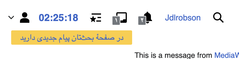
This is what I'm getting when I go to my home wiki:

Basically there is no space between the yellow bar and border, also it's below. Can it stay up? It looks weird to me.
| Ladsgroup | |
| May 5 2023, 11:14 AM |
| F41888925: Screenshot 2024-02-13 at 6.25.18 PM.png | |
| Feb 14 2024, 2:25 AM |
| F41888916: Screenshot 2024-02-13 at 6.24.31 PM.png | |
| Feb 14 2024, 2:25 AM |
| F37001146: Screenshot 2023-05-16 at 10.46.00 AM.png | |
| May 16 2023, 2:49 PM |
| F37001122: Screenshot 2023-05-16 at 10.31.26 AM.png | |
| May 16 2023, 2:37 PM |
| F37001102: Screenshot 2023-05-16 at 10.21.58 AM.png | |
| May 16 2023, 2:37 PM |
| F36990879: grafik.png | |
| May 10 2023, 9:51 AM |
| F36976714: grafik.png | |
| May 5 2023, 11:14 AM |
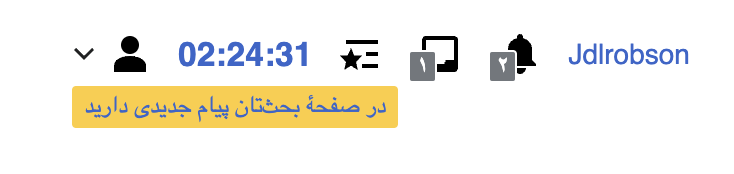
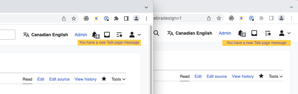
This is what I'm getting when I go to my home wiki:
Basically there is no space between the yellow bar and border, also it's below. Can it stay up? It looks weird to me.
This looks as expected. We have responsive styles that kick in to push it underneath when we believe there's a chance of no space. We have to consider the variable length of the username, so this might be more noticeable with your short username. Could you provide some more information on your display e.g. viewport size and the URL of your home wiki (don't want to assume)? It's hard to tell from your cropped screenshot.
My viewport is 1846 pixels wide.
I'm not that upset about it being below, what annoys me is that it looks smaller and most importantly there is no space between bottom of the notice and border of the toolbar. This might make it more visible:
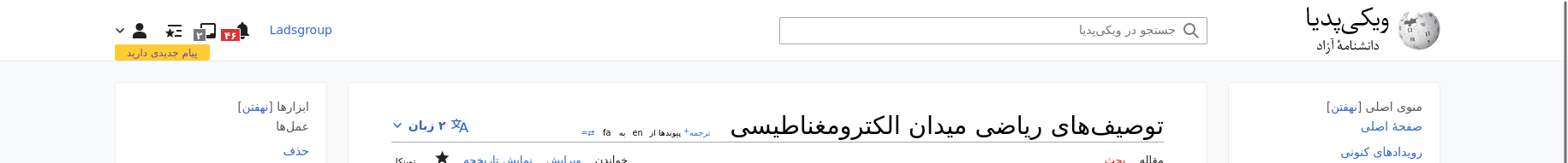
The awkwardness is due to the new gray background in Zebra. The yellow banners position has not changed, and the font-size is the same as in pre-zebra and Legacy Vector, but with the gray background, the yellow banner now sits on the bottom edge of the header:
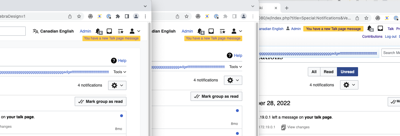
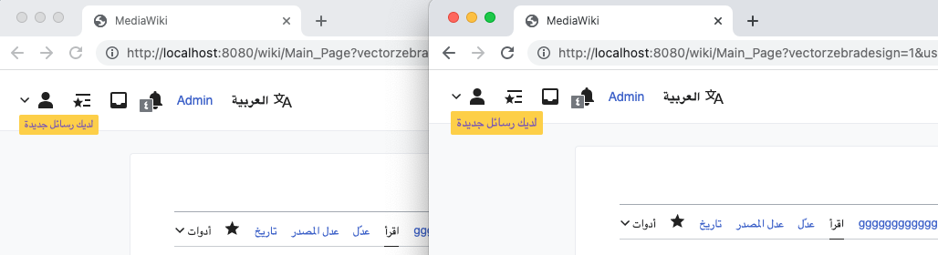
What I think we should do is reduce the padding in the Zebra header from 8px to 4px (which is something I remember Alex mentioning anyway) that way the notification banner will overlap some of the gray area, making it more visually distinct. It'll also move the content 8px higher on the page.
(current vs proposed)
Regarding the banner looking too small, it does have a 12px font-size (which is inherited from legacy Vector) which looks tiny in certain scripts like Arabic:
(current 12px vs 14px font-size)
We could remove that 12px font-size rule which would increase the font-size to 14px, matching the rest of the UI text.