As part of the strategy outlined in https://phabricator.wikimedia.org/T346363#9176155 we would like to keep the CSS refactors that Zebra introduced, but remove it's visual distinction until we do further testing.
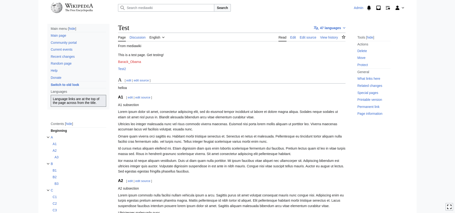
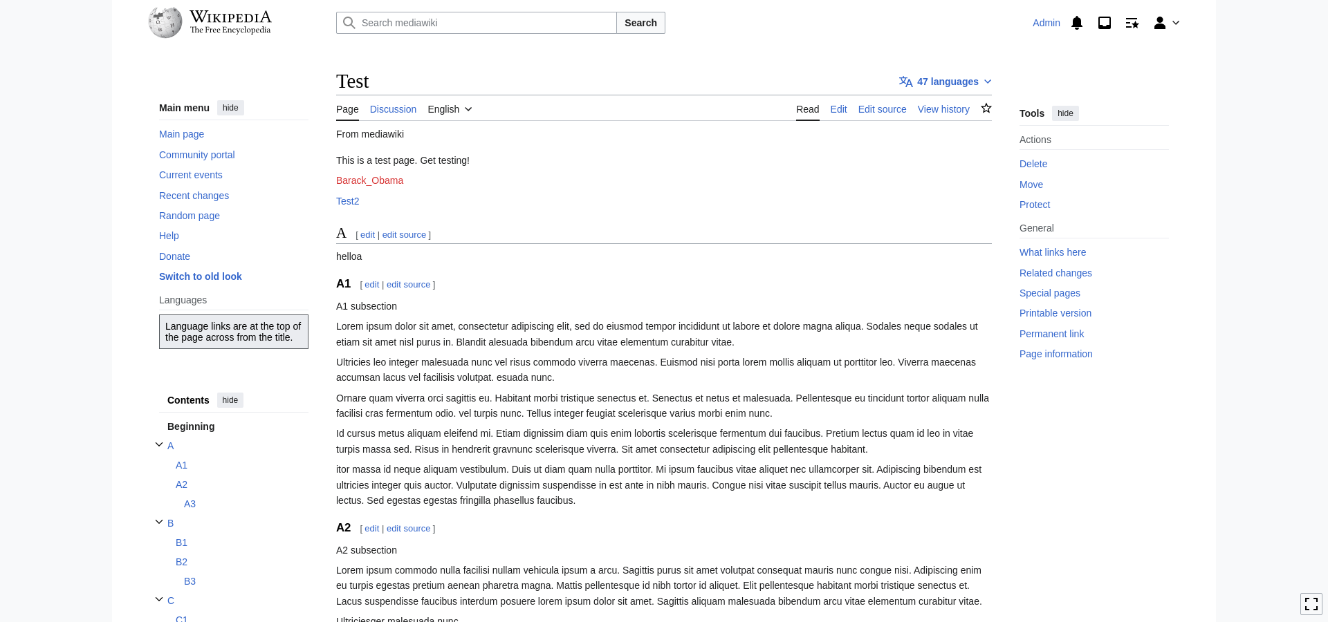
To do this, we should update the Zebra CSS module so that visually, it looks the same as the current Vector 2022 design.
Technical notes
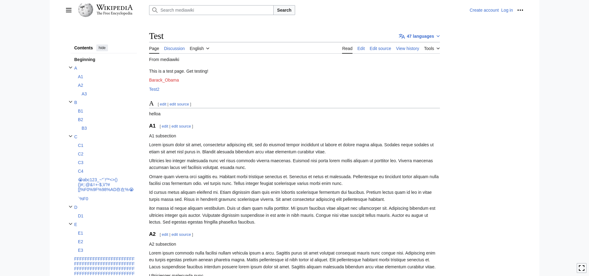
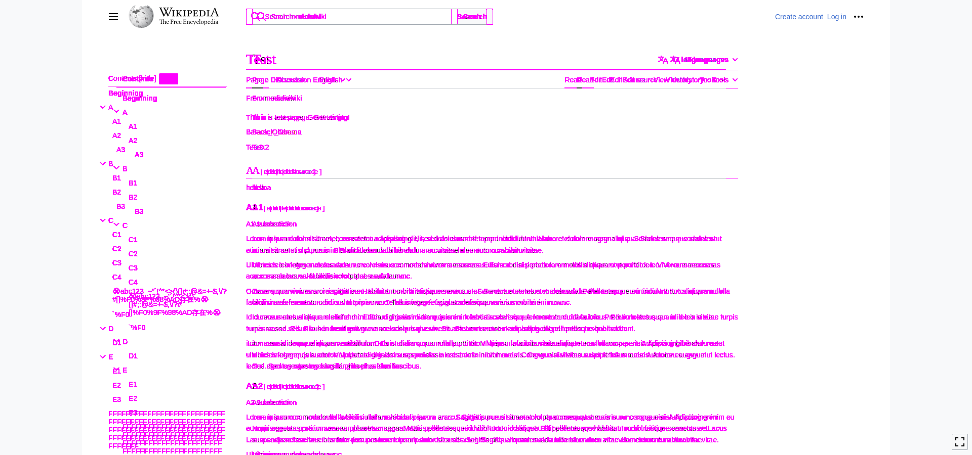
The styles responsible for the Zebra design are actually a very small part of the Zebra code, encapsulated in a mixin called .mixin-vector-content-box(). Modifying that mixin that will remove the background colors and will roughly match the current design, however padding and alignment will have to be adjusted throughout the layout. Design should be consulted in changes to alignment and sizing.
POC Patch: https://gerrit.wikimedia.org/r/c/mediawiki/skins/Vector/+/958529
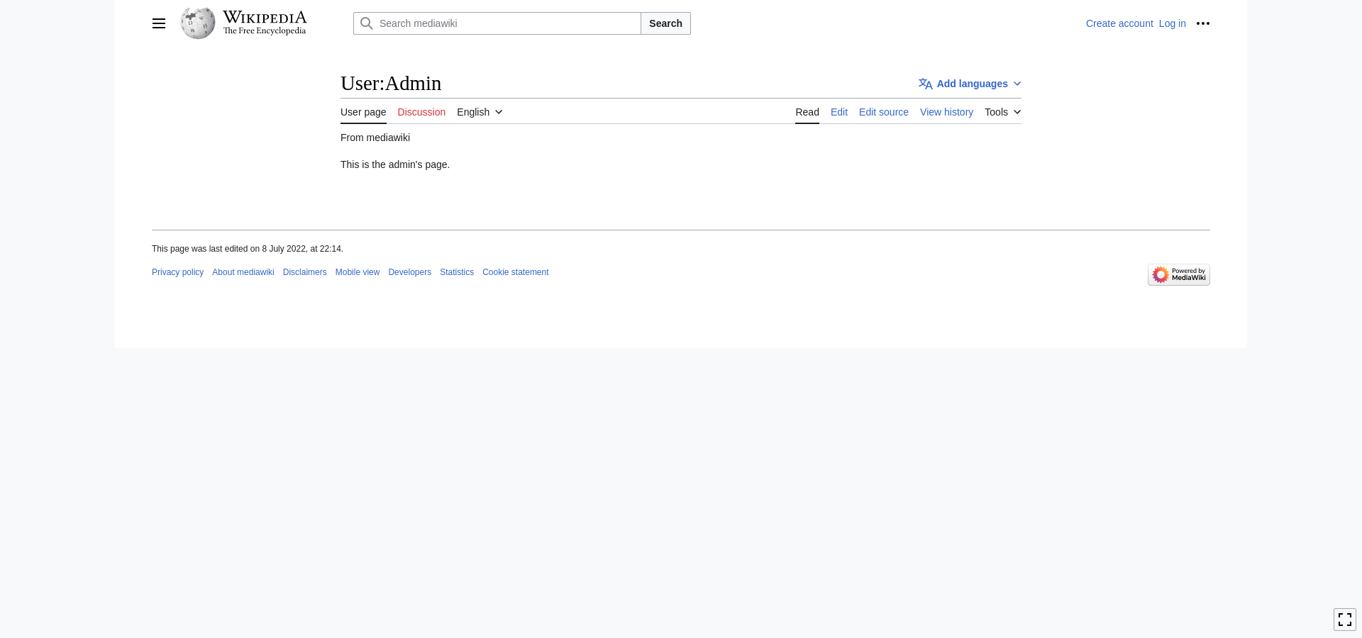
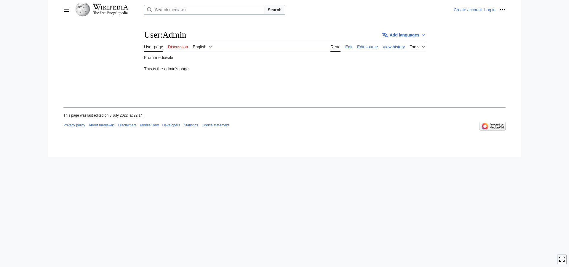
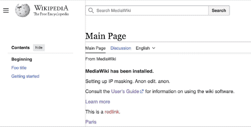
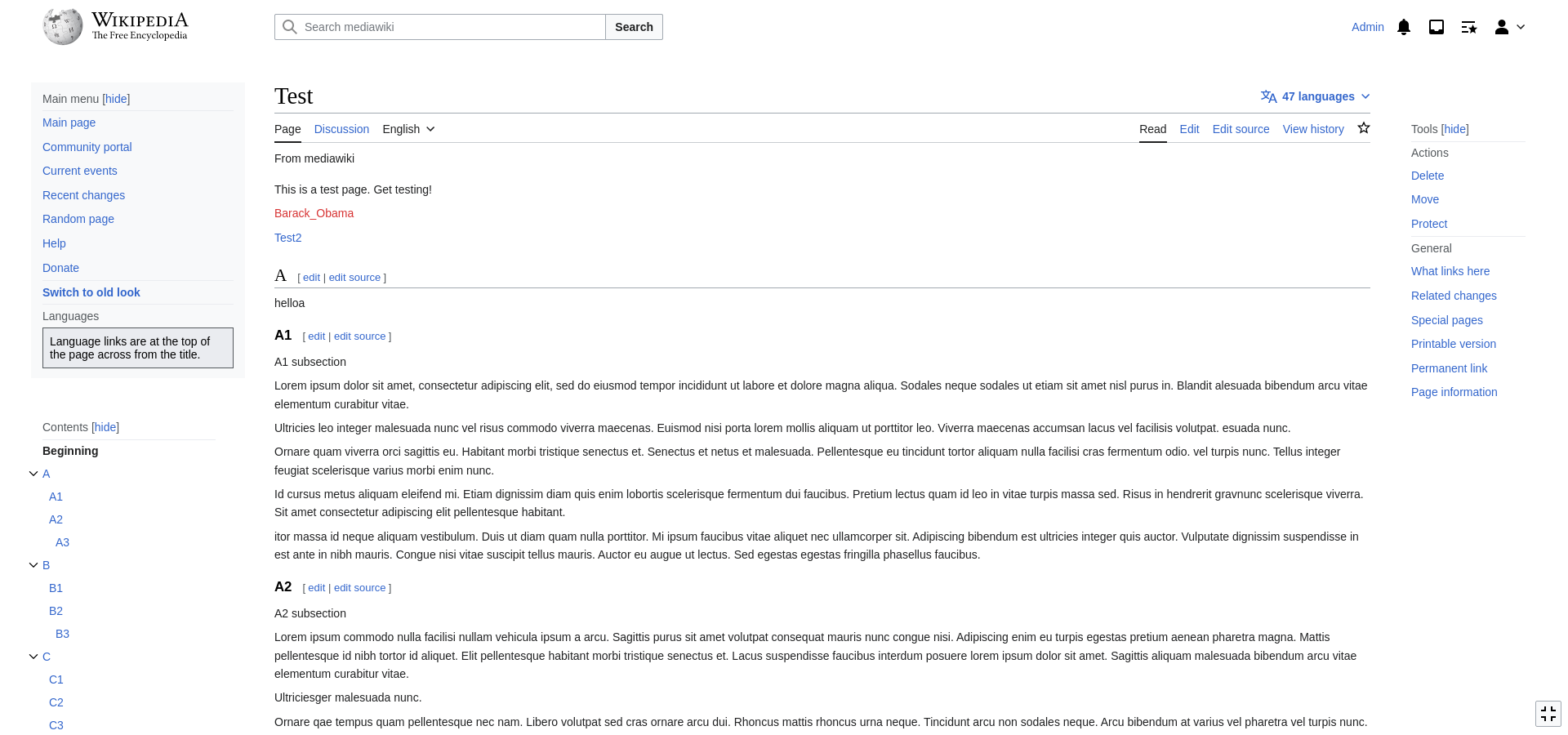
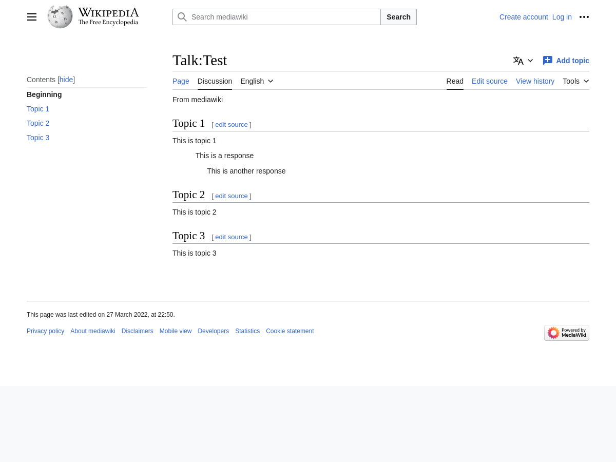
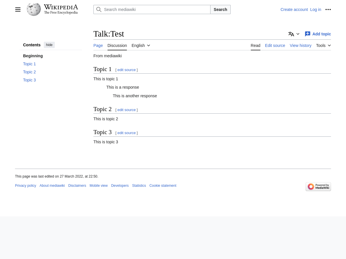
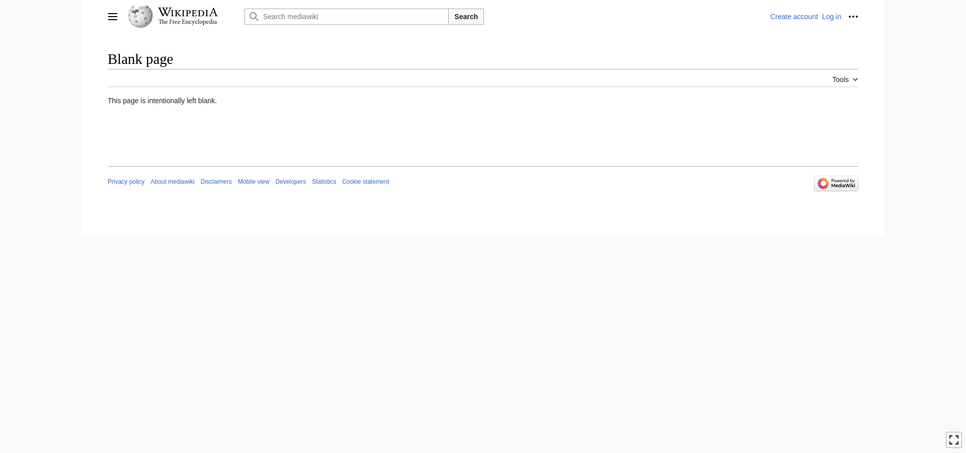
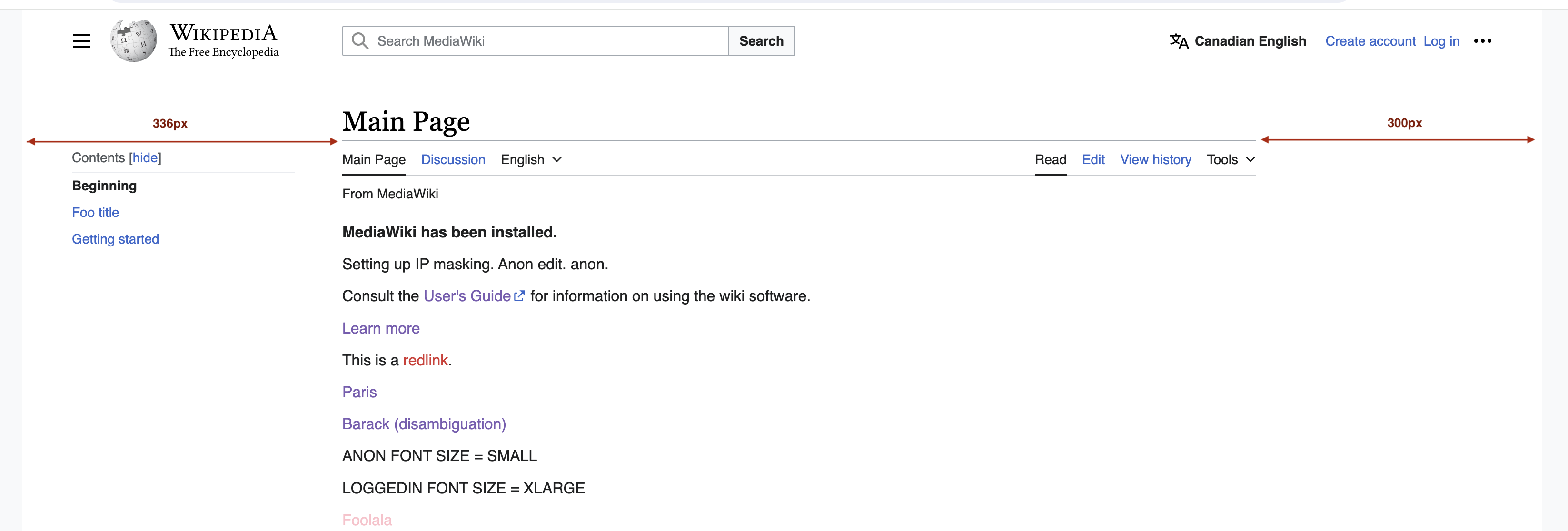
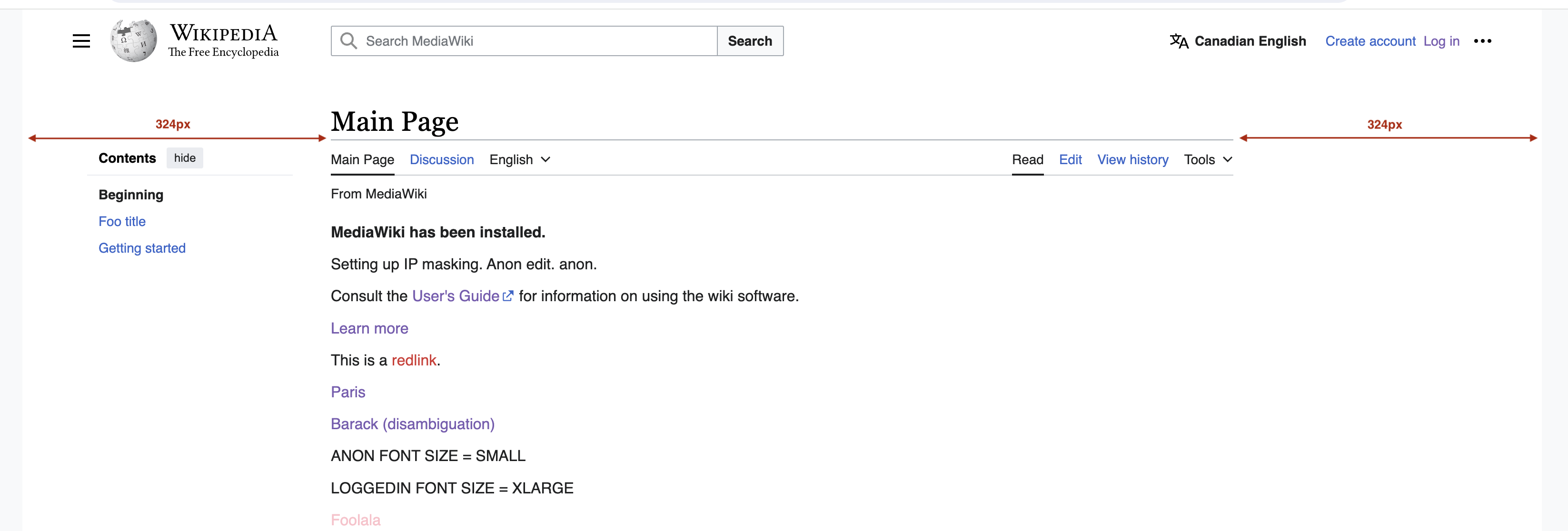
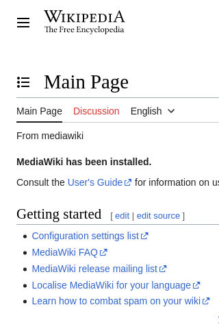
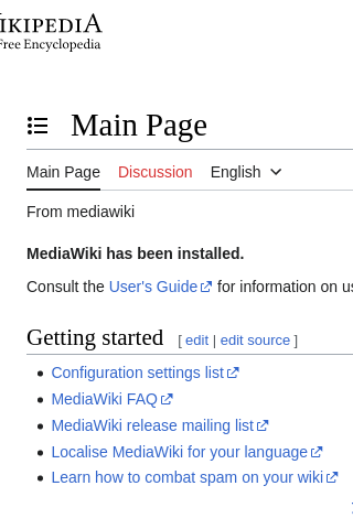
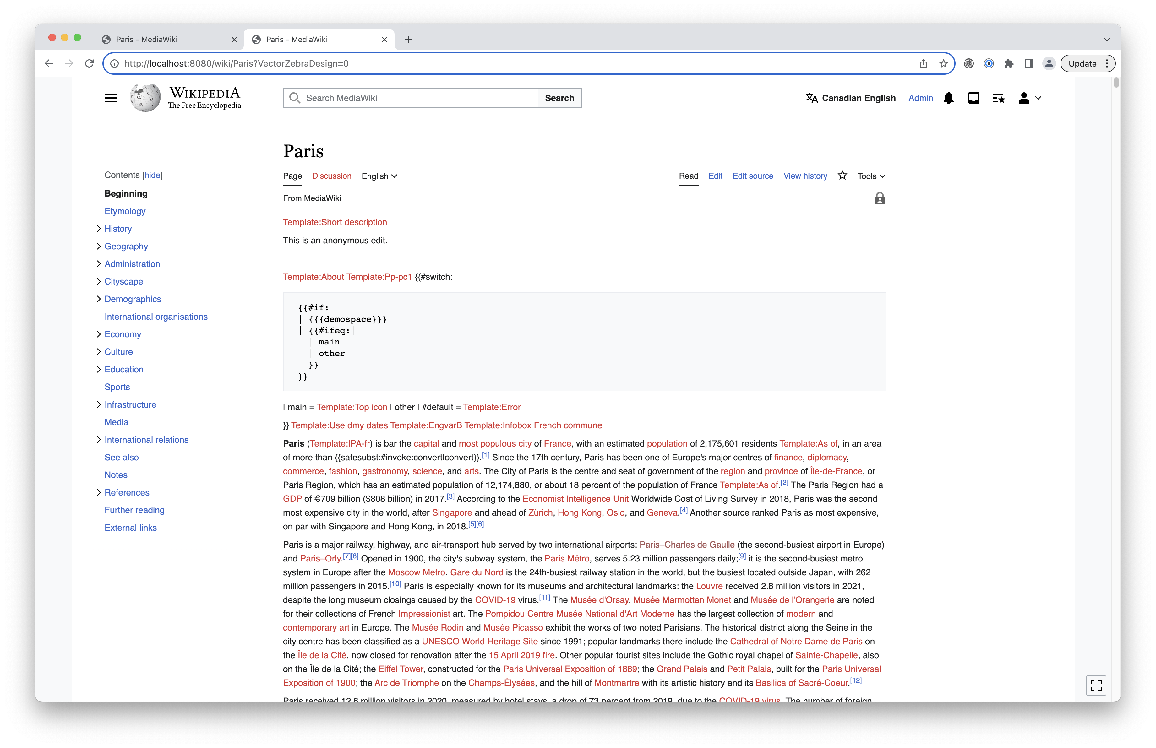 | 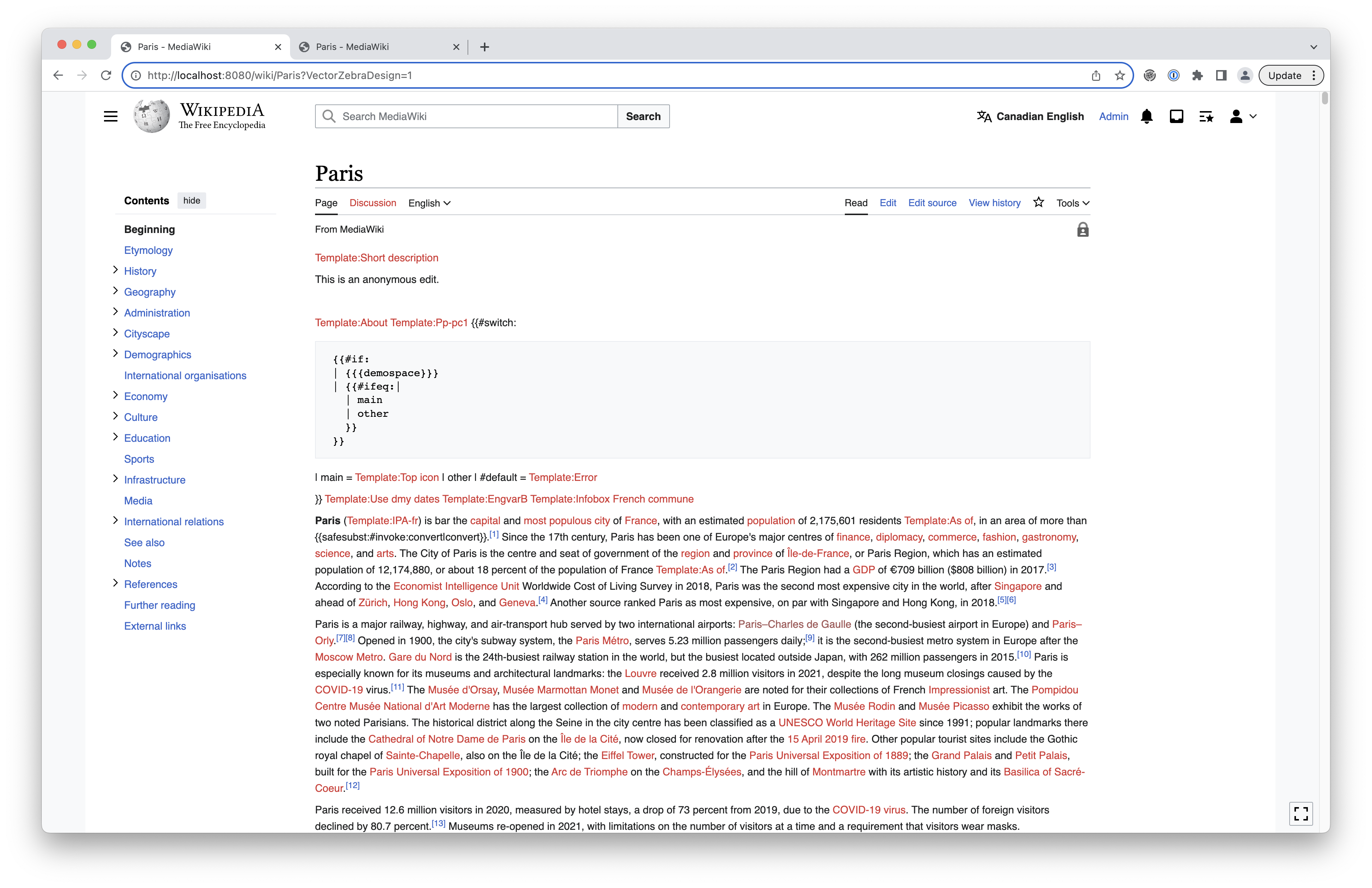 |
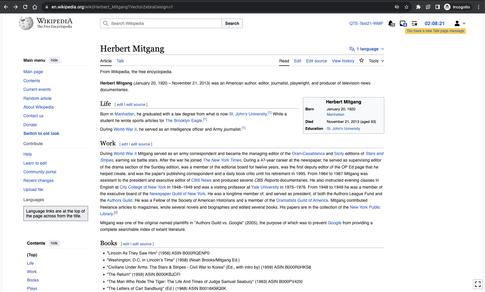
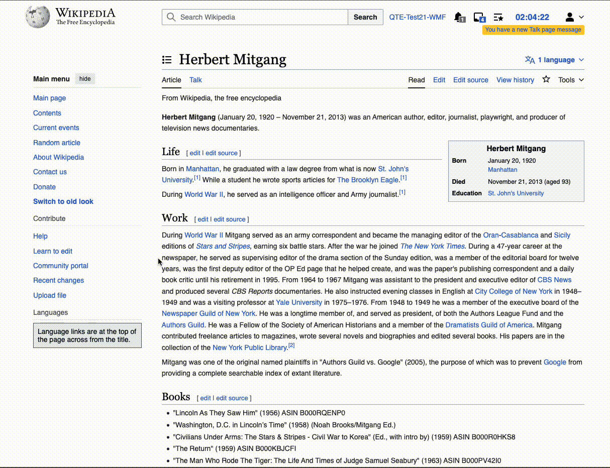
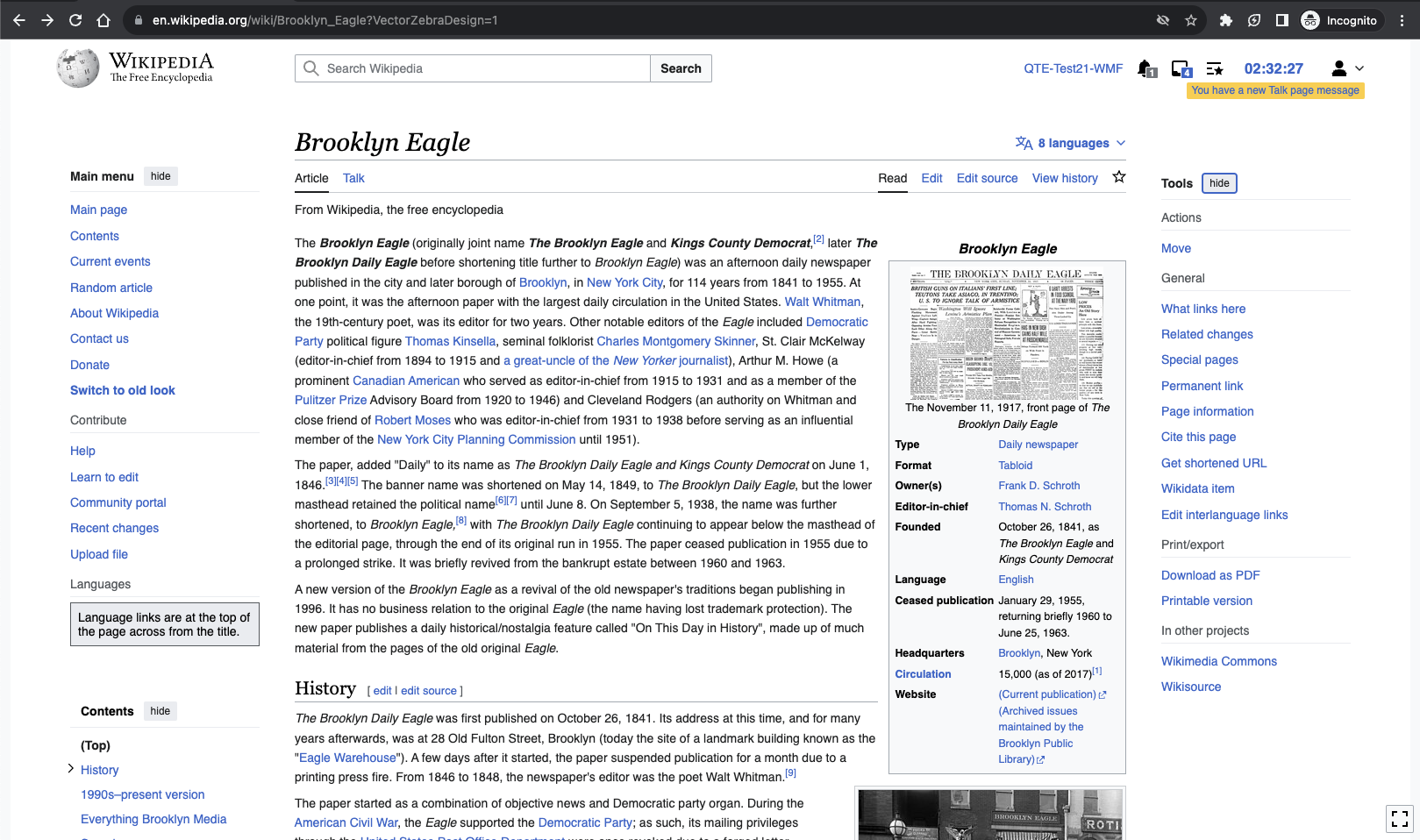
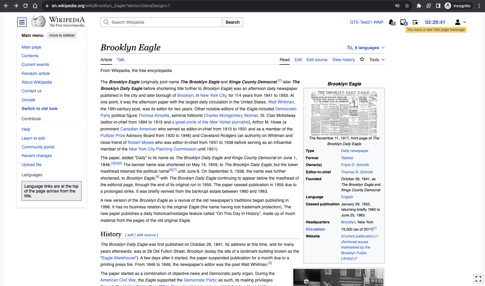
| Current styles | Zebra with current styles |
Visual Changes
There will be some expected visual changes when implementing this change.
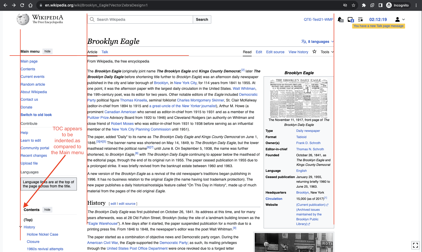
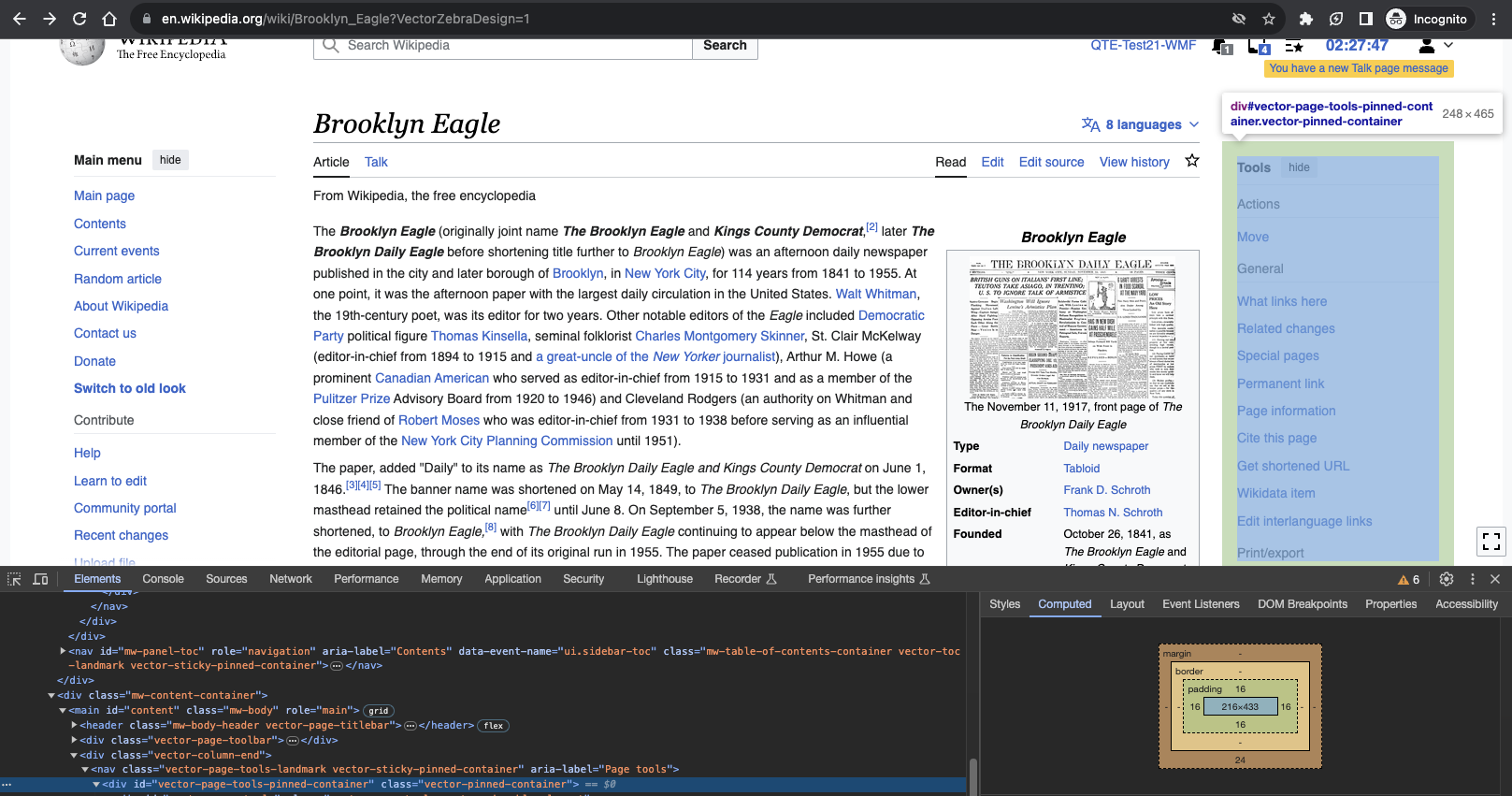
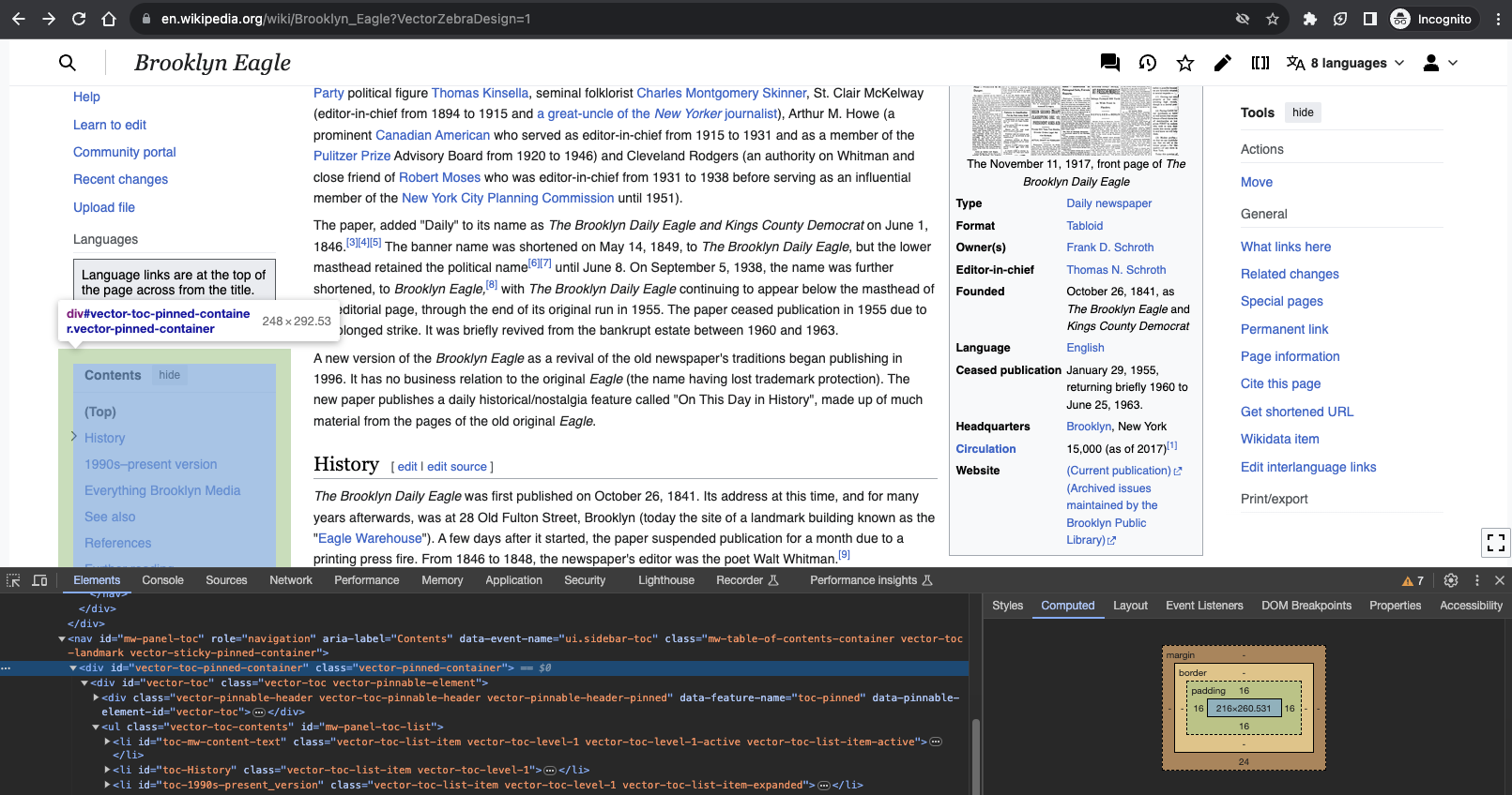
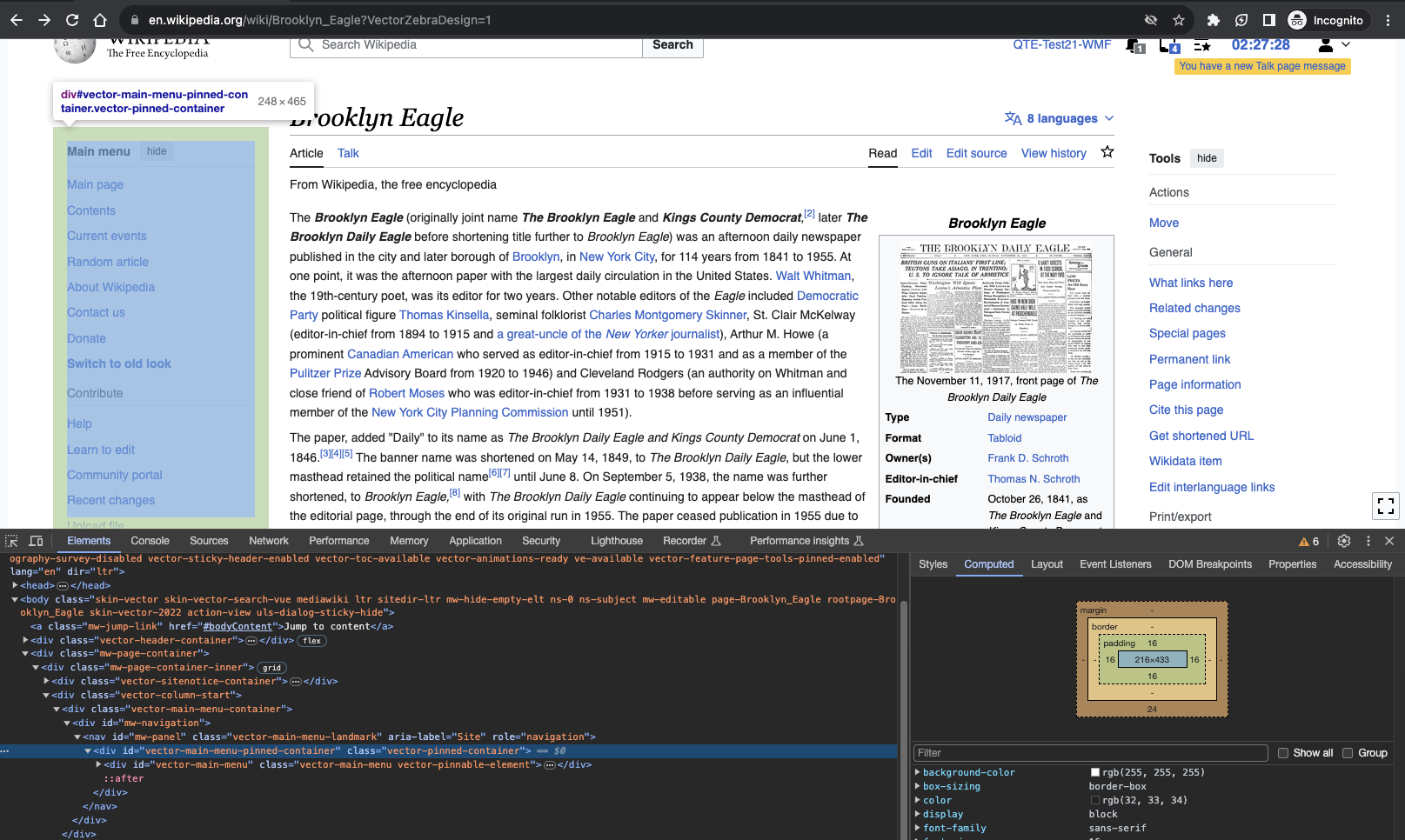
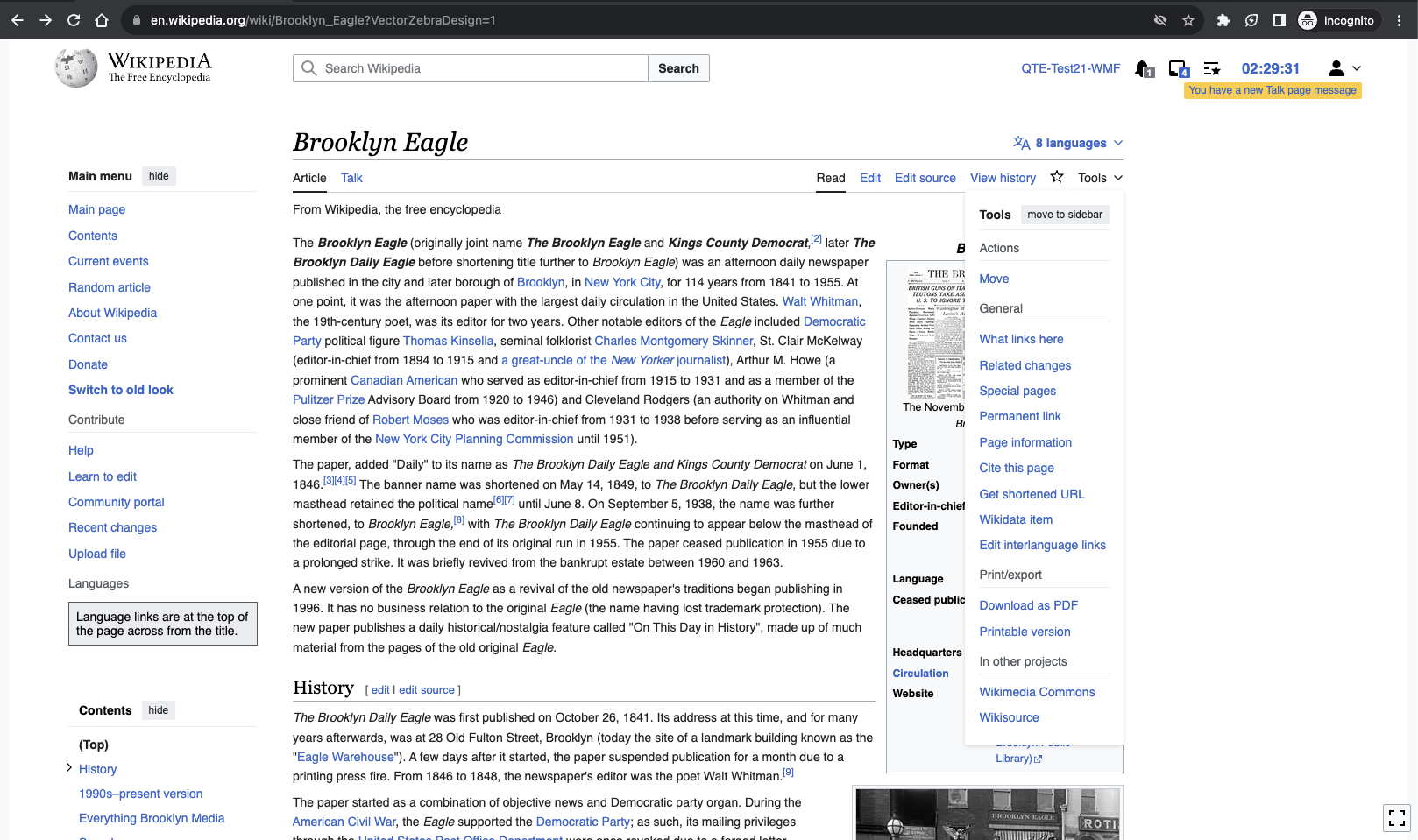
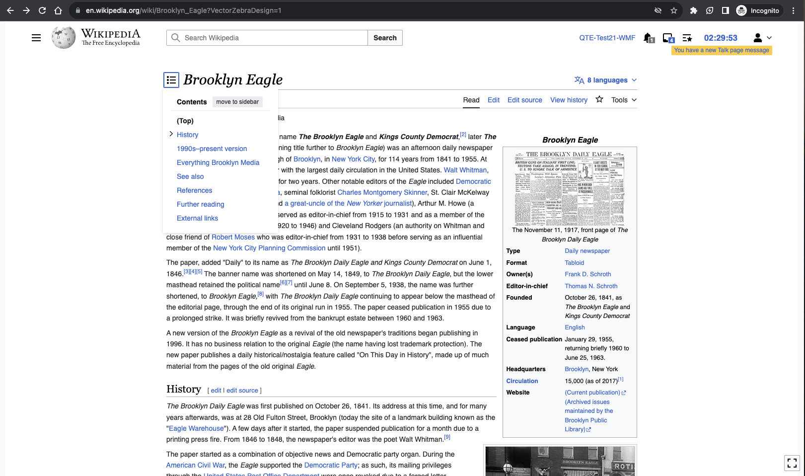
- Pinnable element "hide"/“move to sidebar” buttons will remain in the Zebra style
- Pinnable headers (ie the text labeling the ToC Contents) will remain bold
Acceptable visual change
- The logo and main menu button moving to the left in the header slightly
- User links moving to the right in the header slightly
Updating these styles should resolve (or invalidate) the following issues:
- T339058 Zebra: VE surface widgets have too much padding on Vector Zebra
- T343250 Zebra: Empty table of contents shows in VE edit mode
- T336048 Zebra: You have new message toolbar is too small and too close to the toolbar in zebra design
QA Results - Prod
| AC | Status | Details |
|---|---|---|
| 1 | ✅ | T347638#9342979 |
| 2 | ✅ | T347638#9342979 |
| 3 | ✅ | T347638#9342979 |
| 4 | ✅ | T347638#9342979 |