Page MenuHomePhabricator

Typography: Increased font-size design for Vector 2022
Closed, DuplicatePublicSpike

Assigned To
None
Authored By
Iniquity
May 30 2020, 3:28 AM
Referenced Files
F35309819: en.wikipedia.org_wiki_Moon_useskin=vector-2022 (1).png
Jul 6 2022, 3:52 PM
F35309823: en.wikipedia.org_wiki_Moon_useskin=vector-2022 (2).png
Jul 6 2022, 3:52 PM
Tokens
"Love" token, awarded by CCiufo-WMF."Love" token, awarded by santhosh."Like" token, awarded by SerDIDG."Dislike" token, awarded by IKhitron."Love" token, awarded by alexhollender_WMF."Mountain of Wealth" token, awarded by Volker_E.

Description

Goals

In order to aid readability, we'd like to increase the article font size in Vector 2022. Since font size has broad implications, this change should be developed into a design spec that accounts for impact on things like layout, ui standardization etc.

Research & Consultations

Per community discussion (link), and various research studies (link) we are planning to increase the base font-size for article text from 14px to 16px.

Along with this, the current proposal suggests increasing the line-length for the content from 960px to 1040px.

Prototype (use the options panel in the bottom right to switch between the two font sizes):
https://di-visual-design-font-size.web.app/Hummingbird

Open questions

ToC considerations

  1. Should the ToC font-size increase?
  2. If so, should the width of the sidebar increase?
  3. If the font-size of the ToC increases, then presumably the font size of the main menu should also increase? (when pinned in the sidebar)
  4. Does the ToC have different font-sizes in different locations? (sticky header, pinned/unpinned)

Other non-content elements

  1. Does the size of the page title increase?
  2. Does the size of the page title in the sticky header increase?
  3. Does the #siteSub ("from wikipedia, the free encyclopedia"tagline) also increase?
  4. Does #contentSub #contentSub2 font-size change? (like breadcrumbs etc)

Layout

  1. Does the width of the content column change?
  2. Does the width of the sidebar change?
  3. Does the width of the page tools sidebar change?

Other typographic considerations

  1. Do heading sizes <H1>-<H6> change?
  2. Does line-height change?
  3. Do these values relate to those in the Codex design system?
Related Objects

Event Timeline

There are a very large number of changes, so older changes are hidden. Show Older Changes

@Demian thanks for the demo! :) Looking at example, it seems to me that the headings should be brought in accordance with the https://design.wikimedia.org/style-guide/visual-style_typography.html#use-of-styles.

I also think that as one example, we should use T246420 layout :)

Aklapper changed the task status from Stalled to Open.Jul 8 2020, 11:40 AM

not stalled by definition

Jdlrobson raised the priority of this task from Lowest to Needs Triage.Jul 21 2020, 11:49 PM
Jdlrobson moved this task from Technical to Design on the Vector (legacy skin) board.

I spoke a while back with @alexhollender and @Volker_E about increasing font size. My recollection of that conversation was that this was out of scope but something we'd like to do.

I'll let @ovasileva judge the priority here and whether this is something we want to consider. I also wonder if the only blockers are community consultation whether there is anything @Iniquity could do to help us (e.g. see on village pump whether this would be controversial)

From an overall Design, usability and Style Guide perspective a clear yes to increase the font size to 16px equivalent 1em! Details to be evaluated.

I also wonder if the only blockers are community consultation whether there is anything @Iniquity could do to help us (e.g. see on village pump whether this would be controversial)

Yes, community consensus I think will be the biggest problem for this change. I have already spoken to some of the members and received mixed reviews: old editors work in a very peculiar way with the font, some increase it by browser's scale, some say that it is more convenient to read a small font. We can prepare a survey (with information about [https://pielot.org/pubs/Rello2016-Fontsize.pdf | readers expireince]) and distribute it via Tech Ambassadors & Translators, for example.

[Resetting assignee due to inactive user account]

Change 609797 abandoned by Jdlrobson:
[mediawiki/skins/Vector@master] [DEMO] Font update: Use default 16px article font-size in Vector

Reason:
Demo no longer being used,253 days old and no activity on phabricator since November.

https://gerrit.wikimedia.org/r/609797

@ovasileva @Volker_E do we plan to do this for new Vector? If not, I fear it's not going to happen. Perhaps the way to look at this is to provide a user preference for default font-size, possibly one that applies to logged-out users as we do in Minerva. That should mitigate the need for community consensus as I assume we have good data to backup why font size change is warranted.

The font-size mismatch in Vector does continue to cause us product debt IMO - for example in icons, the size of which are currently tied to it.

Not only in icons, in all components or things like em-based layout sizing we have to provide specific overrides between desktop and mobile. See Figma WikimediaUI file https://www.figma.com/file/2Jb1lVkhEMDFxO20I5xwyA/WikimediaUI-%E2%80%93-Components-library?node-id=4%3A2425
This is a design and UX debt that trickles down into development and continues to be a high cost.

@Jdlrobson could you expand on the user grouping for the Minerva user preference? Who does what apply to when?

@IKhitron Would you mind sharing your dismissal of this idea here?

Two immediate concerns for this (not ‘issues’, as I have no issue with increasing font size):

  1. Vector will be even more mismatched from other skins (notably Monobook) than before, since even now Monobook has old font size one pixel smaller and will have font size three pixels smaller. This mismatch might be problematic in various design decisions made by the end-users. I suppose there’s no way a new font size increase would touch all skins at once, either.
  2. If font size gets increased, already small content frame in new Vector (as seen on main pages or even regular articles with infoboxes) will get even smaller. So, obviously, you would need to increase content width as well with this change, otherwise it would be bad to do.

@IKhitron Would you mind sharing your dismissal of this idea here?

Sure. From my experience, it makes eyes to hurt.

Two immediate concerns for this (not ‘issues’, as I have no issue with increasing font size):

  1. Vector will be even more mismatched from other skins (notably Monobook) than before, since even now Monobook has old font size one pixel smaller and will have font size three pixels smaller. This mismatch might be problematic in various design decisions made by the end-users. I suppose there’s no way a new font size increase would touch all skins at once, either.

On the other hand it would be more consistent with mobile Minerva skin.

  1. If font size gets increased, already small content frame in new Vector (as seen on main pages or even regular articles with infoboxes) will get even smaller. So, obviously, you would need to increase content width as well with this change, otherwise it would be bad to do.

Why would these get smaller? Surely a font size bump would lead to all font sizes increasing?

On the other hand it would be more consistent with mobile Minerva skin.

That is true, but unless you are also prepared to do typeface changes, for most users on Windows the fonts will not look the same size as Segoe UI and Arial have different metrics.

Why would these get smaller? Surely a font size bump would lead to all font sizes increasing?

Smaller as in ‘even less information will fit in the content width’. If that is not what would happen, then this is not a concern.

While this is a bit offtopic, what should be uncontroversial is increasing the font sizes of the interface of Vector itself. Sidebar, footer, personal links have barely legible font sizes by the modern standards, which were not increased with Typography refresh in 2014, and would benefit from an increase, both from the legibility standpoint and the usability standpoint (it is only my hunch but I think that part of the reason people use non-content site elements a lot less is because they are so small they can be ignored by readers by default).

@ovasileva @Volker_E do we plan to do this for new Vector? If not, I fear it's not going to happen. Perhaps the way to look at this is to provide a user preference for default font-size, possibly one that applies to logged-out users as we do in Minerva. That should mitigate the need for community consensus as I assume we have good data to backup why font size change is warranted.

The font-size mismatch in Vector does continue to cause us product debt IMO - for example in icons, the size of which are currently tied to it.

We have had some discussions on introducing font size preferences in the last stage of the project. And just to confirm, a font size increase on new vector would mean and increase in the width of the article content. @alexhollender - for the time being, perhaps we can set up the epic for aesthetic refinements and file this as a subtask?

ovasileva triaged this task as Medium priority.May 27 2021, 9:05 AM
ovasileva moved this task from Incoming to Triaged but Future on the Web-Team-Backlog board.

I'm just going to note here that much of the 'discord' about font size and font style comes back to a conflict of readability/accessibility for more casual users vs. information density and efficiency for experienced and highly engaged users/editors/curators.

This is a side effect of how people with different purposes interact differently with these pages. Readers don't know 'where' they are, so are much more likely to go left, right, top to bottom through an article, at most using headings to 'scan'.
Curators/Editors are experienced with navigation and not there to consume the article information in the same way. They take an overview/scan of the entire page and then mentally zoom into a specific area much faster. Being able to see as much of the entire article in one go and having easy access to as many controls as possible is an elementary part of their mental navigation model and efficiency. (It is also why gmail has a much higher information density than most other Google products.)

This is an essential dynamic we have identified multiple times in the past. It should be part of our design principles.

@ovasileva I'm not sure we should leave this to the end of the project. The font-size discrepancy continues to cause us problems as we implement designs - in fact we're often adding hacks to override it, which is increasing the work we have to do later in the project. Please consider doing it earlier. I don't think this is as controversial as it has been pitched - in fact recently there was a village pump discussion requesting this for legacy Vector.

It's also a clear accessibility improvement, so we might want to consider it as part of the upcoming accessibility sprint we have planned.

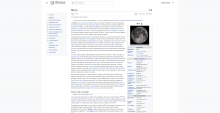
I applied the following CSS in my browser. They make Wikipedia much more readable.

.vector-body {
    font-size: 1rem;
    line-height: 1.5;
}

.vector-body p {
    margin: 1em 0;
}
BeforeAfter
en.wikipedia.org_wiki_Moon_useskin=vector-2022 (2).png (1×2 px, 424 KB)
en.wikipedia.org_wiki_Moon_useskin=vector-2022 (1).png (1×2 px, 412 KB)
alexhollender_WMF renamed this task from Typography: Increase base font-size for modern Vector skin to Typography: Increase base font-size for Vector 2022.Jul 6 2022, 7:17 PM
alexhollender_WMF updated the task description. (Show Details)
alexhollender_WMF removed a subscriber: Demian.

Please also increase the margin between paragraphs.

@ovasileva should this be a blocker for deployment?

@ovasileva should this be a blocker for deployment?

@Jdlrobson - not a blocker for deployment. This will require separate conversations with the community and thus will approach after deployment

Jdrewniak renamed this task from Typography: Increase base font-size for Vector 2022 to Typography: Increased font-size design for Vector 2022.Jun 30 2023, 1:54 PM
Jdrewniak updated the task description. (Show Details)

Given the considerable discussion on this ticket, I think I would be good to evolve this proposal into a more complete design specification. To that end, I've added a number of open questions to the task description to help fill in some of the details.

Doing some task cleanup. Current work is tracked under T345357: [Goal] Improve default typography on mobile and desktop sites. Closing this one as duplicate

@ovasileva I thought this ticket was about increasing font size from 14px to 16px? If not is there another ticket for that?