Description

Details
| Status | Subtype | Assigned | Task | ||
|---|---|---|---|---|---|
| Open | Ladsgroup | T191156 Convert FlaggedRevisions to Codex | |||
| Resolved | Ladsgroup | T179062 Revisit colors of FlaggedRevs | |||
| Resolved | Ladsgroup | T155878 Use OOUI icons for FlaggedRevs | |||
| Resolved | Ladsgroup | T107472 CSS of MediaWiki:Flaggedrevs-watched-pending seems pretty random |
Event Timeline
For the size:
- For the most common use case (one level), it become 154px in my localhost from 84px which is large but not that large. Specially 154px is a big jump but in itself is not much. I'd argue the previous design was too crammed.
- This is the design of WikimediaUI, if we switched it to OOUI or anything else, it would have been the same so it's not really fault of the patch, you could argue against it in the design but we would be back to the issue "I don't like the design, too much whitespace, ..." that I have seen in basically every switch to ooui we did. In other words, this is something you need to resolve with the WikimediaUI style (codex/ooui/etc.) and talk to their designers. I'm sure the designers had good reasons for these sizes (and went over them multiple times every time we have a change like this)
- The point here is consistency in design, every other part of the UI has the same padding and margin and size and color, even if we decide to reduce the size in the future, you can do it in codex and that'll be applied centrally.
- That seems to be going on and happens on in any change we have done in the past six-seven years. I explicitly remember the uproar when we switched ActionEdit, Special preferences, special block and unblock (I think I was called "a cow" for doing that in Czech Wikipedia), and more.
- Last but not least, the point of the patch is to outsource the design to the design system instead of reinventing the wheel, it's part of making FR smaller and more maintainable.
For the images for mobile:
- Done. Thanks.
If I counted correctly, there are 15 wikis using one level, 28 wikis using two levels and 6 wikis using more than two levels. So the most common use case is two levels, not one.
it become 154px in my localhost from 84px which is large but not that large. Specially 154px is a big jump but in itself is not much.
What did you measure? The only thing that was approximately that large for me, is the one-level box at the bottom of the page, where the height doesn’t matter much anyway. When shown at the top (on diffs), there’s an extra paragraph of text, adding 1.6em + 2×0.5em ≈ 22.5px on legacy Vector.
I'd argue the previous design was too crammed.
I’d argue it wasn’t.
- This is the design of WikimediaUI, if we switched it to OOUI or anything else, it would have been the same so it's not really fault of the patch
Of course there are things like margins that are determined by the visual toolkit, but there’s some play. For example, you decided to use the cdx-radio--inline class when there are more than two levels, but not to use the cdx-checkbox--inline class when there are exactly two levels. This means that while the accuracy setting probably is one line tall in the 3+ levels case, it is always two lines tall in the 2 levels case.
- The point here is consistency in design, every other part of the UI has the same padding and margin and size and color, even if we decide to reduce the size in the future, you can do it in codex and that'll be applied centrally.
My point is usability. I think making the UI more usable is more important than making it more consistent.
My point is usability. I think making the UI more usable is more important than making it more consistent.
My understanding is the larger touch areas make the interface more accessible to mobile users and users with disabilities, which is making the UI more usable.
Only increasing the touch areas is also inconvenient for able desktop users, but I’m all for making the Web more accessible, so if that was the only change, I wouldn’t have complained about it. However, that was not the only change: several line breaks were introduced at places that didn’t have line breaks before. These line breaks don’t improve accessibility, so they degrade usability rather than improving it.
Re: Tech News - If I understand correctly, this would be an accurate entry - please confirm.
Please also point me towards what it should link to. The best link I can quickly find is mw:Wikimedia_User_Interface but that isn't marked for translation and I'm not sure if it's the most uptodate overview. Thanks!
[Recent Changes?] or [Changes this week?]
- The Flagged Revisions extension now uses the standardized [[??? | user interface components]]. (1)
Since there was no train this week (T337528), this will go out the week Tech News is distributed, so Changes this week. (The Recent changes section of the 2023-W26 issue will probably remain empty due to the no-train week.)
- The Flagged Revisions extension now uses the standardized [[??? | user interface components]]. (1)
Not the whole extension, we’re far from that. This is about a single box; I’d probably describe it as “the review form of the FlaggedRevs extension”, although I’m not sure if people would understand what I mean by that.
For the ???: I guess we can use https://www.mediawiki.org/wiki/Codex
I agree “the review form of the FlaggedRevs extension” describes it the best.
Very small question: do we really need the bold around ‘Please review the changes’ text? Seems like unimportant text to bold (that can honestly be even removed).
I don't know how it is expected to be, but right now in Vector-2022 it looks very ugly:
- base font size is 16px instead of 14px
- it uses full width when the categories block uses only the content part
- it doesn't adapt on a desktop to use width at all

I wouldn't call it very ugly, but the font size should definitely be reduced. The horizontal positioning on Vector 2022 seems definitely strange. And on dewiki, Monobook users seem to be particularly unhappy about it, but I can't really speak for them, as I have zero Monobook experience.
The DOM looks odd, we have div and p inside span now and the mw-fr-reviewformlegend span got an 'additional' cdx-card__text id which should be in class= I guess.

Was there a community consensus for this change? The new look is just humongous. Here is a piece of the interface from w:uk:4 Веста:

You can see that what used to be a neat bar now is a huge but weirdly narrow block that is about as tall as the whole category list (not a small one) and a navbox. That is not normal and it is very distracting for anyone with the userrights that enable this block to be displayed.
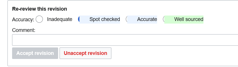
Those background colours on accuracy levels doesn't look good. It overlaps the radio buttons.
I do not see anything in the comments above that indicates this change is a regression (meaning something that worked no longer does). You may not like how it looks now (for various values of valid), but the form still functions as expected.
T191156#8979674 is definitely a regression – it can hardly be seen which option is selected. (It would’ve been useful if @Stryn shared which wiki the screenshot is from; based on his language skills and the number of levels seen on the screenshot, I guess either fiwiki or enwikibooks.)
Yes, it's from the Finnish Wikipedia (https://fi.wikipedia.org/w/index.php?title=Vanha_Paukku&curid=1115937&diff=21652836&oldid=21553931&uselang=en - only users with "review" rights can see it).
Actionable problems list for @Ladsgroup:
- If rendered in #mw-data-after-content, the box displays at 16px font-size, which is too big, see T191156#8977842
- Bold around ‘Please review the changes’ isn’t needed, see T191156#8957257 / my patch at https://gerrit.wikimedia.org/r/c/mediawiki/extensions/FlaggedRevs/+/934353
- ‘hide stability log’ should not be bolded, see T191156#8978724
- Accuracy levels display with a background that clips the radio buttons, see T191156#8979674
(compiled for convenience)
I have been ooo for the second part of the week. I will try to take a look once I'm back
Is the "unaccept revision" really a destructive action? Contrary to the "reject changes" button, it actually doesn't destroy anything. I'd rather use a neutral button style for that (light gray background and black foreground).
(based on comment from Smyru on plwiki)
I'm trying to figure out what led to fiwiki showing these colors, the complex configuration is not really helping. I'm not a reviewer so I can't see the problematic UI.
The issue is coming from on-wiki CSS: https://fi.wikipedia.org/wiki/J%C3%A4rjestelm%C3%A4viesti:Group-reviewer.css
It's better to just remove that coloring TBH.
@Zache can you help here?
Edit: Ladgroup already found where it's coming from. Maybe we can get rid of it then.
I removed it to unbreak the view for the reviewers, feel free to add it back with changes or anything like that.
Message that shows up after you make an edit to an article with unreviewed changes (span.flaggedrevs_important) is also rendering too big tbh:

Maybe this should be an inline message box? https://doc.wikimedia.org/codex/latest/components/demos/message.html
It would be nice getting an update on how the HTML is supposed to look. On dewiki, we used to hide the comment part of the form, but due to the changes, the label has reappeared, while the input field has not, so it looks extra broken atm. I would have fixed the Common.css already, but currently this does not look like the final version, so I am waiting for more information on this.
This is clearly broken (wrong ID, and probably should be a div):
<span id="mw-fr-reviewformlegend cdx-card__text">
And the div containing the comment box should get an ID; the class fr-comment-box only applies to the input field now, which makes hiding the entire comment part unnecessarily tedious:
<div class="cdx-text-input" style="padding-bottom: 5px;">
Just discovered another bug this has caused: when editing in VE or NWE, the new box covers dropdown menus like the link editor or the reference editor.

This is particularly annoying when editing sections in NWE. I believe this box should not even be visible when editing (and definitely not when editing a section). If these issues can't be resolved before Thursday, please consider reverting the change!
Change 935768 had a related patch set uploaded (by Ladsgroup; author: Amir Sarabadani):
[mediawiki/extensions/FlaggedRevs@master] Small fixes to the review form migration to Codex
I removed the id piece, making it a class didn't help and make it look weird. Reduced the size to the size in mw-body. I need to figure out why font-size: 100% outside mw-body is so damn massive but for later.
Regarding "hide stability log" being bold, I have trouble reproduce it locally, or showing it altogether. Where are you seeing it @putnik?
Another thing I noticed regarding the comment field: the input does not have any ID, while the label refers to mw-fr-commentbox.
<label for="mw-fr-commentbox">Kommentar:</label>
<input name="wpReason" size="40" value="" maxlength="500" class="fr-comment-box cdx-text-input__input">
We don't use comments on dewiki, so I don't know if it's broken entirely.
Thanks. for attribute in label is mostly for a11y (screen-readers for example) so it's worth fixing. I updated the patch to add the fix.
My understanding is that V22 team is planning to bump font size to 16px-ish and may have done it in several areas and then applied a decrease in the main body to avoid disturbing the masses. T254055 or thereabouts is future and maybe some past work? (T313828 's survey may be particularly interesting.)
Like I'm not against it per-se, maybe it'd be useful, maybe not but having 100% being different than the size of mw-body makes the interface changes look uneven and weird.
Change 935768 merged by jenkins-bot:
[mediawiki/extensions/FlaggedRevs@master] Small fixes to the review form migration to Codex
Just looked at the patch. I don’t think you should’ve set this value ('style' => 'font-size: 90%;') in HTML, that’s bad. It also should be 0.875em in Vector, and 100% in other skins, since they have different font sizes. This patch will make boxes too small in Monobook.
(Source: I added local CSS in https://ru.wikipedia.org/?diff=131433865 and had to add .skin-vector pretty quickly because Monobook was too small.)
Also, since this box also appears in .mw-body, this patch will make its sizing inconsistent if it is inside .mw-body.
Two things that could be done without messing with default styles (although I don't think that should be anathema - obviously the standard form style can't accommodate every possible use case, it's normal to do adjustments, it's common even in recently authored WMF features):
- Hide the comment field somehow (e.g. put in an "add comment" button for showing it) - pretty much no one ever uses it so there is little point in it being visible by default.
- Remove the checkbox when there's only one level. I don't think reviewing something as "not spot-checked" is meaningful, that's just the same thing as not reviewing. (In the bottom-of-page form unreviewing is a meaningful action, but there's already a button for that.)
Good idea, hopefully someone can come up with a good UI design.
- Remove the checkbox when there's only one level. I don't think reviewing something as "not spot-checked" is meaningful, that's just the same thing as not reviewing. (In the bottom-of-page form unreviewing is a meaningful action, but there's already a button for that.)
There is no checkbox if there is really only one level (e.g. on dewiki). However, the default setting on WMF (which is used among others on huwiki) has two levels, corresponding to the MediaWiki messages revreview-accuracy-0 and revreview-accuracy-1. It doesn’t make much sense, though, as I can’t save the rating if I untick the checkbox – maybe it made more sense before multiple tiers were removed in T277883?
In sports we have an old wisdom: never change a winning game. So was there a real reason to begin meddling with that? I mean a true real reason?
@Matthiasb: See https://www.mediawiki.org/wiki/OOUI from 2013. For general questions, please refer to its "Documentation" section. Thanks.
Code doesn't magically keep working. To continue your sports analogy you can't expect a winning team to still be a winning team 10 years later - code like people degrades in quality over time or in some cases stops working altogether. The team / code needs to adapt which is exactly what is happening here.
Accuracy 0 is unreviewed, so I don't think there's any conceptual difference between a revision that has never been reviewed, a revision that has been reviewed with accuracy 0 (if that's even possible) and a revision that has been reviewed with accuracy 1 but then later got unreviewed. So I think the checkbox can be removed except on the handful of edge case wikis which use multiple levels.
maybe it made more sense before multiple tiers were removed in T277883?
Yes, with multiple dimensions "unreviewed" didn't necessarily mean "level 0 on all dimensions".
Feel free to make a patch removing the checkbox connecting it to T277883: Drop all low-use and unused features of FlaggedRevs to make it more maintainable and I will review them! (I should also review and merge the open patches there).
Any thoughts about my comments above (T191156#8994884 etc.)? The whole way this form was ‘converted to Codex’ is really unclean tbh.
Change 938013 had a related patch set uploaded (by Tacsipacsi; author: Tacsipacsi):
[mediawiki/extensions/FlaggedRevs@master] Hide level zero in the revision review form
It is less a question who is winning, but; the FlaggedRevisions are our strongest asset it it comes to the newest EU regulations concerning fake news, propaganda ant the like on very large online platforms. Given that FlaggedRevisions are not used in every language versionm causing that even might not be enough. ´(As I am informed, the regulation means every language and not just official EU languages onky.)
@Matthiasb I don't think Ladsgroup was questioning the usefulness of FlaggedRevisions but rather implying that it's code is outdated and in some parts broken for a long time and therefore not a „winning team“ but rather in heavy need of updating – which is what this task and many other (see e.g. T185664 / T277883) are trying to accomplish.
Change 938013 merged by jenkins-bot:
[mediawiki/extensions/FlaggedRevs@master] Hide level zero in the revision review form
Change 520116 abandoned by Bartosz Dziewoński:
[mediawiki/extensions/FlaggedRevs@master] Convert RevisionReviewForm to OOUI
Reason:
Superseded by https://gerrit.wikimedia.org/r/930927
I guess this is resolved. If there are any remaining issues, please open separate tasks about them. (I didn't read the discussion above, I'm just cleaning up.)
It isn’t resolved:
- The task description asks for all FlaggedRevs interface elements to be converted to
OOUICodex, but only the review form has been updated yet. There are many more interface elements: special pages like PendingChanges and Stabilization, rating box (uses OOUI icons but almost nothing else follows the OOUI/Codex conventions) etc. - Making the comment field collapsible (proposed by @Tgr in T191156#8996077) has been neither implemented nor declined yet.