Page MenuHomePhabricator

Evaluate and decide on customizable icon sizes for Codex
Closed, ResolvedPublic

Assigned To
Authored By
Volker_E
Aug 17 2020, 9:28 PM
Referenced Files
F36319833: Screenshot 2023-01-19 at 11.25.03.png
Jan 19 2023, 11:28 AM
F36305496: image.png
Jan 18 2023, 7:07 PM
Restricted File
Jan 11 2023, 3:04 PM
F36083783: image.png
Jan 10 2023, 12:27 AM
F36083763: image.png
Jan 10 2023, 12:27 AM

Description

Background/Goal

Started in Icon Component conversation, the request for customizable icon sizes for the library was brought up by @santhosh.

While WikimediaUI theme is set to only two distinct icon sizes – 20x20 dp canvas as default and 12x12 dp as (deprecated) special case indicators, there might be consumers of the library with further needs, possibly implemented in a different theme.

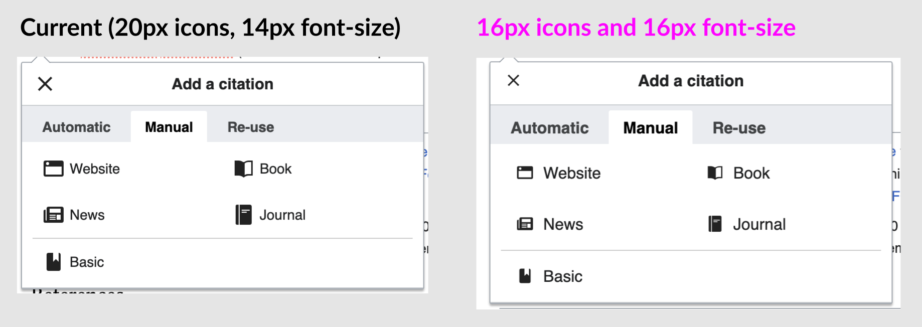
We've come to update many indicators and by-standing icons to 16x16 dp in Codex components. 16x16 is also the minimum size for icons in OS icon listings (Windows and macOS).

Proposal

  • 20x20 dp as default: token size-icon-medium (for backwards compatibility and clarify if we deprecate this and introduce size-icon-medium as successor)
    • Implement that choice into Icon.vue
  • 16x16 dp: size-icon-small
  • 12x12 dp: size-icon-x-small – We shouldn't even call that icon, it's of no use with its usability/recognition issues and should only be used in two or three places, like the Select arrow indicator

Clarify further needs

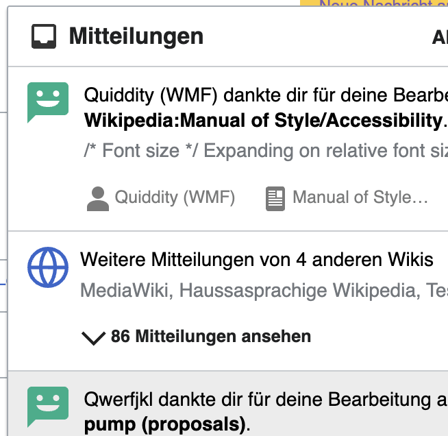
  • There has already been 30x30 icon size implemented a while ago in Notifications

image.png (636×654 px, 87 KB)

  • Microsites feature higher icon sizes, here for example Design entry page with 60x60:

image.png (944×1 px, 120 KB)

Design spec

Acceptance criteria for Done

Design

  • A Figma spec sheet is created for the component that includes the scope defined here. A link to the Figma spec sheet's MVP version has been added to this task's description.
  • Include the component spec sheet in the Figma library

See T322631: Enable Icon components to support pre-defined sizes for implementation steps

Event Timeline

Volker_E renamed this task from Evaluate and decide on customizable icon sizes for WVUI to Evaluate and decide on customizable icon sizes for Codex.Sep 9 2022, 8:27 PM
Volker_E edited projects, added Codex; removed WVUI.

One insight brought up in Desktop Improvements project is, that Vector 2022 features interaction elements that can't contextually be bold, like the article toolbar. For those the 20x20 are thick.

Change 876072 had a related patch set uploaded (by VolkerE; author: VolkerE):

[design/codex@main] tokens: Introduce small icon and min size component tokens

https://gerrit.wikimedia.org/r/876072

Change 876072 merged by jenkins-bot:

[design/codex@main] tokens: Introduce small icon and min size component tokens

https://gerrit.wikimedia.org/r/876072

Change 878213 had a related patch set uploaded (by Anne Tomasevich; author: Anne Tomasevich):

[mediawiki/core@master] Update Codex from v0.4.2 to v0.4.3

https://gerrit.wikimedia.org/r/878213

Test wiki created on Patch demo by ATomasevich (WMF) using patch(es) linked to this task:
https://patchdemo.wmflabs.org/wikis/b7ca0fd8f5/w

Change 878213 merged by jenkins-bot:

[mediawiki/core@master] Update Codex from v0.4.2 to v0.4.3

https://gerrit.wikimedia.org/r/878213

@Volker_E I've created the Figma spec sheet for the different icon sizes. As we comment during our last catch up, I've used the following nomenclature (different from the one listed in the task description):

  • size-icon-base = 20x20
  • size-icon-small = 16x16
  • size-icon-extra-small = 12x12

I've just included the sizes we are currently using, so the 30x30 and 60x60 are not part of our icon sizes now.

Regarding the 12x12 size, I've included a note in the spec to explain that this icon will be used just for those use cases. @Volker_E let me know your feedback and if it's all ok to you we can move the task to Ready for development.

{F36118503}

Test wiki on Patch demo by ATomasevich (WMF) using patch(es) linked to this task was deleted:

https://patchdemo.wmflabs.org/wikis/b7ca0fd8f5/w/

size-icon-base should be size-icon-medium from my POV. We can still consider aliases later on. But in current logic, -medium in t-shirt sizes seems most appropriate.
Also, in DS design sync we've agreed on using size-icon-x-small over size-indicator while leaving latter in as “deprecated” for OOUI compatibility.

Change 880799 had a related patch set uploaded (by VolkerE; author: VolkerE):

[design/codex@main] tokens: Rename icons according to design

https://gerrit.wikimedia.org/r/880799

Change 869274 had a related patch set uploaded (by VolkerE; author: Catrope):

[design/codex@main] build, tokens, styles: Introduce simple stylesheet unit transform

https://gerrit.wikimedia.org/r/869274

Test wiki created on Patch demo by ATomasevich (WMF) using patch(es) linked to this task:
https://patchdemo.wmflabs.org/wikis/595f8966a0/w

Also created a Codex documentation site:
https://patchdemo.wmflabs.org/wikis/595f8966a0/w/build/codex/docs

Considering that the size tokens and grid are oriented to 4-multiple unit (e.g., size-100 = 16px), IMO it makes sense to consider making the larger sizes 32px and 64px instead, and consider whether we want to in the longer term adapt the base icon size to pixel-fit to a 16px canvas.
There is also pending initiative to increase the base font size on desktop to 16px as well on T254055, where 16px icons might also be more complementary.

Just a quick example of how it could look with slightly reduced icon size and increased base font:

image.png (652×1 px, 144 KB)

+@KieranMcCann for input based on his explorations and past work on typography and icons.

+1 for the exploration, and also interesting take on the 32/64px bigger sized. But I'm not a big fan from a recognition and usability perspective to reduce the default icon size.

+1 for the exploration, and also interesting take on the 32/64px bigger sized. But I'm not a big fan from a recognition and usability perspective to reduce the default icon size.

Yes, on thinking further, maybe it could be better to try the sizes as 28px/56px so that the it works within the 4x multiple, but not having the icons appear even larger (as imo they already do seem big compared to the notifications text for example).

I do feel like it is worth exploring in the longer term a revision to icon set to be the slightly smaller 16px size as the "base", and revise larger sizes after that to allow more flexible size increments at 24px/32px/40px/48px/56px/64px, etc.

Test wiki on Patch demo by ATomasevich (WMF) using patch(es) linked to this task was deleted:

https://patchdemo.wmflabs.org/wikis/595f8966a0/w/

Test wiki created on Patch demo by ATomasevich (WMF) using patch(es) linked to this task:
https://patchdemo.wmflabs.org/wikis/71dd00c269/w

Also created a Codex documentation site:
https://patchdemo.wmflabs.org/wikis/71dd00c269/w/build/codex/docs

Thanks for pinging me here @RHo. I agree that it makes sense for the larger icon sizes to be explored in units that are dividable by 4.

In terms if the icon size relating to the base font, this is something I’ve wanted to explore for a while – and did some experimentation as part of my desktop improvements work. At the moment the visual weight of the icons feels too heavy compared with the weight of the typography. This is the case with Latin script but is even more extreme in some other cases – see Arabic example...

Screenshot 2023-01-19 at 11.25.03.png (552×444 px, 30 KB)

Please note that we're exploring an upscaling of icons (starting though from 20x20px min-size) relative to surrounding text in T313318 for Codex.

Thanks for pinging me here @RHo. I agree that it makes sense for the larger icon sizes to be explored in units that are dividable by 4.

In terms if the icon size relating to the base font, this is something I’ve wanted to explore for a while – and did some experimentation as part of my desktop improvements work. At the moment the visual weight of the icons feels too heavy compared with the weight of the typography. This is the case with Latin script but is even more extreme in some other cases – see Arabic example...

Screenshot 2023-01-19 at 11.25.03.png (552×444 px, 30 KB)

Thanks @KieranMcCann - these are great examples. Another use-case is for when we have actions inline, where we historically have been incorrectly rendering them to look like links as has been noted on T320798. It may make sense to create a new button variant in Codex for a smaller button when inline as part of T327426, and as part of creating a smaller button variant, it would make sense to use a smaller size icon too.

Change 869274 merged by jenkins-bot:

[design/codex@main] build, tokens, styles: Introduce simple stylesheet unit transform

https://gerrit.wikimedia.org/r/869274

Since this task is just to create the icon size tokens, I would move forward with the tokens created and I would move these conversations about the icon base size (if 20px or 16px) and the 30px vs. 32px icons to other new task.

Change 880799 merged by jenkins-bot:

[design/codex@main] tokens: Rename icon token sizes keys according to design

https://gerrit.wikimedia.org/r/880799

Test wiki on Patch demo by ATomasevich (WMF) using patch(es) linked to this task was deleted:

https://patchdemo.wmflabs.org/wikis/71dd00c269/w/

bmartinezcalvo added a subscriber: Catrope.

Design sign-off done and the new icon size tokens look good to me. @Volker_E @Catrope could you please verify if the rest of acceptance criteria have been done?

  • Move default size to Icon.vue
  • Add prop for custom icon sizes for components using it

Another question, should the different icon sizes be added as different sizes in Codex Icon component?

Since this task is just to create the icon size tokens, I would move forward with the tokens created and I would move these conversations about the icon base size (if 20px or 16px) and the 30px vs. 32px icons to other new task.

@KieranMcCann the use of 20px and 16px icons could also be explored in T301328 so we can move the conversations about 16px base icon there or create another new task if needed.

+1 for adding configuration for icon size to the Icon component itself. Currently, the default icon size is set in the styles of that component, which requires 6 lines of code, so adding a prop for icon size will allow users (and us as we build more Codex components) to configure the icon size in a standard way with very little code.

It looks like there is already a separate task for implementation: T322631: Enable Icon components to support pre-defined sizes.

Should we close this one (since the evaluation/decision-making seems to be complete) and pull the other one back onto the sprint board with updated acceptance criteria?

Change 869852 had a related patch set uploaded (by Catrope; author: Catrope):

[mediawiki/core@master] Update Codex from v0.4.3 to v0.5.0

https://gerrit.wikimedia.org/r/869852

Change 885450 had a related patch set uploaded (by Catrope; author: Catrope):

[mediawiki/core@master] Update Codex from v0.4.3 to v0.5.0

https://gerrit.wikimedia.org/r/885450

Change 885450 merged by jenkins-bot:

[mediawiki/core@master] Update Codex from v0.4.3 to v0.5.0

https://gerrit.wikimedia.org/r/885450