Page MenuHomePhabricator

Document how to use group of buttons
Closed, DuplicatePublic

Assigned To
Authored By
bmartinezcalvo
Jan 19 2023, 5:28 PM
Referenced Files
F37805504: image.png
Sep 26 2023, 2:44 PM
F37805501: image.png
Sep 26 2023, 2:44 PM
F37805499: image.png
Sep 26 2023, 2:44 PM
F36922597: image (13).png
Mar 22 2023, 9:33 AM
F36353886: image.png
Jan 23 2023, 4:46 PM
F36352837: image.png
Jan 23 2023, 4:46 PM
F35568866: Screen Shot 2022-10-14 at 8.14.41 AM.png
Jan 23 2023, 4:46 PM
F35568874: Screen Shot 2022-10-14 at 8.14.55 AM.png
Jan 23 2023, 4:46 PM

Description

Background/Goal

We need to define some guidelines about the use of group of buttons in the interface for the following cases:

Primary progressive/Secondary normal (e.g. Accept/Cancel)

We are using different patterns when more than one related button is placed in the interface. We should also define when to use primary buttons and when to use neutral ones. Also if we should use buttons of the same flavor in the same place (e.g. Primary progressive + Quiet progressive).

Captura de Pantalla 2023-01-19 a las 18.14.41.png (1×2 px, 879 KB)
Captura de Pantalla 2023-01-19 a las 18.15.25.png (1×2 px, 870 KB)
Captura de Pantalla 2023-01-19 a las 18.21.37.png (1×2 px, 1 MB)
Main button on the left, secondary one on the rightMain button on the right, secondary one on the left (in Codex dialog)
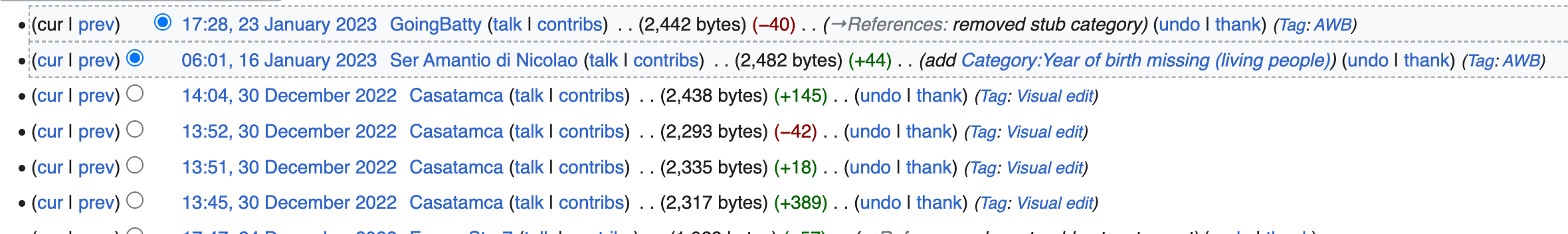
Group of different types of buttons

We need to document the use of groups of buttons with a combination of different types of buttons. Also, we need to document when to use the destructive ones.

Captura de Pantalla 2023-01-23 a las 17.05.00.png (488×1 px, 411 KB)
e.g. why the cancel button is a quiet button in this example while the rest of buttons are normal?
Destructive buttons

We need to document when to use destructive buttons and when to use neutral ones since destructive buttons should be used just when the action is not reversible.

image (13).png (741×506 px, 68 KB)
e.g. in this example the "Cancel" button should be a neutral button instead.
'Inline' and small buttons in content

Figma explorations for inline-button style (related to T325553 and T327426)

Vector2022 menus
image.png (1×2 px, 391 KB)
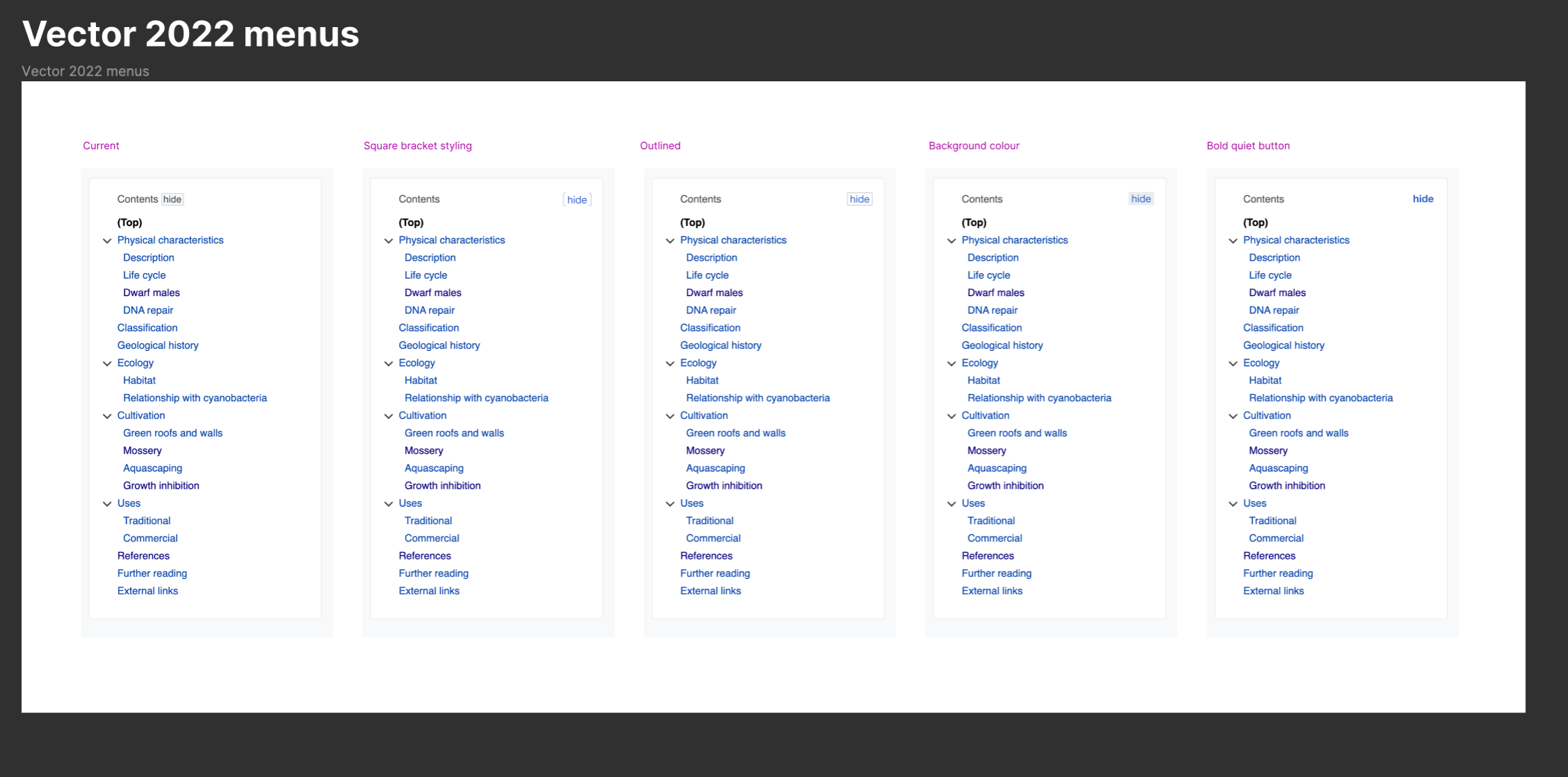
Inline actions in groups
image.png (1×1 px, 369 KB)
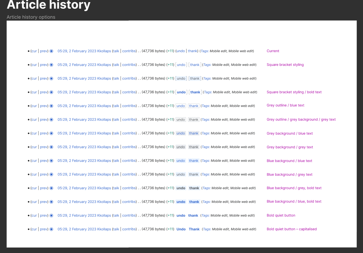
"Bracket" button exploration states
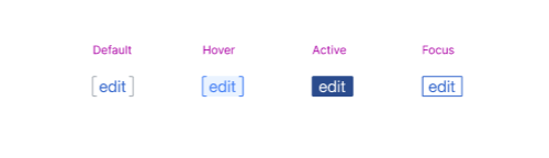
image.png (144×500 px, 11 KB)

User stories

  • As a designer or developer I need to know where should I place the main and secondary actions.
  • As a designer and developer I need to know how to use buttons (primary, neutral, quiet) to represent primary and secondary actions.

Considerations

Development considerations

Acceptance criteria (or Done)

  • Define the placement of primary and secondary actions
  • Define the use of buttons (primary, neutral, quiet) and how to use them to represent primary and secondary actions

Event Timeline

@KieranMcCann feel free to add more use cases in the task description.

@bmartinezcalvo - can you please put an initial/proposed priority level on this task and move it to the Backlog column?
DST prioritization guidance

bmartinezcalvo moved this task from Inbox to Backlog on the Design-System-Team board.

@KieranMcCann will help us documenting with the visual style and documentation for this task.

Further use case to consider as part of this task or another one is creating a set of smaller button variants when there are actions appearing inline with content. As discussed on T325238#8543678 and T320798, there are places where actions are shown mixed in with content where the regular sized button does not work.

Here are a few places with these 'inline actions':

  • Undo and Thank actions on History, Recent changes, and Watchlist
    image.png (352×2 px, 228 KB)
  • Hide on table of contents
    Screen Shot 2022-10-14 at 8.15.39 AM.png (516×650 px, 63 KB)
  • Edit on section headings
    Screen Shot 2022-10-14 at 8.14.55 AM.png (338×934 px, 84 KB)
  • Reply on old Talk pages
    Screen Shot 2022-10-14 at 8.14.41 AM.png (364×742 px, 93 KB)
  • Reply on Discussion Tools - I believe this currently adds some customisation on OOUI quiet buttons to reduce the line-height:
    image.png (106×582 px, 24 KB)
  • Proposed "show IP" quiet button for IP Masking (will have same custom CSS to adjust line-height):
    image.png (82×836 px, 19 KB)
DTorsani-WMF changed the task status from Open to In Progress.Jan 2 2024, 6:05 PM