Page MenuHomePhabricator

[Design spike] Style "hide" and "move to sidebar" buttons as buttons (not links)
Closed, ResolvedPublic

Assigned To
Authored By
alexhollender_WMF
Dec 19 2022, 2:51 PM
Referenced Files
F37805504: image.png
Sep 26 2023, 2:45 PM
F37805501: image.png
Sep 26 2023, 2:45 PM
F37805499: image.png
Sep 26 2023, 2:45 PM
F37128147: image.png
Jul 4 2023, 4:05 PM
F37128149: image.png
Jul 4 2023, 4:05 PM
F36899704: Screenshot 2023-03-09 at 11.46.23 AM.png
Mar 10 2023, 5:20 PM
F36899702: Screenshot 2023-03-09 at 11.46.16 AM.png
Mar 10 2023, 5:20 PM
F36905409: Screenshot 2023-03-10 at 12.20.00 PM.png
Mar 10 2023, 5:20 PM

Description

Description

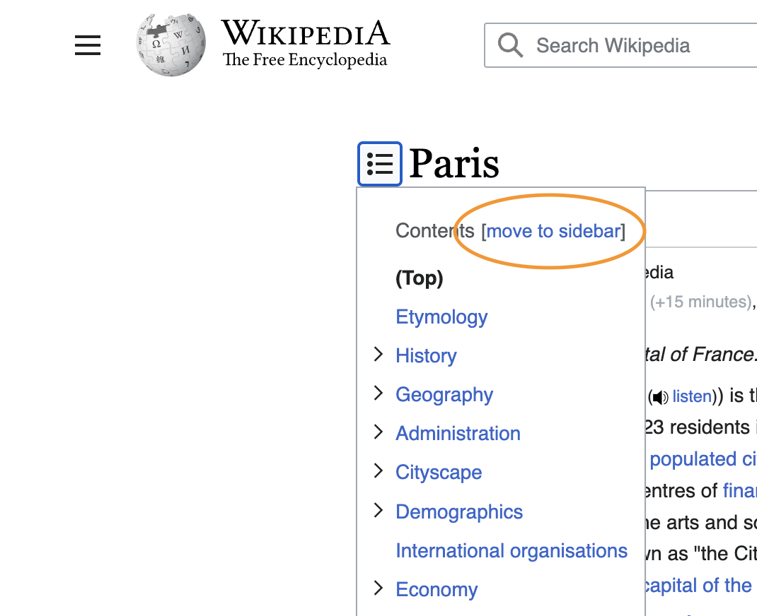
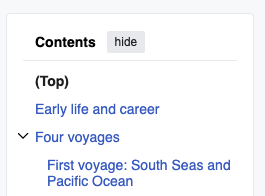
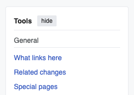
Currently the "hide" and "move to sidebar" toggle buttons on the various panels (table of contents, main menu, page tools) are styled as links. Instead they should be styled as buttons:

hidemove to sidebar
Screen Shot 2022-12-19 at 9.33.09 AM.png (1,078×922 px, 183 KB)
Screen Shot 2022-12-19 at 9.33.21 AM.png (1,070×872 px, 137 KB)

Design explorations

hidemove to sidebar
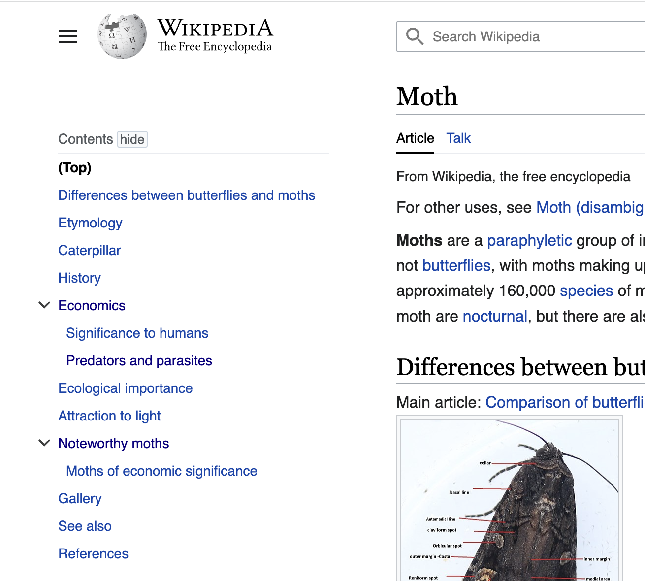
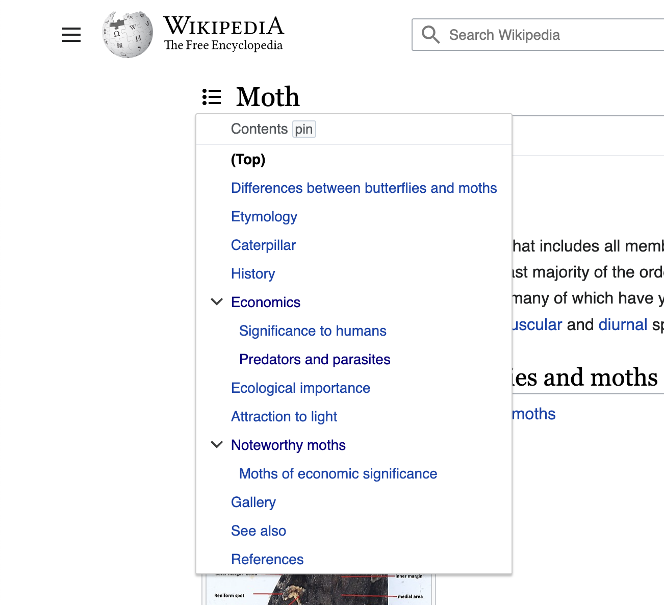
small button (non-standard)
Screen Shot 2022-12-19 at 9.41.02 AM.png (1,310×1,180 px, 454 KB)
Screen Shot 2022-12-19 at 9.41.24 AM.png (1,302×1,186 px, 240 KB)
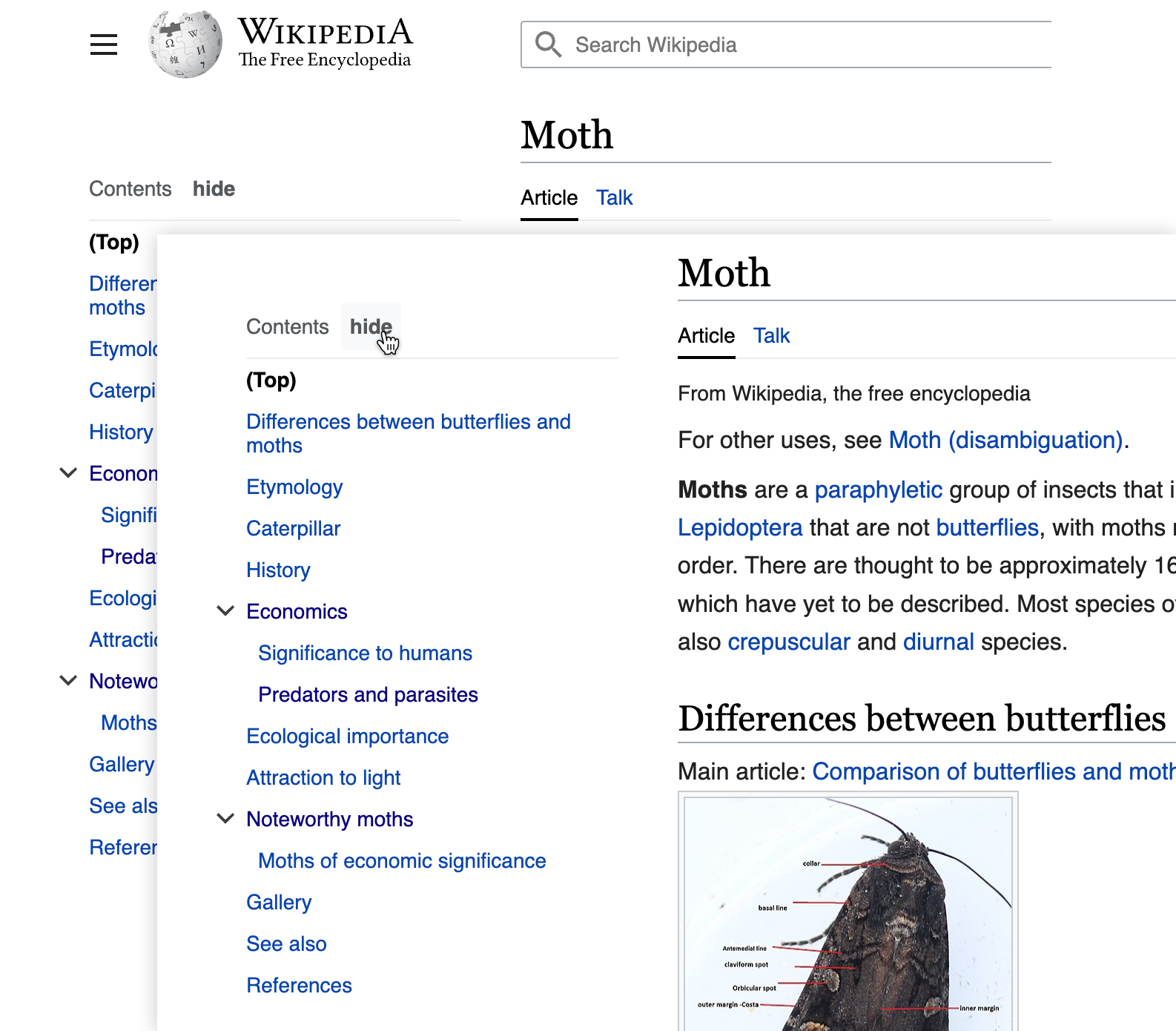
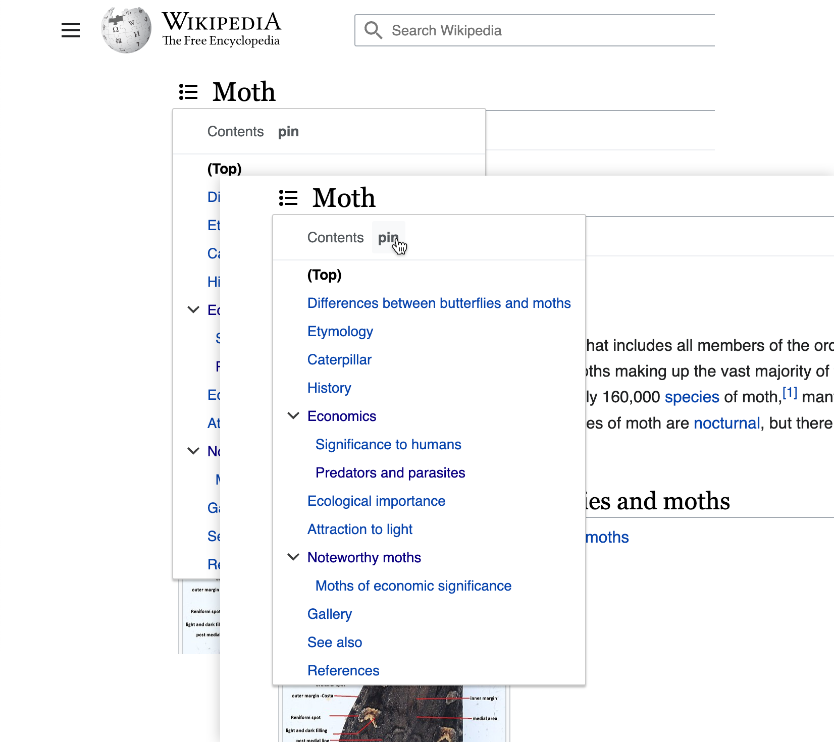
quiet button
image.png (1,586×1,390 px, 528 KB)
image.png (1,652×1,470 px, 356 KB)
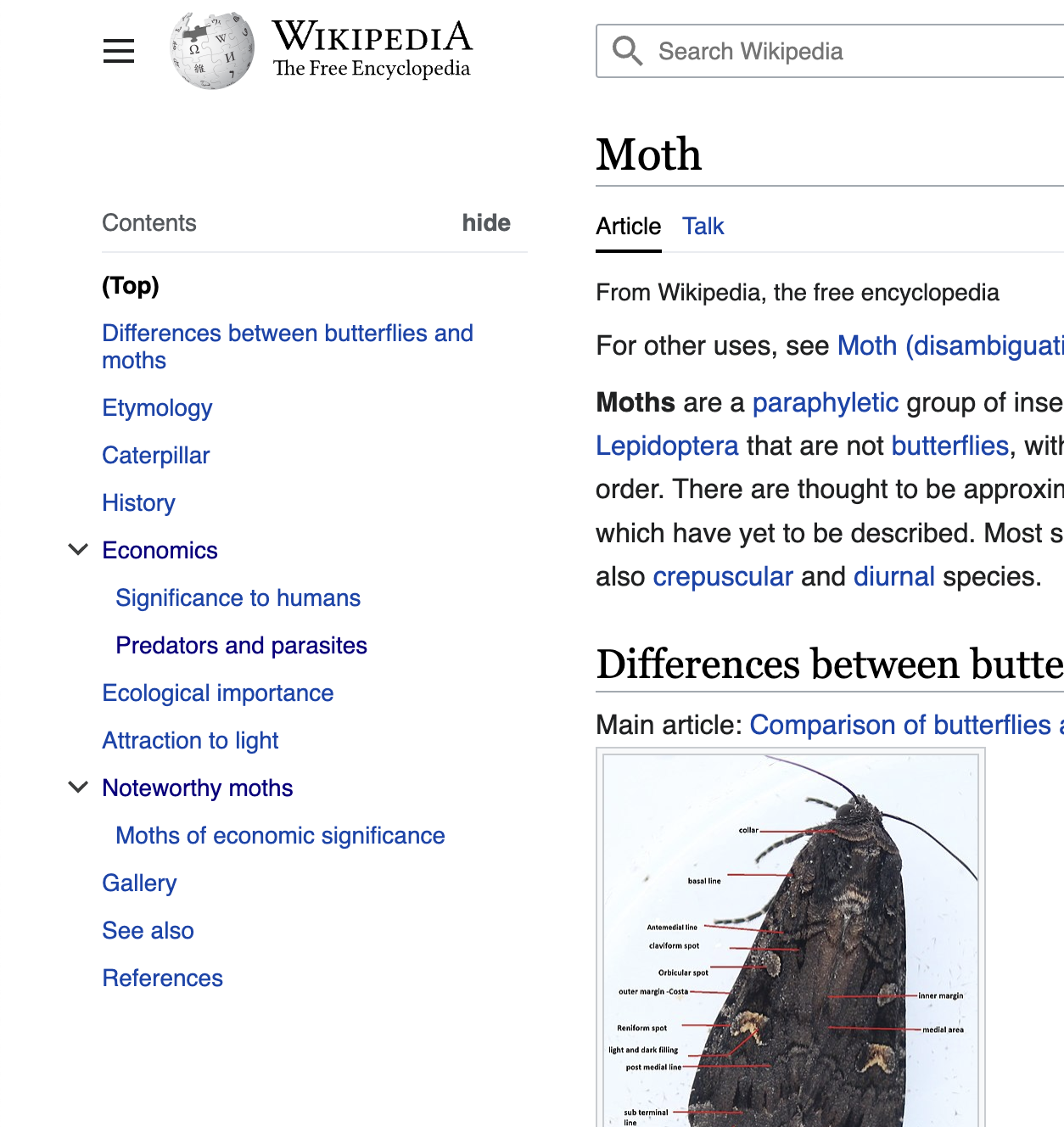
quiet button (right-aligned)
Screen Shot 2022-12-19 at 9.46.17 AM.png (1,254×1,328 px, 565 KB)
Screen Shot 2022-12-19 at 9.46.28 AM.png (1,344×1,316 px, 352 KB)
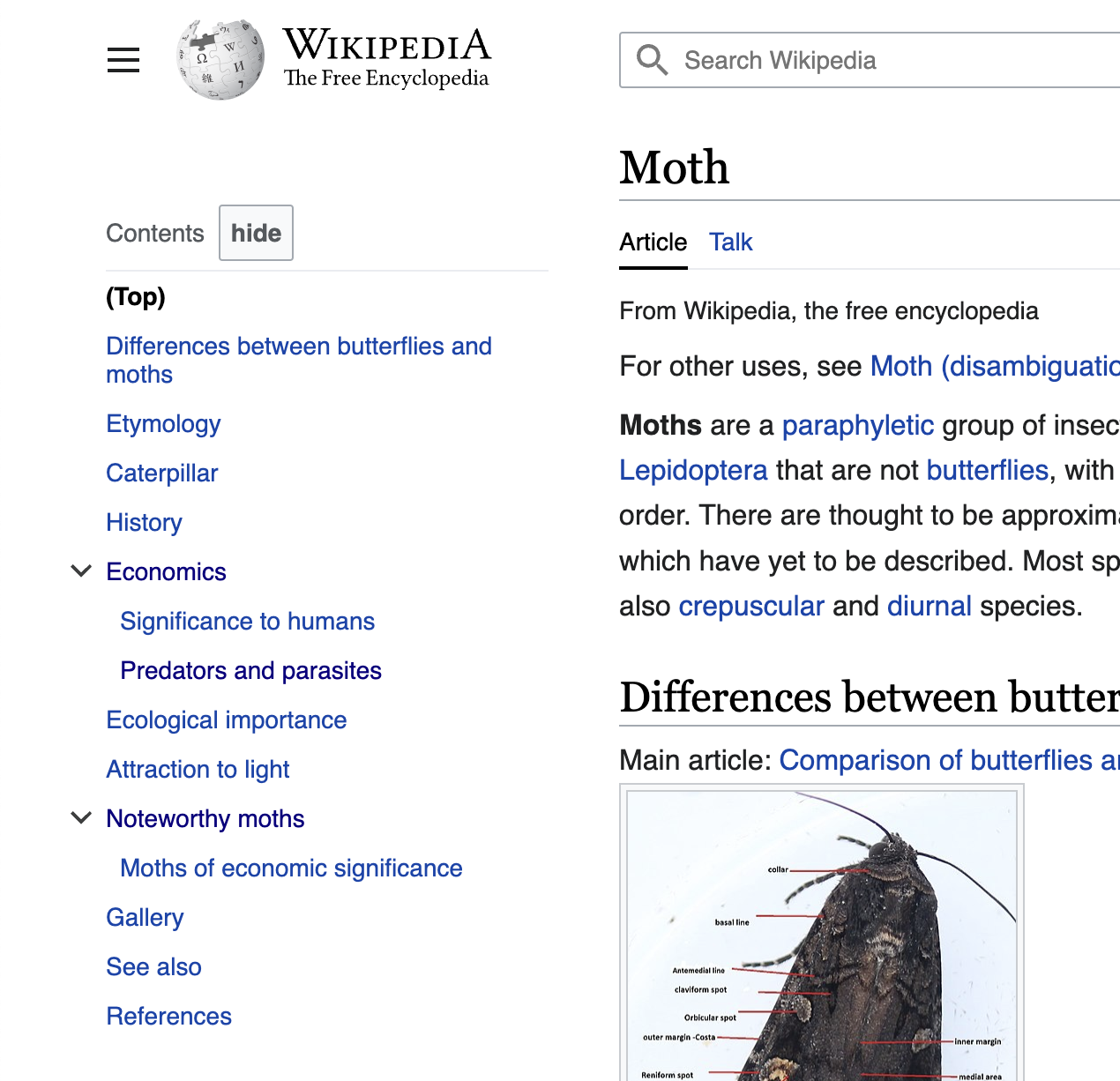
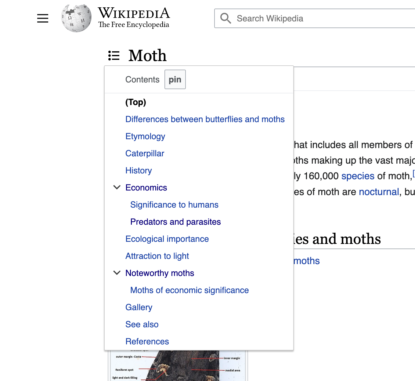
normal button
Screen Shot 2022-12-19 at 9.42.06 AM.png (1,270×1,226 px, 469 KB)
Screen Shot 2022-12-19 at 9.42.15 AM.png (1,360×1,248 px, 295 KB)
icon button
icon button small (non-standard)
Further explorations for single new 'inline' and small buttons in content

Figma explorations for inline-button style (related to T325553 and T327426)

Vector2022 menus
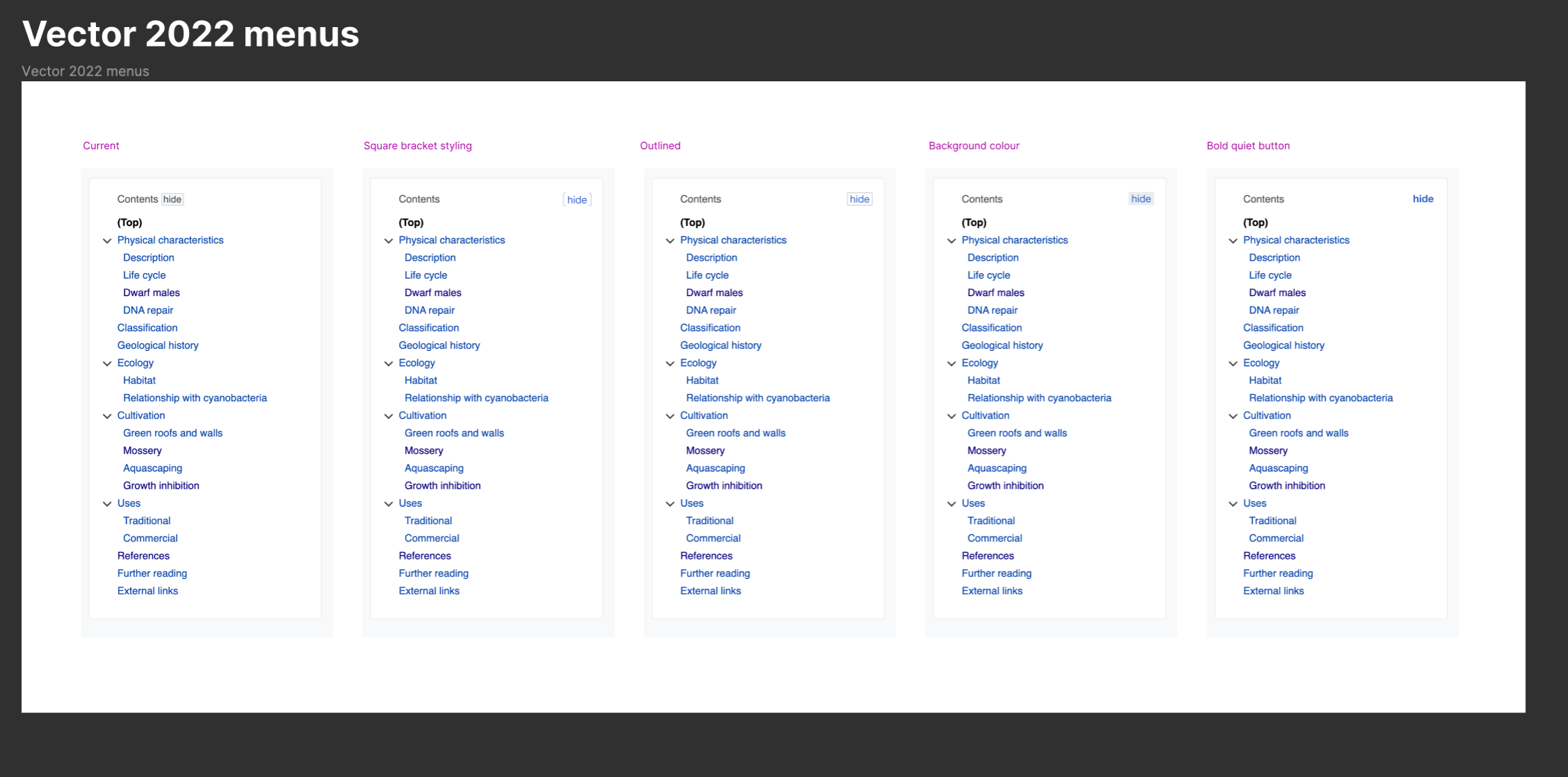
image.png (2,256×1,118 px, 391 KB)
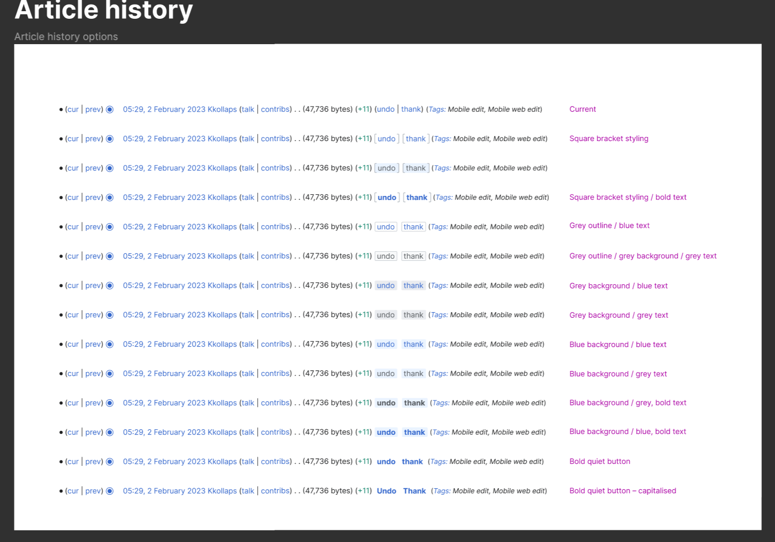
Inline actions in groups
image.png (1,528×1,068 px, 369 KB)
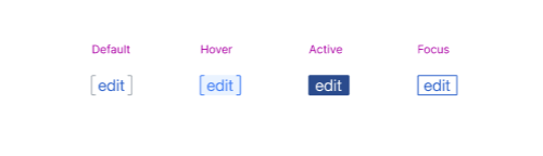
"Bracket" button exploration states
image.png (500×144 px, 11 KB)
NOTE: Consider the "Using links and buttons" guidance when completing this task.
Event Timeline

@Sarai-WMDE @bmartinezcalvo I added some quickly sketched out versions of things we discussed, just to get the ball rolling

@Sarai-WMDE @bmartinezcalvo I added some quickly sketched out versions of things we discussed, just to get the ball rolling

Thank you for sharing @alexhollender_WMF. At first glance I think the hide/pin buttons are better when they are closed to the "Content" title. In the proposal where the hide/pin is on the right it seems to be in the middle of nowhere and it could be related more with the article toolbar than with the Content title. Maybe if the ToC were inside a content box it would be more obvious but now they seem too separated.

Captura de Pantalla 2022-12-19 a las 17.42.43.png (1,270×1,266 px, 1 MB)

Let's review the other proposals with icon only buttons to compare. It would be great to compare these proposals in one of your amazing prototypes.

@bmartinezcalvo sounds good. would it be okay for this task to be assigned to you or @Sarai-WMDE?

It would be great to see the affordance with longer terms, like “verstecken” und “anpinnen” in long-word languages like German as well for next explorations.

@bmartinezcalvo sounds good. would it be okay for this task to be assigned to you or @Sarai-WMDE?

@alexhollender_WMF I think the appropriate process for this task would be for you to work on the design explorations and then for us to find a systematic solution for that decision (e.g. if we finally go with a hide small button, we should work this new small button solution). I think it would be good to create a prototype with all the options described in the task (text button, icon button, etc.) and then decide which one is better for a user's perspective. Once the decision is taken we can create/update the system component if needed.

I have one more question, does it bother you that this text ([hide]) repeats the text in navboxes and other collapsed blocks, but works in a completely different way? It stumped me, for example. Maybe change it to [collapse] or [unpin] or smth else?

Related conversation about new smaller button variants esp when used inline in this task T327426#8549928.

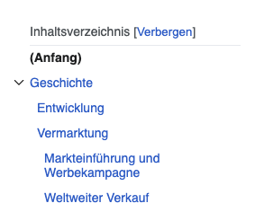
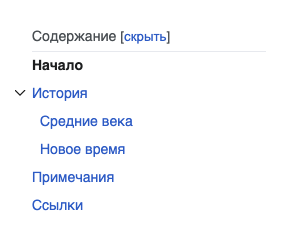
important to consider the length of the text labels in various languages:

German
Screenshot 2023-03-09 at 11.45.29 AM.png (283×236 px, 17 KB)
Screenshot 2023-03-09 at 11.45.36 AM.png (415×217 px, 23 KB)
Russian
Screenshot 2023-03-09 at 4.01.08 PM.png (292×227 px, 13 KB)
Screenshot 2023-03-09 at 4.01.13 PM.png (378×279 px, 26 KB)
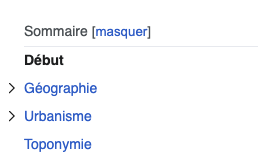
French
Screenshot 2023-03-09 at 11.45.44 AM.png (269×164 px, 10 KB)
Screenshot 2023-03-09 at 11.45.53 AM.png (338×195 px, 16 KB)
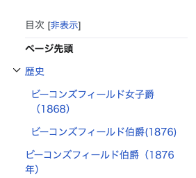
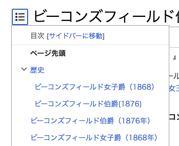
Japanese
Screenshot 2023-03-10 at 12.19.52 PM.png (282×256 px, 19 KB)
Screenshot 2023-03-10 at 12.20.00 PM.png (350×285 px, 31 KB)
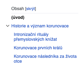
Czech
Screenshot 2023-03-09 at 11.46.16 AM.png (268×217 px, 17 KB)
Screenshot 2023-03-09 at 11.46.23 AM.png (520×295 px, 36 KB)

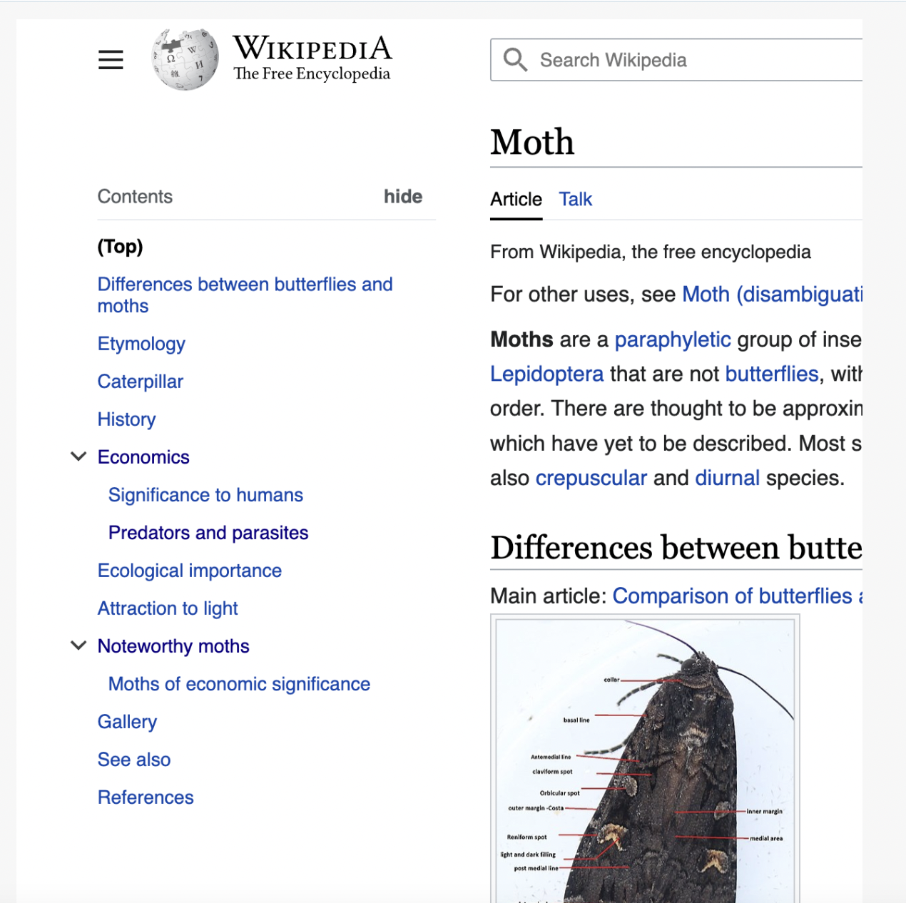
In the latest Vector 2022 Zebra design, these buttons are implemented using a custom style. Is that tracked in a different task somewhere?

image.png (265×196 px, 13 KB)

image.png (270×191 px, 10 KB)

@bmartinezcalvo I wonder if this should be considered as part of T338021: [EPIC] Buttons and Inputs: Determine the approach for a large size as well.

In the latest Vector 2022 Zebra design, these buttons are implemented using a custom style. Is that tracked in a different task somewhere?

image.png (265×196 px, 13 KB)

image.png (270×191 px, 10 KB)

@bmartinezcalvo I wonder if this should be considered as part of T338021: [EPIC] Buttons and Inputs: Determine the approach for a large size as well.

FWIW it is referenced as part of T329963: Provide guidelines on when to choose which basic interaction element in Codex and T327426: Document how to use group of buttons for DST as it touches upon the use case for when smaller and differently styled buttons should be considered when inline, esp. when inline button groups.

In the latest Vector 2022 Zebra design, these buttons are implemented using a custom style. Is that tracked in a different task somewhere?

image.png (265×196 px, 13 KB)

image.png (270×191 px, 10 KB)

@bmartinezcalvo I wonder if this should be considered as part of T338021: [EPIC] Buttons and Inputs: Determine the approach for a large size as well.

@CCiufo-WMF included this as possible use case in the Figma inventory for that task.

I think this task was resolved? :)

CCiufo-WMF claimed this task.