Background
- Description: Clarify and update desktop versus mobile design
- History: describe or link to prior discussions related to this component
- Considerations: list any known challenges or blockers, or any other important information
User stories
- Ensure ToggleSwitch is usable in regards to touch interaction size requirements.
Previous implementations
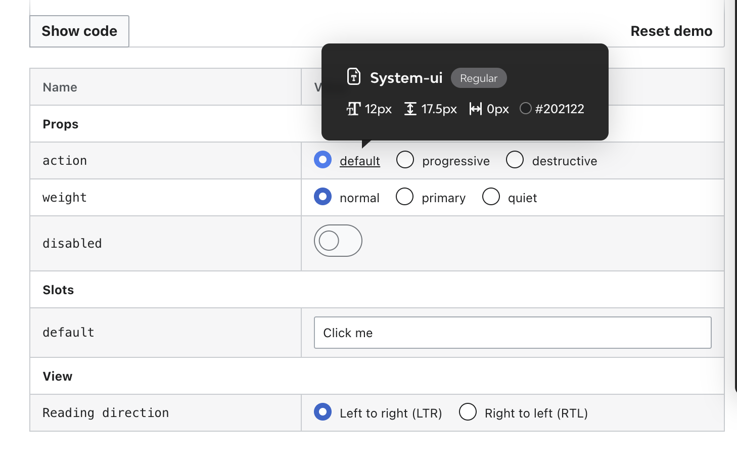
- Codex demo: ToggleSwitch
- Design style guide: add Design Style Guide link, if applicable
- OOUI: add the relevant OOUI widget name here, if applicable. See OOUI demos.
Proposal
- Toggle Switch will be updated with the following sizes:
- Grip: 20px
- Width: 48px
- Height: 32px
- Desktop and mobile will use the same size
- ToggleSwitch size will be updated in both Codex and OOUI libraries and demos (so it's visually the same in all OOUI and Codex projects).
Design spec
Open questions
List here open questions related with this task.
Acceptance criteria (or Done)
Design
- Create Figma spec sheet with the new sizes proposal and link it in this task
- Update the component and spec sheet in the Codex and OOUI libraries
- Update the specs images with the new size in the Design Style Guide
Code
- Update the component in Codex
- Update the component in OOUI