Background
In T338021: [EPIC] Determine guidelines/recommendation for sizing of form components we are exploring the possibility of implementing a large size for buttons and for items. We also need to explore the possibility of adding a small size (24px?). But in this case, the small size would be applied just in buttons.
Known use cases
 | "Hide" button in the Table of contents T351660: Align buttons in pinnable menus with Codex styles |
 | Inline actions in groups on the History, Watchlist, Recent Changes etc pages. |
 | IP reveal button for the Temp accounts work. |
 | The reply button on Talk pages (Discussion Tools). |
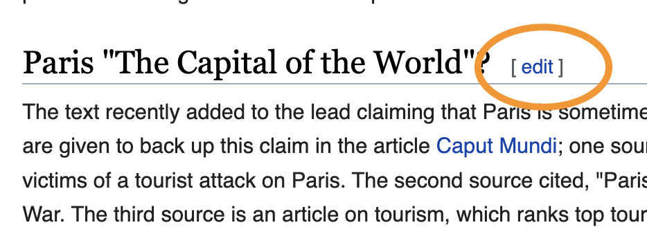 | Edit on section headings. |
| Proposed "show IP" quiet button for IP Masking (will have same custom CSS to adjust line-height). |
Design spec
Once a component spec sheet has been created in Figma, remove the note stating that the spec is missing and link to the spec below.
| Component spec sheet |
Open questions
Add here the questions to be answered in order to design and implement the component
Acceptance criteria (or Done)
Design
- Design the Figma spec sheet and add it in this task
- Update the component in the Figma library. This step will be done by a DST member.
- Update guidelines on Codex for "Using links and buttons" in Style Guide
Code
- Implement the component in Codex