Design inventory background
Identify everything that exists and reduce design (and possible technical) debt as we move things into Vue.js. Inventory is to prioritise the order by which we build the future Vue.js based Codex component toolkit.
Please see also the list and status of currently defined Codex core components in T313357
For simplicity we'll focus here on one default theme application “WikimediaUI”.
Overarching design challenges
Typographic styles not universally used
- Base font size different per skin – Vector 14px equiv, MinervaNeue 16px equiv. Don't even look at Monobook ;)
- Two different technical solutions and range of design discrepancies for mobile web (MobileFrontend/MinervaNeue skin) and Desktop (Vector)
Grid system just rudimentary (spacing) implemented
- T90687: Define a baseline grid and support a responsive grid system Connected to (blocked on) mobile and desktop issue above and prioritization across teams
Theming beyond “WikimediaUI” theme problematic
Thinking MediaWiki skins application of Codex/OOUI components in skins like Monobook or a dark mode feature for one of Vector/MinervaNeue
Components design inventory
Legend:
… not applicable
… not clear yet
/ … covered and available; Green = Go, Yellow = Go with minor todos
blocking issue, that blocks or slows down designers/devs
(XL/L/M/S) … estimated size of issue from x-large to small
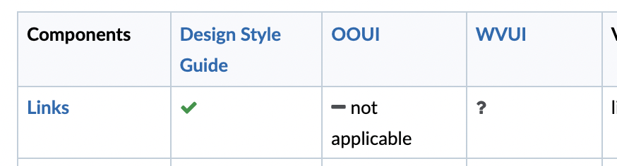
| Components | Design Style Guide | OOUI | Codex | Vector skin | MinervaNeue skin | Notes |
|---|---|---|---|---|---|---|
| Links | not applicable | Core component. To be implemented | link color not aligned | all, but focus T245887 | Complete documentation of link styles T280494 | |
| Buttons | demo | Core component demo | by Codex/OOUI/mediawiki.ui | by OOUI/mediawiki.ui | ||
| Buttons primary (progressive and destructive): | (See 'Buttons') | by OOUI/mediawiki.ui | by OOUI/mediawiki.ui | |||
| Buttons quiet (frameless) | (M) Missing explanation of quiet progressive & destructive ones and their application | (See 'Buttons') | by OOUI/mw.ui | by OOUI/mw.ui | Not fully clear when to choose quiet progressive & destructive ones. Some style inconsistencies were found: background color of quiet progressive and destructive on hover (T280344), active state (T280498, T280503). | |
| Buttons secondary | (S) Missing explanation of normal progressive & destructive ones and their application | (See 'Buttons') | by Codex/OOUI/mw.ui | by OOUI/mw.ui | - T253755. What's the difference between Secondary and Normal (neutral, progressive and destructive) buttons? | |
| Buttons normal | (See 'Buttons') | by Codex/OOUI/mw.ui | by OOUI/mw.ui | |||
| Toggle buttons | demo | Core component demo | ||||
| Button Groups | demo | Core component. To be implemented | ||||
| Button with dropdown | documented as a type of button | to be implemented | by Codex/OOUI/mw.ui | ? | Should we document the use cases of this component better? Can it be considered an individual component? | |
| Checkboxes | demo | Core component demo | by mw.ui/OOUI | by mw.ui/OOUI | The WikimediaUI design file documents a size variation of 4px between desktop and mobile checkboxes (20px > 24px) that is not documented on the Style guide. | |
| Radio buttons | demo | Core component demo | The WikimediaUI design file documents a size variation of 4px between desktop and mobile radio buttons (20px > 24px) that is not documented on the Style guide. | |||
| Toggle switches | demo | Core component demo | by OOUI | by OOUI | ||
| Dropdowns | demo; full-width issue, too long | Core component demo | by OOUI | Inline validation styles should be defined and documented T267807; Consolidate style of disabled dropdowns T280508. Consider menu dependency. Should the font-weight of the Dropdown label be regular (OOUI, Codex, etc) or bold (DSG)? | ||
| Comboboxes | demo | Core component demo | by OOUI | Inline validation styles should be defined and documented T267807 | ||
| Label | Core component/mixin. To be implemented. | |||||
| Field | Core component. To be implemented. | |||||
| Text inputs | demo | Core component demo | by Codex/OOUI/mw.ui | by OOUI/mw.ui | Inline validation styles should be defined and documented T267807 (Applies to all input types) | |
| Label | Core component/mixin. To be implemented. | |||||
| Textareas | (S) Core component. To be implemented | by OOUI/mw.ui | by OOUI/mw.ui | |||
| Search inputs | Core component demo | by Codex/OOUI/mw.ui | by OOUI/mw.ui | |||
| Lookup | Missing | Core component demo | by Codex/OOUI/mw.ui | by OOUI/mw.ui | ||
| Number inputs | demo | (S) Core component. To be implemented | by OOUI | by OOUI(?) | - Increase/decrease buttons useful and necessary? - Position of the buttons (same side vs opposite sides)? - T145598 | |
| File inputs | demo | (L) Core component. To be implemented | by OOUI | by OOUI(?) | Also known as SelectFile* widget; Limited by strict OS mobile specifics; multiple [[ T218408 | support ]] on desktop | |
| Tag inputs | Missing, but design approved implementation in OOUI TagMultiselect | demo | (aka ChipInput) Core component. To be implemented | by OOUI | ||
| Tags | Already an implementation in OOUI TagMultiselect | (aka InfoChip and FilterChip) Core component. To be implemented | by OOUI | Added T280681 for DSG | ||
| Filtering component & filter chips/tags | ? | partially | ? | T324223: FilterChip: Add FilterChip component to Codex. See also discussion around Category widgets T147811. Duplicate of Tags/Filter chip? | ||
| Messages | demo | Core component demo | by MW core CSS/OOUI | by MW core CSS/OOUI | Added T280658 for additional definitions and revision of existing DSG component | |
| Form validation | (M) to be implemented, already in Sketch | (M) (Aka ValidationMessage) Core component. To be implemented | by MW core CSS/OOUI | by MW core CSS/OOUI | ||
| Toast notification | Core component. To be implemented | |||||
| Language selectors | not planned | (M) Potential core component or pattern. To be implemented | Related responsive debt T161957 | |||
| Typeahead search | (M) to be implemented T272625 | not planned | Core component demo | by Codex in modern Vector 2022 | not planned | |
| Date pickers | (XL) to be added | 2 different OOUI-based MW widgets, somewhat following design | Core component. To be implemented | Consolidation task of 2 different MW ones: T91148 | ||
| Color pickers | not planned | |||||
| Progress indicators | (M) to be implemented T266028 | Dialog loading indicator wrong | (S) Core components. To be implemented | by MW core CSS/OOUI | by MW core CSS/OOUI | Still jquery.ui and other non-design approved implementations available |
| Progress bar | (M) to be implemented T266028 | Core component demo (Indeterminate only) | ||||
| Lists | (M) Intro typographic guidelines | not planned | Potential core component | (S) allover design-wise in Vector, partly community driven | (S) allover design-wise in MN | |
| Lists of pages aka Lists (Advanced) | (M) | not planned | Probably covered by 'List' | by MW core/extensions like RelatedArticles | T153417 & T266031: Add “Lists (advanced)” to Codex | |
| Menus | (M) partly covered by dropdown and typeahead | Core component demo (basic functionality) | by Codex/OOUI | by OOUI | T286240: Define and add “Menu” component to the DSG | |
| Menu item | Missing | Core component demo | ||||
| Dividers | Intro typographic guidelines | not planned | Core component/mixin. To be implemented. | by MW core | ||
| Cards | (M) Captured in T278311, T338015 | not planned | (M) Core component. MVP (card): T278311, WIP (module): T338015 | Newcomer homepage project/ext, Wikifunctions | MN features card-like elements | Consolidate and take into account desktop & mobile current implementations and challenges, also includes defining layout rules for when multiple cards/modules are shown |
| Tabs/segmented control | (M) Already a standards-oriented implementation in Codex/OOUI | Core component demo | by Codex/OOUI | by Codex/OOUI | Minor variabilities in implementations need to be unified. Codex: T303321 | |
| Tables, data tables | (L) Already a standards-oriented treatment in Vector/MN | (L) Core component. To be implemented | (S) MW core/Vector home-brewed implementations (MW core's own data table .wikitable styles) | (S) MW core/MN home-brewed implementations | See T303320: Table: Add Table component to Codex and also T280727, and T214208 | |
| Sheets: bottom and side | Already an implementation in MN, that is not standards-compliant | Potential core component | MN code | T366048: Sheet: Add Sheet component to Codex | ||
| Navigation menu: bottom and side | (M) | not planned | ? | by MinervaNeue | T280680 details how this may be considered distinct from "Sheets:bottom and side" | |
| Image | Missing | Potential core component | T314514 | |||
| Thumbnail | Missing | Core component demo | ||||
| Image galleries | (L) To be implemented | not planned | not planned | Vector (community) implementations | MN home-brewed implementations | |
| Steppers | (M) To be implemented, compare Number inputs | not planned | ||||
| Pagination | (S) To be implemented | not planned | Potential core component | some semi-design approved Vector implementations | some semi-design approved MN implementations | |
| Breadcrumbs | Potential core component | |||||
| Slider | (S) To be implemented | not planned | Potential core component | T236119: Slider: Add Slider `input type="range"` component to Codex | ||
| Drag & Drop / Reorder | (M) To be implemented, already OOUI widget avail | (?) Available, but w/o design involvement | not planned | via OOUI | not planned yet, due to drag & drop difficulties on mobile | T356644: Add reorderable list (by drag & drop) to Codex Technical difficulties with touch interfaces |
| Avatars | (M) | not planned | See old task T128953 | |||
| Badges | (M) | not planned | Core component. To be implemented. | designed but not unified | T280708 | |
| Page previews/hover cards | (M) Already standards-oriented implementation in Vector | Vector-only | ||||
| Dialogs | Captured in T266029. Alerts and quick confirm treatment still needs extra work | (L) Out of sync with DSG, T155528 | (XL) (Simple and complex) Core components. To be implemented | by jquery.ui/OOUI/home-brewed | by OOUI/Minerva home-brewed | |
| Page/view types | (XL) Not available besides bits & pieces | Scope of Codex unclear yet, if it is meant for full page types, prob yes | (XL) designs all over the place | (XL) designs all over the place | Grid as one the missing keys of the issue | |
| Text highlight | (S) | Yes, but outdated | ? | ? | ? | T280670 |
| Edit Diff | (M) | not planned | Core component. To be implemented | ? | ? | T333681, T90948 |
| Tooltips | (S) design approved implementation in OOUI | demo | Core component. To be implemented | by OOUI/jquery.ui | T340456: Tooltip: Add Tooltip component to Codex T280677 | |
| Floating action buttons (& associated components) | (L) Captured in T278134 | Core component. To be implemented | See T280330 and T278134 | |||
| Onboarding/ guided help | (S) | not planned | Potential core component | T280705 | ||
| Form layouts | (S) Rudimentary captured in components overview | Provided various layout types as Fieldlayouts | Could provide pattern recommendations | by MW core/OOUI/Vector | by MW core/OOUI/MinervaNeue | T280724 |
| Media player | not planned | Potential core component | ||||
| Media player controls | (S) | not planned | Potential core component | by TimedMediaHandler extension | T280725 | |
| Expand and collapse (accordion) | (M) design approved implementation on special pages/Advanced Search | Potential core component | T280785 | |||
| Empty states | (S) | not planned | Patterns should be documented | T280789 | ||
| Skeleton / Placeholder UI | (S) | not planned | Core component/mixin. To be implemented | T311874: Skeleton: Add Skeleton loader component to Codex, potentially as a child of T75972 | ||
| Offline states | (S) | not planned | T280845 | |||
| Carousels | (M) | not planned | Potential core component | Should this even be part of DSG. With all negative usability research on carousels?! T280846 | ||
| Data visualisations | (XL) | T280847 - Note that wikistats charts currently uses Vue | ||||
| Icons | need to be constantly synced in 4 different places | default implementation | Core component demo | (M) also still a number of out-of-sync and homegrown icons | (M) Some icons homegrown still in | See also T141801: WikimediaUI (Codex/OOUI) icon inventory (tracking), T280662, and T280666 |
| Grabber / Handlebar | Missing (S) | See T297805: Add a grabber (aka handlebar) component to Codex | ||||
| Animation and transitions | (XL) | partly implemented in widgets | Partially covered by Animation and Transition tokens | by Codex/OOUI/mw.ui/MW core | by OOUI/mw.ui/MW core | T77949 |
| Color palette - dark/black mode | (XL) | not planned | only by gadgets/extensions per wiki | See dark-mode and example gadget on enwiki | ||
| Components | Design Style Guide | OOUI | Codex | Vector skin | MinervaNeue skin | Notes |
Question and open call
Go through the design inventory and add in any gaps you are aware/you come across. First round feedback is gathered in next Design Practice and Systems Meeting on April 20th. Deadline for design-all review is May 04th.
- File a sub-task to this task on the affected component.
- Put a Tnnnnnn link into notes column for it, maybe with a short (few words) summary of the issue.