Background
Implement the Sheet component in Codex.
Description
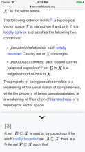
A Sheet provides additional context by sliding in from the bottom (or side) of the screen. It is particularly useful on mobile and small devices.
https://www.nngroup.com/articles/bottom-sheet/
Considerations
Some wish list items for this component:
- It would be nice if this component could launch at a certain height and then be expandable into full height
- It would be nice if this component could have micro flows inside of it with a back stack (similar to the onboarding dialog but without a progress indicator)
- It would be nice if this component had an option for smooth transitions in and out with a fallback behaviour that has no transition for low bandwidth devices or noJS readers.
- It would be nice if this component supported drag up and down gestures in mobile viewports.
- It would be nice if this component supported wide viewports (i.e. desktop)
- It would be nice if this component supported contextual functions in the header, e.g. search icon, context menu, etc.
User stories
- As a user, I need to access additional information, options, or actions, without losing focus on the current screen.
History
Describe or link to prior discussions related to this component
Known use cases
| T129054#8363253 | |
| Templates (and Wikifunctions in the near future) | |
| Template sheet on desktop screen | |
| Notifications in Minerva | |
| References/Citations in Minerva | |
Existing implementations
These artifacts are listed for historical context. The figma spec, linked below, is the source of truth for the new component.
Wikimedia community:
- OOUI: add the relevant OOUI widget name(s) here, if applicable. See OOUI demos.
- Vue: add any existing Vue implementations, if applicable. See Projects using Vue.js.
External libraries:
- Add links to any examples from external libraries
Codex implementation
Component task owners
- Designer: add the main designer's name
- Developer: add the main developer's name
Open questions
- Do we want to implement both Bottom and Side Sheets?
- Will Sheets be displayed on desktop devices?
Design spec
Once a component spec sheet has been created in Figma, remove the note stating that the spec is missing and link to the spec below.
| Component spec sheet |
Anatomy
Designer should list the structure and properties of the component.
Style
Designer should list the visual features of the component.
Interaction
Designer should list interaction specifications.
Guidelines
Designer should provide the guidelines and associated images for this component. Once the guidelines have been documented, please remove this note and share a link to the guidelines below.
| Doc with the guidelines | Images |
Demos
Designer should describe how the component should be documented in the demos, including configurable and standalone demos.
Acceptance criteria
Minimum viable product
This task covers the minimum viable product (MVP) version of this component. MVP includes basic layout, default states, and most important functionality.
MVP scope
- List all parts of the MVP scope for this component
Design
- Design the Figma exploration file and include its link in this task:
- Document the component's guidelines and provide the link to the doc and its images in this task.
- Publish the main component in the Figma library. This step will be done by a DST member.
Code
- Implement the component in Codex
- Implement the guidelines in the component's page
Future work
- If applicable, list future work that should be done for this component after the MVP is implemented as part of this task. You should open new, standalone tasks for all future work.


