Page MenuHomePhabricator

Consider changing default focus style (e.g. for links) to match WMUI
Closed, InvalidPublic

Description

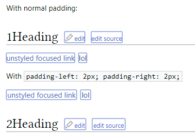
In Chrome 81, the default focus style has been made much strong to improve accessibility:

Chrome 80Chrome 81
image.png (36×229 px, 2 KB)
image.png (39×237 px, 2 KB)

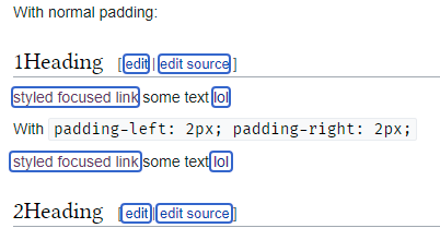
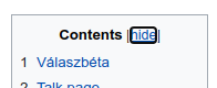
It is now very similar to the WMUI focus styling, which is 2px outline in dark blue instead of black, so we should probably just align it with WMUI.

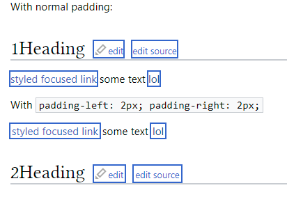
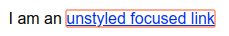
That said, the new outlines can make text hard to read:

image.png (43×135 px, 1 KB)

so we may just want to come up with our own solution.

Event Timeline

A suitable rounded background gives much better UX. Interactions with icons, the logo and labelElements (ex. in search) need a bit of fine-tuning.

focus-timeless-2.png (211×511 px, 13 KB)
focus-timeless-3.png (209×509 px, 15 KB)
focus-nav-mild-1.png (460×215 px, 23 KB)
focus-nav-dark-1.png (449×210 px, 23 KB)

I think the point here is to unify our focus styles, not create a new one. The proposal is to make the outline blue to match our existing focus styles in WMUI:

image.png (39×89 px, 818 B)

image.png (122×160 px, 3 KB)

I think the point here is to unify our focus styles, not create a new one.

That's food for the thought. Focus styles are usually overlooked in webdesign and this is the case here too. The default outline is often hard to recognize and almost always makes the text less readable and it also lacks design finesse (it's ugly).

That being said, back to the original "focus":
Making it blue (#36c - Accent50) is an obvious step to take imho. If somebody has better idea... then it will be changing the style, as said above.

The question that has weight imo is "How?".

  • outline-style: auto; will effectively turn the #36c color into #a0b1e5.
  • The rest of the outline styles won't round the corners.
  • Buttons use a combination of: border-radius: 2px + box-shadow: 1px inset #36c +border: 1px solid #36c. I wonder why that resource-consuming double solution is used. Let's evaluate these options separately.
  • Using a 2px border changes the layout, that can be compensated with negative margin, but that spoils the positioning of the notification icons, maybe more. Notification icons still use the <a> element... technical debt.
  • Using a 2px box-shadow was the least problematic, I've seen no issues with it. Outset, not inset, see samples, why.
    • box-shadow: 0 0 0 2px #36c;

To address the border being too close to the text (demonstrated with "lol"), a 2px horizontal padding can be added to <a> elements. This can be compensated with a -2px horizontal margin.
The notification icons are unaffected, but it might have inadvertent effects in some hidden places, that need to be checked.

Samples

All taken with border-radius: 2px;

outline auto (Chrome 80)outline solid 2pxborder solid 2pxbox-shahow inset 2pxbox-shahow outset 2px
focus-outline-auto-blue-36c.png (282×402 px, 16 KB)
focus-outline-solid-2px-blue-36c.png (283×412 px, 17 KB)
focus-border-solid-2px-blue-36c.png (238×390 px, 15 KB)
focus-boxshadow-inset-2px-blue-36c.png (236×388 px, 15 KB)
focus-boxshadow-outset-2px-blue-36c.png (248×399 px, 16 KB)

Note: screenshots taken with Timeless' 15.2px font-size. Vector with 14px looks worse. Sidenote: fix the font-size.

Vector:

focus-boxshadow-outset-2px-blue-36c-vector.png (220×402 px, 17 KB)

Thanks. The box-shadow outset was the one I was experimenting with, and would probably be the best approach here.

@Volker_E do you have thoughts on this? What is the current thinking around why we don't apply custom styling for blue links, as we do for OOUI elements?

Have updated today to v81 and on macOS it's still the blue from before, relying on outline: -webkit-focus-ring-color auto 5px;
@Demian @alexhollender We needed to provide our own focus styles based on border and box-shadow to apply outline in a visually satisfying clear manner in plethora of our widgets based on combination of elements.
We have left link styles out of the game so far as it, among other reasons, wasn't part of OOUI's responsibility.

An issue when applying Accent50 to the outline is, what is already visible Demian's write-up above, that the color would effectively turn into something darker, more grey, which we clearly would want to prevent.

image.png (1×2 px, 300 KB)

Not much more exciting.

I think the black accessible outlines were pulled in the Edge port, but clearly the OSX build is still special.

wasn't part of OOUI's responsibility.

Yes, plain links are not OOUI widgets, however the WMUI theme/style-guide applies to more than just OOUI widgets.

I think this would definitely be an improvement for chrome+windows/linux where the black outline is default. It is less clear if we want to change the browser defaults elsewhere (chrome+osx, Firefox, ...).

Revisiting with some distance. Have prepared a reduced test case:
https://codepen.io/Volker_E/pen/QWyNpwP

I think it's seriously to consider alongside what @Esanders has been requesting here.

We could reduce code to

:focus {
  outline-color: #36c; /* Variable to be used instead of static value in prod code. */
}

With this we wouldn't interfere with our own components focus styles and still provide a consistent look with the custom ones.

Effect as intended, very close to Wikimedia Design Style Guide components focus
Chrome v81+/macOS; Edge v83+/Win 10; Yandex 14.12, Samsung web browser:

image.png (66×956 px, 9 KB)

Effect in color change with minimal change from normal user expectations:
Chrome until v80 and lower/Win 7 or macOS (BrowserStack, therefore worse image quality):
image.png (74×1 px, 28 KB)

No effect (those browsers use different default focus properties):
Edge 17/Win (no change, color differences only due to hover/focus default styles), iOS Safari, macOS Safari:
image.png (74×964 px, 39 KB)

Change 604945 had a related patch set uploaded (by VolkerE; owner: VolkerE):
[mediawiki/skins/Vector@master] [less] Normalize focus styles in Blink based browsers

https://gerrit.wikimedia.org/r/604945

Looks good. I noticed an edge case in the TOC where a link is generated as an :after element:

image.png (80×196 px, 3 KB)

My debugger only lets me add :focus to the real element, which generates the correct blue outline, but when I tab through I get black.
This could be a browser bug we can't fix though?

Ha, yes, seems like a browser bug. :focus:after doesn't alter it either. Seems still an acceptable improvement to me with the bug.

Looks good. I noticed an edge case in the TOC where a link is generated as an :after element:

I don't see a link there. It's a <label> with 'pointer' cursor, :after only adds the text "span". The focused element is the <input> checkbox associated with the <label>.
<label>s draw the focus ring when the <input> is focused, the bug is that the :focus styles are not applied in this case.

Change 604945 merged by jenkins-bot:
[mediawiki/skins/Vector@master] [less] Normalize focus styles in Blink based browsers

https://gerrit.wikimedia.org/r/604945

CC @nray @Niedzielski in relation to the sidebar button's focus ring question.

@Demian, the sidebar button is a custom element and is supposed to follow our own WikimediaUI focus styles as seen in OOUI/WMUI theme button demo for example.

Change 607905 had a related patch set uploaded (by Aron Manning; owner: Aron Manning):
[mediawiki/skins/Vector@master] [less] TOC hide link follows the WMUI focus style

https://gerrit.wikimedia.org/r/607905

Change 607906 had a related patch set uploaded (by Aron Manning; owner: Aron Manning):
[mediawiki/skins/Vector@master] [less] "More" Menu follows the WMUI focus style

https://gerrit.wikimedia.org/r/607906

Looks good. I noticed an edge case in the TOC where a link is generated as an :after element:

image.png (80×196 px, 3 KB)

My debugger only lets me add :focus to the real element, which generates the correct blue outline, but when I tab through I get black.
This could be a browser bug we can't fix though?

The following rule is a workaround:

input#toctogglecheckbox:focus + .toctitle .toctogglelabel {
	outline-color: #36c;
}

Committed: https://gerrit.wikimedia.org/r/607905

"More" menu has fallen victim of the focus ring blackening.
Fix: https://gerrit.wikimedia.org/r/607906

Both patches tested in Firfox and Chrome. The focus outline is consistent with other links in both browsers. Firefox: 1px dotted blue, Chrome: auto (2px solid) blue.

Change 608159 had a related patch set uploaded (by Aron Manning; owner: Aron Manning):
[mediawiki/skins/Vector@master] [less] Add normalized focus ring styles as .mw-focus-outline class

https://gerrit.wikimedia.org/r/608159

Change 608160 had a related patch set uploaded (by Aron Manning; owner: Aron Manning):
[mediawiki/skins/Vector@master] [less] Apply Firefox's dotted focus outline in IE

https://gerrit.wikimedia.org/r/608160

Change 608161 had a related patch set uploaded (by Aron Manning; owner: Aron Manning):
[mediawiki/skins/Vector@master] [modern] Normalize the sidebar button focus ring

https://gerrit.wikimedia.org/r/608161

  • Patch 608159 codifies the normalized focus outline as .mw-focus-outline {} in Vector's 'normalize.less'.
  • Patch 608160 applies these styles universally to :focus, thereby applying Firefox's dotted focus outline in IE.

These styles could be candidate for T256520: Consider 'normalize' stylesheet RL module

DEMO for browserstack.

Focus rings that should be consistent with rings on all other links:

  • Sidebar button
  • More menu (narrow the window to make it appear)
  • TOC hide

@Volker_E per your feedback - request? - the class has been upgraded to a mixin.

Please note: this "utility" class served the only purpose to be :extend() - ed, NOT to be applied in HTML. As such it does not fall under the pattern of Atomic CSS which concerns what styles are applied.
Basically the implementation was a parameterless mixin to enable entension. The constraint is: pure mixins that aren't output as classes cannot be extended, therefore that solution had to be dropped.
With advanced @import features the "utility" class could be hidden, but I highly doubt those features are implemented in less-php.

Change 607906 abandoned by Jdlrobson:
[mediawiki/skins/Vector@master] [less] Normalize the "More" Menu focus outline color to WMUI defined color

Reason:
264 days old

https://gerrit.wikimedia.org/r/607906

Change 607905 abandoned by Jdlrobson:
[mediawiki/skins/Vector@master] [less] Normalize the TOC hide link focus outline color to WMUI defined color

Reason:
264 days old

https://gerrit.wikimedia.org/r/607905

Change 608159 abandoned by Jdlrobson:
[mediawiki/skins/Vector@master] [less] Add normalized focus outline mixin .mixin-focus-outline()

Reason:
262 days old

https://gerrit.wikimedia.org/r/608159

Change 608160 abandoned by Jdlrobson:
[mediawiki/skins/Vector@master] [less] Apply Firefox's dotted focus outline in IE

Reason:
No activity in quite some time. Task remains open so won't get lost.

https://gerrit.wikimedia.org/r/608160

Change 608161 abandoned by Jdlrobson:
[mediawiki/skins/Vector@master] [modern] Normalize the sidebar button focus ring

Reason:
262 days old

https://gerrit.wikimedia.org/r/608161

CCiufo-WMF subscribed.

It doesn't seem like this is on anyone's radar, and given the age of the task and how much has changed (like the development of Codex), I'm going to close it. If some or all of this is still relevant, I'd suggest filing a new task in the appropriate place with updated context.

@CCiufo-WMF is there a reason why Phabricator styles now include an a {outline-style: none;} declaration instead of the color(s) mentioned above?
It removes all focus outlines from links in focus, even for the :focus-visible heuristic.

I could not figure out where to

  1. add this issue
  2. attempt to fix it myself
  3. create a merge request

since there's no core.pkg.css within the Phabricator code itself (which I pulled from https://gerrit.wikimedia.org/r/plugins/gitiles/phabricator/+/refs/heads/production)

Hi @banaanihillo, this task was actually about the focus styles in Wikimedia projects (like Wikipedia), not for Phabricator itself. I believe the right place to file such a request is at Phabricator, but @Aklapper might be better suited to point you in the right direction :)