Page MenuHomePhabricator

Mobile version Star for Watchlist not consistent with desktop (blue fill vs black fill)
Open, MediumPublic

Assigned To
None
Authored By
Waddie96
Oct 3 2019, 4:47 PM
Referenced Files
F36844993: Screen Shot 2023-02-14 at 2.49.23 PM.png
Feb 14 2023, 10:49 PM
F30875642: animation.gif
Oct 22 2019, 6:05 PM
F30580698: Screen Shot 2019-10-07 at 9.06.25 AM.png
Oct 7 2019, 1:07 PM
F30544547: T234550 screencast 2019-10-04.mp4
Oct 4 2019, 7:27 PM
F30535909: IMG_1372.PNG
Oct 3 2019, 4:47 PM
F30535911: IMG_1373.PNG
Oct 3 2019, 4:47 PM
Tokens
"100" token, awarded by Waddie96."Like" token, awarded by xSavitar.

Description

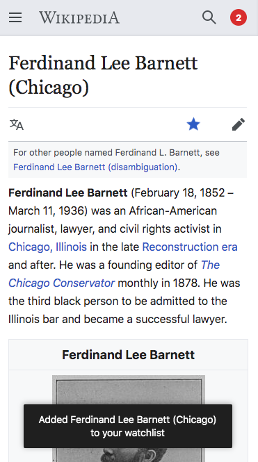
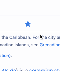
When a page is on one's Watchlist versus not, the star changes from hollow to filled and blue. However, these two images do not appear to be the same star, the hollow one appears clean and sharp whereas the filled blue star is somewhat rounded. Would it not appear more consistent if both stars were of the same star but just filled and blue.

. MinervaVector 2022
IMG_1373.PNG (116×116 px, 4 KB)
.
Screen Shot 2023-02-14 at 2.49.23 PM.png (88×98 px, 3 KB)

Event Timeline

(Removing Mobile-Web-Settings as there is no setting in your mobile user preferences to set your favorite watch list star.)

Haha, that's due to the rotation of the watch star by 72 degrees.
360 seems like a lot.

I'd recommend probably to mirror it, by transform: scale(-1, 1). @alexhollender you onboard?
See

Change 540950 had a related patch set uploaded (by VolkerE; owner: VolkerE):
[mediawiki/extensions/MobileFrontend@master] Amend watchstar animation to provide a cleaner icon look

https://gerrit.wikimedia.org/r/540950

That looks rather good, thank you

@Waddie96 good catch. @Volker_E I think a small improvement would be for the star to flip and then change color. Currently it changes color then flips, which feels a bit off.

If we wanted to further simplify, because we have a toast message I feel like it would be fine with just the color changing and no animation.

Screen Shot 2019-10-07 at 9.06.25 AM.png (665×371 px, 95 KB)

Spoke with @Volker_E and we agreed to remove the flip/spin animation but keep the color change. Also noting that it would make sense to remove the spin animation from Vector as well for consistency, but that's not a blocker here.

Has the update been deployed yet? Also, thank you!

@Krinkle has provided a different idea in a conversation today, that I think is worthwhile considering over the mirroring I've provided above.
transform: scale( -1 ) scale( -1 );
https://usercontent.irccloud-cdn.com/file/Bw0Ow2hV/Untitled2.mov

In agreement with him, it provides a more “rewarding” feel that accompanies the star icon. My additional take were to add a different animation on removing from watchlist action, as the rewarding emphasis felt wrong there. A fade-out transition seems more appropriate. The action is resulting in a user notice aside of the click animation.

@Krinkle has provided a different idea in a conversation today, that I think is worthwhile considering over the mirroring I've provided above.
transform: scale( -1 ) scale( -1 );
https://usercontent.irccloud-cdn.com/file/Bw0Ow2hV/Untitled2.mov

Looks awesome

@Krinkle has provided a different idea in a conversation today, that I think is worthwhile considering over the mirroring I've provided above.
transform: scale( -1 ) scale( -1 );
https://usercontent.irccloud-cdn.com/file/Bw0Ow2hV/Untitled2.mov

In agreement with him, it provides a more “rewarding” feel that accompanies the star icon. My additional take were to add a different animation on removing from watchlist action, as the rewarding emphasis felt wrong there. A fade-out transition seems more appropriate. The action is resulting in a user notice aside of the click animation.

I agree, looks great

The animation I am seeing is consistent with what @Krinkle reports - it does not look as smooth and the icon vanishes even on multiple clicks.

animation.gif (230×196 px, 26 KB)

Change 540950 abandoned by Jdlrobson:
[mediawiki/extensions/MobileFrontend@master] Amend watchstar animation to provide a cleaner icon look

Reason:
This is a 362 days old change. We can restore it when the ticket becomes active again. I don't see any value in keeping it in the review queue.

https://gerrit.wikimedia.org/r/540950

@Jdlrobson Hi, please explain the above, I'm not familiar with the lingo. To me it's a bit odd that something could stay in a 'review queue' for 362 days? Why abandon it, is it superseded by something else or now obsolete due to other changes?

@Jdlrobson Hi, please explain the above, I'm not familiar with the lingo. To me it's a bit odd that something could stay in a 'review queue' for 362 days? Why abandon it, is it superseded by something else or now obsolete due to other changes?

Code changes over time. In 362 days a lot can change. If a patch hasn't been merged, this can mean the whole patch is unsalvageable and needs to rewritten from scratch.

Abandoning it doesn't mean that the task/bug is not still valid, it just avoids the confusion of the patch being "open" suggesting that the task is being worked on and will be fixed sometime soon when the reality is that it is not.

Presumably this will finally be fixed as part of the desktop improvements project given the current work to add the watchstar to the sticky header: T294759

@Volker_E @alexhollender the watchstar on mobile goes blue when clicked but in the sticky header on Vector it goes black. Is that different intended?

@Volker_E @alexhollender the watchstar on mobile goes blue when clicked but in the sticky header on Vector it goes black. Is that different intended?

thanks for pointing this out. not intended, no. though I'm not sure what's best here. I will make a note to include this as a consideration as we move into final visual design stuff.

Change 824303 had a related patch set uploaded (by Jdlrobson; author: Jdlrobson):

[mediawiki/skins/Vector@master] Icons: Watchstar and wikilove are upgraded

https://gerrit.wikimedia.org/r/824303

Change 824303 merged by jenkins-bot:

[mediawiki/skins/Vector@master] Icons: Watchstar and wikilove are upgraded

https://gerrit.wikimedia.org/r/824303

Jdlrobson renamed this task from Mobile version Star for Watchlist not consistent to Mobile version Star for Watchlist not consistent (blue fill vs black fill).Dec 14 2022, 4:30 PM
Jdlrobson renamed this task from Mobile version Star for Watchlist not consistent (blue fill vs black fill) to Mobile version Star for Watchlist not consistent with desktop (blue fill vs black fill).Feb 14 2023, 10:49 PM
Jdlrobson updated the task description. (Show Details)