Page MenuHomePhabricator

NumberInputWidget: Challenge current user interface of buttoned widget
Open, LowPublic

Description

Throughout a conversation with @RHo and @Pginer-WMF we were identifying possible sources of user dissatisfaction/hurdles in current widgets' user interfaces. At buttoned NumberInputWidget
(as of v0.17.9) Rho pointed out, that having minus and plus buttons on opposite sides seems problematic.

T145598 NumberInputWidget buttoned OOjs UI 0.17.9 Demos 2016-09-14.png (68×657 px, 6 KB)

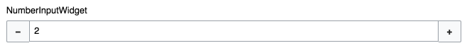
Use case: A mouse/pointer-only user has gone one step too far up and needs to move all the way to the other side to correct the value.

Browsers' native implementation features a rudimentary (& not very user-friendly because minuscule, button size against sev human-computer-interaction guidelines) top incremental, bottom decremental buttons on one side. Chrome shows the buttons just on :hover/:focus

FirefoxChrome
T145598 HTML5 `<input type=number>` native Firefox 2016-09-13.png (26×124 px, 3 KB)
T145598 HTML5 `<input type=number>` native Chrome 2016-09-13.png (29×142 px, 3 KB)

The original design M44 featured a smaller “stepper control” (limited width), something that you can also find in the wild.
Original:


  • Example in the wild:
    T145598 NumberInputWidget buttoned - stepper in the wild - Biber Umweltprodukte Versand 2016-09-13.png (56×99 px, 4 KB)

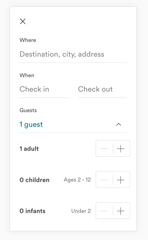
    We have to considerate mobile design of the widget as well, where big(ger) touch action areas are needed.
    Also, the button position should be the same in any theme.

    Event Timeline

    Restricted Application added a subscriber: Aklapper. · View Herald Transcript

    How would you even use the native style on mobile? The opposite sides approach seems pretty good for that, at least.

    Yeah, I don't really understand how they (browser makers) came up with the native interface. It is dumping several human-computer-interaction guideline recommendations (size, focusability…).
    One possibility were, should we even present the + & - buttons on limited space, when the native keyboard is already there on focus?
    Currently by touch-pressing the buttons the input field looses the focus and also the keyboard. Which is presumably not serving the user.

    I have never used the increment/decrement buttons to change the inputs value, especially on mobile. The number only keyboard that shows up is easy enough to use.

    I have never used the increment/decrement buttons to change the inputs value, especially on mobile. The number only keyboard that shows up is easy enough to use.

    We may not need the increment options to be available for all number inputs, but there are cases where small adjustments to the default are common and those are convenient.

    An example from a completely different domain: in the Airbnb search panel only increment and decrement actions are provided for guests. If the most common options for people to travel are 1 or 2 guests, selecting them in one step seems more convenient than editing the default to remove the 1, type 2, and exit editing mode. Having the increment controls next to each other with big enough target sizes works well in both mobile and desktop.

    airbnb-input.png (913×562 px, 49 KB)

    I'd not consider the pattern useless per se, and I think it can be supported on mobile. I also think we want to identify relevant usecases in our context (I'm not sure when this particular component is being used currently) and define guidelines on where/when such controls are appropriate.

    I'm not sure when this particular component is being used currently

    A quick search showed that it is primarily being used in the APISandbox. It is also used in the ProofreadPage extension, but I couldn't find where the element was in the interface.

    Screen Shot 2017-01-11 at 8.51.12 PM.png (484×696 px, 54 KB)

    The year selection input on some special pages (such as log) uses this type of input, too, though these have yet to be converted to use ooui. That usage never made much sense to me, though.

    This task has been assigned to the same task owner for more than two years. Resetting task assignee due to inactivity, to decrease task cookie-licking and to get a slightly more realistic overview of plans. Please feel free to assign this task to yourself again if you still realistically work or plan to work on this task - it would be welcome!

    For tips how to manage individual work in Phabricator (noisy notifications, lists of task, etc.), see https://phabricator.wikimedia.org/T228575#6237124 for available options.
    (For the records, two emails were sent to assignee addresses before resetting assignees. See T228575 for more info and for potential feedback. Thanks!)

    Another option were to keep increment/decrement button together, to reduce mouse or hand movement to interact with both buttons:

    image.png (134×1 px, 11 KB)

    Note, that button width is also reduced to 32px here, breaking our standard width. Positively is, that input text would be always on same horizontal starting line with other types of text input widgets above and below, making scanning of forms simpler. Alternatively with same-size buttons:
    image.png (132×1 px, 11 KB)