Page MenuHomePhabricator

Module: Add Module component to Codex
Open, Needs TriagePublic

Assigned To
None
Authored By
bmartinezcalvo
Jun 2 2023, 10:20 AM
Referenced Files
F41986332: Captura de pantalla 2024-02-19 a las 20.02.21.png
Feb 19 2024, 7:02 PM
F41986151: Module.png
Feb 19 2024, 7:01 PM
F41732672: Dashboard v 1.png
Jan 30 2024, 11:26 PM
F37157178: Captura de pantalla 2023-07-31 a las 17.19.07.png
Jul 31 2023, 3:20 PM
F37157173: Captura de pantalla 2023-07-31 a las 17.18.24.png
Jul 31 2023, 3:20 PM
F37157167: Captura de pantalla 2023-07-31 a las 17.14.20.png
Jul 31 2023, 3:20 PM
F37157170: Captura de pantalla 2023-07-31 a las 17.15.23.png
Jul 31 2023, 3:20 PM
F35196470: image.png
Jul 31 2023, 3:06 PM
Tokens
"Love" token, awarded by gengh."Love" token, awarded by AAlhazwani-WMF.

Description

Background

NOTE: We need to evaluate if we want to add the Module or Content Box component in Codex.

Description

Modules are containers for content, actions, and components around a single topic or function. Modules may be considered a complex card - a module may contain a card but not vice versa.
Typically modules have a header section and a body section.

User stories

Add at least one user story.

History

Describe or link to prior discussions related to this component

Known use cases

Wide layout.png (1×2 px, 292 KB)
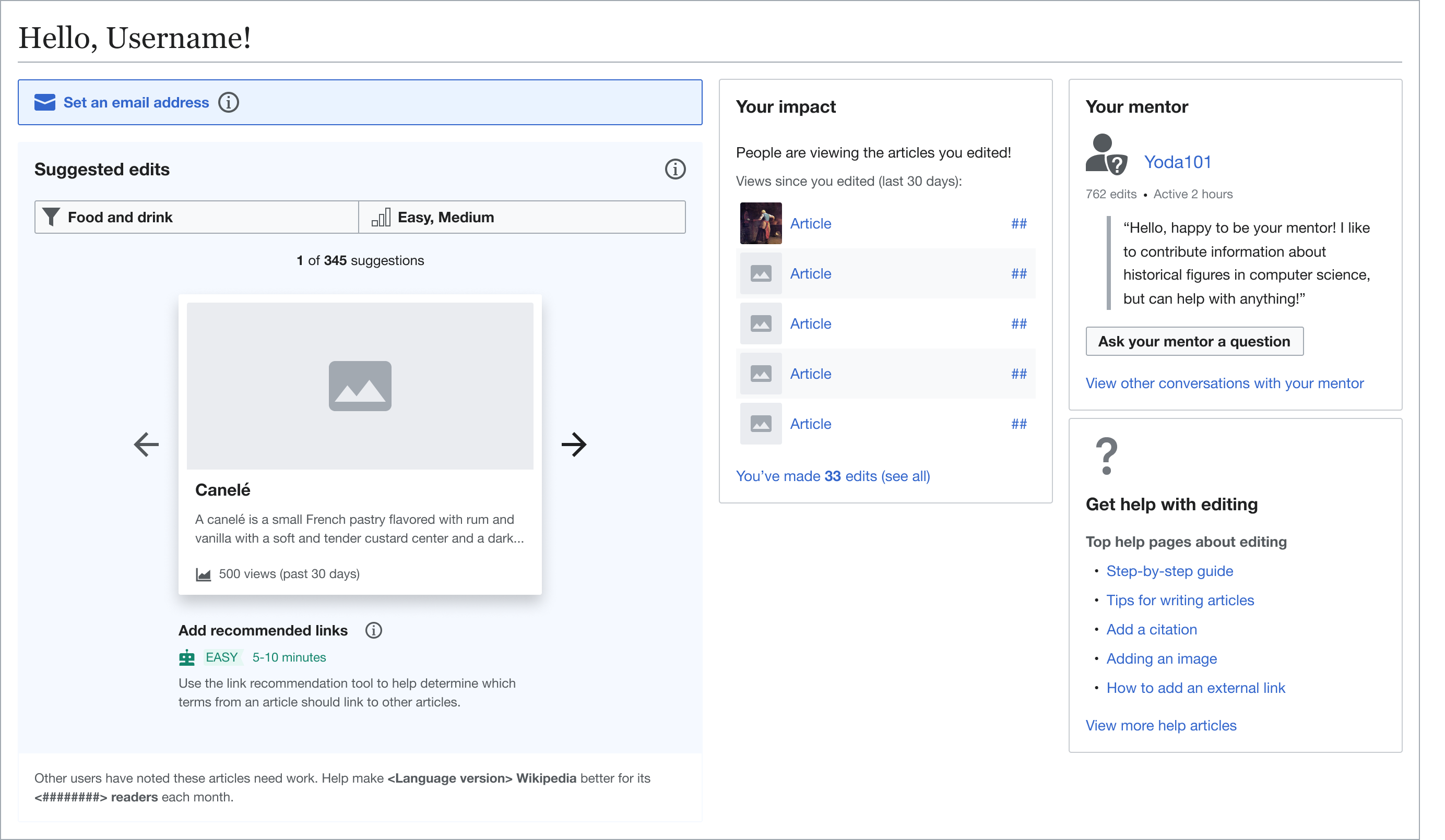
Modules with different content in the Growth's Newcomer homepage
image.png (1×516 px, 110 KB)
Growth - newcomer homepage on MOBILE
CleanShot 2023-07-31 at 13.06.35@2x.png (912×2 px, 182 KB)
image.png (2×2 px, 291 KB)
Modules with title, variable content and actions in AW - Wikifunctions
image.png (1×1 px, 1 MB)
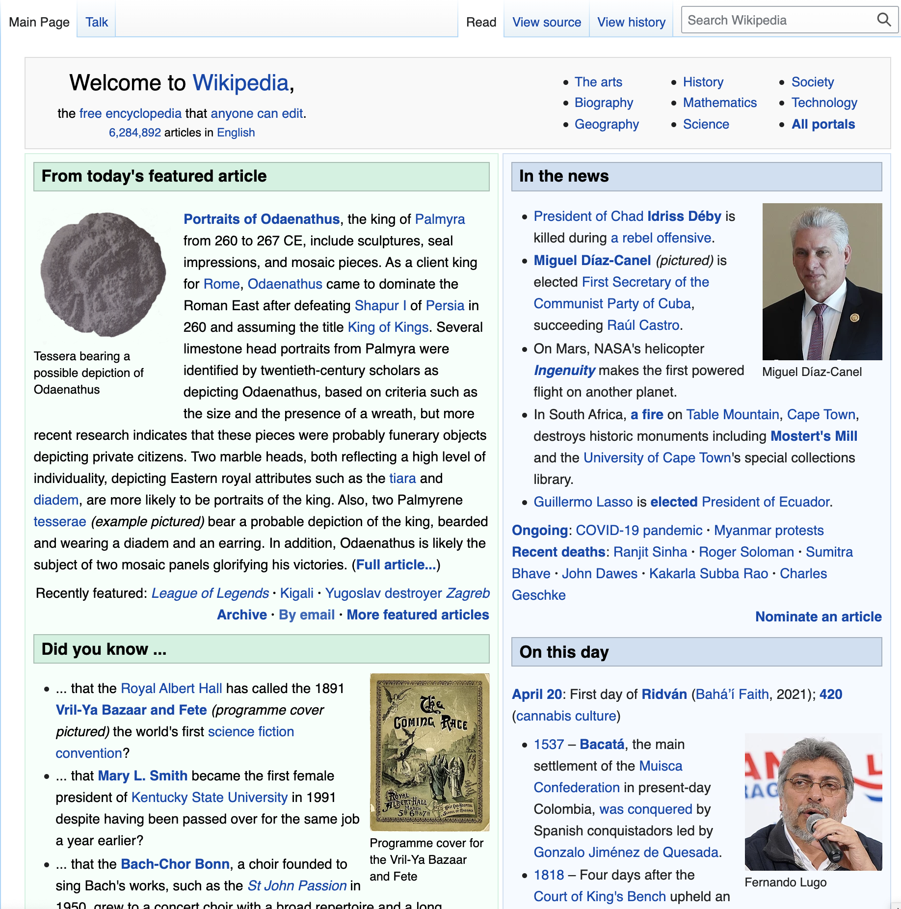
Wikipedia - Main page
Captura de pantalla 2023-07-31 a las 17.15.23.png (1×2 px, 1 MB)
Wikidata - Main page
image.png (504×1 px, 71 KB)
doc.wikimedia.org, DSG code repo derivative
image.png (1×1 px, 187 KB)
design.wikimedia.org
image.png (1×2 px, 634 KB)
image.png (1×938 px, 214 KB)
Content Translation 'home' page Desktop and Mobile
image.png (1×1 px, 138 KB)
Content Translation side panel (Desktop)
image.png (840×494 px, 243 KB)
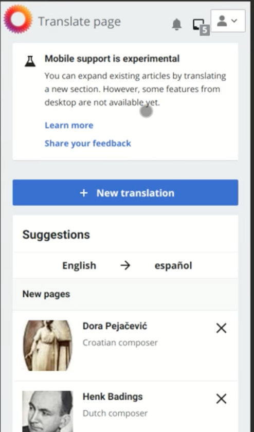
Content Translation Section translation - mobile only at present. More info here https://www.mediawiki.org/wiki/Content_translation/Section_translation
Screen Shot 2022-06-01 at 10.03.35 AM.png (254×1 px, 38 KB)
image.png (444×1 px, 68 KB)
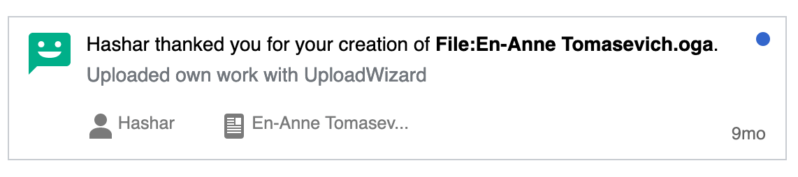
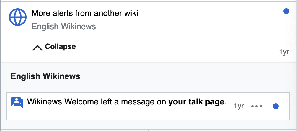
Echo notifications (on Special:Notifications and in the popup menu in the header). Notable features: Unread/read indicator, different links for the entire card and items within the card e.g. user page and "view change" link, notification age in the bottom-end corner
Captura de pantalla 2023-07-31 a las 17.14.20.png (1×2 px, 388 KB)
Wikimedia Stats
Captura de pantalla 2023-07-31 a las 17.18.24.png (1×2 px, 2 MB)
Wikicommons - Main page
Captura de pantalla 2023-07-31 a las 17.19.07.png (1×2 px, 2 MB)
Wikicommons - Results
Dashboard v 1.png (428×869 px, 40 KB)
Growth - Community Configuration 2.0 (WIP). Designs

Existing implementations

These artifacts are listed for historical context. The figma spec, linked below, is the source of truth for the new component.

Wikimedia community:

  • Design style guide: -
  • OOUI: -
  • Vue: -

External libraries:

  • Add links to any examples from external libraries

Codex implementation

Component task owners

  • Designer: add the main designer's name
  • Developer: add the main developer's name

Open questions

  • Component's name: Module / Content Box?
  • Which use cases from the inventory do we want to cover?

Design spec

Design explorations with the possible component's properties

Component's properties explorations.png (4×1 px, 745 KB)

Once a component spec sheet has been created in Figma, remove the note stating that the spec is missing and link to the spec below.

A component spec sheet has not been created yet.

Component spec sheet
Anatomy

Designer should list the structure and properties of the component.

Style

Designer should list the visual features of the component.

Interaction

Designer should list interaction specifications.

Documentation

Designer should describe how the component should be documented, including configurable and standalone demos.


Acceptance criteria

Minimum viable product

This task covers the minimum viable product (MVP) version of this component. MVP includes basic layout, default states, and most important functionality.

MVP scope

  • List all parts of the MVP scope for this component

Design

  • Design the Figma spec sheet and add a link to it in this task
  • Update the component in the Figma library. This step will be done by a DST member.

Code

  • Implement the component in Codex

Future work

  • If applicable, list future work that should be done for this component after the MVP is implemented as part of this task. You should open new, standalone tasks for all future work.

Event Timeline

There are use cases captured on T278311 that should be captured here as well.

There are use cases captured on T278311 that should be captured here as well.

@RHo added those and other use cases in this task's inventory.

during one of the past abstract/codex fortnightly we chatted about the possibility of me taking over this task as a codex external contributor. following @bmartinezcalvo suggestion, i'm sharing that i could work on this during the course of Q3 FY23-24. based on wikifunctions needs and priorities we might opt for a different component in the course of the next quarter.

Does this actually need to be a component? What if we provided guidelines or documented this as a pattern instead? I'm not sure what value creating a dedicated component for this brings that can't be done through a combination of existing tokens and components.

Does this actually need to be a component? What if we provided guidelines or documented this as a pattern instead? I'm not sure what value creating a dedicated component for this brings that can't be done through a combination of existing tokens and components.

I lean towards creating it as a Codex component. A Module or Content Box is a versatile container for different types of content. You can find some examples in this Figma inventory. I also explored how to handle all these use cases with a single Module component in this exploration where you can check how we could cover many the different use cases with one single component.

Captura de pantalla 2024-02-19 a las 20.02.21.png (592×1 px, 339 KB)

There are many benefits to building it as a component But in case we don't want to create it as a component for now, we can start by providing design guidelines. Later on, we can turn those guidelines into a component if we find more situations where it's useful.

Either way, we will need to define and document the following:

  • What type of content can be included within a Module
  • The paddings in the Module, according to the size of the Module (paddings will vary on small and large modules).
  • Color and style
  • How the Module's head will look like and what type of content will have (title, action?)
  • Where to place any buttons or actions

To help determine if this is a Pattern/Complex Component/Component or something else, I think we first need to complete the outstanding item to define what a Pattern is for Codex. There is an action that @mwilliams has taken over from me to run a follow-up to the offsite patterns sessions with designers and DST to resolve this.
Separately, it would make sense to work on higher prio planned components first.