Background
- Description: A common layout for presenting information, e.g. a link to an article page with a thumbnail, title, and description. There are many use cases across Wikimedia. Cards may be standalone or in a layout with other Cards.
- History:
- The card pattern has been used in many places, although it has never become a standard component. See the table below for many examples.
- See T153417: Align the style for lists of pages, a related task (although some of these cases may be covered by a future ListItem component)
- See T256036: Add Card component to
WVUICodex, a closed task that discussed potentially adding a Card component to WVUI - See T286973 and T299682 for discussion about reusing the WVUITypeaheadSuggestion and CdxMenuItem components for other card-like use cases, an idea that was later declined in favor of creating a dedicated Card component that better covers non-menu use cases
- Known use case(s):
- GrowthExperiments: see the first three items in the table below
- NearbyPages: see UI on beta
- Considerations:
- As mentioned, there are many existing examples of card-like layouts. A first step in this epic will be to collect and organize these use cases, then define general rules on appearance and interactivity and align to internationalization and accessibility requirements
- We will need to define layout rules for when multiple cards/modules are shown
Examples of pages with cards/card-like layouts
| Sample screenshot | Found in | Notes |
|---|---|---|
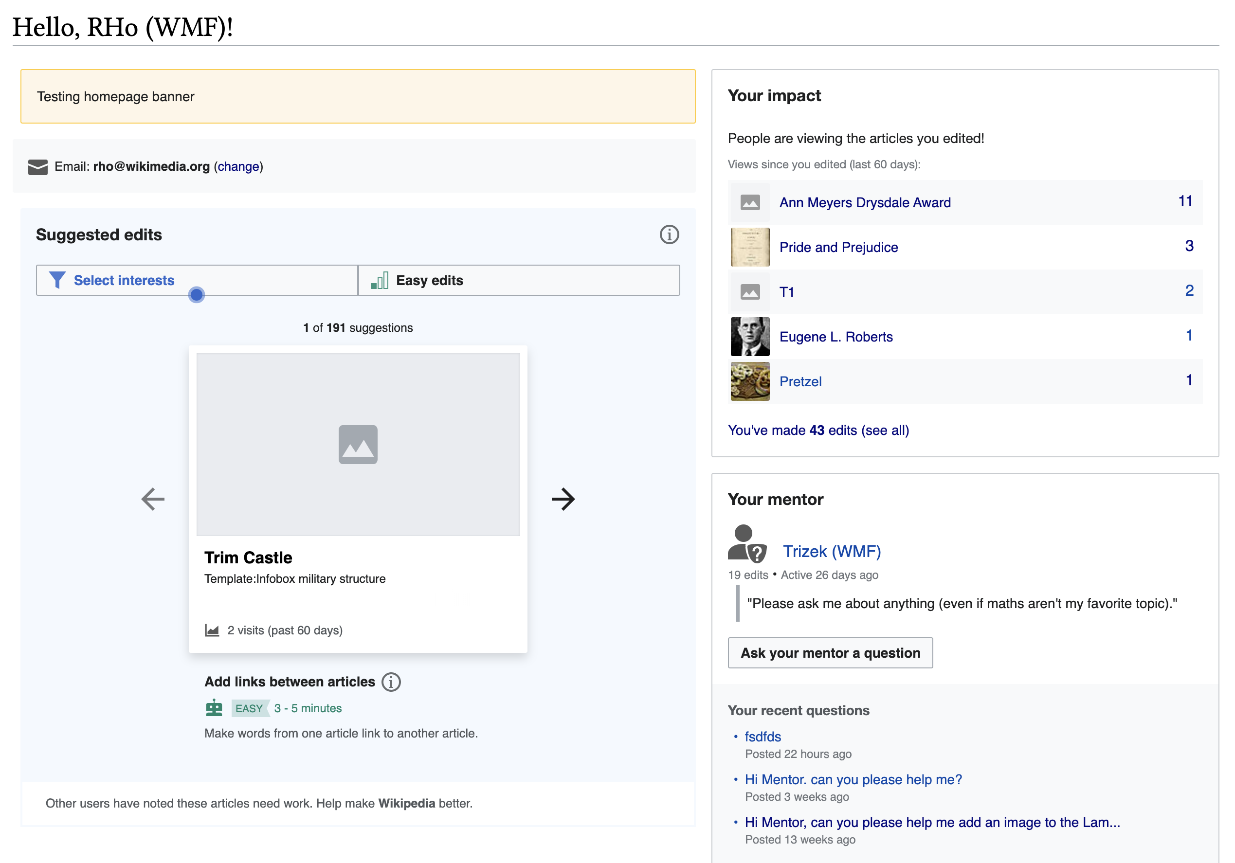 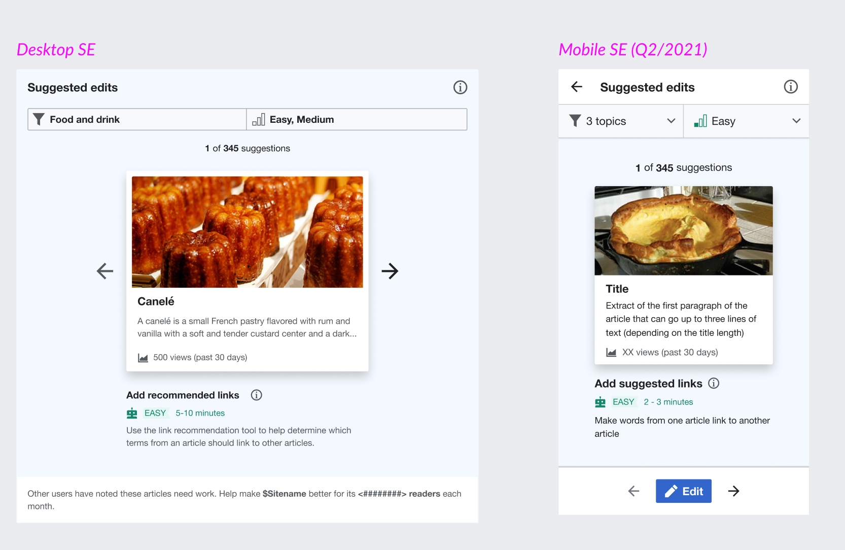 | Growth Newcomer homepage desktop | Card in the Suggested Edits UI - note the Mobile and Desktop differences. Could the modules themselves be considered cards? |
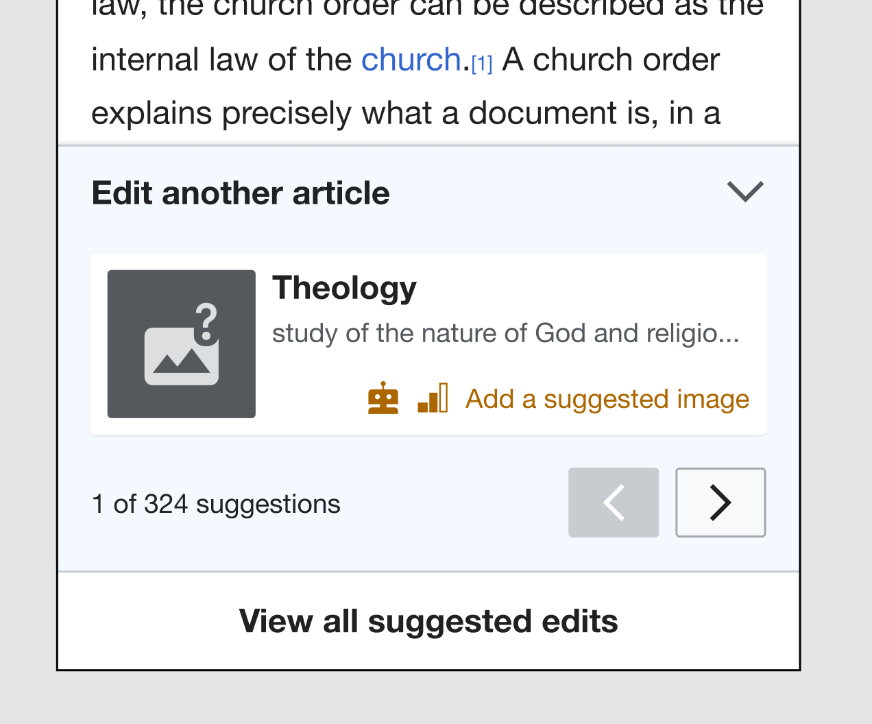 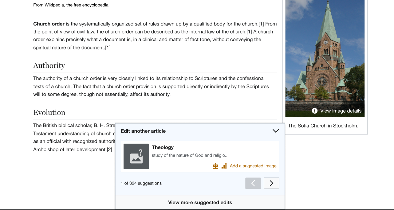 | Growth - post-edit dialog/bottom sheet on mobile & desktop | Appears after someone completes a Suggested edit task - unclear if this would be a separate bottom sheet component - would only the article within this be considered a "card" or ListItem component ?? |
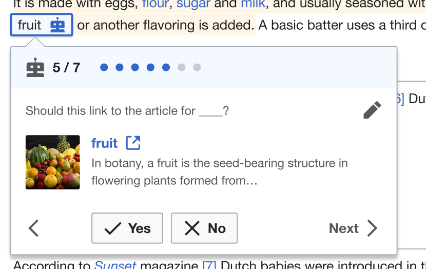 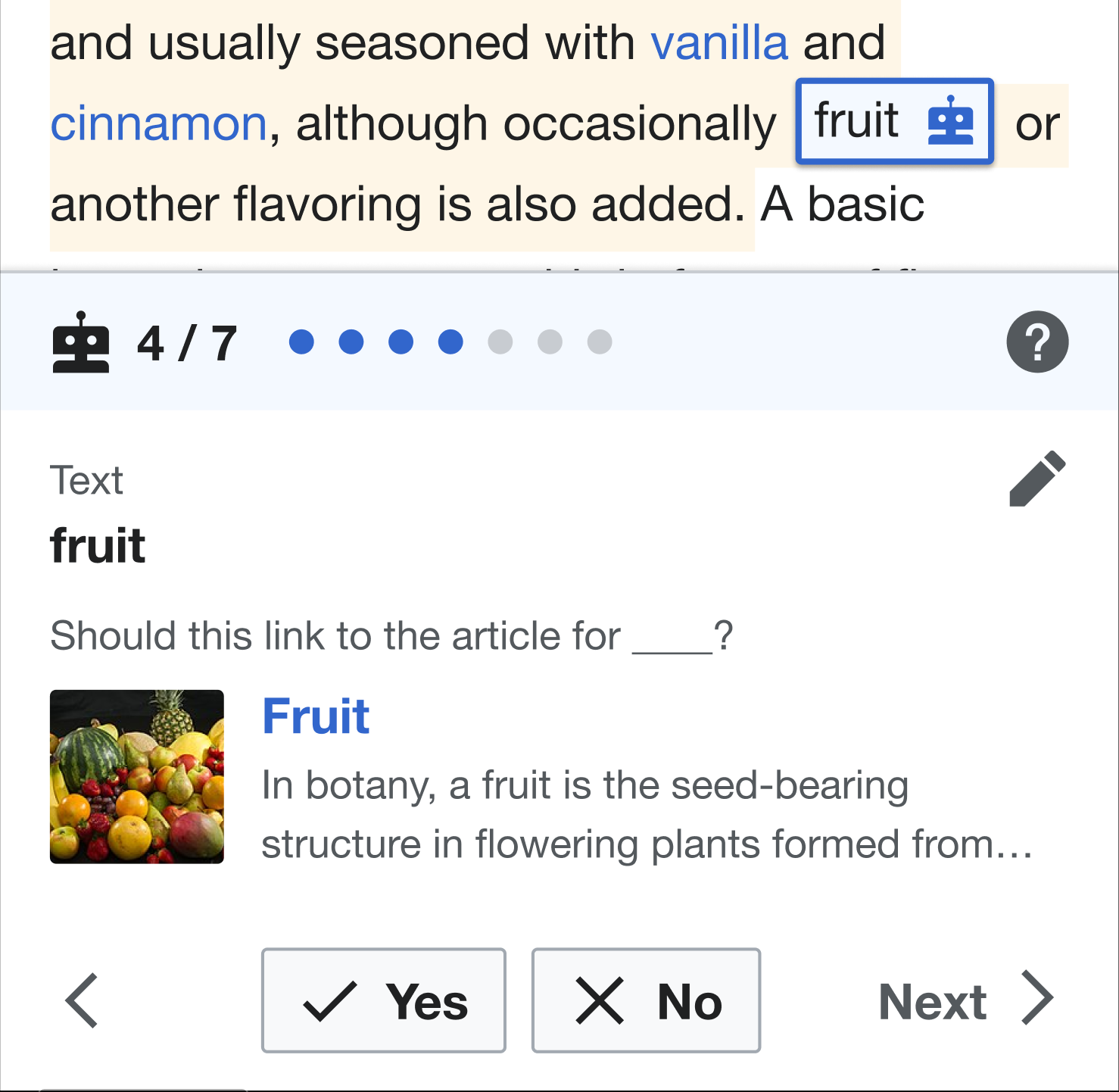 | Structured task link "inspector" card, shown under the item on desktop, as a bottom sheet on mobile (similar to VE link card) | again, not sure if only the article inside the dialog/sheet is considered the card/ListItem. |
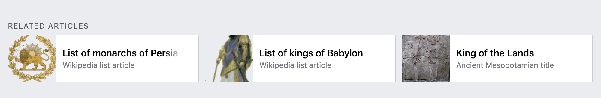 | Related articles at the bottom of Minerva articles | |
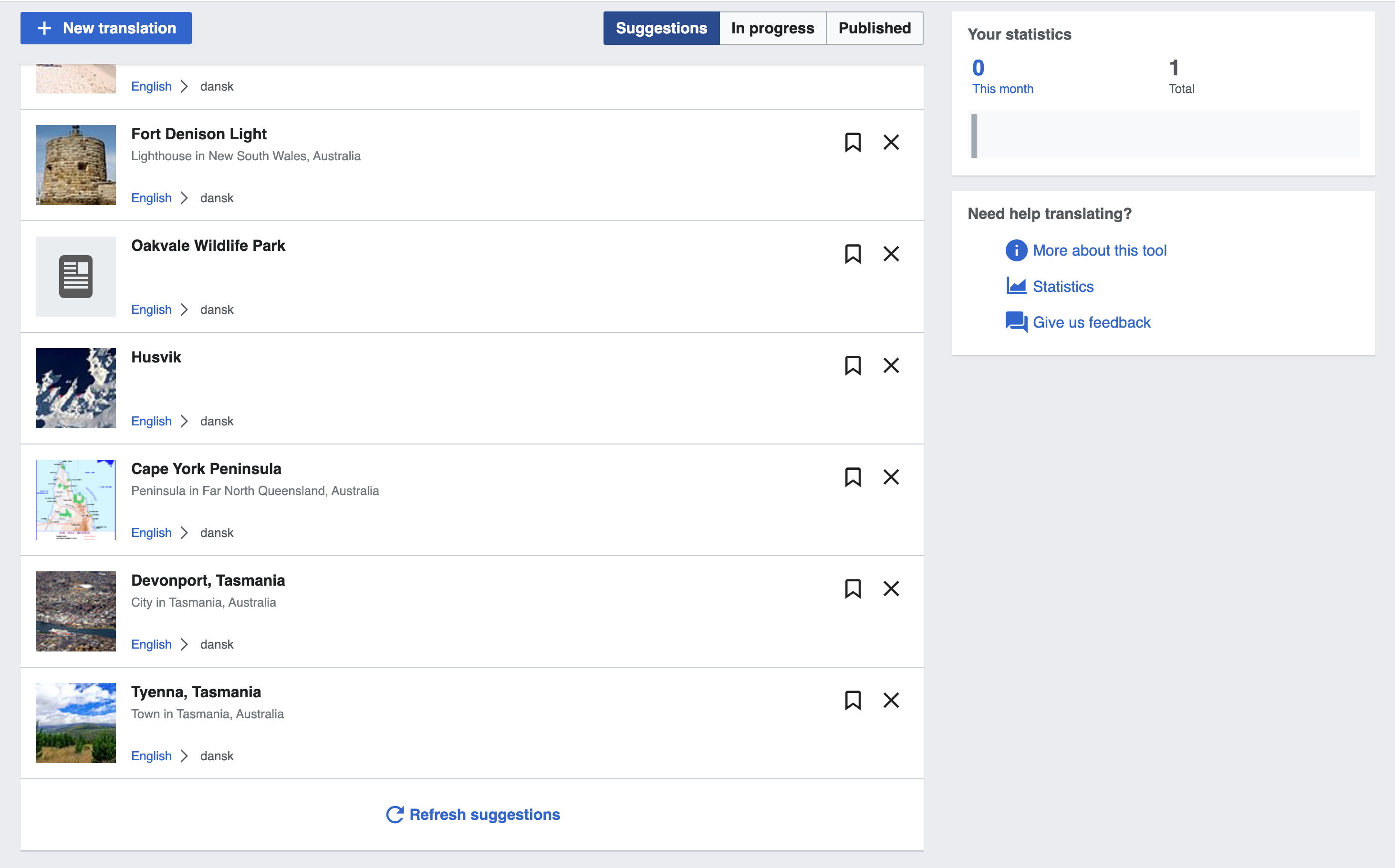  | Content Translation 'home' page Desktop and Mobile | |
User stories
- add at least one user story
Previous implementations
These artifacts are listed for historical context. The figma spec, linked below, is the source of truth for the new component.
- Design style guide: n/a
- OOUI: n/a
- Vue: WVUITypeaheadSuggestion and CdxMenuItem were suggested as potential Card components but are too divergent from Card UI and use cases. However, some of parts of MenuItem, namely thumbnail styles and loading state, could be reused via a separate Thumbnail component.
Codex implementation
Component task owners
- Designer: @Sarai-WMDE
- Developer: @AnneT
Design spec
Stage 1: Minimum viable product (MVP)
MVP includes basic layout, default states, and most important functionality.
Acceptance criteria
- Determine what MVP includes for this component and document this in a subtask. Assign task to designer.
- Design MVP. Once complete, assign task to developer.
- Implement MVP