Page MenuHomePhabricator

Extend color and size guidelines of the Wikimedia Design System icon set
Closed, ResolvedPublic

Assigned To
Authored By
RHo
Apr 20 2021, 12:37 PM
Referenced Files
F34408572: image.png
Jun 29 2022, 4:53 AM
File Not Attached
F35067327: image.png
Apr 25 2022, 4:59 PM
F35067330: image.png
Apr 25 2022, 4:59 PM
F35067296: image.png
Apr 25 2022, 4:49 PM
F35067316: image.png
Apr 25 2022, 4:49 PM
F35067312: image.png
Apr 25 2022, 4:49 PM
F35067305: image.png
Apr 25 2022, 4:49 PM
F34453840: image.png
May 14 2021, 11:17 AM

Description

Background/Goal

The current Wikimedia icon set is limited as there is no "tokenisable" way to

  • add icons in all the colors of the style guide, and
  • at a size other than 20x20dp. We should address this as part of the Codex effort (tracked in T277047).

Specific examples:

Colour

Limitations and lack of clarity on how to implement at in different palette colours. E.g., in the Growth projects, we are using the robot icon to denote a task as one suggested by machines. We would like to have it appear in Green30, Yellow30 or Red30 next to the corresponding difficulty level text colour but this is not currently an easy thing to achieve using the OOUI icon set.

ContextScreenshot
Growth difficulty levels and robot icon
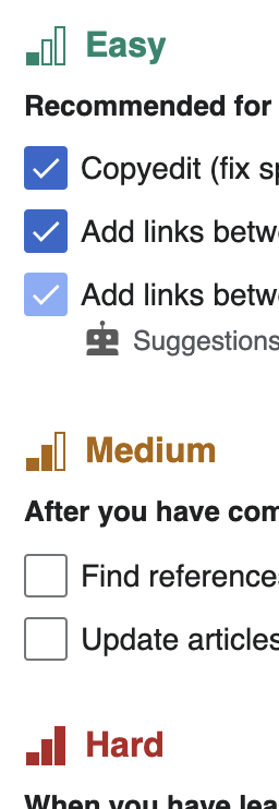
image.png (742×256 px, 34 KB)
Size

The DSG is missing guidance on setting at different sizes in certain context (e.g., when in use as an illustration or in headers as a decorative element)

ContextScreenshot
Growth newcomer homepage page views indicator
image.png (242×412 px, 19 KB)
Growth suggested edits structured task type and difficulty level
image.png (194×626 px, 27 KB)
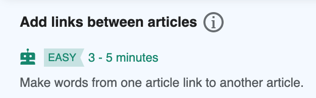
ULS (Universal Language Selector) icons - 'favourite' star, settings cog, close icons
image.png (708×1 px, 104 KB)
image.png (1×2 px, 868 KB)
image.png (198×1 px, 31 KB)
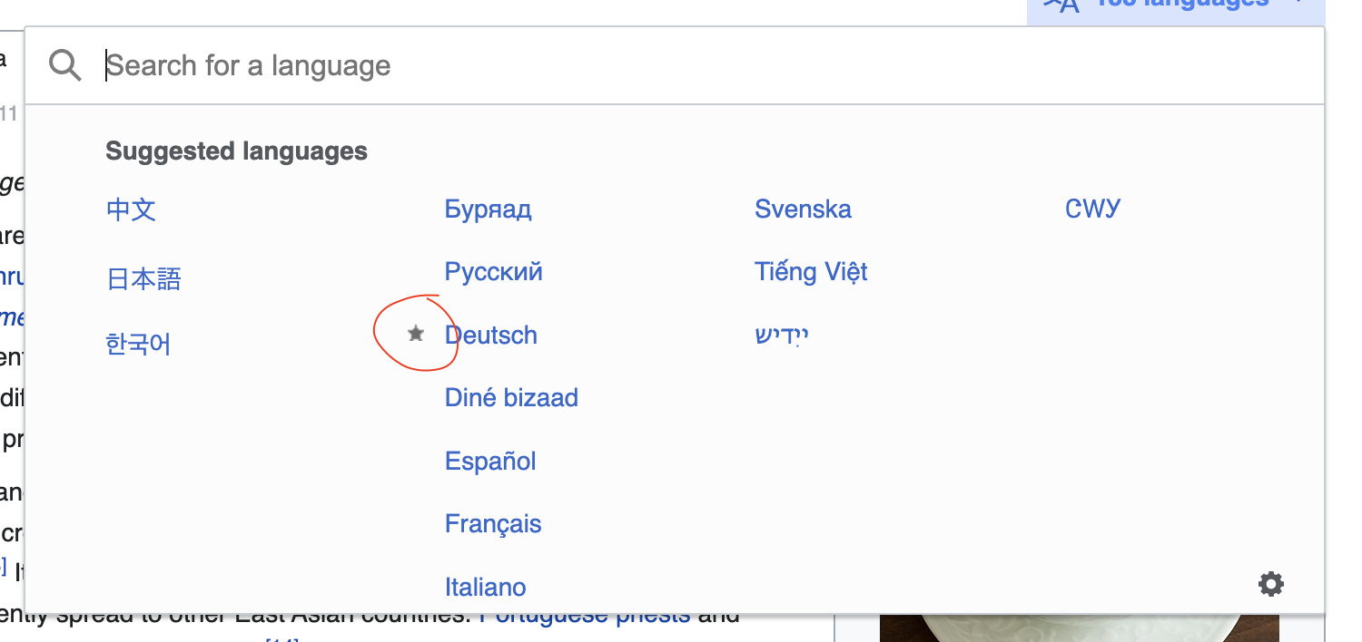
Icons used inline like the avatar icon in personal tools or the external links icon
image.png (74×382 px, 9 KB)
image.png (50×132 px, 6 KB)
Info icon used for the help popup is currently smaller than the rest of the icons T280677
image.png (356×878 px, 39 KB)
Use inline with text elements

Easily enabling inclusion of icons when used in for example help text. This includes having the ability to also specify size that is smaller than the 20x20dp.

ContextScreenshot
Example from the Growth teams's newcomer help panel feature
image.png (674×780 px, 55 KB)
Example from the Growth teams's newcomer homepage feature (welcome banner)
image.png (206×624 px, 38 KB)

User stories

As a designer, I need to be able to use different icon sizes and colors in my designs and choose them according to the need of each use case.

Possible solutions with the icon size

  • Redraw at a smaller size some icons if they always feel larger. This only makes sense if the problematic icons are a few and always look bigger than they should.
  • Support an alternate size by scaling down the icons. This would lead to pixelation and we may want to select a size that minimizes the pixelation as much as possible.
  • Define an alternate size and redraw all icons to try to best align them. This would require to review all icons and prepare each new icon in two sizes.
  • Redraw all icons to a smaller size and use only that. This requires to review all icons, but there will be just one (hopefully more convenient) size.

Acceptance criteria (or Done)

  • Decide how we solve the problem with the icon sizes

We're providing a number of predefined icon sizes to choose from for different contexts. This set is also able to be

  • Solve problem with icon colors

Event Timeline

Note that MediaWiki currently already provides an ability to define color variants for specific icons via ResourceLoaderImageModule.
While GrowthExperiments has already defined certain icons itself, and also features a non-guideline default color #4A4F53 for the 'newspaper' icon(?!), it doesn't define further variants.

In the example provided in the task description for the levels the code would translate to:

"ext.growthExperiments.Homepage.icons": {
	"class": "ResourceLoaderImageModule",
	"selectorWithVariant": ".oo-ui-image-{variant}.oo-ui-icon-{name}",
	"selectorWithoutVariant": ".oo-ui-icon-{name}",
	"variants": {
		"green30": {
			"color": "#14866d"
		},
		"yellow30": {
			"color": "#ac6600"
		},
		"red30": {
			"color": "#b32424"
		}
	},
	"images": {
		"difficulty-outline": {
			"file": {
				"ltr": "../images/levels-outline-ltr.svg",
				"rtl": "../images/levels-outline-rtl.svg"
			}
		},
		"difficulty-easy": {
			"file": {
				"ltr": "../images/difficulty-easy-ltr.svg",
				"rtl": "../images/difficulty-easy-rtl.svg"
			},
			"variants": [ "green30" ]
		},
		"difficulty-medium": {
			"file": {
				"ltr": "../images/difficulty-medium-ltr.svg",
				"rtl": "../images/difficulty-medium-rtl.svg"
			},
			"variants": [ "yellow30" ]
		},
		"difficulty-hard": {
			"file": {
				"ltr": "../images/difficulty-hard-ltr.svg",
				"rtl": "../images/difficulty-hard-rtl.svg"
			},
			"variants": [ "red30" ]
		},
		"info-unpadded": "../images/info-unpadded.svg",
		"live-broadcast": "../images/live-broadcast.svg",
		"live-broadcast-anim": "../images/live-broadcast-anim.svg",
		"mentor": {
			"file": {
				"ltr": "../images/mentor-ltr.svg",
				"rtl": "../images/mentor-rtl.svg"
			}
		},
		"robot-task-type": "../images/suggestededits/robot-green.svg"
	}
},

{F34415592}

Note that MediaWiki currently already provides an ability to define color variants for specific icons via ResourceLoaderImageModule.
While GrowthExperiments has already defined certain icons itself, and also features a non-guideline default color #4A4F53 for the 'newspaper' icon(?!), it doesn't define further variants.

Thanks for flagging this @Volker_E - that colour should definitely not be there as it's not in the colour palette, but also because it's for the "Main page" navigation menu item (not part of the newcomer features) which should just use the same icon colours as the rest of the mobile side nav. I'll file a task.

The new Codex library features a different ability to icon usage and inclusion, catering to all three needs mentioned in the task description, implemented by @Catrope.

  • The icon element uses SVGs fill=currentColor. With that it defaults to the wrapper HTML element's color style. And can be easily overwritten by a CSS class or even an inline style (not advised).
  • The size setting is similarly easy with classes amending the min-width or width of the Codex Icon component when placed inline. See demo for an example of those inline Icons. The remaining question is if the icon should be specifically set-able or if a number of specific typography wrapper bound styles could be sufficient. Thinking of all block level elements direct icon component children here.

And how this should be clarified in the Design Style Guide.

Volker_E renamed this task from Extend colour and size guidelines of the Wikimedia icon set to Extend color and size guidelines of the Wikimedia Design System icon set .Apr 25 2022, 4:55 PM
Volker_E updated the task description. (Show Details)
Volker_E claimed this task.

Revisiting this. Codex actually provides all flexibility needed from task description on icon sizes and icon colors. Resolving this, as the other refinements – larger icon sizes for example – are better off in already filed different tasks.