Page MenuHomePhabricator

Figure out icon system architecture for WVUI
Closed, DeclinedPublic

Description

The current icon system in WVUI is very different from the one in OOUI. They have different benefits and drawbacks that we should take into account when deciding on how we want to use icons in Vue going forward.

OOUI's icon system

Delivery and use

Icons are stored in individual .svg files. They are embedded in CSS that looks like this (simplified):

.oo-ui-icon-alert {
    background-image: url('data.image/svg+xml,<svg><path d="..." /></svg>');
}

Callers can use an icon by passing in the icon name as the icon config option to an IconWidget, or to any widget that uses the IconElement mixin, e.g.:

var button = new OO.ui.ButtonWidget( { icon: 'alert' } );

which generates HTML that uses the CSS class for the icon:

<span class="oo-ui-iconElement-icon oo-ui-icon-alert"></span>

Icons are grouped together in bundles that fit together thematically, with each bundle being a ResourceLoader module (e.g. oojs-ui.styles.icons-alerts, oojs-ui.styles.icons-movement). Code that uses icons must include one or more of these modules as a dependency. This ensures that each individual icon is only loaded once even if multiple modules need it, but it also causes unused icons to be loaded, since most code doesn't use all icons in a bundle, and many features use only one or two icons each from multiple bundles.

Colors

The icon SVGs are monochrome and use pure black (#000) as their fill color. This is then lightened by applying an opacity rule to the icon in CSS, with opacity values for different situations defined in wikimedia-ui-base that approximate colors from the color palette.

Arbitrary colors can't be applied to icons. Instead, additional CSS rules like that embed modified versions of the SVG files are generated by ResourceLoaderImageModule:

.oo-ui-image-progressive.oo-ui-icon-alert {
    background-image: url( 'data:image/svg+xml,<svg><g fill="#36c"><path d="..." /></g></svg>');
}

Applying the oo-ui-image-progressive CSS class to the icon span then causes the icon to turn blue. Because of this strategy, only a limited set of icon colors can be used: progressive (blue, #36c), destructive (red, #d33), and warning (yellow, #fc3). Not all of these variants are available for all icons, they're made available on an as-needed basis where it makes sense (there is no progressive trash icon or destructive add icon, for example). Every icon also has an inverted variant (white, #fff) that is used when the icon appears on a colored background (on primary buttons for example). The modified versions of these icons are not stored as separate .svg files, but are generated automatically by reading the .svg file and wrapping it in <g fill="color">...</g>.

Language and right-to-left support

Some icons have both an LTR and an RTL version, stored as separate SVG files (e.g. arrowNext-ltr.svg and arrowNext-rtl.svg), and ResourceLoaderImageModule automatically serves the appropriate one based on the interface language. For icons with language-specific versions (e.g. bold and italic), there is a separate SVG file for each distinct version, but multiple languages can share the same version (for example, Armenian uses bold-armn-to.svg, while bold-cyrl-zhe.svg is used for Kyrgyz, Russian and Ukranian).

Each icon bundle has a JSON file (e.g. icons-movement.json) that defines which icons are in it, which SVG file is used for each version of the icon (LTR, RTL and language versions), and which color variants are available for each icon. Some example icon definitions:

		"subscript": {
			"file": {
				"ltr": "images/icons/subscript-ltr.svg",
				"rtl": "images/icons/subscript-rtl.svg"
			}
		},
		"unLink": {
			"file": "images/icons/unLink.svg",
			"variants": [ "destructive" ]
		},
		"underline": {
			"file": {
				"default": "images/icons/underline-a.svg",
				"lang": {
					"en,de": "images/icons/underline-u.svg"
				}
			}
		},
Extensibility

Extensions can't add icons to the existing OOUI icon bundles, but they can create their own icon module by passing icon definitions in the same format as above to ResourceLoaderImageModule, as follows (simplified example):

{
    "ResourceModules": {
        "ext.foo.icons": {
            "class": "ResourceLoaderImageModule",
            "images": {
                "foo": { "file": "src/icons/foo.svg" },
                "bar": { "file": { "ltr": "src/icons/bar-ltr.svg", "rtl": "src/icons/bar-rtl.svg" }
            }
        }
    }
}

Once this module is loaded, passing 'foo' or 'bar' as an icon name to an OOUI widget will display the specified icons.

WVUI's current icon system

Delivery and use

Icons are not stored in individual .svg files (, but are all stored together in one big icons.ts file:

export const wvuiIconAdd: Icon = 'M11 9V4H9v5H4v2h5v5h2v-5h5V9z';
export const wvuiIconAlert: Icon = 'M11.53 2.3A1.85 1.85 0 0010 1.21 1.85 1.85 0 008.48 2.3L.36 16.36C-.48 17.81.21 19 1.88 19h16.24c1.67 0 2.36-1.19 1.52-2.64zM11 16H9v-2h2zm0-4H9V6h2z';
// etc.

Note that these icons aren't full SVGs, they're path strings. This means every icon must use a single SVG <path> element. T260815 complains about this restriction and the fact that the SVGs aren't real files, and T276808 talks about the process for converting a multi-path SVG to one suitable for this format.

Callers can use an icon by importing it from this file, then passing it to the Icon component (or to a component that accepts an icon as a prop, and uses the Icon component internally). Because icons are long strings and sometimes complex values (as opposed to short names), they can't be used in the template directly, but have to be passed through the component data in JavaScript. For example:

import { wvuiIconAlert } from '../../themes/icons';
export default Vue.extend( {
    // ...
    data() {
        return {
            alertIcon: wvuiIconAlert,
            // ... other component data ...
    }
    // ...
} );

then alertIcon can be used in the template as follows:

<wvui-icon :icon="alertIcon" />

This results in HTML that looks like this (simplified):

<span class="wvui-icon">
    <svg>
        <path d="..." fill="#000" />
    </svg>
</span>

Icons are not separated into bundles like they are in OOUI, they're all in one big file. Callers are expected to import only the icons they need, and use tree shaking (which requires a build step) so that only those icons are sent to the client. (This why the usage is a bit more complex than just passing the name of the icon in as a string.) For WVUI consumers that don't use a build step, a separate bundle that exports all icons is available, but it's big (65 KB).

Colors

Because the icon is an <svg> element, its color can be controlled through attributes in the generated SVG, or through CSS. Currently, the Icon component takes an icon-color prop, and that color is used as the fill attribute of the <path> element. T280934 proposes to instead set fill="currentColor", and control the icon color with CSS. Components like buttons would set color: inherit on the icon, so that the icon color matches the color of the adjacent text (e.g. red for quiet destructive buttons, or white for primary buttons).

Language and right-to-left support

Icons can define separate LTR and RTL versions, or language-specific versions, in their definition as follows:

export const wvuiIconImageAdd: IconVariedByDir = {
	rtl: 'M12 6v2H8v4H2v6a2 2 0 002 2h14a2 2 0 002-2V8a2 2 0 00-2-2zM3.83 17l3.55-4.5 2.52 3 3.55-4.5L18 17zM4 10h2V6h4V4H6V0H4v4H0v2h4z',
	default: 'M16 17H2l3.5-4.5 2.5 3 3.5-4.5.5.67V8H8V6H2a2 2 0 00-2 2v10a2 2 0 002 2h14a2 2 0 002-2v-6h-5.75z M16 4V0h-2v4h-4v2h4v4h2V6h4V4z'
};
export const wvuiIconStrikethrough: IconVariedByLang = {
	langCodeMap: {
		en: wvuiIconStrikethroughS,
		fi: wvuiIconStrikethroughY
	},
	default: wvuiIconStrikethroughA
};

A shorthand is available for the common case (63 out of 70) where the RTL version of an icon is the exact mirror image of the LTR version:

export const wvuiIconArrowNext: IconFlipForRtl = {
	path: 'M8.59 3.42L14.17 9H2v2h12.17l-5.58 5.59L10 18l8-8-8-8z',
	shouldFlip: true
};
export const wvuiIconHelp: IconFlipForRtl = {
	path: 'M10.06 1C13 1 15 2.89 15 5.53a4.59 4.59 0 01-2.29 4.08c-1.42.92-1.82 1.53-1.82 2.71V13H8.38v-.81a3.84 3.84 0 012-3.84c1.34-.9 1.79-1.53 1.79-2.71a2.1 2.1 0 00-2.08-2.14h-.17a2.3 2.3 0 00-2.38 2.22v.17H5A4.71 4.71 0 019.51 1a5 5 0 01.55 0z M12 17 A2 2 0 0 1 10 19 A2 2 0 0 1 8 17 A2 2 0 0 1 12 17 z',
	shouldFlip: true,
        // The help icon (which looks like a question mark) is not flipped in Hebrew and Yiddish, even though those languages are RTL
	shouldFlipExceptions: [ 'he', 'yi' ]
};

The full icon definition object (potentially with multiple versions of the icon) is passed to the Icon component, which decides which one to use based on the lang attribute of the <html> element (or the lang-code prop) and the direction property of the containing HTML element (which can be set in CSS, or with the dir attribute). Icons with shouldFlip: true are rendered as LTR and then flipped in CSS if any of their ancestors has dir="rtl" set, using this rule:

[dir="rtl"] .wvui-icon--flip-for-rtl svg {
    transform: scaleX( -1 );
}
Extensibility

Extensions can define their own icons in the same format that WVUI uses, and pass them to the Icon component the same way as "core" WVUI icons. The Icon component also accepts an SVG path string directly, e.g. <wvui-icon icon="M11 9V4H9v5H4v2h5v5h2v-5h5V9z" />.


Event Timeline

Here are some pros/cons and trade-offs with WVUI's current icon system as I see them:

Pros:

  • Using an inline <svg> tag allows arbitrary icon colors; allows icon colors to be controlled with CSS; and avoids the need to ship multiple, differently-colored versions of the same icon
  • Automatic RTL flipping is useful, and applies to the vast majority of icons

Cons:

  • Storing all SVG paths in one single file and requiring them to be single paths makes it harder to work on them (T260815).
  • Needing to import icons in JS and pass them through to the template via data() is annoying

Trade-offs:

  • Bundling icons with the code that uses them means that only icons that will be used are loaded (unlike with icon bundles, which wastefully load unused icons), but it also means that popular icons are duplicated in each module that uses them (unlike with icon bundles, which load each icon only once). Overall, I think this trade-off is probably worth it, but it requires either a build step. For non-build-step consumers, we'd need to split up the big bundle of icons, or add support for bundling individual icons in ResourceLoader.
  • Loading an icon in WVUI always loads all versions of the icon (both directionalities, all languages). This is somewhat heavy for icons that have distinct LTR and RTL versions, and particularly heavy for letter-based icons that have many versions. However, this only affects a small number of icons: out of 209 icons, only 16 have multiple versions, and only two have more than 3 versions (bold has 16, italic has 12). Loading this extra information allows us to display icons in a language or directionality that's different from the interface language/directionality, but that's rarely needed.

Issues:

  • Automatic RTL flipping uses a combination of the computed direction property and the [dir="rtl"] selector, which is inconsistent and leads to problems when LTR content is nested inside RTL content
  • According to caniuse.com, some browsers (including IE 11 and Edge 12-16) don't support applying CSS transforms to SVG elements, so automatic RTL flipping wouldn't work in those browsers. We may be able to work around this by using the transform attribute instead.

I'd be curious to hear what other people's experiences are with these icon systems or others, what suggestions they have for what our icon system should look like, and what other factors they think we should consider in the architecture of our icon system.

Thanks Roan, I think you have covered most of the points. In general, I think it is important to make an early decision on whether consumers of wvui require a build system or not. The requirement of treeshaking(and hence the build step) or not is crucial to answer the design questions here.

Along with the design of the icon system, we need to think from the perspective of a potential developer using this system and optimize towards that. Whether this design saves time and make their development workflow easier and happier. Let me share some point from my experience of using @mdi/js with vuetify and using the above mentioned icon system in Section Translation.

  1. The strong binding of available icons to javascript helps you to use quickly discover and pick an icon through autocompletion features of popular IDEs.
  2. A build step or even real time checks by IDE make sure you are not refering an icon that does not exist. This is better than a loose dependency like CSS classnames

Needing to import icons in JS and pass them through to the template via data() is annoying

I would say this is positive. It is kind of "strong typing" for icons :-).

Storing all SVG paths in one single file and requiring them to be single paths makes it harder to work on them (T260815).

WVUI need to maintain the actual SVGs(full svg images) and then have some documented method to update the javascript file containing icon paths(not necessarily fully atuomated, considering the low frequency of changing icons). We can refer how this is done in popular icon system like material design icons.

An alternate to Javascript file with icon names holding paths is SASS SVG Icon approach outlined here. It has two variants: background-image: url(path to svg) and background-image: url(inline svg). Developers need to use CSS classnames with a defined pattern to get the icons then. This is not discoverable at the time of development compared to Javascript and prone to human errors undetected, leading to missing icons in UI. This approach also has some degree of treeshaking challenges depending on the usage of postcss and build system.

I'd be curious to hear what other people's experiences are with these icon systems or others, what suggestions they have for what our icon system should look like, and what other factors they think we should consider in the architecture of our icon system.G

TBH It's useful having the icons inside wvui and the approach with ResourceLoaderImageModule has not been perfect - it requires a lot of explaining (institutional knowledge) and leads to lots of modules in the repo (Minerva has about 8 of them). T244558 and T248912 remain open. Assuming we are going to get server side rendering, it feels like the right approach to move away from it and to allow icon rendering only inside Vue.js.

Trade-offs:

The duplication trade off is probably not a big deal - I think that is already happening. For example many of the same icons in Minerva desktop are also loaded inside VisualEditor.

Loading an icon in WVUI always loads all versions of the icon (both directionalities, all languages)

This actually sounds like a good thing. In future with an API driven frontend we'd be able to switch the UI in JavaScript from LTR to RTL. We're already shipping multiple icons for colors, so that trade off might counter-act this one.

Storing all SVG paths in one single file and requiring them to be single paths makes it harder to work on them (T260815).

I think a build step could take care of this con. It feels like it would be trivial to parse SVGs to grab the path and then generate an asset exporting those.

Icons are not separated into bundles like they are in OOUI, they're all in one big file.

I agree that this is a big challenge - some kind of build step definitely needed. I wonder if async components could be used in some way to handle this?

I would say this is positive. It is kind of "strong typing" for icons :-).

+ 1

  1. The strong binding of available icons to javascript helps you to use quickly discover and pick an icon through autocompletion features of popular IDEs.
  2. A build step or even real time checks by IDE make sure you are not refering an icon that does not exist. This is better than a loose dependency like CSS classnames

Needing to import icons in JS and pass them through to the template via data() is annoying

I would say this is positive. It is kind of "strong typing" for icons :-).

This is a good point, and I had forgotten to say: the little extra annoyance is probably worth it for performance reasons (so that tree shaking works), and I also like your framing here as "strong typing for icons", that's exactly what it is. It's also worth noting that, in cases where logic is needed to choose which icon is displayed, you need a computed function anyway, and at that point returning an Icon object instead of a string isn't any extra work.

Trade-offs:

The duplication trade off is probably not a big deal - I think that is already happening. For example many of the same icons in Minerva desktop are also loaded inside VisualEditor.

It is already happening, but only for extensions/skins that chose to use custom icon bundles rather than using the standard OOUI ones, and I think Minerva (and Echo, to a lesser extent) are the only ones using custom bundles to load core icons. Most other code use the OOUI modules, which doesn't result in the same icon being loaded twice, but does result in lots of unused icons being loaded. The WVUI system is basically equivalent to everyone doing what Minerva does. I agree it's probably worth it, since the bandwidth wasted by loading some icons twice is probably much less than the bandwidth wasted when loading an entire icon pack just to use one icon. Loading multiple features on the same page that are both heavy icon users is also not common, and most of those cases are probably going to be things like skins, with most of the duplicated icons being in a small set of popular ones. If we really wanted to, we could do a later optimization where popular icons are always loaded when WVUI is loaded, and are no longer bundled with individual modules.

Loading an icon in WVUI always loads all versions of the icon (both directionalities, all languages)

This actually sounds like a good thing. In future with an API driven frontend we'd be able to switch the UI in JavaScript from LTR to RTL. We're already shipping multiple icons for colors, so that trade off might counter-act this one.

Yes, it's certainly true that shipping 2-4 versions of every icon because of colors is much more wasteful than shipping multiple versions of a handful of icons because of RTL and language versions (after gzip, the former may be less wasteful, sure, but it applies to all 200+ icons rather than only 16 of them).

Storing all SVG paths in one single file and requiring them to be single paths makes it harder to work on them (T260815).

I think a build step could take care of this con. It feels like it would be trivial to parse SVGs to grab the path and then generate an asset exporting those.

Yes, we could definitely build the icons.ts file based on a JSON definition and a set of files. I would also like to investigate if we can use some Rollup trickery to make something like this work:

export const wvuiIconImageAdd: IconVariedByDir = {
	rtl: require( './icons/image-add-rtl.svg' ),
	default: require( './icons/image-add-ltr.svg' )
};

Icons are not separated into bundles like they are in OOUI, they're all in one big file.

I agree that this is a big challenge - some kind of build step definitely needed. I wonder if async components could be used in some way to handle this?

If we wanted icon bundles, it'd be easy enough to make them: we could add e.g. src/entries/icons-media.ts that contains something like import { WvuiIconCamera, WvuiIconChart, ... } from '../themes/icons'; export { WvuiIconCamera, WvuiIconChart, ... };, and configure our build to produce a separate file in the dist/ directory for that. In general though, I don't think the lack of bundles is much of a problem, since the system is designed to load and bundle individual icons instead. Related to that:

In general, I think it is important to make an early decision on whether consumers of wvui require a build system or not. The requirement of treeshaking(and hence the build step) or not is crucial to answer the design questions here.

I agree that consumers using a build step makes it easier for them to tree-shake out only the icons they need, and bundle those with their code (the WVUI library itself would not be bundled, it'd be loaded separately). But it's not required: it wouldn't be too difficult to provide ResourceLoader support for bundling icons into an existing module, as an alternative for code that doesn't want to have to use a build step just to be able to use icons. This would require writing sort of a next-generation ResourceLoaderImageModule but for the WVUI system, which I don't think would be hard to do, and I'm hoping to write a proof of concept for that soon. (What I'm thinking of so far is having WVUI generate a JSON blob with all icon data as a build product, then putting a somewhat generic "embed this JSON file but only a subset of its keys" feature in ResourceLoader.)

TBH It's useful having the icons inside wvui and the approach with ResourceLoaderImageModule has not been perfect - it requires a lot of explaining (institutional knowledge) and leads to lots of modules in the repo (Minerva has about 8 of them). T244558 and T248912 remain open. Assuming we are going to get server side rendering, it feels like the right approach to move away from it and to allow icon rendering only inside Vue.js.

...and of course that proof of concept would need to address these pain points too.

  1. The strong binding of available icons to javascript helps you to use quickly discover and pick an icon through autocompletion features of popular IDEs.
  2. A build step or even real time checks by IDE make sure you are not refering an icon that does not exist. This is better than a loose dependency like CSS classnames

Pretty much every time we've introduced a UI component with an icon we've spent time checking through the available icons to decide on the most appropriate one so having an autocomplete list seems of very limited use other than preventing a typo (which should be obvious with cursory testing).

If we get this functionality with our chosen system then great, but I wouldn't weight it as an important factor when choosing.

Hi @Catrope - I recently captured some ways we would like to ideally extend the icons set usage on T280666:

  • Colours - being able to easily implement icons in different colours within the Wikimedia palette.

image.png (742×256 px, 34 KB)

*Sizing - guidance or extended guidelines for smaller or larger sized icon sizes in certain contexts (e.g., when used in smaller text labels, used larger in header text)
image.png (662×748 px, 33 KB)

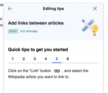
  • Adding icons as part of content - example when used in explanatory text or instructions.
    image.png (206×624 px, 38 KB)
    image.png (674×780 px, 55 KB)

Hi @Catrope - I recently captured some ways we would like to ideally extend the icons set usage on T280666:

Thanks!

  • Colours - being able to easily implement icons in different colours within the Wikimedia palette.

This is doable only with obscure workarounds in OOUI's icon system. Now that T280934 is done, this is easy in WVUI's icon system, because icons' colors can be styled in CSS as if they were text (with the color property). As you point out on the task you linked, guidance should be added to the Design Style Guide for when to use colored icons and what colors to use.

*Sizing - guidance or extended guidelines for smaller or larger sized icon sizes in certain contexts (e.g., when used in smaller text labels, used larger in header text)

There is some talk of this on T260617. Right now, WVUI's icon system always displays icons at 20x20px, whereas OOUI scales icons according to the font size of the surrounding text. I think we could do the same in WVUI by setting the width and height of the icon's <svg> element to something relative to the font size (e.g. 1.42857em, which is 20px when the surrounding font size is 14px).

  • Adding icons as part of content - example when used in explanatory text or instructions.
    image.png (206×624 px, 38 KB)
    image.png (674×780 px, 55 KB)

This is something that I'd like for us to support, but we'll have to think about how it will work, and how we can make it easy to use. We would probably want the icon to be a message parameter like it is currently (so the i18n message looks like Click on the "Link" button $1, and select...), and we'd have to provide an easy way for the code that uses this message to generate the right thing to pass in as the value of $1.

Not only, but also from a future theming and theme-independence perspective, it's not crystal clear to me that WVUI itself needs to or should store the icons. This could be done in an external library, similar to what WikimediaUI Base is for the variables definition to provide a clearer separation.
The single-path expectation is a not small hurdle, specifically if it were that we can't automate it properly and need to rely on non-FLOSS software like Adobe Illustrator.

Another point I've made in today's front-end dev standards meeting on this topic:
Currently we're providing the “WikimediaUI” theme icons for extensions via OOUI lib through ResourceLoaderOOUIIconPackModule without needing to load OOUI itself.
From design systems perspective we also need to include an ability to provide such replacement as well even though not necessary as part of WVUI itself.

Please also keep T275914: Using WVUI via ResourceLoader should expose icons in mind - OOUI lets end users say new OO.ui.ButtonWidget( { icon: 'alert' } ); without needing to worry about what the SVG for the 'alert' icon will be, but WVUI requires users and developers to copy the icon definitions to then pass back as a parameter.

Krinkle renamed this task from Figure out icon system architecture to Figure out icon system architecture for WVUI.Jul 13 2021, 3:31 PM

T286955 is another example where the single-path versus normal multi-path SVGs has cost valuable time and originated in an otherwise simpler avoided mistake.

From the strawman poll today, where we discussed two options:

OOUI icon inspired systemWVUI current system
Less freedom = stricter coherence?More freedom = more inconsistency?
Only one size that fits all currently (except for 4 icons called indicator)Size freedom with DSG size templates
Adding specific color needs extra mileColor textual context specific and flexible in design terms

Decision from Designer Workshop meeting from vast majority of designers without objection:
Move forward with the WVUI way and choose more freedom path.

  • Adding icons as part of content - example when used in explanatory text or instructions.
    image.png (206×624 px, 38 KB)
    image.png (674×780 px, 55 KB)

This is something that I'd like for us to support, but we'll have to think about how it will work, and how we can make it easy to use. We would probably want the icon to be a message parameter like it is currently (so the i18n message looks like Click on the "Link" button $1, and select...), and we'd have to provide an easy way for the code that uses this message to generate the right thing to pass in as the value of $1.

You'd also have to consider screenreaders. When icons are used, they are often decorative and coupled with a titled function (button, header etc). But when used in this way, you will have to provide alternative text to screenreaders, using the alt property of the img element or something.

Putting on Declined for WVUI.
A lot of the discussion topics and learnings here have been brought over into development of Codex icon architecture in tasks like T297007, T295185 or T293132.