Page MenuHomePhabricator

Image: Add Image component to Codex
Open, Needs TriagePublic

Description

Background

Image component needs to be implemented in Codex.

Description

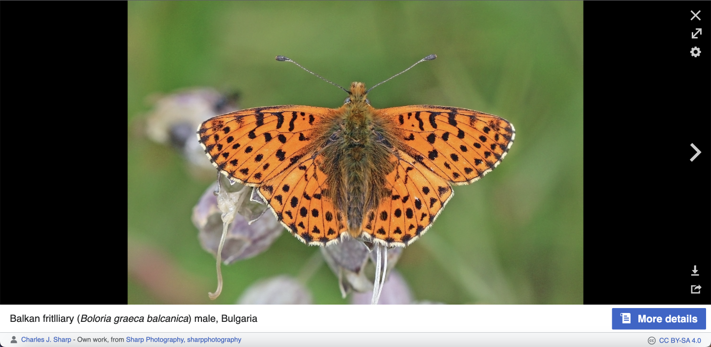
The Image component is used to display visual content (e.g. photos, illustrations). This component is used to provide visual context to the content. We can use images as individual components in the interface or to provide visual context in other components (e.g. cards, dialogs).

User stories

  • As a designer and developer, I want to be able to reuse an image component to support the meaning or illustrate content in layouts and components.

History

We've considered the introduction of image as a core Codex component. This wasn't listed as part of the big design inventory of the Wikiverse performed by the Product design team, though.

Known use cases

Images within the interface
Captura de pantalla 2023-04-19 a las 17.03.png (710×1 px, 446 KB)
Captura de pantalla 2023-04-19 a las 17.04-2.png (704×1 px, 855 KB)
Captura de pantalla 2023-04-19 a las 17.04.png (706×1 px, 1 MB)
Captura de pantalla 2023-04-19 a las 17.04-1.png (703×1 px, 1 MB)
Captura de pantalla 2023-04-19 a las 17.08-1.png (700×1 px, 451 KB)
Captura de pantalla 2023-04-19 a las 17.47 1.png (702×1 px, 272 KB)
Captura de pantalla 2023-04-19 a las 17.08-2.png (704×1 px, 379 KB)
Captura de pantalla 2023-04-19 a las 17.08.png (704×1 px, 938 KB)
Images as part of other components
Captura de pantalla 2023-04-19 a las 17.11 1.png (704×1 px, 137 KB)
Portrait card with image
Captura de pantalla 2023-04-19 a las 17.10 1.png (682×1 px, 271 KB)
Image within a popup
Captura de pantalla 2023-04-24 a las 14.01 1.png (702×1 px, 429 KB)
Thumbnail with image
Desktop - Onboarding - first step example.png (646×762 px, 49 KB)
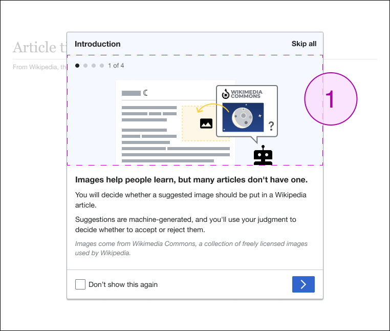
Onboarding Dialog with image T332767

Existing implementations

These artifacts are listed for historical context. The figma spec, linked below, is the source of truth for the new component.

Wikimedia community:

  • Design style guide: -
  • OOUI: -
  • Vue: -

External libraries:


Codex implementation

Component task owners

Open questions

  • What does the image need to do from tech standpoint, lazy loading, etc?
  • Component's properties:
    • Aspect ratios: they will be implemented as components properties
    • Image customization (e.g. left, right, center): it will be implemented in a separated ImageContainer component
    • Option to provide a specific px size (e.g. VE image settings): we will not specify the px at the moment

Design spec

Anatomy
Style
  • Image: it will not have any style applied
  • Placeholder: it will use background-color-interactive-subtle and color-placeholder in the icon
Interaction

The following states will be implemented in the Image component:

  • default
  • loading (it will use the skeleton once it's implemented in T311874)
Documentation

A configurable demo will be included with the component's properties and states:

  • Image's content: Image with photo / Placeholder
  • Aspect ratios: No/Yes (when yes, we should view the different aspect ratios options)
  • Loading: a toggle switch will display/hide the loading state
  • LTR/RTL: the RTL option will not mirror the image component in this case

Apart from the configurable demo, we will include other demos with:

  • Image component using an illustration
  • Placeholder: we will need to explain in the demo that the placeholder's icon will be scaled with the width of the placeholder as defined in the Figma spec

Acceptance criteria

Minimum viable product

This task covers the minimum viable product (MVP) version of this component. MVP includes basic layout, default states, and most important functionality.

MVP scope

  • List all parts of the MVP scope for this component

Design

  • Design the Figma spec sheet and add a link to it in this task
  • Update the component in the Figma library. This step will be done by a DST member.

Code

  • Implement the component in Codex

Future work

  • If applicable, list future work that should be done for this component after the MVP is implemented as part of this task. You should open new, standalone tasks for all future work.

Event Timeline

AnneT raised the priority of this task from Lowest to Low.Mar 1 2023, 4:59 PM
bmartinezcalvo renamed this task from [Needs discussion] Design and implement Image component to Image: Add Image component to Codex.Apr 24 2023, 11:41 AM
bmartinezcalvo updated the task description. (Show Details)
bmartinezcalvo subscribed.
Restricted Application raised the priority of this task from Low to High. · View Herald TranscriptApr 24 2023, 4:53 PM
ldelench_wmf set the point value for this task to 1.Apr 24 2023, 4:53 PM

FWIW, Codex thumbnails use background image styles, not actual <img> elements. If we want Thumbnail to use the Image component internally, we would either need to change that in the Thumbnail or support use of background images in the Image component.

I wanted to add a few implementation-specific notes which might impact design of this component as well.

  • I'd recommend limiting the initial MVP version of this component to <img> elements (no CSS background-image use yet). The img element provides onload and onerror events that we can use to implement lazy-loading and fallback behavior; images loaded via CSS don't provide the same interface (though we may be able to figure out workarounds later).
  • Modern CSS already provides pretty sophisticated controls for control of image aspect ratio, cropping, and positioning. Rather than duplicating a lot of this functionality ourselves within the component, I think we should just expect the user to style image components using these CSS properties. We could still provide design tokens or LESS mixins for commonly used image styles (including pre-defined aspect ratios).
  • I think that this v-lazy-image component on GitHub is a good example of the kind of thing we'll want to build in Codex – this component is very simple and style-free; the component controls the loading and fallback behavior but not much else, with the expectation that styling should come from the user.

So maybe we need to build two different things here:

  • A basic CdxImage component similar to v-lazy-image that manages loading/fallback state for images using the IntersectionObserver API (where the user provides a src or srcset, a fallback src, and intersection observer options); this component would have very little additional styling on its own
  • Some tokens and mixins to provide consistent values for one or more style properties – aspect ratio, border, CSS transitions/animations, background color during fallback state, etc.

In the future we could build more specific components on top of the base Image component that are more opinionated in terms of appearance & behavior.

During the last Eng/Design sync we decided that aspect ratios will not be defined as tokens but they will be included in the Image component as component's property. So I've created the Figma spec sheet accordingly with this and adding the following:

  1. Aspect ratios (16:9, 3:2, 4:3, etc.) have been added as component's property
  2. Image component will have 2 states: default and loading (using the Skeleton once it's implemented in T311874)
  3. If Image component doesn't have an image uploaded, it will display the placeholder
  4. Placeholder icon will scale from a minimum size (12px) to a maximum size (40px). More details in the spec.
  5. RTL behavior: the image component will not be mirrored but the assets for the image component will be created/exported in both LTR/RTL in some cases (e.g. illustrations)

Apart from the image component, we will create an ImageContainer or Figure in the future, where we will implement the image position within a container, the image's container borders and caption (image text). This will be done in a separate task. I've defined some of the aspects in this other spec to grab the differences between Image and ImageContainer.

Let me know your feedback about all this.

There is one open question to solve in the task before implementing the Image component: Do we want an option to provide a specific px size in the image? (use case from VE image settings)

There is one open question to solve in the task before implementing the Image component: Do we want an option to provide a specific px size in the image? (use case from VE image settings)

During the last Engineering/Design sync we decided to move forward with no option to specify px. So this task is Ready for development.

CCiufo-WMF removed the point value for this task.
CCiufo-WMF raised the priority of this task from High to Needs Triage.Feb 15 2024, 9:01 PM