Page MenuHomePhabricator

Design (Menu) Option component
Closed, ResolvedPublic

Description

Goal

Design Menu Option component

  • Collect current menu options implementations states:
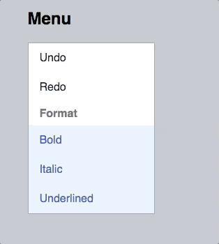
  • Design all states: default, hover, active, selected, selected hover, disabled
  • Design variants:
    • Only text
    • Title + Text (Label and supplemental text)
    • Icon + Title + Text (This will be used for the “Search more” option)
    • Image (thumbnail placeholder?) + Title + Text
    • Selectable options

Original task:
We're currently featuring Base80 (#eaecf0) as :hover background color for dropdown menu items and toolbar tools.

After having selected items changed to blue shade in T143634, we should reconsider using a lighter blue (“Accent90“?), separating it clearer from inactive or just descriptive elements.

We've decided to not go with blue backgrounds for hover at one point in the discussion as it is probably too disruptive and focus grabbing while not really a strong user interaction with the system. Grey seems to be the better choice. Blue for real user interaction element indications.

In the work for Codex we've found ourselves in the problem with scattered menu options designs across Products and without clear design specifications. Therefore reusing this task as centerpoint for the Design System definition of a Option in a Menu.

Event Timeline

Hover on selected item: #e9effaAccent90: #eaf3ff
Screen Shot 2017-05-31 at 8.53.54 PM.png (176×333 px, 25 KB)
Screen Shot 2017-05-31 at 8.54.02 PM.png (179×341 px, 25 KB)

Just wanted to point out the amount of difference there would be between the hover state of a normal menu item and a selected menu item. No opinion here, just an FYI.

@Prtksxna Thanks for the comparison. Yes, there might be another change considered as well.

Reassigning this to @Pginer-WMF as it needs design support on clearer outlining current shortcomings and proposed improvements.

Reassigning this to @Pginer-WMF as it needs design support on clearer outlining current shortcomings and proposed improvements.

I created examples for the use of accent90 light blue used on hover:

I think the color combinations can work well, while still distinguishing the relevant states. Thoughts?

@Pginer-WMF Thanks for creating these demos . Summarizing the change you're suggesting for the menu.

StateCurrentProposed
hoverBase80 #eaecf0Accent90 #eaf3ff
selectedAccent90 #eaf3ffAccent90 #eaf3ff
selected + hoverSomething close to Accent90 #cde3ffDarkened Accent90 #eaeefa

I think the color combinations can work well, while still distinguishing the relevant states. Thoughts?

I agree, these work well. Also, changing the hover background from gray to blue, as you have done, makes the selected + hover state more predictable.

I think too, that the :hover amendment to Accent90 works well, but I need to add a few details to currently in-production way:
The :active way is different (active is also known as mousedown, while the active described above is a selected state) already, it takes selected foreground color and a bit darker background rgba( 41, 98, 204, 0.1 ).
This is important for UX as action indicator and we should make use of the option.
Compare current behaviour of for example Outlined BookletLayout's menu.

To sum up:

  • Giving selected+hover a special case doesn't seem important to me (as you can't chose to unselect those items nor usefully interact with them in current technical prospect), but there is an important differentiation in this case between
  • :hover
  • :active
  • selected (selected+hover equals selected)
  • selected:active equals :active OR doesn't change at all, probably looses cursor: pointer, although this has been opposed as too jarring in another similar use case on OOUI earlier
  • Giving selected+hover a special case doesn't seem important to me (as you can't chose to unselect those items nor usefully interact with them in current technical prospect), but there is an important differentiation in this case between

I was considering "selected+hover" distinction not to be very relevant initially, but there is a good point Prateek brought up: keyboard use. When moving with keyboard through a list, we are using the hover state as the way to indicate where the focus is on menus. If you move through 3 selected items next to each other in a menu, you won't notice which is the current selected one if all the selected elements are displayed the same (making no distinction of which is the one with the focus).

One alternative to provide some support to that case without introducing a new color could be to use accent30 dark blue for the text on selected elements when hovered/focused to distinguish them from the non hovered/focused. The distinction is subtle, but at least provides some cues of where you are, if we consider this usecase important. I created an example and captured a gif simulating the keyboard interaction:

Dec-13-2017 10-03-01.gif (350×314 px, 844 KB)

Getting more complex than I was hoping here, you're right, there is the special case of keyboard navigation.
Pitifully we're not consistent in it.
If you look into the Toolbars demo, menus in the toolbar giving only keyboard navigation feedback on :focus per tab while very late and weird (first scrolls the page) also work with arrow keys.
That's an experience contrast to the navigational dropdown in the left upper corner. (Should be filed in a related task)

Not sure though, if the slight color change treatment for this case is best-possible solution. I'd rather stay with our focus outlines whereever we can over such small color differences.

Not sure though, if the slight color change treatment for this case is best-possible solution. I'd rather stay with our focus outlines whereever we can over such small color differences.

It's not the best-possible solution in general. I was presenting it as a possible solution in the intersection of "avoid no signal at all" and "use only the existing palette without adding new colors". For the specific keyboard interaction, there is an expectation of the next item to react and even a subtle change may help users to get oriented.

Note that we are not talking about keyboard navigation in general, but the specific case of navigating through a sequence of selected elements. So we need to consider in that context which level of support to provide. I'm ok to find ways to support this edge case better, but I think we need to be careful not to do so at the expense of making the regular cases worse.

@Pginer-WMF I've forked the CodePen and:

  • added :active state as currently defined
  • added Accent50 as selected color to strengthen difference between :hover and selected items (is also currently the case)
  • refined transition from current OOUI state
  • made use of <a> elements as they support :active out of the box similar to our OOUI menu items

With that I think that the selected:hover state is a bit out of touch to the rest. Thoughts?

Volker_E renamed this task from Consider changing :hover tools and menu background to use Accent90 to Design (Menu) Options component.Jan 20 2022, 6:08 PM
Volker_E raised the priority of this task from Low to Medium.
Volker_E updated the task description. (Show Details)
Volker_E added a subscriber: Sarai-WMDE.
Volker_E renamed this task from Design (Menu) Options component to Design (Menu) Option component.Jan 20 2022, 6:11 PM
Volker_E updated the task description. (Show Details)